Brand Identity
Play Fantasy Tennis
Play Fantasy Tennis is the most simple and convenient fantasy tennis platform.
Initial Situation
Having no brand, it was tough to stand out and aquire members who we're looking for fantasy tennis. With a multitude of competitors, the vision and personality had to be communicated well to create their own big player base community.
Strategy
Using wording, design & animation we communicate throughout the strong message that Fantasy Tennis is better because its; simpler. This pushes the emotion of convenience, makes it a better customer experience and makes it a more attractive option than the others in the your market.
Project Type / Brand Identity
Place / Canada
Year / 2021


Visual Concept
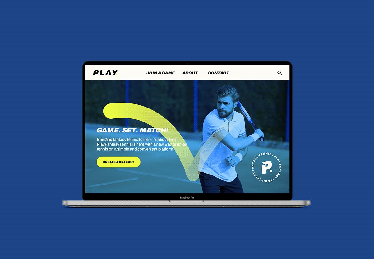
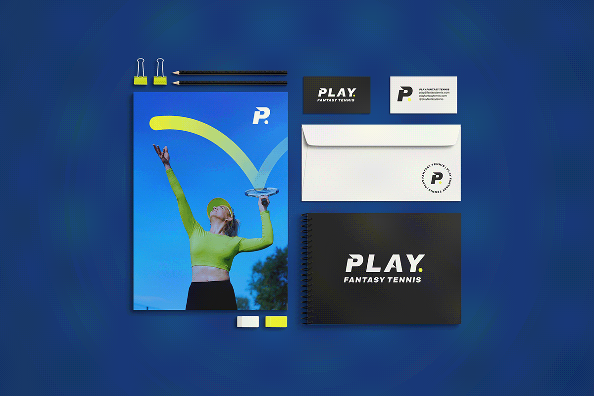
The project visual concept is inspired by the tennis ball and its movement. The main colors are black and yellow and the italic font brings the idea of movement. We used notches in the font to demonstrate speed and brought the blue as a secondary color to further reinforce that the brand is for tennis fans. The “swoosh” replicates the ball in action in a creative way to point your eye in the right direction.

Result
Using the keywords earlier, we created a brand that makes you laugh in it’s clever writing, challenges you with slangs that you use with friends and establishes the value they bring by being professional and informed in the sport. It’s almost like one of your buddies, and everytime you think of them, you think of starting a new pool to get a game going.


Thank you!


