THE CHALLENGE
ANTHROPOCENTRISM:
NURTURING A
PHILOSOPHY FOR
A NEW AUDIENCE
Aquaform has been producing innovative shower systems which aid relaxation and wellbeing for more than three decades. However, a few years ago Aquaform decided to shift from being a subcontractor to a brand that offers its products directly.
Our role was to help Aquaform face this paradigm shift and find its way to being leaders of the wellness and spa market. In order to do that, we needed to establish and nurture the company’s philosophy of anthropocentrism - putting people first at everything they do.
THE LANDSCAPE
TURNING WELLBEING
FROM A BUZZWORD
TO A FOUNDATION
The beauty and spa industry has been growing in recent years and the concept of wellness has rightfully entered our collective vocabulary. Taking good care of our body and mind is increasingly considered a right for everyone, not a luxury reserved for the privileged. From Aquaform’s perspective, the technical features of their products are vehicles that take people down experiential paths, with improved or maintained wellbeing always the destination.

The main audience in this sector is often technical architects and spa managers, which are not always those who would be using the products on a regular basis. It was therefore important for Aquaform to be able to design and propose products that could comfortably convey the experience of wellbeing, earning the trust of decision makers.
STRATEGY
GETTING TO THE
GETTING TO THE
ROOTS OF THE
PROJECT
Before attempting anything else, we first knew that we had to define the company’s positioning and the landscape in which it operates. Next, we held a deep dive into the phases of the production chain, examining all actors involved, whilst also learning about the key competitors in the market.
This research was conducted over a two day workshop with the Aquaform management team. As our sessions drew to a close we all felt that one core truth had been uncovered: in both conception and production, Aquaform is constantly seeking to make the consumer’s experience as close to nature as possible.
At that point we asked ourselves: what does rain smell like? What color is reflected in the droplets of a waterfall? Is it possible to communicate these sensations with a visual language made up of colors, shapes and products?

BRAND
BRAND RESTYLING:
TOWARDS A SINGLE,
VISUAL LANGUAGE
The coordinated image was conceived with the desire to create something pristine and candid, as if to define a feeling of ethereal wellbeing. The lettering of the logo is based on pure and circular geometric shapes. The colors are inspired by the earth, with warmth as a base before finding accents in secondary colors. The more vibrant colors refer to chromotherapy. The layout and typographic grid emphasizes strength and centrality, as if there is a backbone supporting the entire skeleton of the page.
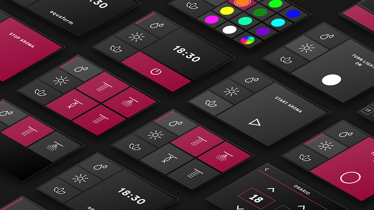
We have compiled a set of various icons with the aim of being able to adapt to multiple applications, from touch displays to command keys, in order to create consistency and easy recognition.



CAPTURING
SELF-CARE
We decided to present the Aquaform brand and products through a visual and photographic language. This was to once again highlight how people, and how they take care of themselves, remain central.
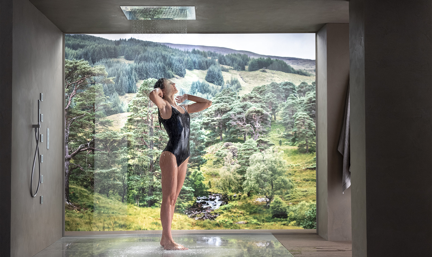
As such, we felt it was important to represent aspects such as how water contacts and rebounds off the skin, the consistency of water vapor and the green colour of nature. The photography acts as an immediate capture of wellbeing, not focusing on the sky or the earth, but what lies in between.


UNIFORMITY
THROUGH
SIMPLICITY
The project's challenge was to extend a simple, passionate and elegant language to all business elements, even the most technical, while maintaining brand consistency. To achieve this we developed several design tools to cover all touchpoints, from the product catalogue through to the configuration examples and installation manuals. These elements are very different from each other in content but consistent in visual narrative.


EXPERIENCE
RAISING
STANDARDS
TO MEET
EXPECTATIONS
When operating as a subcontractor, Aquaform’s goal was to display high-level shower systems with a wide range of features, leaving the client brand to take care of all customer-facing aspects. With the transition to a B2C brand, we needed to work on the user experience.
The customer's expectation of a high-level brand is that it is five stars across the board. A pleasant sensory experience when viewing items would produce little pleasure if accompanied by a low-level UX that generates cognitive stress.
We worked to make interaction simple and straightforward, providing the person with essential information and building interaction patterns that could be used across the different products. The feedback for this type of product is both sensory (shower sensations) and cognitive (UI). We therefore chose to build a UX that takes into account the information that the person collects through their senses and incorporate it into the journey.


