We’ve taken our project from the heart to a new level!
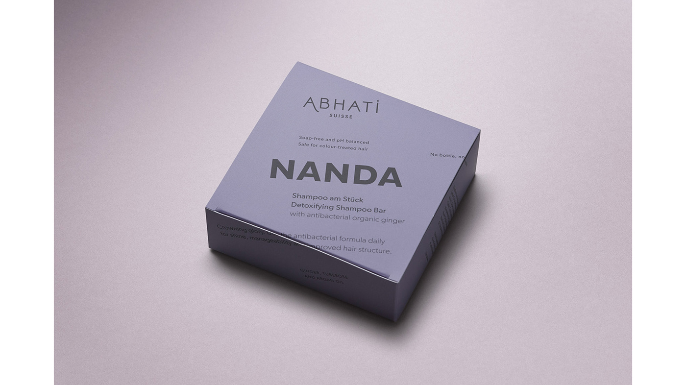
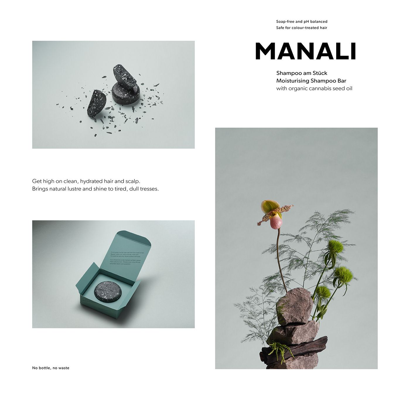
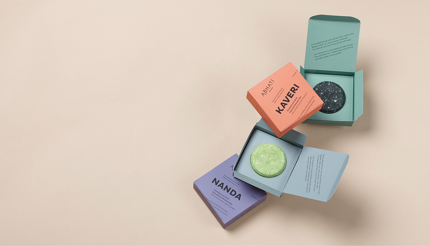
After around 6 years of working for and with Abhati Suisse, it was time to do a little brush-up on the logo, find a solution for the new SOLID collection – featuring solid shampoos as a first product – introduce some colour to the brand, while still staying true to the branding we developed 6 years ago. Also, we worked with Anouk Jans and Yannick Müller to create tutorials and some video material and with Lilo Klinkenberg from Studio Lilo on beautiful stills which showcase ingredients from the shampoo bars – and then some.
About the project in general:
Where India meets Switzerland. The Abhati product line combines both of these worlds and is raising the bar to create a better and more beautiful world: Each product does its fair share to finance the education of girls in India! We support this project by gifting our time and dedication wholeheartedly.
The creative overall responsibility was consigned to us, including the naming of the brand and products, corporate design, product design, web design and all photographical concepts. The body care line draws upon names of Indian lakes, whereas the names of the hair products derive from Indian rivers. When thinking of the product design, we took the packaging idea of our Abhati candle further: roaming around on a street market in Mumbai, a keepsake wrapped in a sheet of an old newspaper. The typography is laid out in a strict Swiss grid. Indian patterns are nestled up against the bottles, colours were introduced to the newest product line of Shampoo Bars.
We feel: A perfect combination of both worlds!
We feel: A perfect combination of both worlds!