

SD Luxury Rentals
Find your next luxury apartment in sunny San Diego.
_________
Areas of Expertise
Strategy, Design, UI, UX and Prototyping
Platforms
Web, Mobile and iOS
_________
Challenge
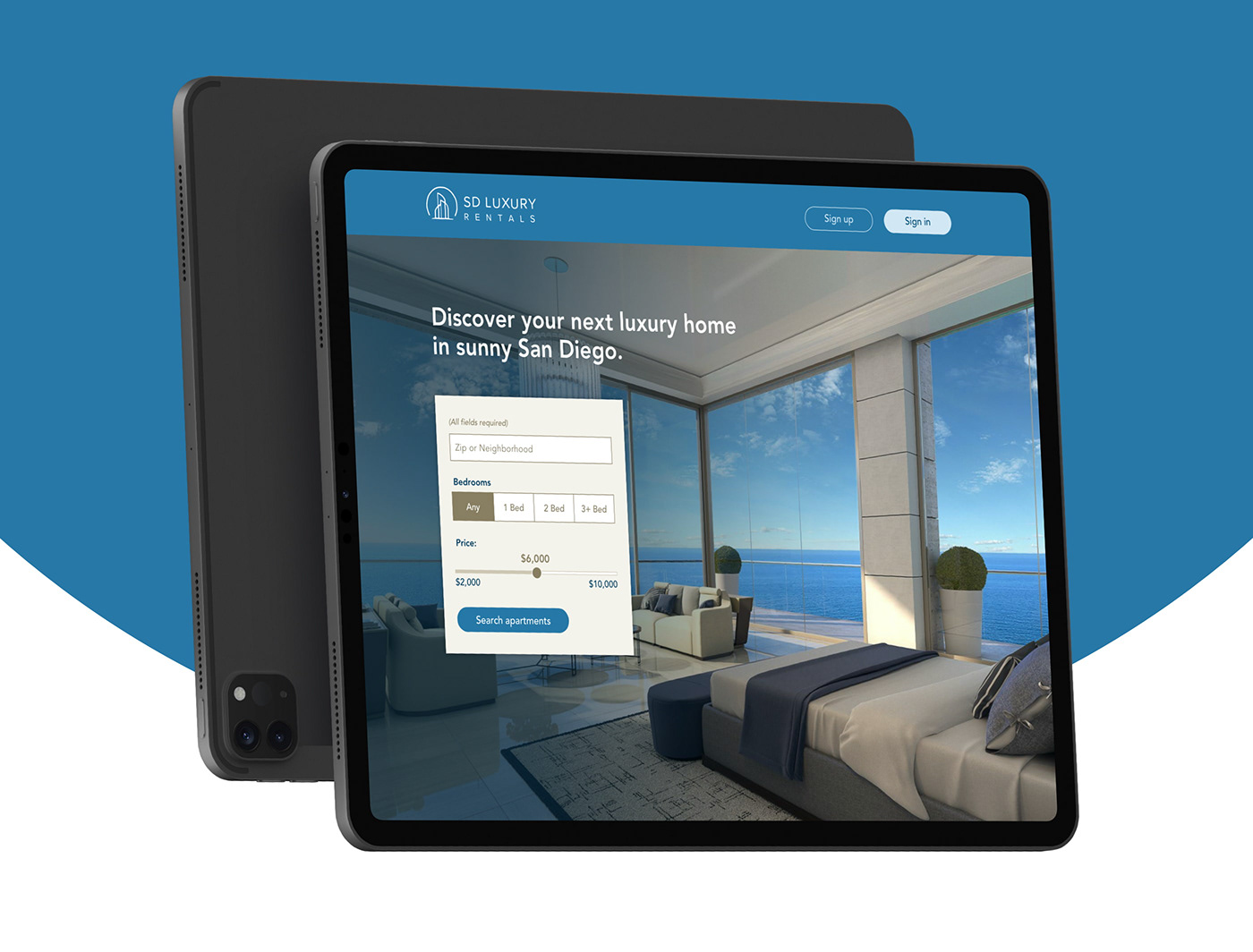
Develop an exploratory application for SD Luxury Rentals, a luxury apartment finder for San Diego, California.
Users should be able to sign in / sign up for an account, search for an apartment to rent in a specific neighborhood or zip code, modify the search and apply filters, view individual listings and call or message the property owner within the application.
Final assets created included a landing page, application pages (desktop and mobile), mobile app, logo, icons and a style guide.
_________
Process
Step 1 | Research
I researched (5) popular applications, specializing in finding an apartment. Gathering screenshots of their desktop, mobile and phone apps, I analyzed the components, features and user flow that was necessary to optimize the user’s experience.
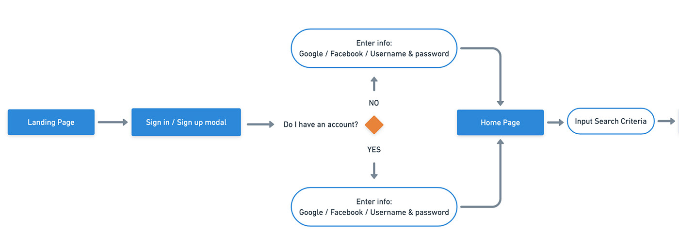
Step 2 | User Task Flow
I created a task-flow diagram for the user task: sign in / sign up for an account, search for an apartment to rent, modify the search if necessary, view an individual listing and message the property owner. Below is a snippet of the beginning of that user flow.
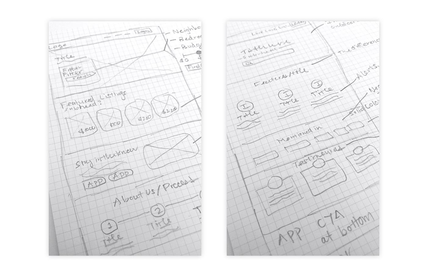
Step 3 | Sketches and Wireframes
I sketched out ideas for the landing page components and then moved onto low-fidelity wireframes with more design and navigation detail.
Landing Page Sketches
(Featuring different components and layout options)
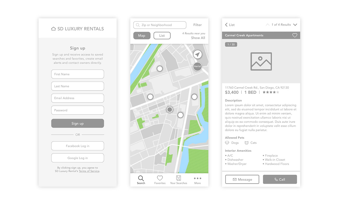
Mobile Application Wireframes
Left: Sign up page where users can create an account
Middle: Map search result page where users can view apartments in their area
Right: Individual apartment page where users can explore apartment details
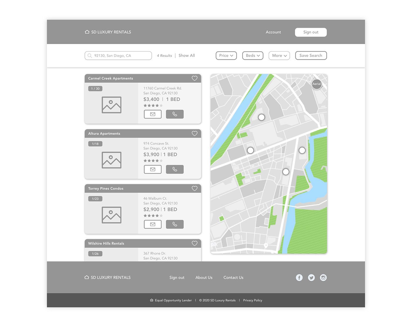
Desktop Application Wireframe
Search results screen where signed in users can explore a list of results, view results in a map or apply filters to refine their search results.
Step 4 | Style Guide
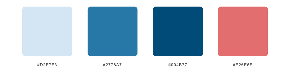
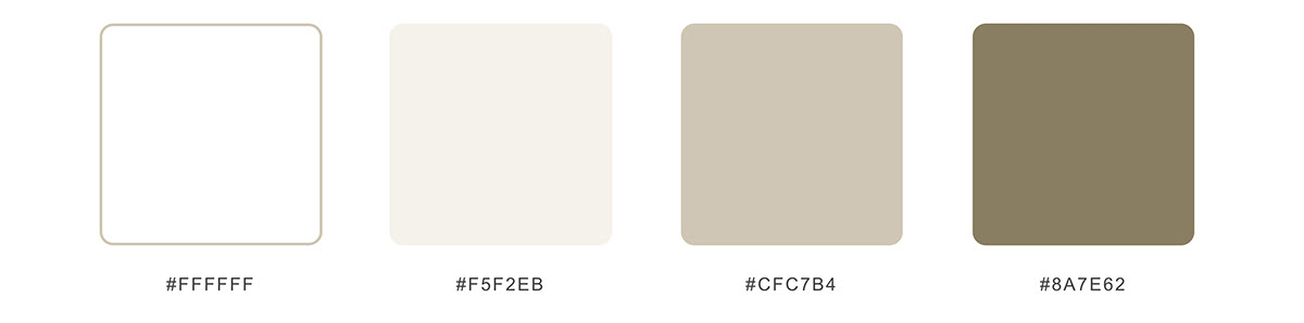
The family of blue colors were chosen to emulate the natural blues of the ocean in Southern California. The tan base colors mimic the sandy beaches in California. The light red color mirrors coral in the ocean and was chosen to provide a contrasting color for error messages on components.
The logo icon represents an organic shape of a high-rise luxury apartment building enclosed by a California “sun” and paired with a sans-serif font. The components were kept simple, focusing on the bold photography of the apartments and the essential functions of navigating the application.
Brand / Action Colors
Base Colors
Typography

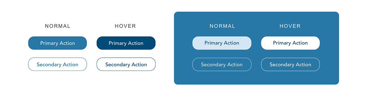
Buttons
Logos

Responsive Logos

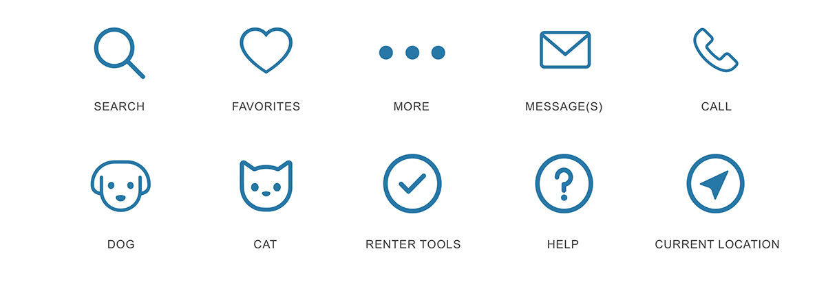
Icons
Apartment Search Result Component

Form Fields

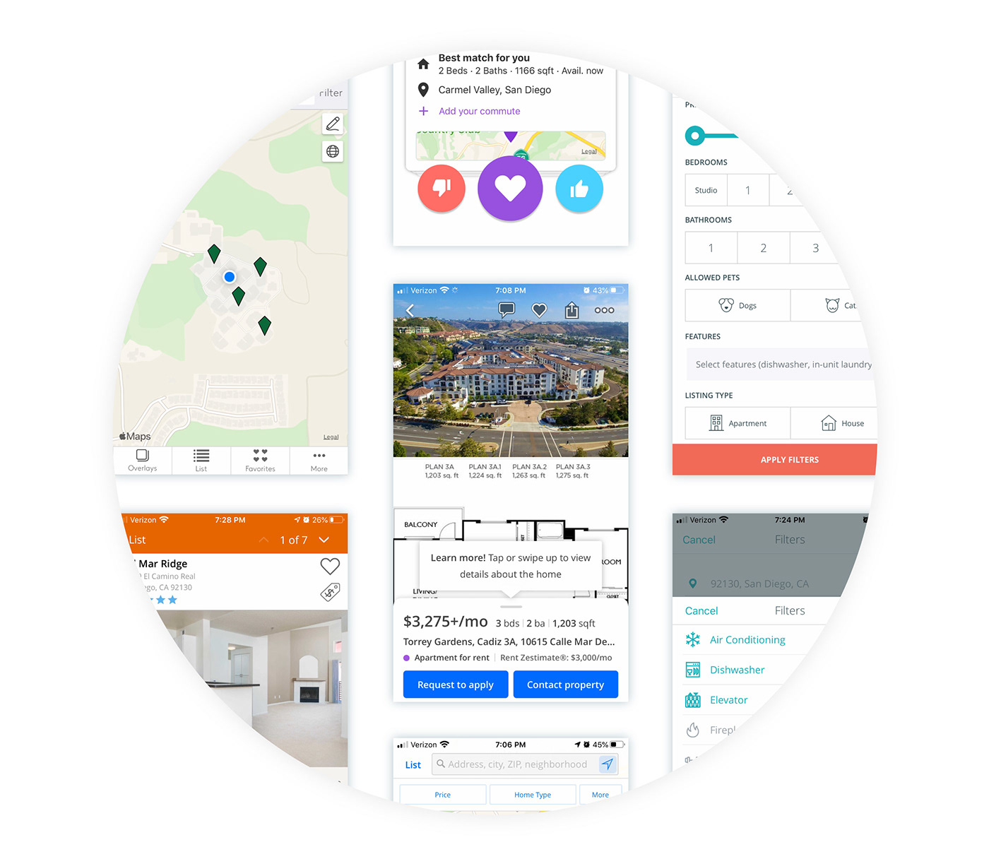
Step 5 | User Testing and Final Mockups
User testing was initiated with (3) people in-person on an interactive prototype of the mobile application to gather feedback on the user experience.
Users were asked to do the following tasks:
• Sign up for an account
• Search for an apartment by city or zip code
• View the results by map and list view
• Add additional filters to the results
• View an individual apartment listing
• Call the apartment
• Message the apartment
• Sign out of their account
I monitored users as they went through each task and took notes. Challenges included being able to find specific elements and navigating the application. These results were analyzed and incorporated into the final mockups to improve the user experience.
Final Mockups of the landing page, desktop application and mobile application


Interactive Prototype Video


