Mobills is a creative group who experiments with new ways of working. We deliver message through our brand, Mobetterworks and solve various problems with Partners who understand with the message. All stories we talk about are recorded on MoTV.

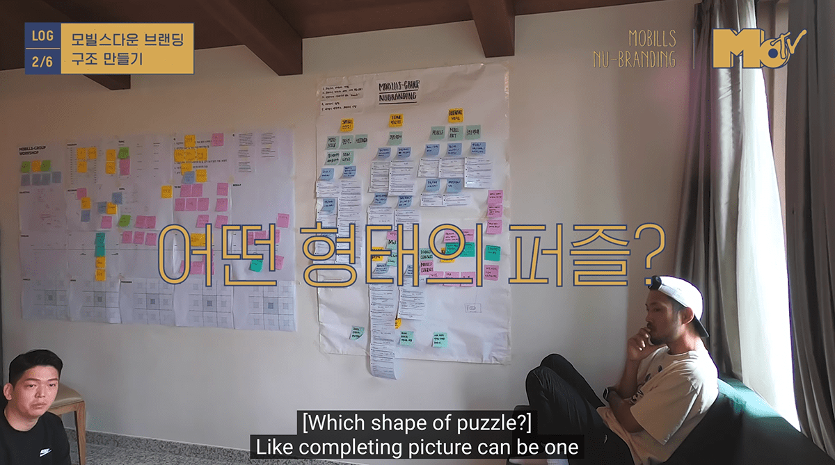
Traditional corporate branding means that a branding expert will put the philosophy of the logo and identity and someone will offer it from beginning to end. But we've done experiments that we've been working with consumers from the beginning.
With MoTV, we've completed the corporate identity of what users and consumers think about us, and what they want, and what they want, converging and reinterpreting with everyone with content called
With MoTV, we've completed the corporate identity of what users and consumers think about us, and what they want, and what they want, converging and reinterpreting with everyone with content called
"Nu-Branding."
We got keywords from viewers.
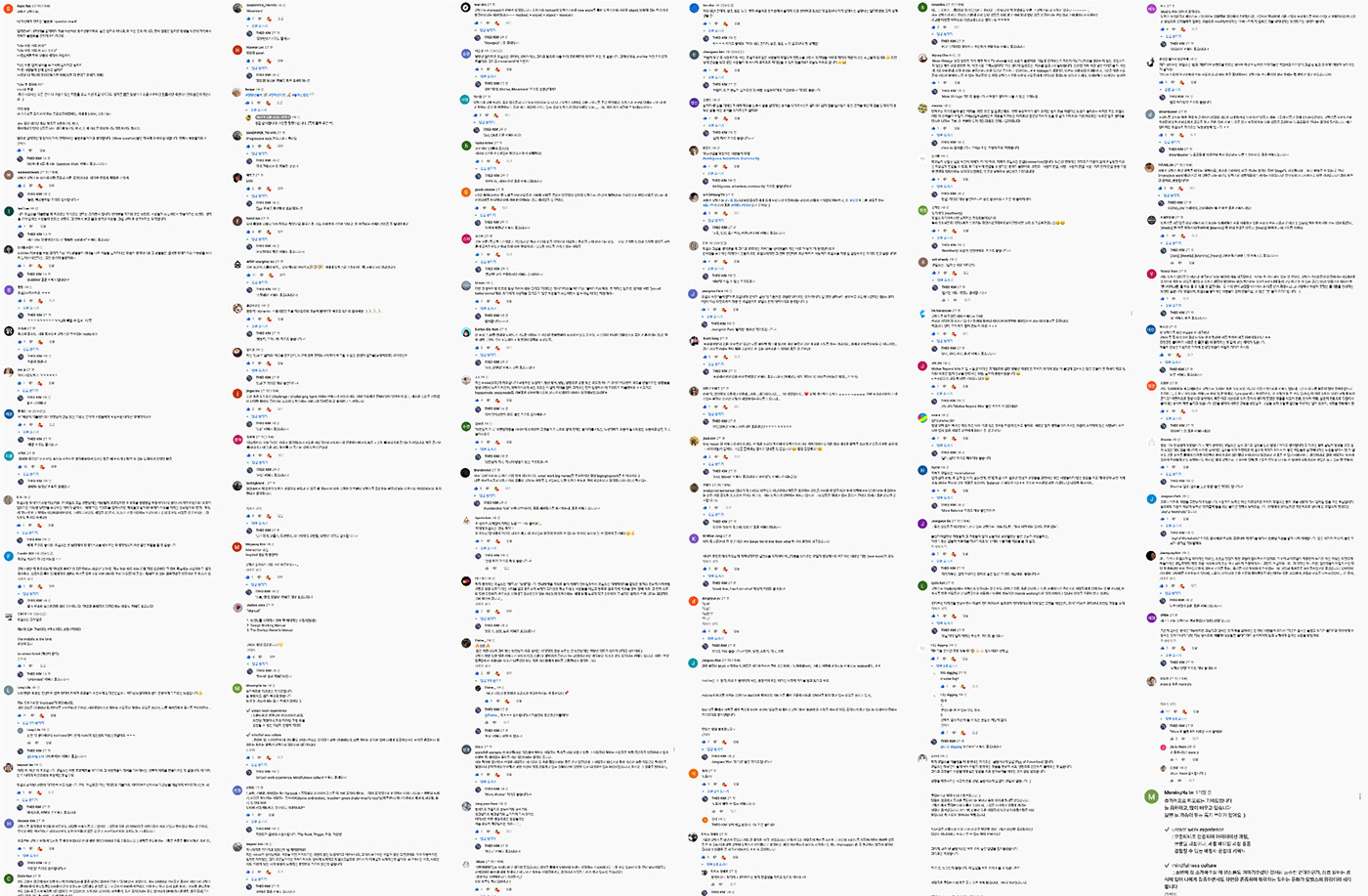


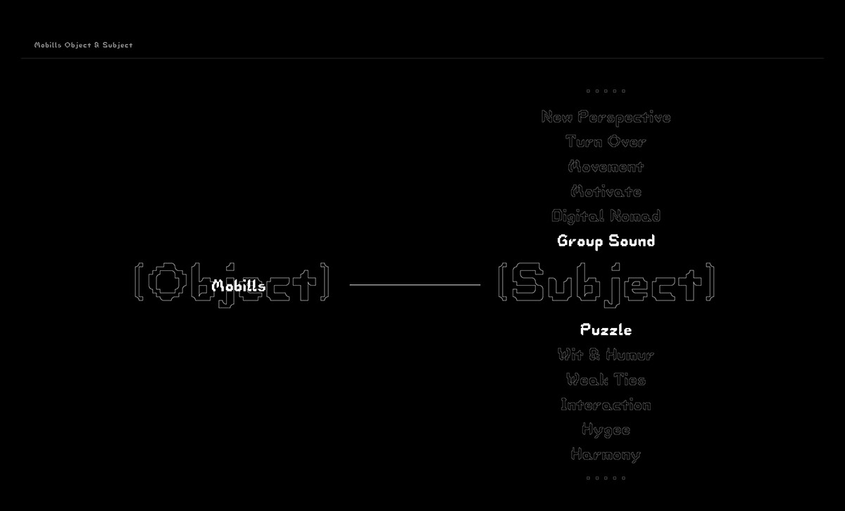
Through YouTube video content called "Nu Branding," I explained how branding will proceed to consumers. Naturally, consumers were intrigued and left the impression of Mobills-group in the comments. There were more than 240 comments in total, including comments titled Motivate, Movement, Puzzle, Wit, Humor, and Group Sound. The meanings were defined by combining and visualizing typical impressions.


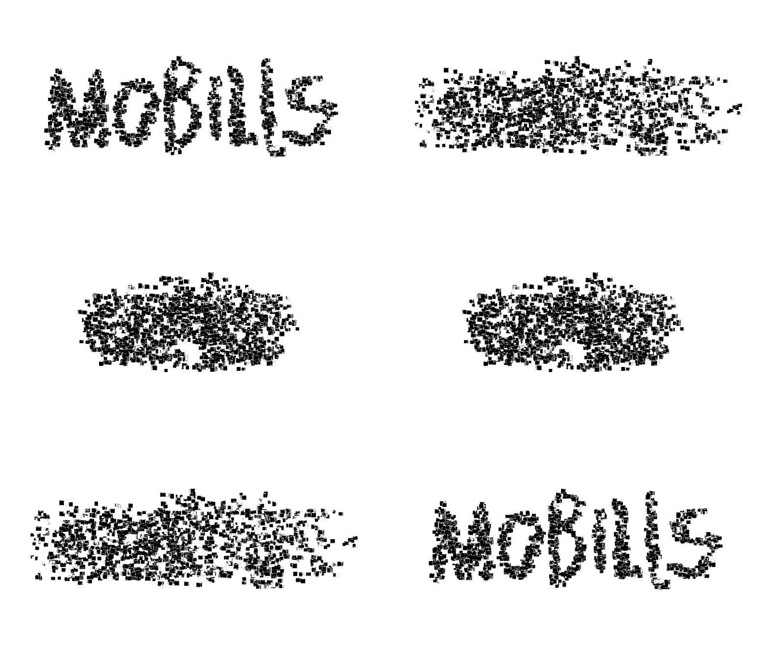

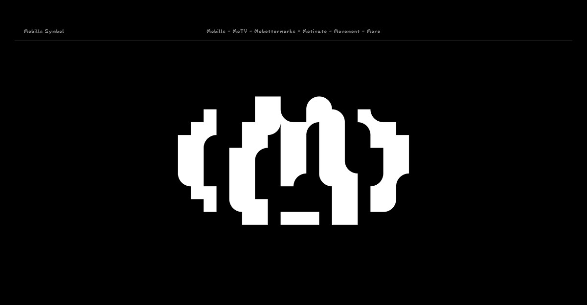
A combination of the representative subjects ‘‘Puzzle’ and the ‘Group Sounds’ created a three-dimensional logo consisting of x,y, and z-axis. Symbols and logos were combined into one object, and it has the properties of puzzles in the form of Illusion Sculpture, which cannot be expected from the front and cannot be expected from the side. We made a Nu-Typeface out of three puzzle modules and symbols were completed by combining MO, which means Mobills, Motivate, Movement, More, etc., and the font of the logotype was completed by combining alphabets written lightly by the members of Mobills-group.


As consumers participated in the initial planning, the use of the logo encouraged consumer participation. The Mobills-group's business card did not display the logo, but each member has a different slogan, so consumers can see each member's Instagram address along with the logo on the screen when they light the slogan with an Instagram AR camera. It means that customers are invited to Mobills-group through a business card.


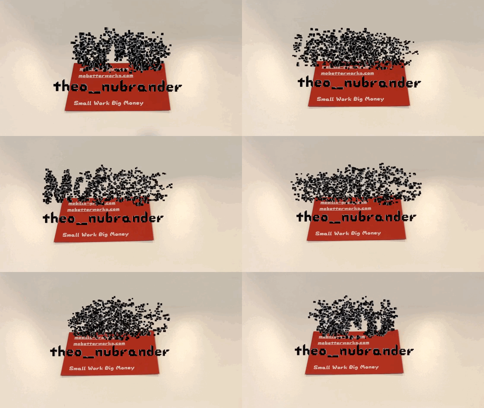
People can see each member's Instagram address along with the logo on the screen when they light the slogan with an Instagram AR camera.
The project features a completely different approach from the existing corporate brand identity production approach, leading to consumer participation, and the results also come from the consumer's thoughts. Consumers have the story through Mobills-group's brand identity and branding to understand how naturally became an opportunity. This is small but became a big, funny play. Since we are a brand that tells jokes for people who work, we also made jumpsuits that symbolize workwear.


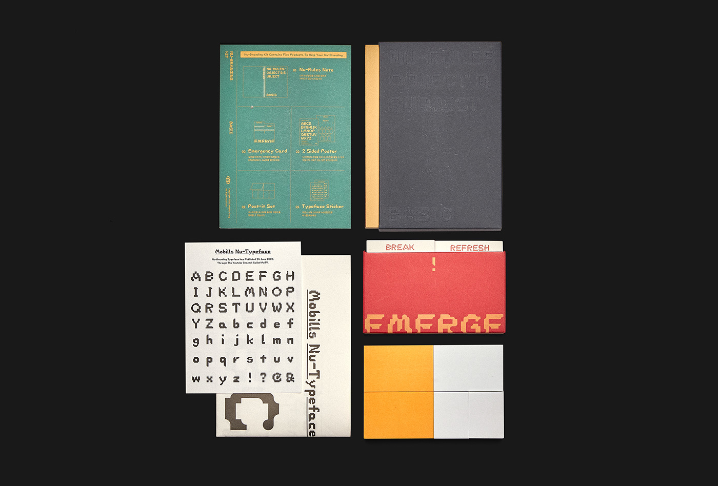
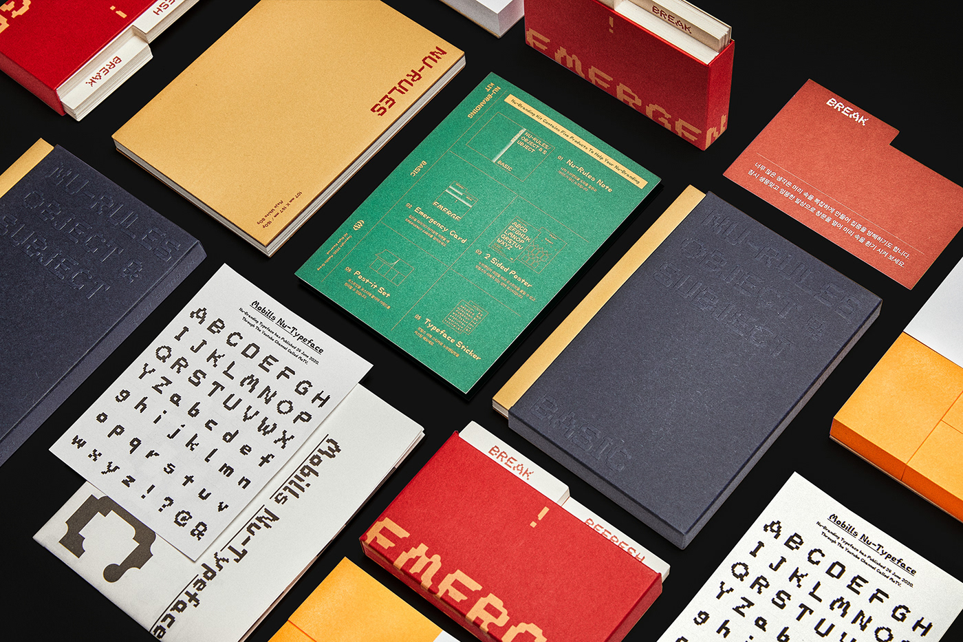
The name "Nu-Branding" is more focused on convergence than on novelty like Nujazz. Including the meaning of embracing diversity, the boundaries of roles between consumers and businesses were naturally broken down, completing branding that could be enjoyed together. It is now expanding and is applying the method of Nu-Branding to build individuals and companies on the brand side. Others have made it possible to follow the process of Nu-Branding through the Nu-Branding Kit, and working with consumers on the food package of the Korean food giant called Ottogi.




-
Story : Mochoon & Soho
Nu-Branding Director : Theo
Corporate Identity & Typeface & Edited : Theo
A.R & Website : Hoontaek
3D Logo : Gyeyong
Nu-Branding Kit Planning : Jiwoo
&
Mojjangi


