Operina Pro
Typographic adaptation of 16th century lettering
Operina is based on a 16th century lettering model of the scribe Ludovico degli Arrighi that he used in his 1522 instructional lettering book, La operina da imparare di scrivere littera cancellarescha. This book is considered the earliest printed examples of the Chancery Cursive style.
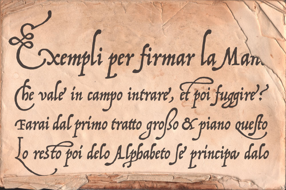
Rather than try to reproduce a perfect, smooth, type-like version of Ludovico’s hand—which has been attempted in the past—I opted to leave in some rough edges and, thereby, create something that has a time-worn look and mimics the endearing artefacts of quill and ink lettering on parchment.
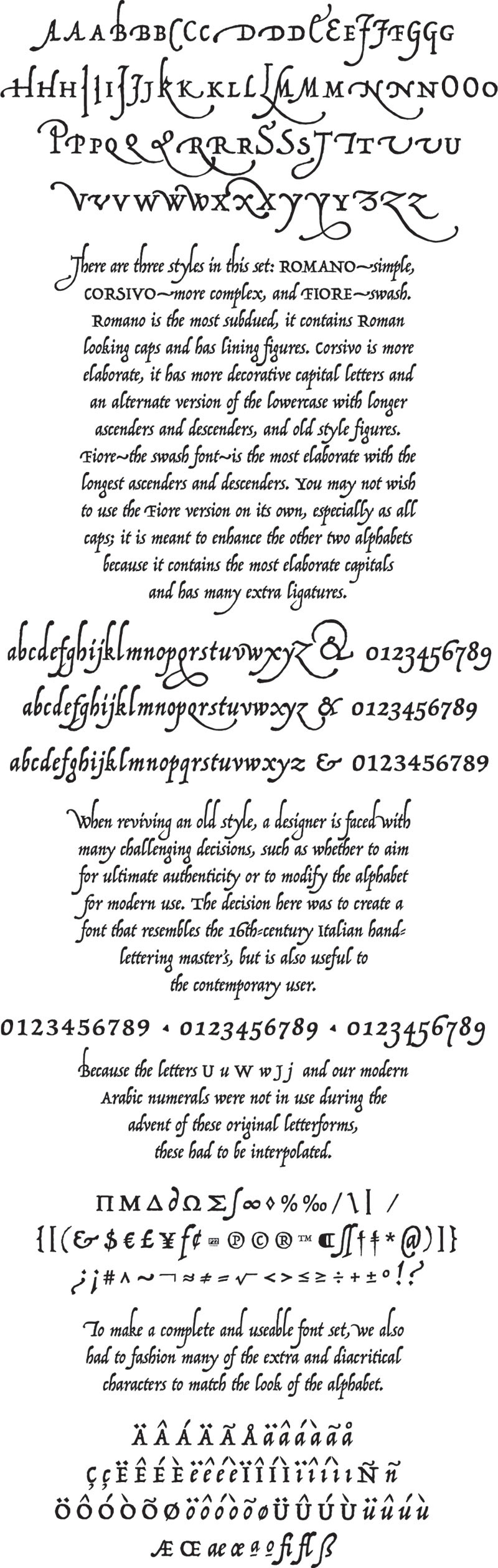
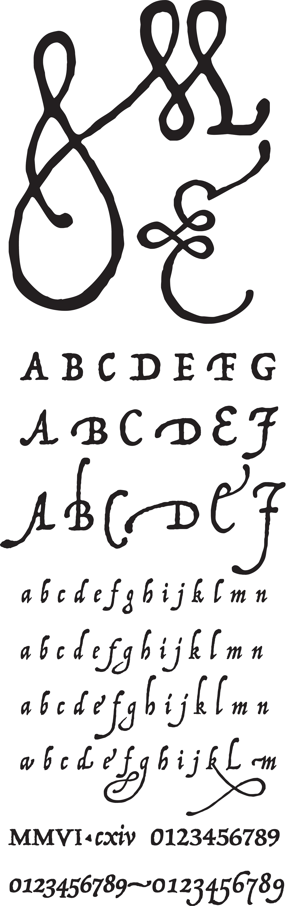
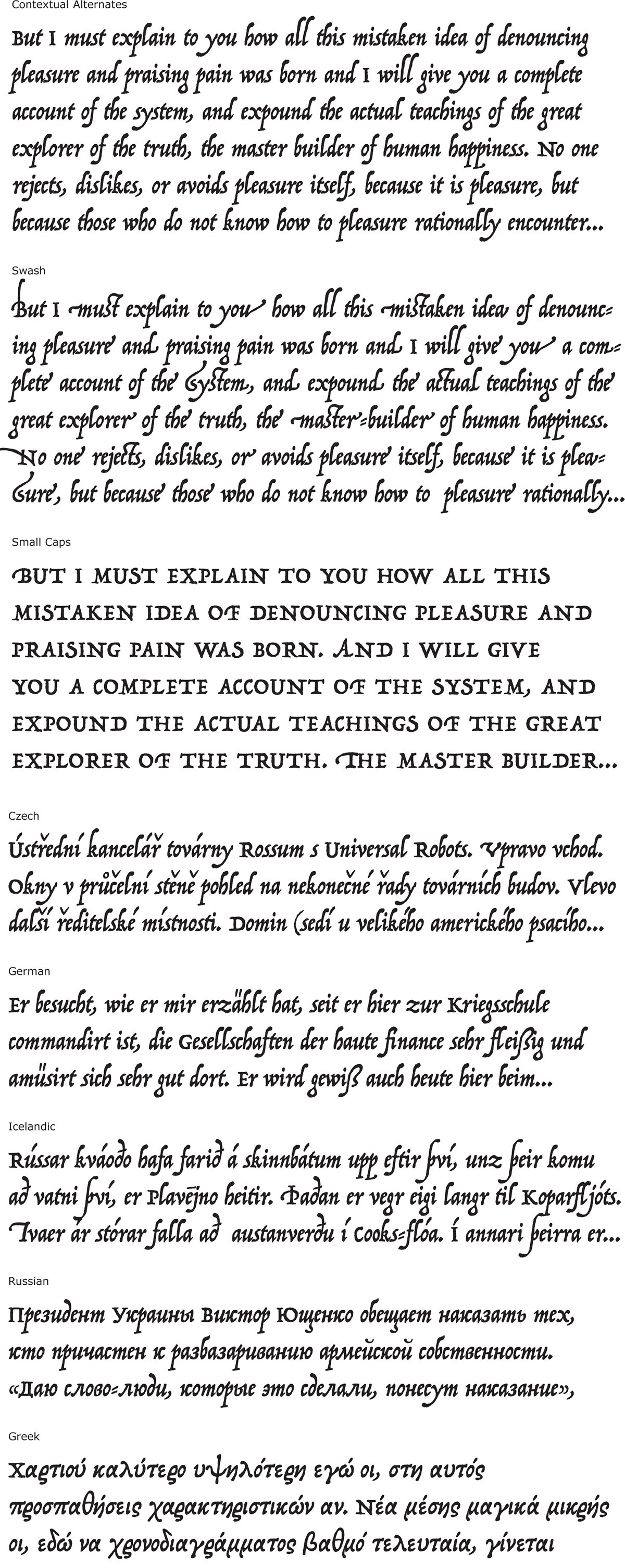
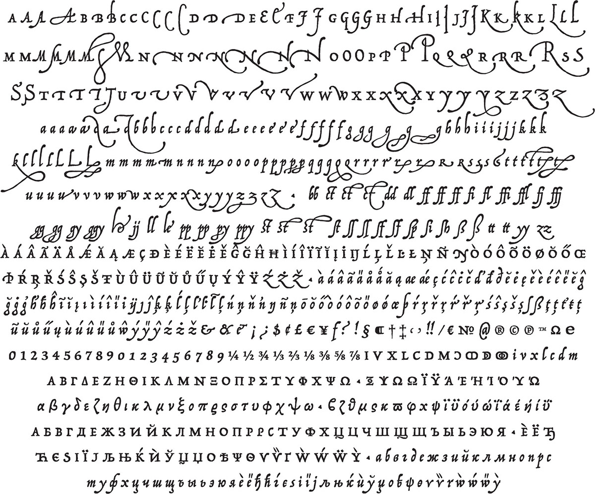
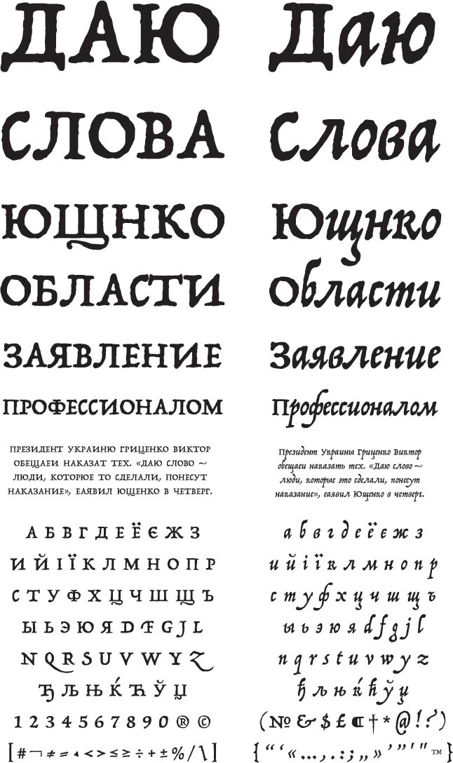
Operina Pro contains over 1200 glyphs including many alternate, ligature, and swash forms that are accessible through the Glyph Pallet in OpenType applications. When you use Operina Pro in OpenType savvy apps with Contextual Alternates and Ligatures turned on it starts to take on the look of hand lettering. When you turn the Swash feature on, swash end forms will be substituted for the last letter of each word, some swash beginning forms will appear, and swash caps will be substituted at the beginning of each sentence. At this point, Operina begins to take on the look of a hand crafted text.
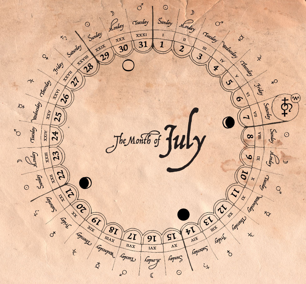
Besides all the standard number features you expect in a Pro font, Operina contains a special Roman Numeral feature. When the Titling Alternates feature is on, the numbers will be automatically transformed into their Roman Numeral equivalents.