Konop Wood Type Project for Hamilton Wood Type Musuem
A new wood and digital font release by Mark Simonson from the Hamilton Wood Type Collection via P22 Type Foundry

Ear
When I was asked to come up with a wood type design, I wanted to make something that hadn’t been done before, and something that would take advantage of the medium.
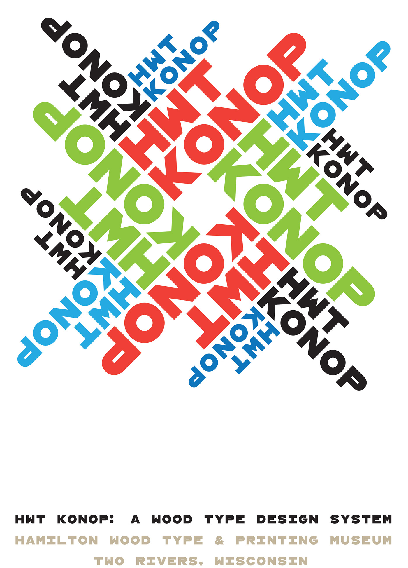
One thing I’d never seen was a monospaced or fixed-width wood typeface, and I thought this could be an interesting idea. But then I thought, what if the characters were not only the same width, but square? If they were square, the characters could be arranged vertically or horizontally and in any orientation. To a traditional job printer, a font like this wouldn’t make much sense. But to a modern letterpress printer it could be an unusual and creative design element.
For the letterforms themselves, I chose to use a bold gothic style, reminiscent of gothic wood types but more geometric. Since the characters are meant to be used in any orientation, I set aside some of the usual optical adjustments, such as making verticals thicker than horizontals and making tops smaller than bottoms. This, combined with the distortions needed to get all the characters to fit into squares, results in a quirky but (I hope) charming design.
To provide more design options, I came up with a modular system consisting of three sizes: 12-line, 8-line, and 6-line. These three sizes can be used together like Lego® bricks, with endless arrangements possible. And the sidebearing match so that characters always align when different sizes are used together.
The digital version of Konop replicates the wood type version as much as possible, including the three different size designs. It includes OpenType stylistic sets that allow most characters to be rotated in place, 90° left, 90° right, or 180°, just like the wood type version. I also includes extra characters not available in the wood type version.
Even so, since Konop was designed primarily with wood type in mind, it’s actually simpler and more fun to work with the wood type version than the digital version, if you don’t mind getting your hands dirty.
-Mark Simonson

Original "napkin Sketch" by Mark Simonson for the Konop font system idea.

Later draft of hand-drawn Konop font by Mark Simonson

Prototype wood type tests at Hamilton Wood Type Museum
See more and order HWT Konop at P22.com. Proceeds of all sales benefit the Hamilton Wood Type and Printing Musuem

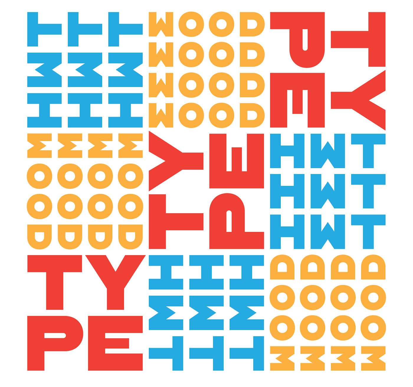
"Magic Square" using Konop
HWT Konop is named for Don Konop, a retired Hamilton Manufacturing employee, who worked from 1959 to 2003. In addition to serving on the Two Rivers Historical Society Board from 2004 to present-day, he was also instrumental as a volunteer in helping with the museum’s move to its current home in 2013.
short video of George Brylski — daughter of Norb Brylski keeping the art of pantographic type cutting alive at Hamilton.

Designer Mark Simonson and Georgie Brylski with fist wood type cuttings of Konop font

