The legendary King of Concrete is back after a seven year absence. The longest running, multidisciplinary UK BMX contest.
Organizer Effraim Catlow (The Big E) contacted me in April to see if I'd like to put together a design for the flyer and poster.
There were limited resources and a minimum / non-existent budget but, having spent so many great teenage years there, it was a project I couldn't turn down.
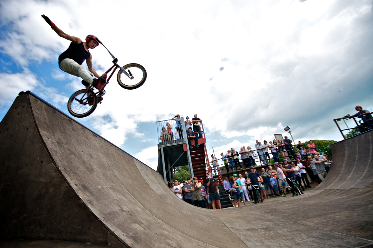
One of the existing source materials was a photo of Declan Brooks by Matthew Maber
Organizer Effraim Catlow (The Big E) contacted me in April to see if I'd like to put together a design for the flyer and poster.
There were limited resources and a minimum / non-existent budget but, having spent so many great teenage years there, it was a project I couldn't turn down.
One of the existing source materials was a photo of Declan Brooks by Matthew Maber
The aim was to get across an austere, classic, concrete almost Brutalist feel. Conceptually all the things which I visually associated with the park and the 'King of Concrete' name.
There were a couple of things to overcome, firstly the painfully obvious fact that Declan isn't riding one of the CONCRETE parts of the park and is of course riding a wooden mini-ramp. So a quick layer mask, some colour distortion, and a few erased ramp nails give the photo slightly more coherence.
After an evening's worth of 'computer touching' it's getting somewhere towards a flyer.
It's still looking flawed though. The cropping of the photo in an attempt to simply the image, has accentuated the wide angle, fish eye effect on Declan's hand.
The second problem: this particular jump doesn't reflect Declan's potential on going high, and with the standard of modern day riding, an advert featuring someone with an average height jump will not suffice. Photoshopping the height is not an option.

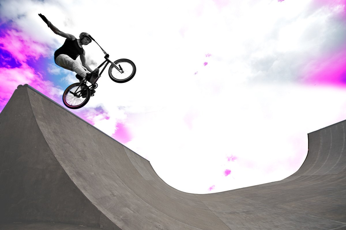
So the inevitable arrangement of asking Mathew and Declan to meet up for a photoshoot at Southsea skatepark is organized by the Big E.
With a brief, the photos are looking more suitable. The unnecessary clutter is reduced from the photo with various bits of masking, cloning and airbrushing to enhance the visual impact and austere look.
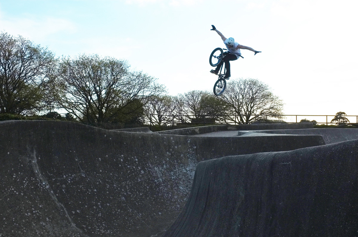

There were 2 options - this one felt better for composition and has a clearer view of the face. Again, background clutter is reduced for maximum impact. I'm not a fan of too many components within a photo. Partial trees and lamppost behind an airborne rider detract from a subject that could be nicely framed by sky. Easy to say, less easy to do, especially with these moving variables.
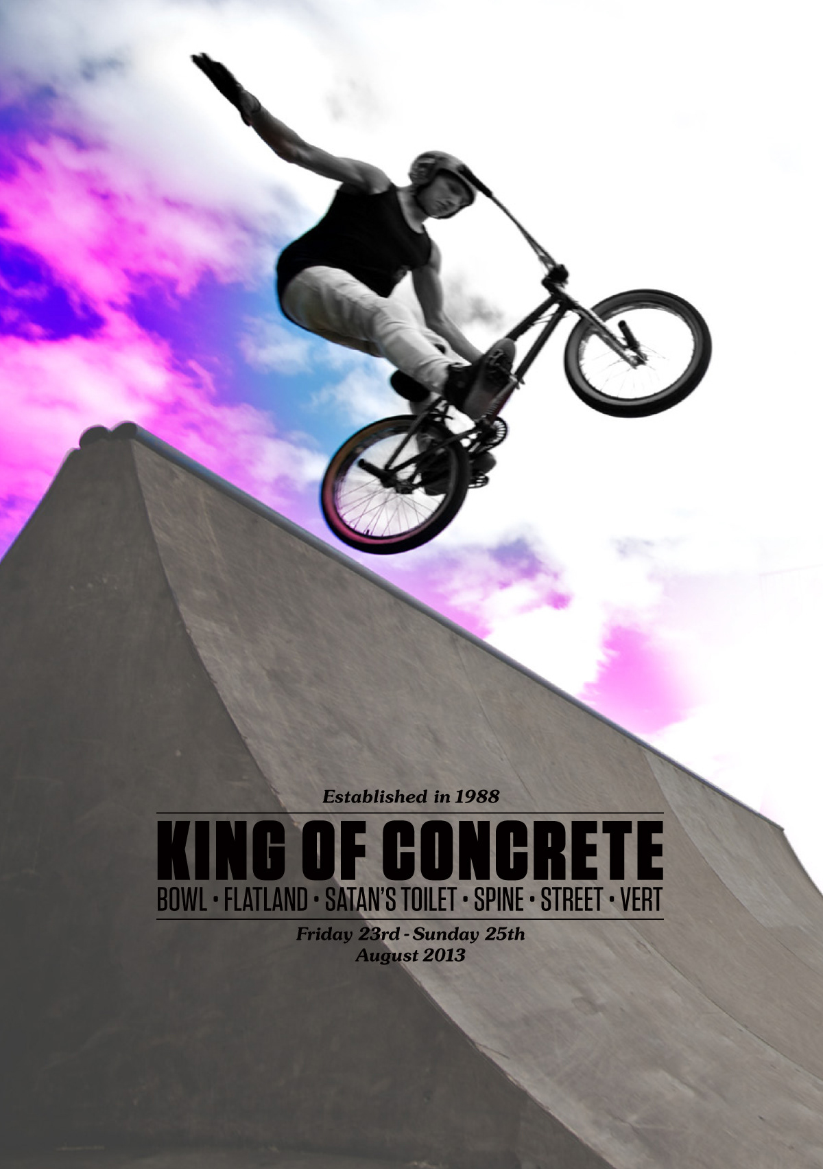
The next step was to work the type into the image, almost contradictory to removing the trees and lamppost, a strategically placed subject over type can help make a piece more dynamic.

After several type treatments and font searches, trying various bold, ultra heavy sans typefaces. It became evident that only a classic typeface would match this event. With the need for legibility at small sizes (online and posters from afar). I chose a classic serif - Baskerville bold, less to do with my Birmingham roots, but more to do with legibility, and balancing well with the stark white space.
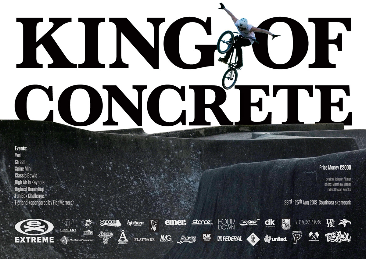
The poster features sponsors logos. Tip: If you're going to send your logo, try to have it in the best format. These are vector (eps or ai) files. Convert your text to outlines, so the fonts aren't missing. Or better still, pay a graphic designer to do one for you properly. Instead of just typing it out in Photoshop then realizing further down the line it doesn't work on a poster because it doesn't scale up, or you've completely ballsed up the kerning.

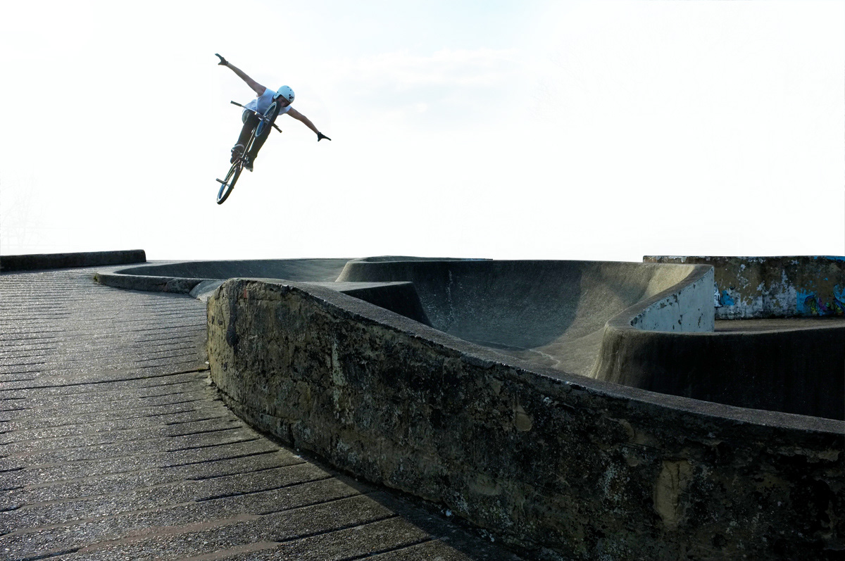
King of Concrete t-shirt. The composition of the bottom half is rescaled and tweaked to fit a portrait orientation.
Check out the event on 23rd-25th August at Southsea skatepark.

