Holiday Cards
Illustration & Printing
Going on 15+ years, I have always made my own holiday cards. Partly to create Linoleum cut illustrations, partly to do some craft printing, but mostly for the fun of it. My wife always assists in the printing and fabrication process. Many years we created the cards without the aid of a formal press.
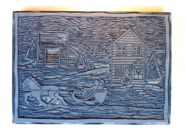

Corn Hill Winter Scene
Linoleum cut illustration of the house I lived in in the Corn Hill neighborhood of Rochester, NY. The intention was to make the print in black ink and fill the background with water color. It turns out the Speedball ink I used was water soluble, so that made a big mess. As a quick solution, I created the color fields on the computer, printed them on a color printer, and hand printed the Linoleum block on top, to create a similar effect.
____________________
____________________
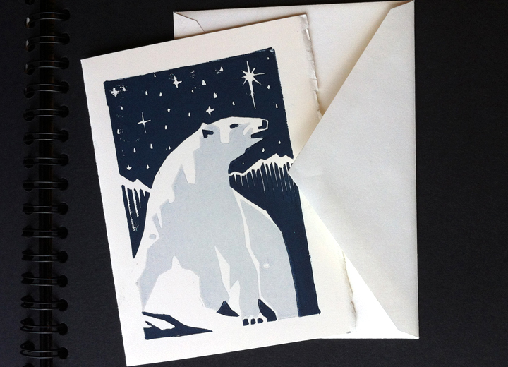
Deco Polar Bear
This is a 2 color Linoleum block illustration. As I recall, this one was inspired by Art Deco travel posters. This one is hand printed, by which I mean literally brayer inked and baren rubbed onto the paper by hand, which makes registration a bear, pardon the pun. Navy blue and grey ink were used on a nice deckle edge Arches stock.
____________________

Snowflakes
Snowflakes just lend themselves beautifully to the Linoleum block style of illustration. I found this wonderful white and red (not shown) stock that has what looks like flecks of Mica in it, furthering the snowy feel. We hand printed it in off-white ink on both stocks and attached the prints to a more ridged white stock. Scissored deckle edge to finish it off.
____________________

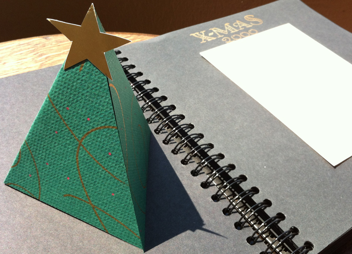
3D X-mas Tree
This years card was entirely hand made, no printing processes. Gold and red paint pens were used on heavy pine green stock. Metallic gold paper was cut for the star. The shapes were cut and folded, so that when opened, the card would stand as a 3-sided pyramidal tree. I hand lettered insides in gold paint marker.
____________________
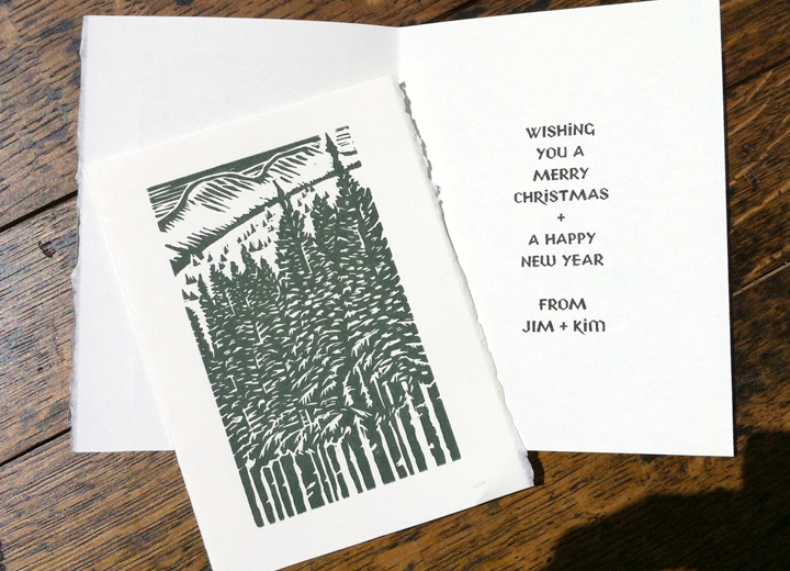
Breckenridge Mountains
This years card is a linoleum cut I did based on a photo I took at the Breckenridge Mountains in Colorado. Hand printed in Pine Green ink on Arches deckle edge stock. The inside salutation was laser printed in my own font design, P22 Yule.
____________________

Snowmen
Colored pencil, gold paint marker, 5 papers, and twigs were all employed to create these one off cards. The inside was laser printed once again using my Yule font.
____________________
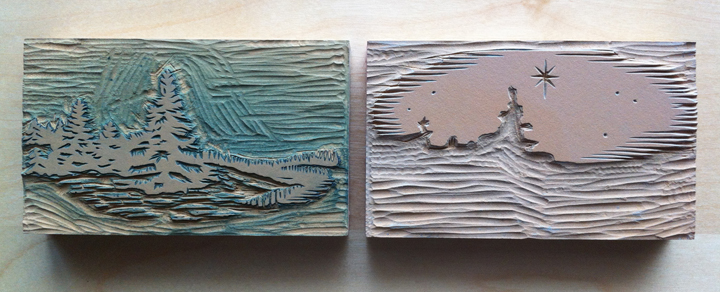

Snowy Pines
This is one of my favorite designs. This is a 2 color Linoleum block illustration that I based on an illustration J. J. Lankes did for Robert Frost. Printed in grey/blue and deep dark blue inks on an off-white Mohawk Super Fine cover stock. This is the first year we used an actual press for printing the blocks. We printed it on a Vandercook at the Paradise Press owned by Hal Leader in Buffalo, NY. We set the inside salutation with metal type available at the press. We use the Nicolas Cochin font with a special seasonal drop cap.
____________________


Mistletoe Wreath
This is a 2-color Linoleum block illustration inspired by a Mistletoe Wreath. This was printed in dark green and gold inks on a soft rice paper stock. We printed the entire design on one side, and two-folded it to have the greeting on the inside, and to give the card some heft. This is the second year we used an actual press for printing the blocks. We once again printed it on the Vandercook at the Paradise Press. We set the inside salutation with metal type available at the press. We use the Nicolas Cochin font with a special seasonal 2-color drop cap.
____________________

Melting Snow
This is another 2-color Linoleum block illustration inspired by snow melting off pine trees. This was printed in purple and lavender inks on a Neenah Bright White cover stock. This is the third year we used an press for printing the blocks. I believe this was the first year we decided to print the card as work-in-turn. This a technique where you print the inside and out side of the card on one side, flip the sheets and print the same. This allows you to print the inside and outside, without having to do all the make-ready for the second side. We once again printed it on the Vandercook at the Paradise Press. We set the inside salutation with metal type available at the press. We use the Old English and Nicolas Cochin fonts.
____________________

Pine Cone
This is a 2-color Linoleum block illustration inspired by an Arts & Crafts illustration of a pine cone. I adapted the design and cut it in linoleum blocks. This year we hand printed it, rater than using a press, because we we teaching a friend the process. It is printed in dark green and brown Speedball Lino Inks on off-white Arches with a deckle edge. You can really see the texture difference of the inks when hand printing compared to printing on a press.
____________________

Holly X-mas Tree
This years card was composed entirely on press. We used 2-color holly border ornaments and arranged them in the shape of a tree, interspersed with some star ornaments. Printed in Red and Green inks on light green laid cover stock. Continuing with the playful tone we set the salutation in metal Dom Casual font.
____________________

Brayer Christmas Tree
This years card was inspired by a printers brayer inking trick I learned from Jim Sherraden of the Hatch Show Print. In a workshop, Jim demonstrated how one could get variable amounts of ink on a brayer by tilting it while inking it, then when you roll it on paper you get a distinct effect. What I attempted to do here was that use that effect to create the layered image of a Christmas tree with snow on it. It was finished off with red and gold paint marker ornaments. The salutation was laser printed in my newly redesigned P22 Yule font, that now includes a lower case.
____________________

Victorian
This year I was inspired to do a Victorian Christmas design. I wanted overtly Victorian letters, so I found an old Currier & Ives greeting card for inspiration. I wanted to hand set an ornate metal border, so I drew the letters on the computer and had them made into a 2 color Zink plates for printing. This was the first year we Printed at the Western New York Book Arts Center (WNYBAC) where they had an extensive collection of metal borders, rules, and ornaments. Making a 2 color rule border by hand is much harder than it looks, it took a long time. When we finally had the border composed we printed it 2-color, Dark green and Gold on off white Mohawk Super Fine cover stock on a Vandercook No. 4 proofing press. Continuing with the exuberance, the inside greeting was composed of metal French Script with a drop cap and special holiday ornament.
____________________


Art Deco
This is a 2-color design inspired by old Art Deco holiday cards. I drew the illustration and designed it to have overprinting, to make a 3rd color with the transparent ink. With the use of negative space for the snow, it almost looks like 4 colors in the end. I then had these designs made into Zinc plates for printing. We married this with a metal type available at the Western New York Book Arts Center (WNYBAC) we found called Huxley Vertical. Huxley Vertical was just a perfect match for the deco illustration. We tried several color combinations for the printing, but ultimately decided on the red and silver for for both the art deco feel and the exciting combination it created. We typeset and printed this on bright white Mohawk Super Fine cover stock over the course of 2 days on a Vandercook No. 4 proofing press at the WNYBAC, where we are members. We finished it off with bright white Mohawk Super Fine envelopes, lined with red foil, and addresses laser printed in my own P22 Art Deco Chic font.

