


What is Kyber Network
Kyber Network is a decentralized exchange service that allows seamless, secure, and instant crypto token conversion.
In other words, Kyber Network is comparable to PayPal in our present economy. For many online retail stores, the payment is usually denominated in local currency. As an example with PayPal's integration, anyone from any part of the world can pay in their own currency, while the retail store still receives the payment in its local currency. In such cases, services like PayPal and a few other entities work behind the scenes to make the conversion from one currency to another seamless. Kyber Network functions similarly to PayPal, except that Kyber Network only functions in the blockchain sector.
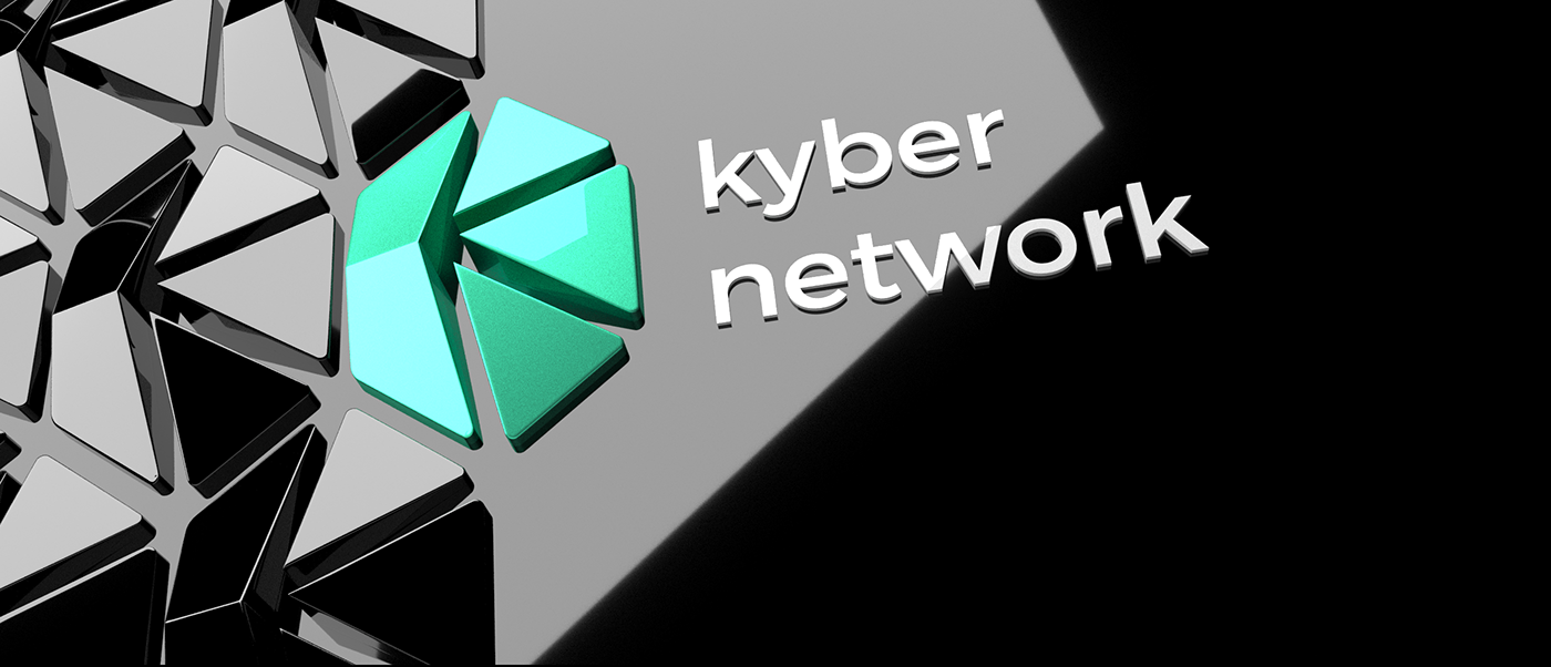
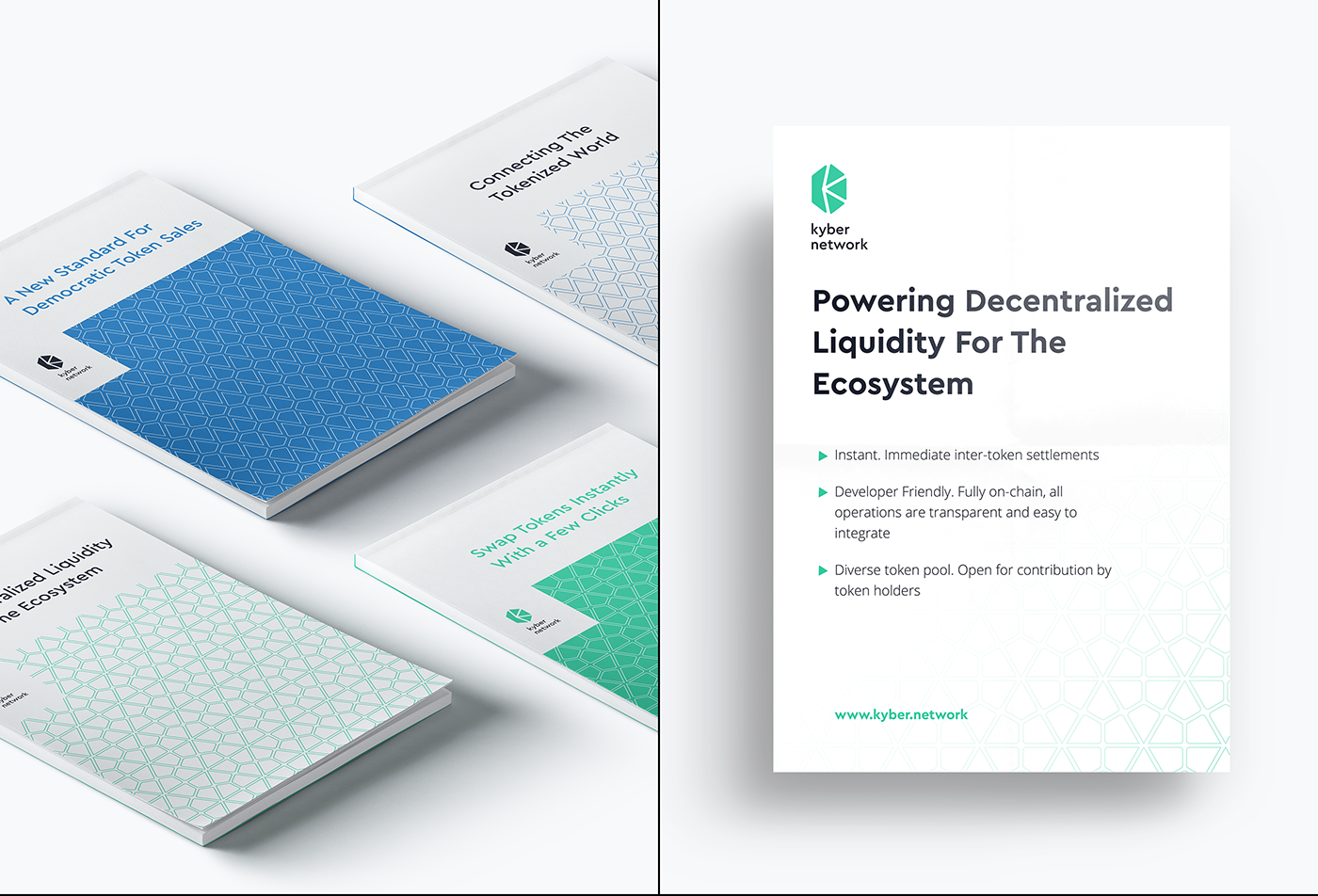
Our ultimate goal in this project was to make the brand more recognizable among all current crypto services and currencies. Kyber Network’s goal was to become the best exchange service, so crypto enthusiasts and businesses would be able to recognize the company when they see the logo.
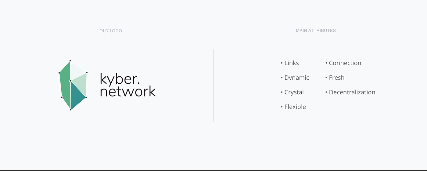
As usual, our branding process started with visual positioning based on the information we obtained from the client. Once we discussed our vision with their team, we decided to start our work from scratch, despite the fact that the Kyber Network already had a logo. From that point, we started our work with our unique and gradual process that we call the “design funnel”.


Revision
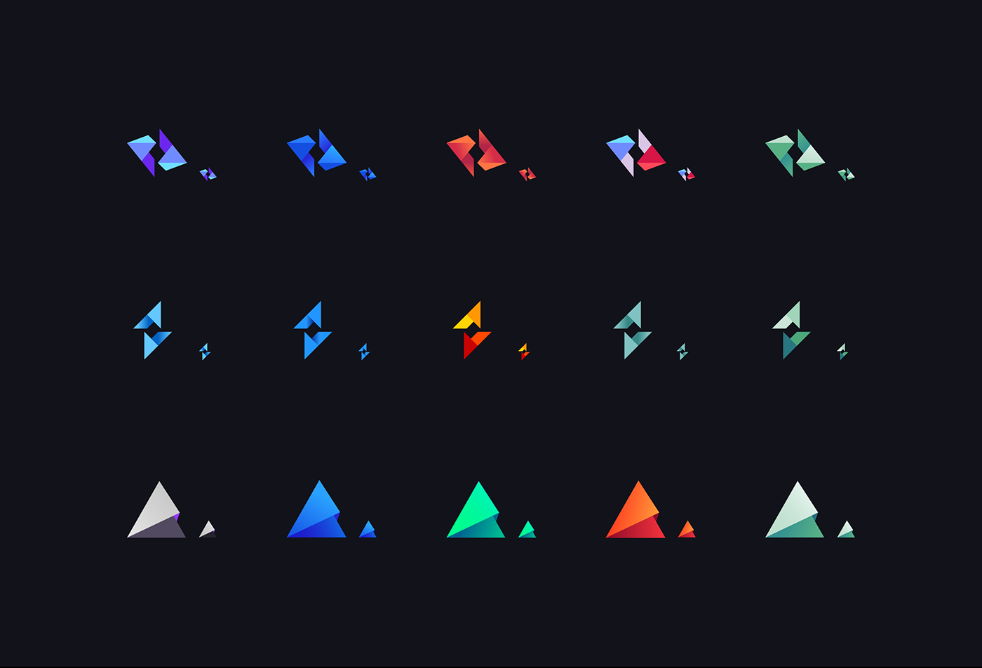
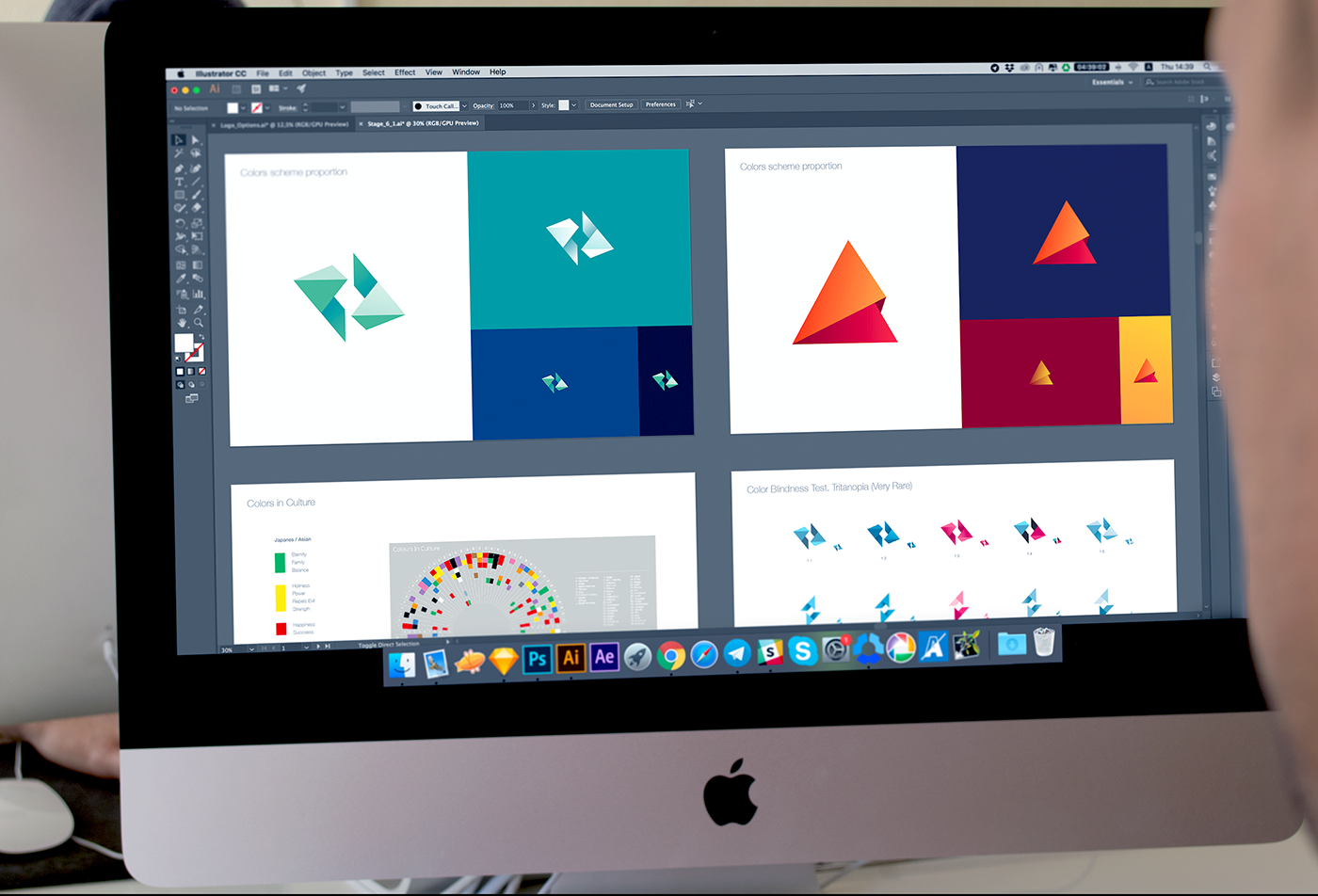
We selected a shape based on a 3d object. It had more options for cool and unusual animation, could be presented in AR/VR, and had a better correlation with a crystal as an object. We created an animated version of this shape and at this stage and the Kyber Network team took some time for internal discussion.
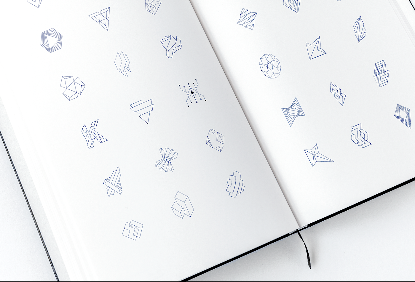
At the beginning of any rebranding work, we discuss with our clients how they envision the rebranding process. There are two pathes to consider: revolutionary and evolutionary. The first approach considers major changes and a total update of color palettes, brand typefaces etc. In contrast, the evolutionary approach updates and refreshes the current styles and visual assets.
After a short time, we had a conversation with the Kyber Network team. They decided the revolutionary approach would be too risky for the business and we returned to the current logo with the alternate, evolutionary approach. The main point of this revision was that the direction that we developed was more 3d, more object like: it has gradients and several edges. It’s not a bad thing to have a 3d base, but the Kyber Network team wanted to be closer to the current market. Cryptocurrencies and businesses in that segment mostly have flat logos. Nowadays, more and more companies are leaning toward simplification, clarity, and modernism, so it was pretty clear to us why the Kyber Network team decided to lean in that direction. Flat, simple, and clean logos are now everywhere. That trend is still growing.
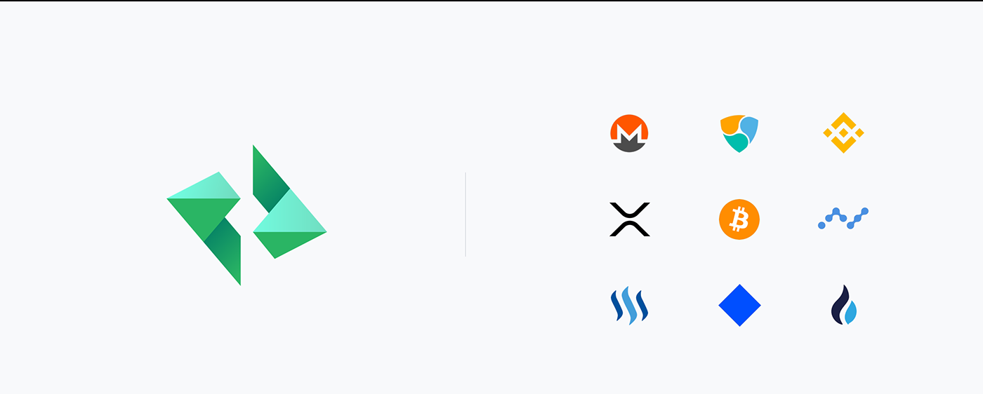
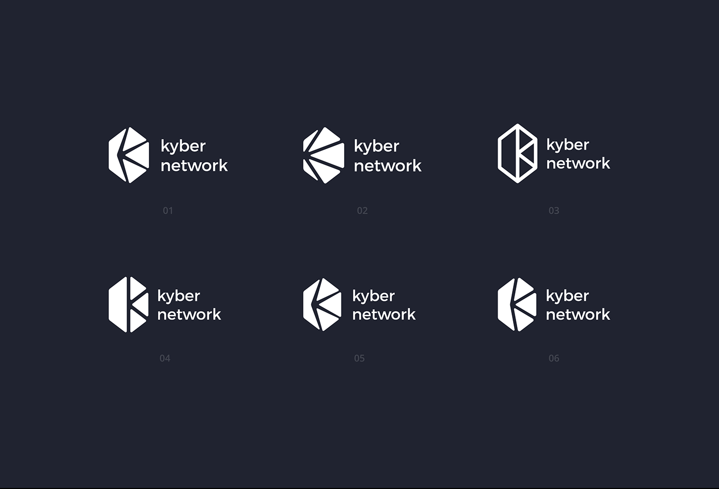
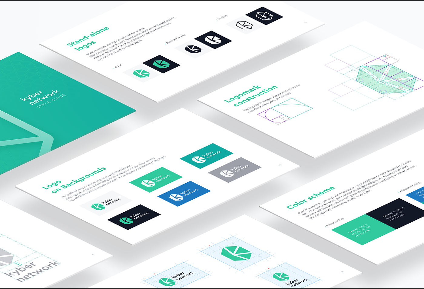
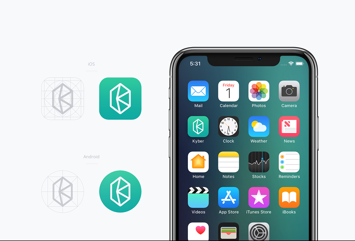
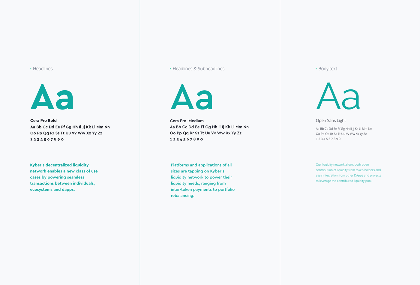
Our approach was slightly changed, and we were able to find several directions for logo transformation. The original logo was tweaked to be cleaner and simpler, but maintain the ideas and metaphors. The brand colors were also slightly changed, without a total rework, so the current users and people familiar with the company would be able to recognize it.


Thanks for watching!
We are available for branding projects


