
Díez y Bonilla is a couple of dental surgeons who runs together a well known nationally and internationally master of orthodontics and orthognathic surgery. Given the need to showcase the content of the master to their students in a clear and nice way, Díez y Bonilla asked us to redesign their visual identity to also reflect their values more effectively and highlight their product.
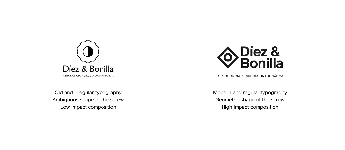
Apart from the words “Díez & Bonilla”, their old logo contained a graphic element whose intention was representing a screw, a common tool in his work, without being too explicit. The black and white inner circle was intended to represent the concept of duality which characterizes this professional couple.
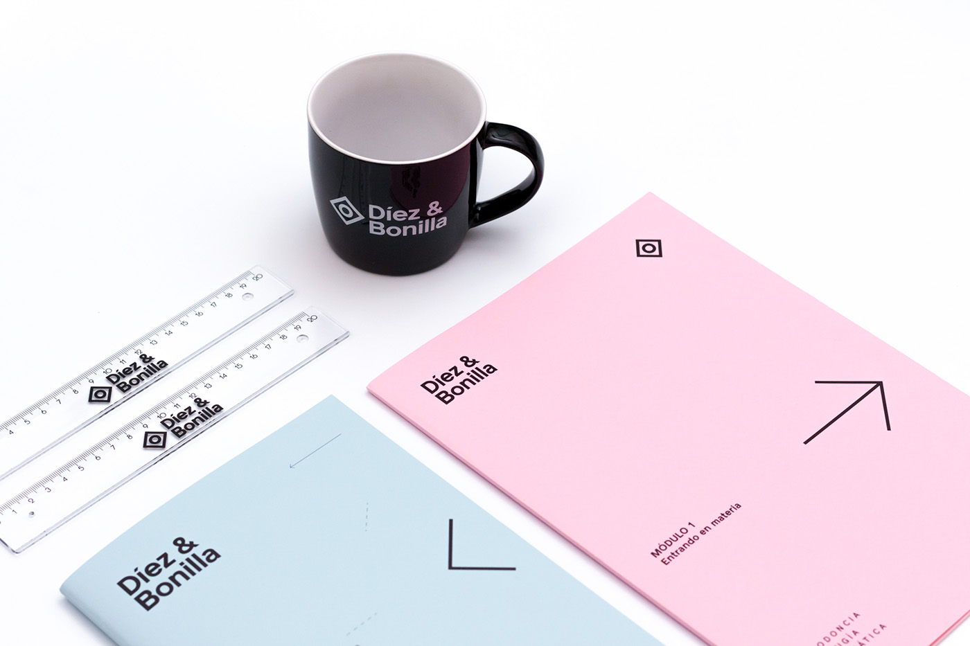
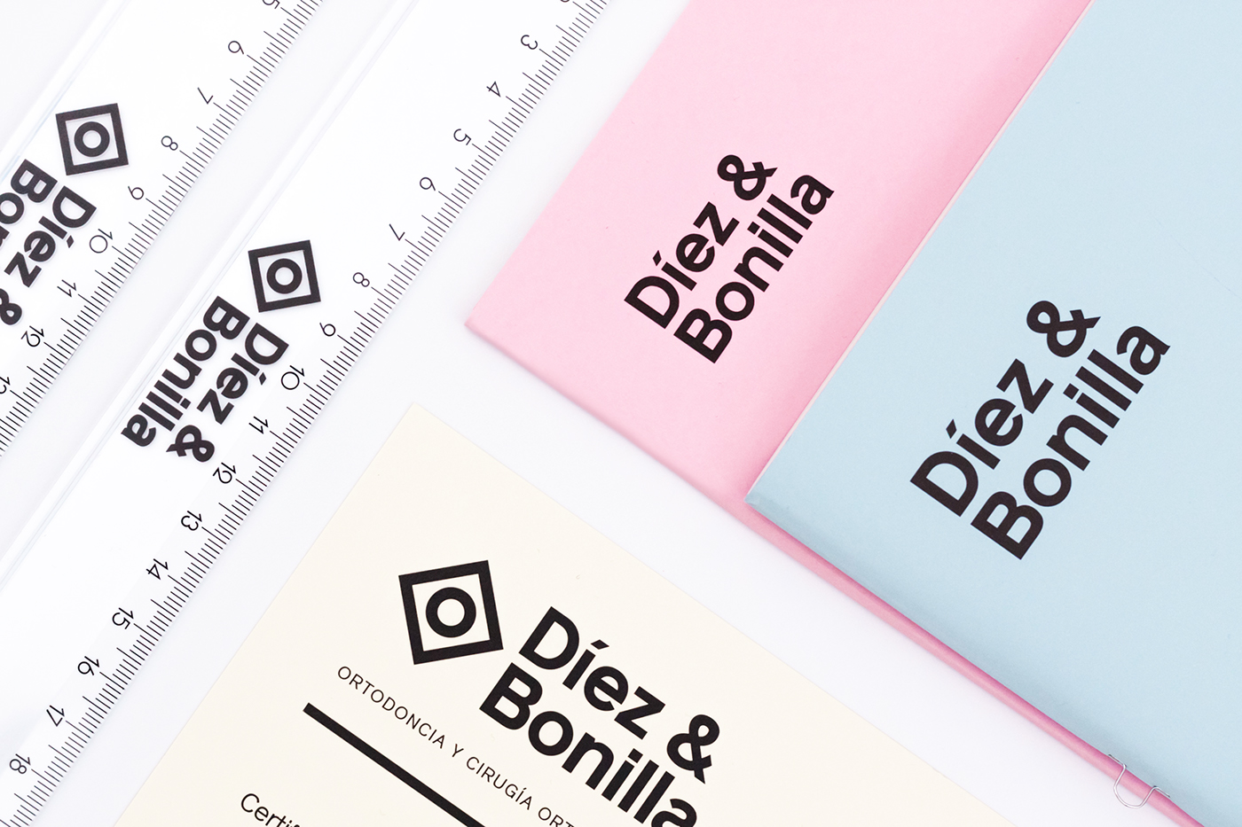
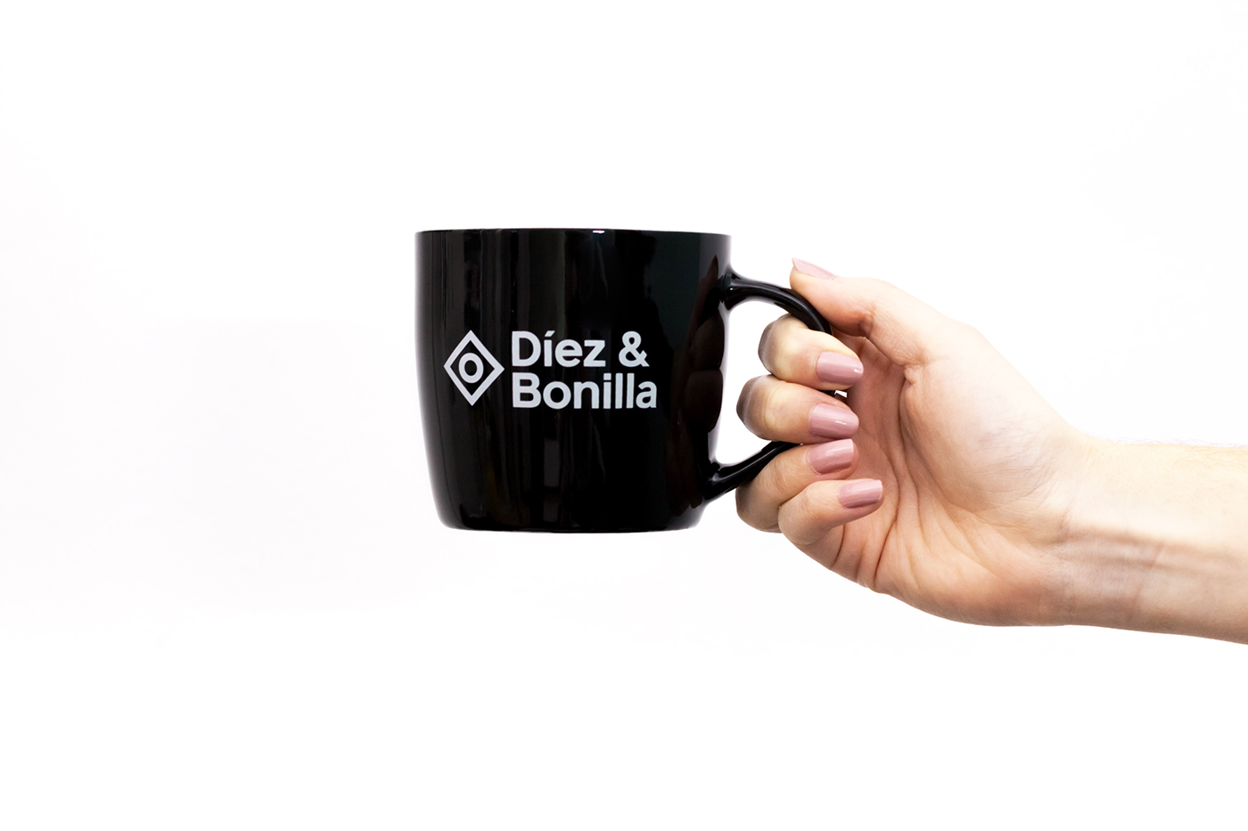
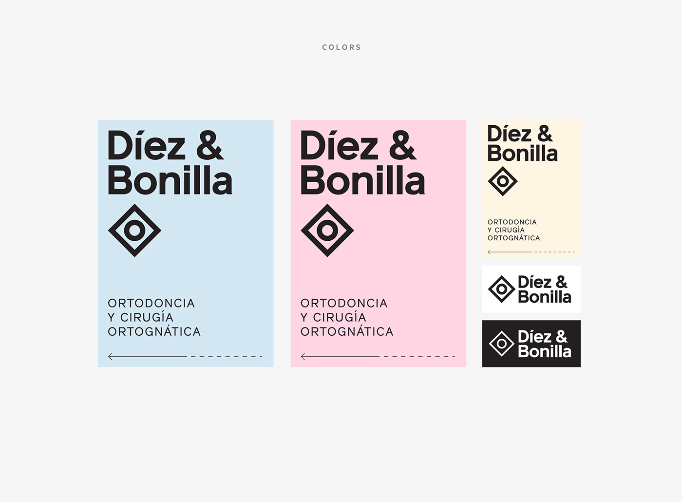
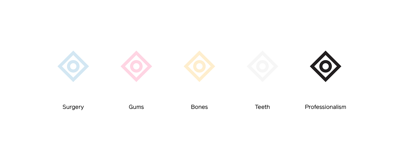
When we collected these ideas we transform the graphic element into an even more abstract sign, composed by two basic shapes, the square and the circle, corresponding to Díez and Bonilla. We made the strokes as thick as the stems of the typography we chose to get a more homogeneous and impactful composition.
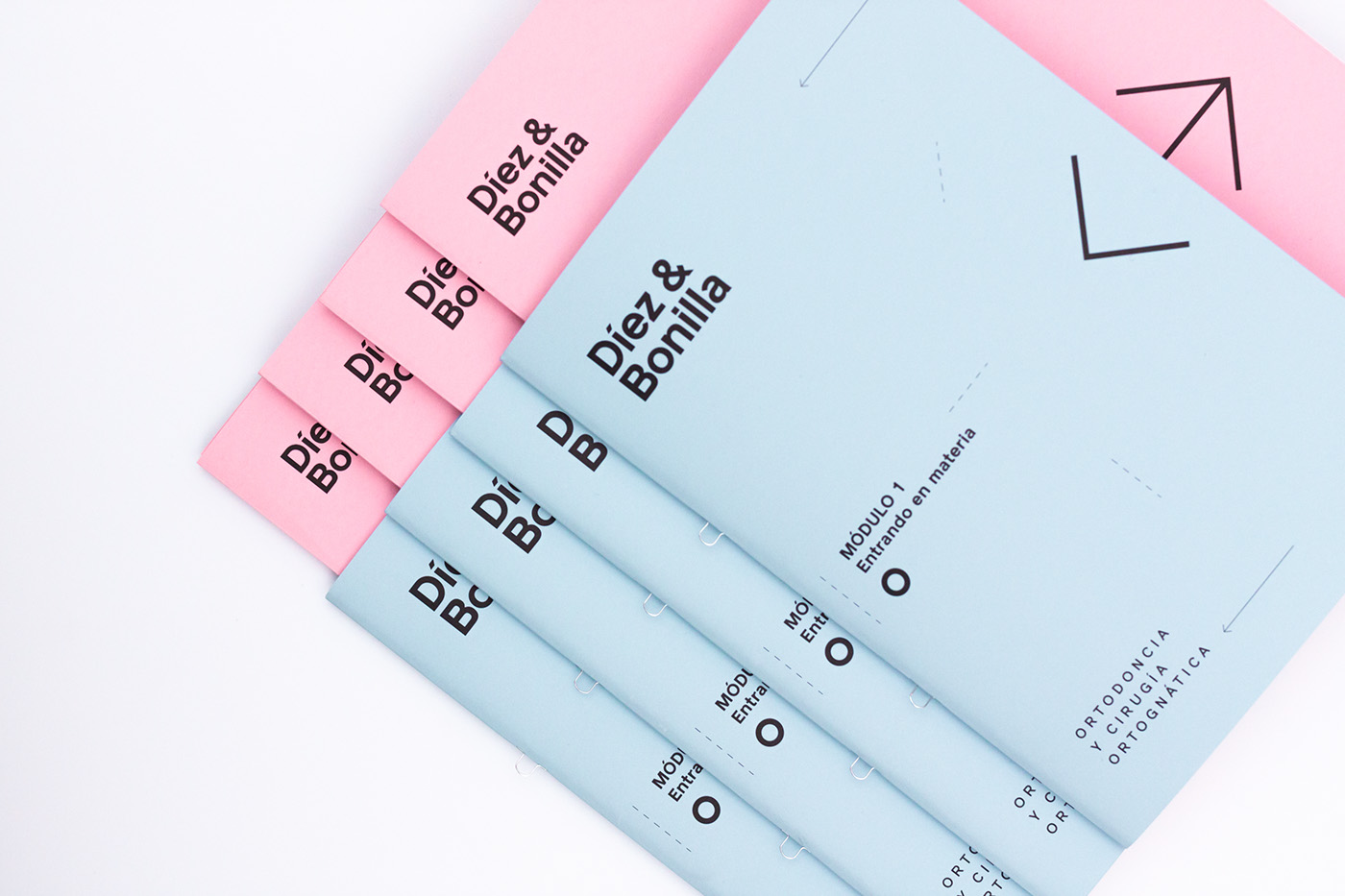
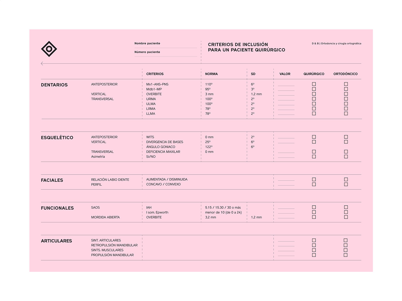
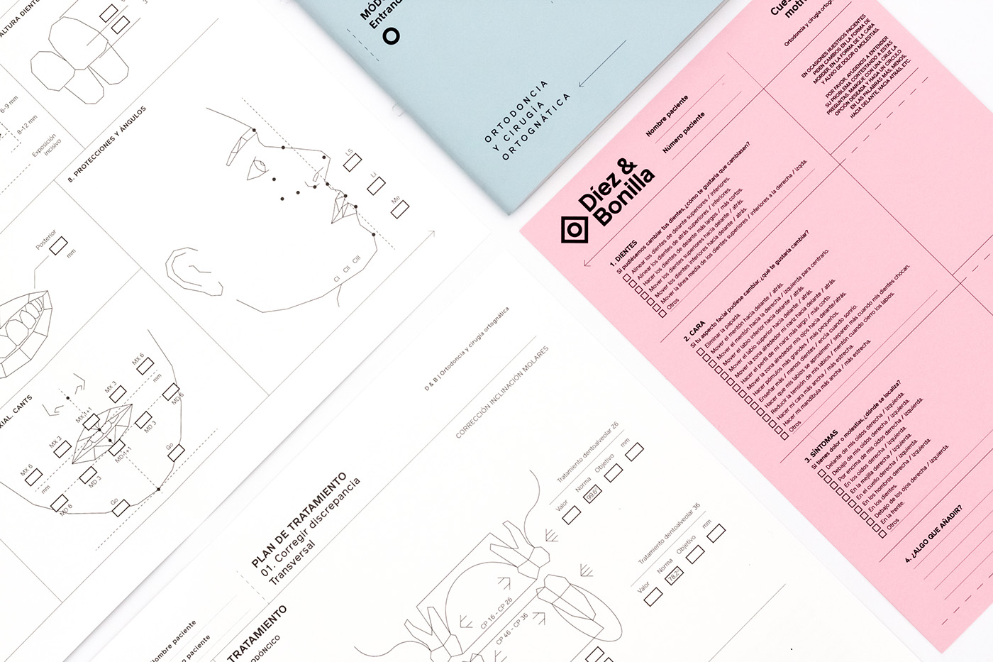
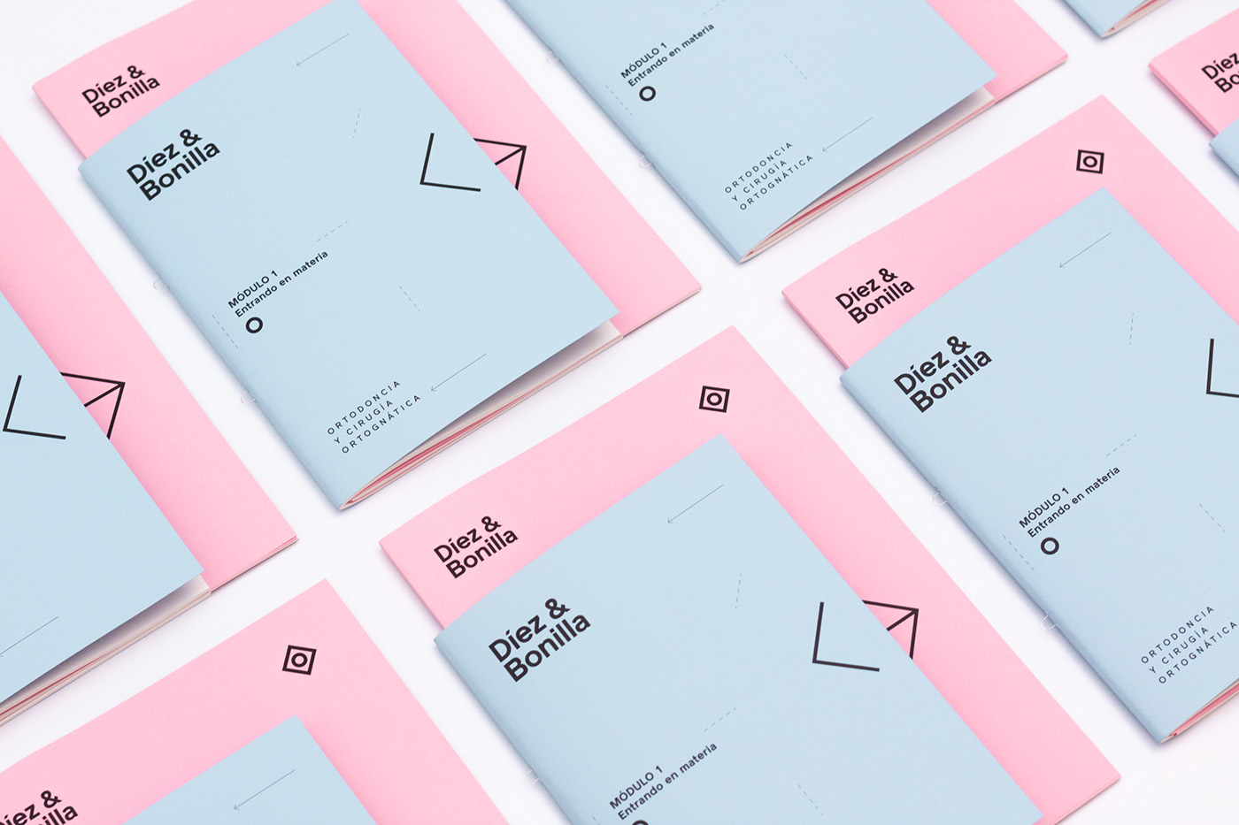
We defined blue and pink as the two brand main colors, since they mainly deal with teeth and gums and to refer more generally to the medicine sector. As third color we chose a pale yellow as the color of the bones they usually intervene.
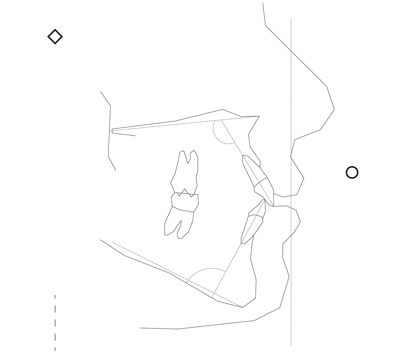
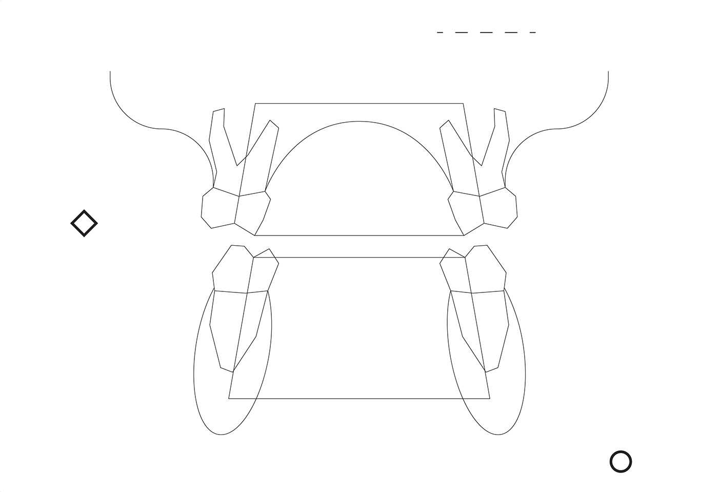
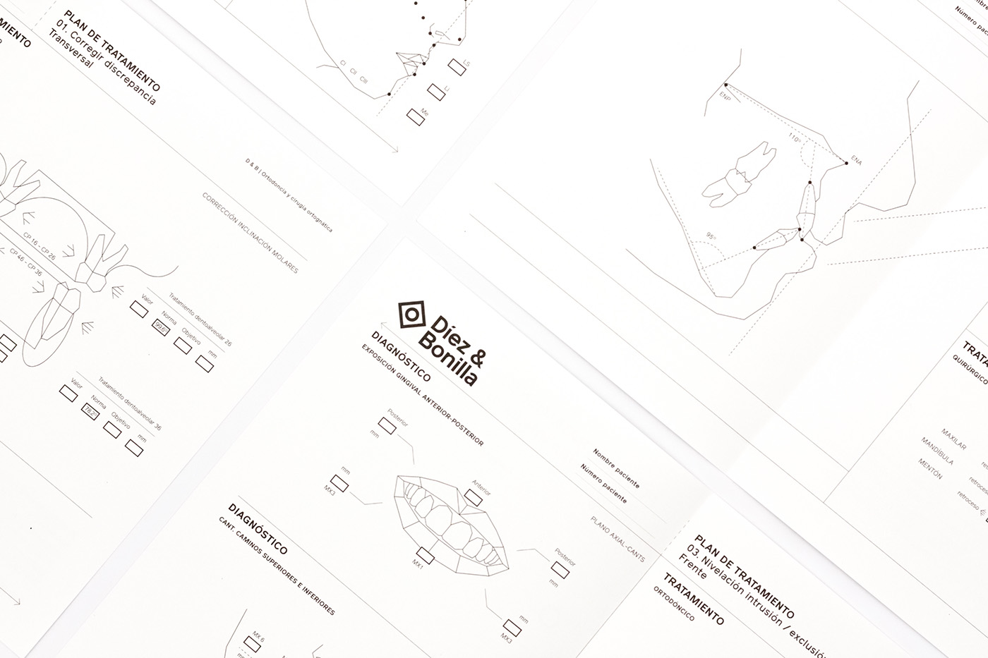
Being a very technical course and having to explain in detail the configuration of the teeth and facial bones, we adopted a polygonal drawing style in line with this feature. Finally, we used dashed lines as a graphic element within the entire visual identity to refer to the signs that surgeons make when intervening.