


Facebook Fit Campaign Branding
Concept
Engage small businesses with Facebook by meeting with them offline
Project Brief
Design branding and collateral for local experiential events in five cities around the country
Logo Design
Research
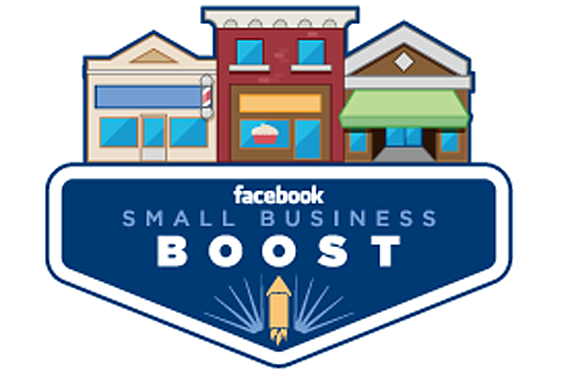
This was the only previous Facebook small business logo we were able to find. To us, it felt dated and had subtle composition issues — notably the rocket color and position in relation to the "O" in "boost".
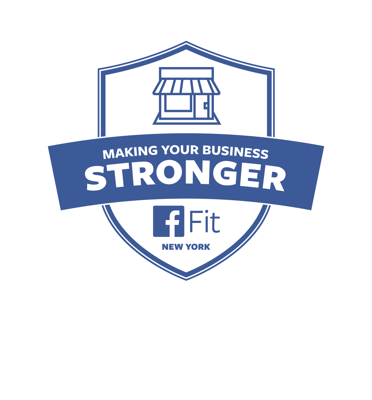
Given the campaign concepts of "fitness"and "making small business stronger," we liked the shield shape as a starting point to define, contain and convey the message. We also wanted to use some of the existing Facebook iconography if possible to strengthen the connection between the campaign and the brand.
Research
This was the only previous Facebook small business logo we were able to find. To us, it felt dated and had subtle composition issues — notably the rocket color and position in relation to the "O" in "boost".
Given the campaign concepts of "fitness"and "making small business stronger," we liked the shield shape as a starting point to define, contain and convey the message. We also wanted to use some of the existing Facebook iconography if possible to strengthen the connection between the campaign and the brand.
Considerations
The primary considerations from our initial discussions were to stay true to the Facebook branding so that the logo worked within the Facebook brand ecosystem. To that point, we focused on the Facebook color and typography as starting points for exploration.
The primary considerations from our initial discussions were to stay true to the Facebook branding so that the logo worked within the Facebook brand ecosystem. To that point, we focused on the Facebook color and typography as starting points for exploration.
Concepts & Variants

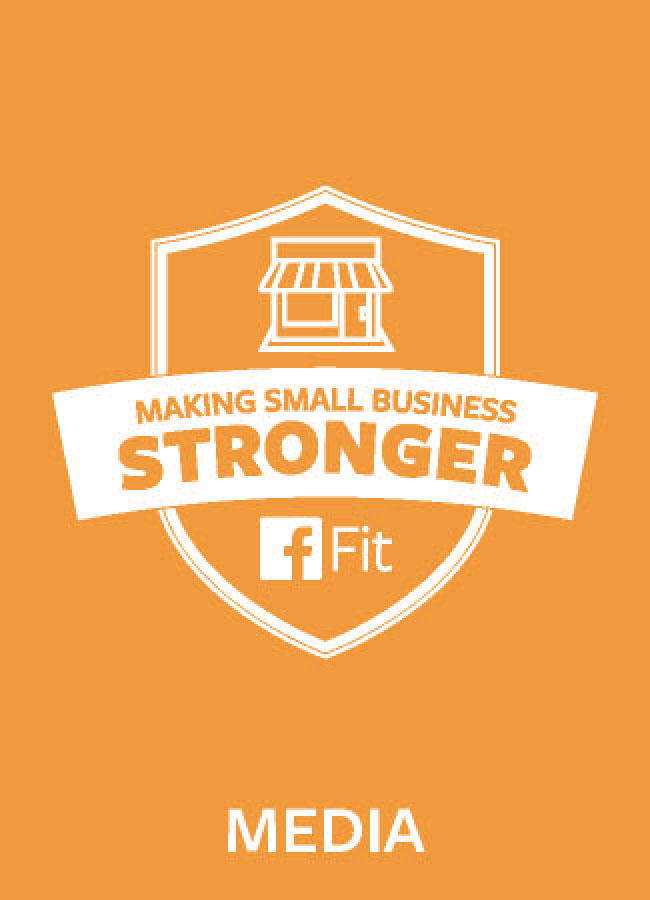
Final Logo

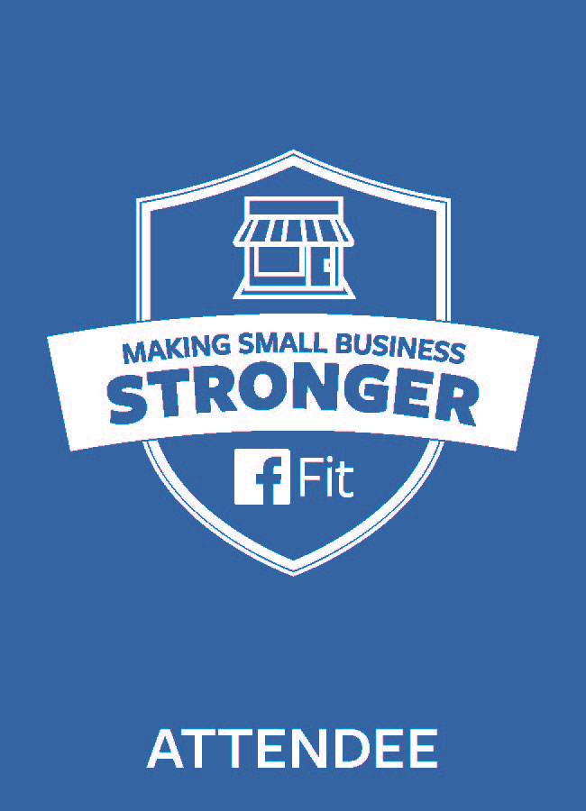
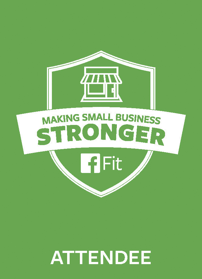
Regional Versions


Collateral Design
Schedules, agendas, invitations, comment cards, postcards, signage, apparel and badges, badges, badges.
Schedules, agendas, invitations, comment cards, postcards, signage, apparel and badges, badges, badges.


Event Photos: Branding in Action


