
Meet your next favorite anime or manga
Kitsu is a social platform similar to Goodreads, but for anime and manga fans. The core product's values revolve heavily around helping users track, share, and discover new content.
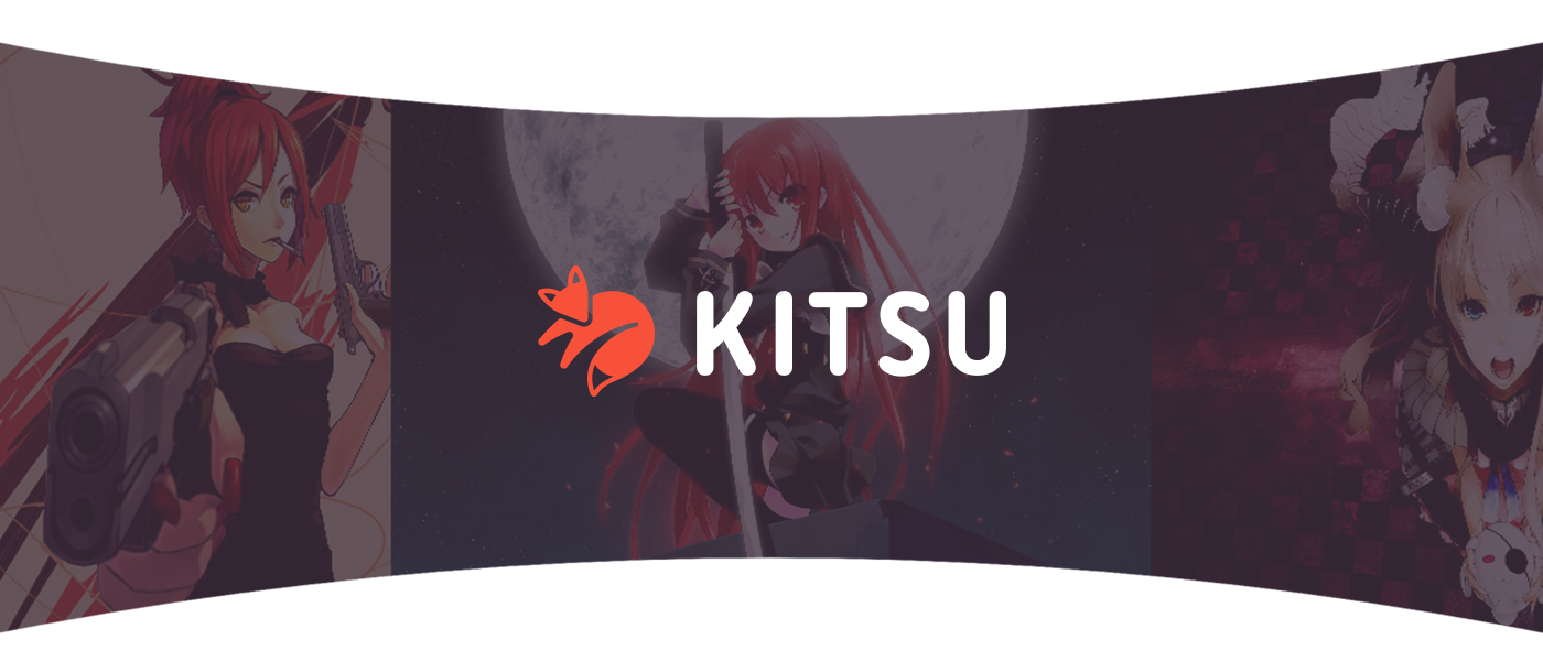
Playful but professional
Our primary goal was to create a visual brand identity that reflects the playful spirit of anime and manga while staying professional. As our client, Josh, said: "We take our mission of helping users discover new media seriously, but not ourselves." Moreover, this product targets a US audience who loves Japanese anime and manga and it was a tricky task to get these two aesthetics married.
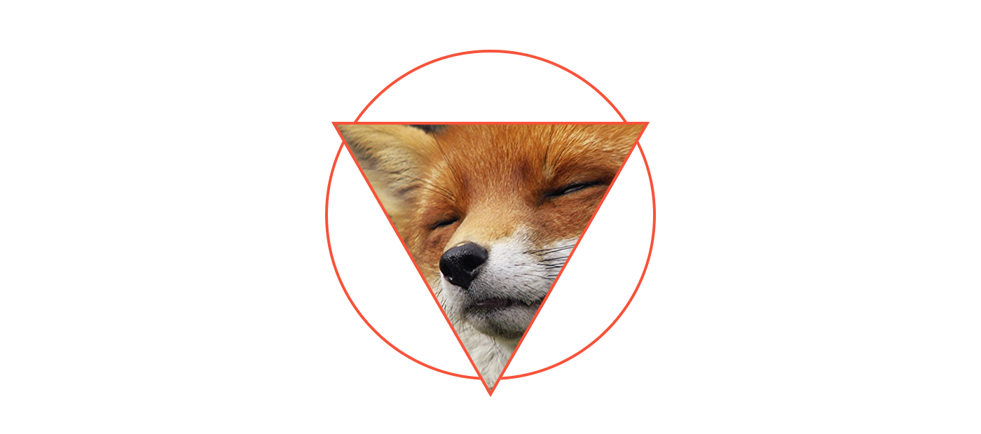
Base shape
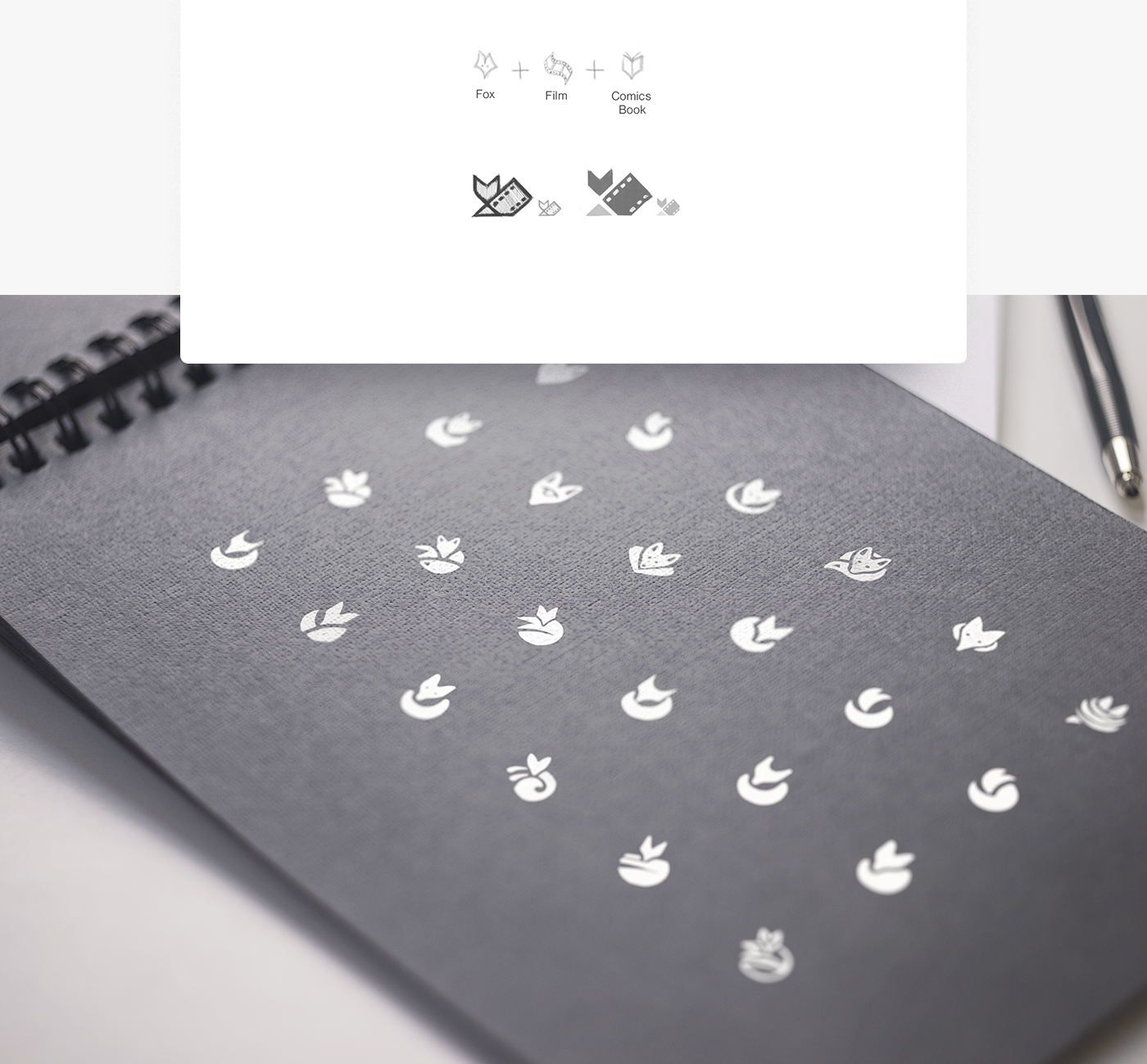
Based on the theory of Biederman's geons, a human recognizes complex objects as a group of simple geometries. To make comparing competitor's logos easier, we reduced the detail level to low-poly base shapes. We chose a triangle and circle as base objects for the logo construction to achieve a friendly yet expressive shape. This combination correlates well with foxy ears, nose, tail, etc.
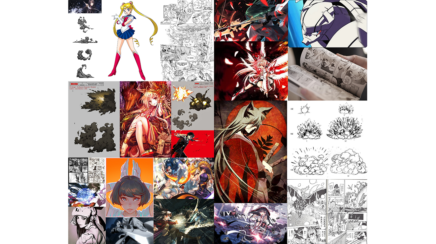
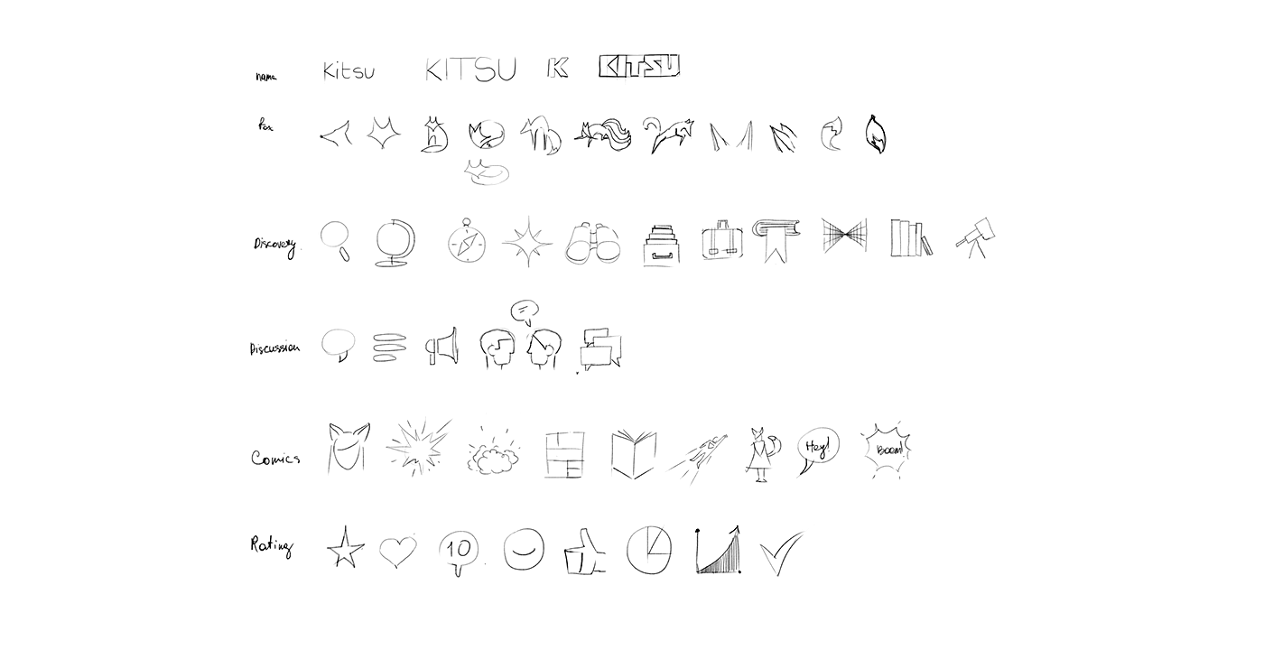
Attributes and moodboards
We start each branding from a deep understanding of the product. We need to be sure that we are on the same page with the client and understand each other well. Gathering product attributes and moodboards works well for these goals. We took this approach in the Kistu project too.
Fox
nine tails, ears, fire, orange, red, illusion, flight, invisibility, bend time and space, cunning, magic, shapeshifting, magic ball, girl, mask.

Comics
book, comics page, halftone, superhero, character, page, paper, colorful, chi-power
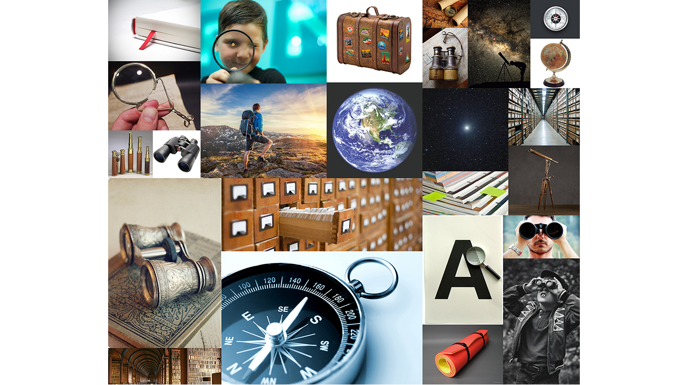
Discovery
magnifier, telescope, binoculars, flipping pages, bookmarks, traveler, backpack, karemat, tent, globe, trunk, stars, compass, lighthouse, map, flashlight, library catalog, archive.
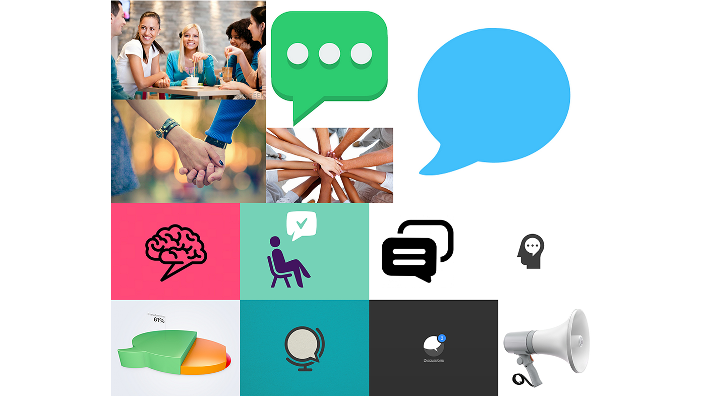
Discussion
Chat bubble, comment, chat, question, answer, megaphone
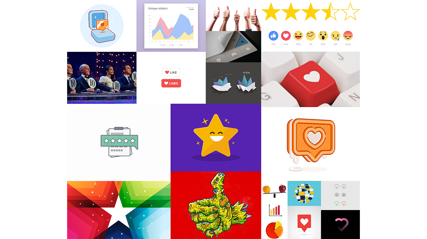
Rating
Stars, heart, like, smile, graphic, thumbs up, pie chart
Sketches
Next, we explored dozens of draft shapes by drawing low-poly sketches.
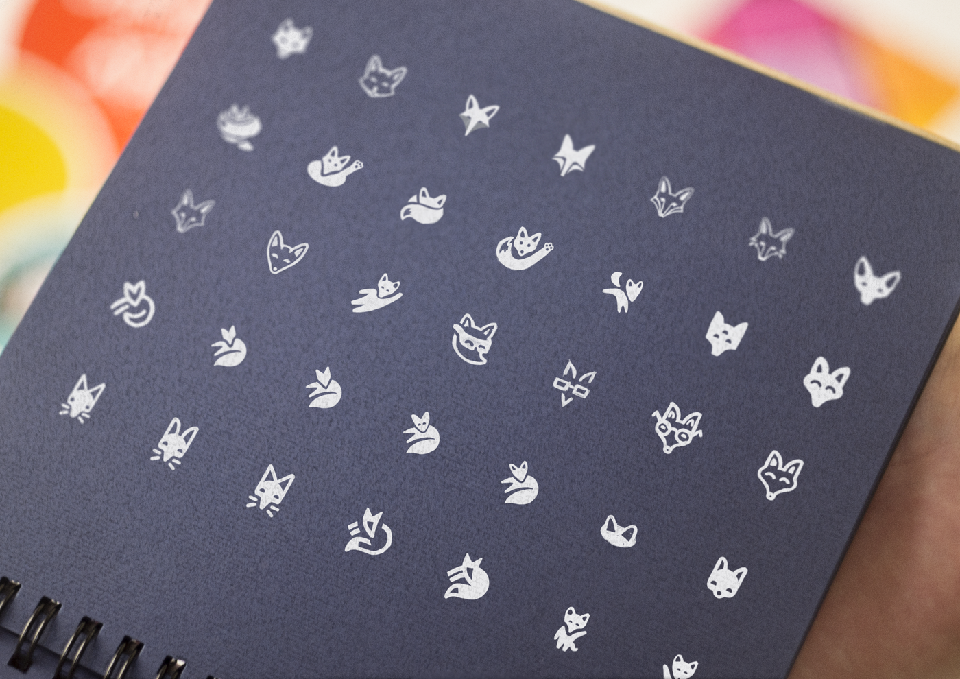
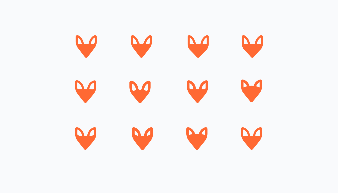
This stage allows spending less time yet getting better results. We found that foxy shapes could be amazingly different: sharp, rounded, simple, detailed.
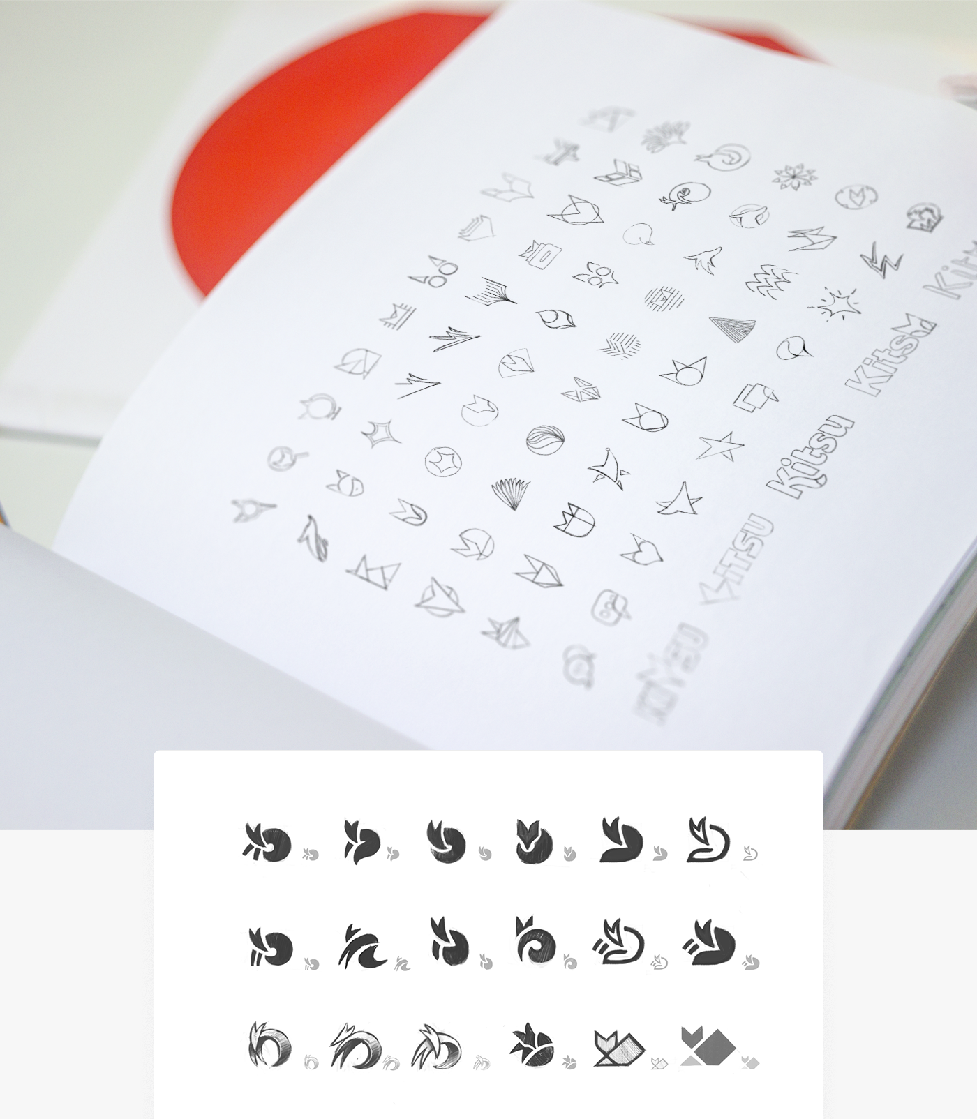
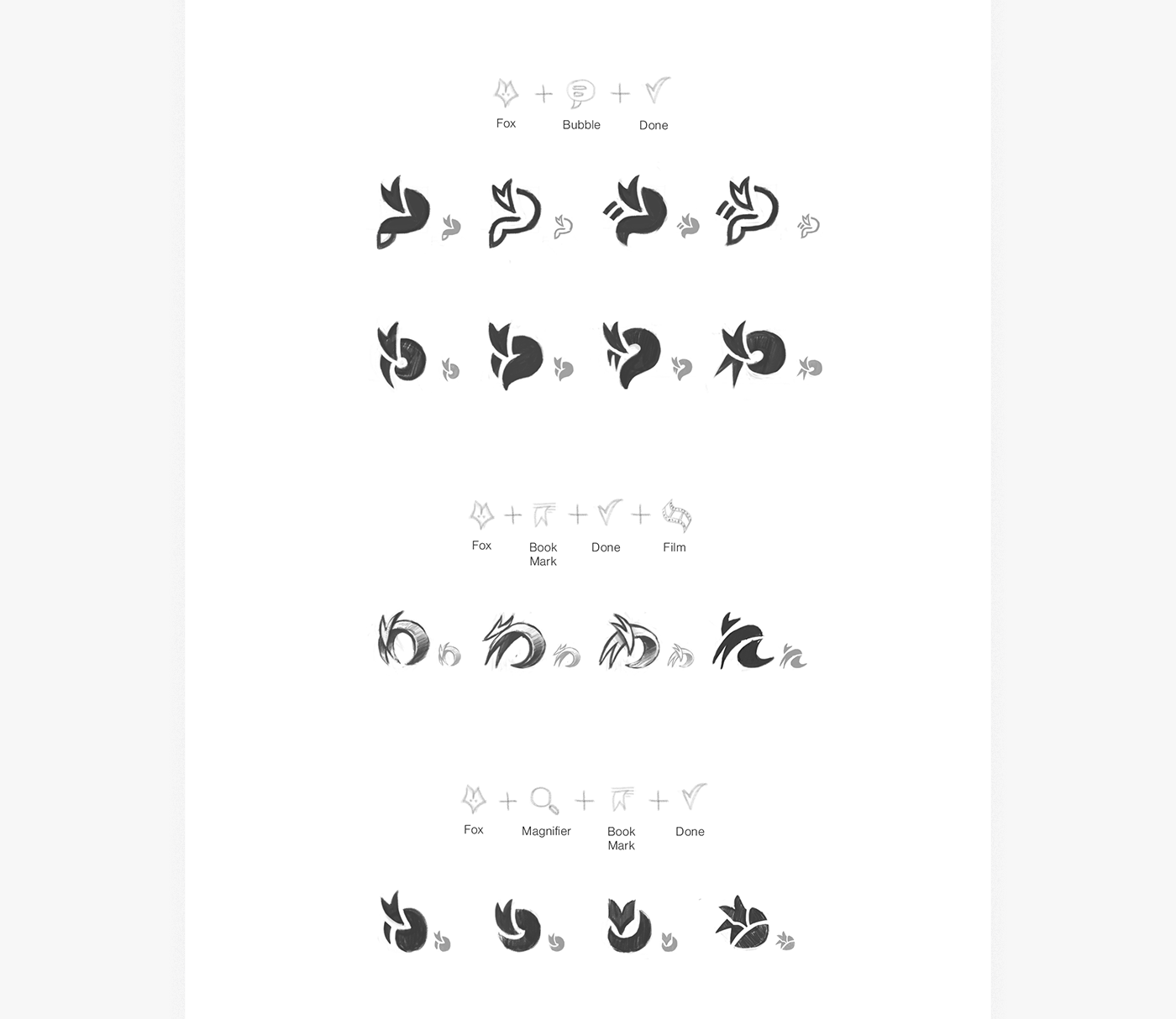
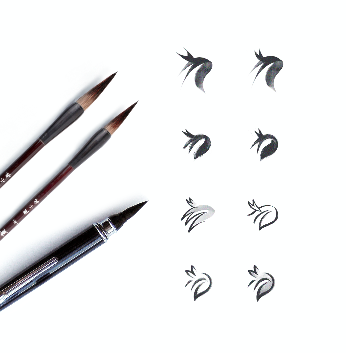
Selected options
After all these explorations, we came up with a shape that fits our requirements.
The shape had a certain visual dynamic yet looked solid. However, we weren't happy with the foxy head and tail. So we did one more iteration to improve it.

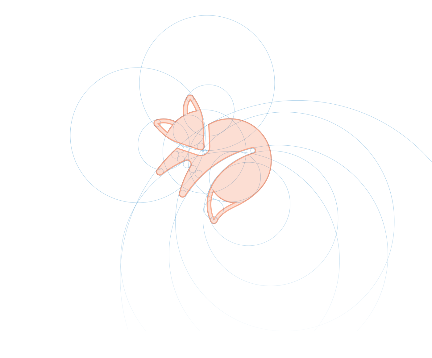
Symbol construction
You might notice that we like to use the 'Golden Ratio' term even if sometimes it's not 100% true. The fact is the Golden Ratio builds on the Fibonacci's sequence in which each of the rectangles are proportionally related. We used our system of circles that works in the same way.
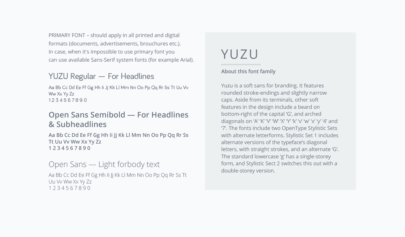
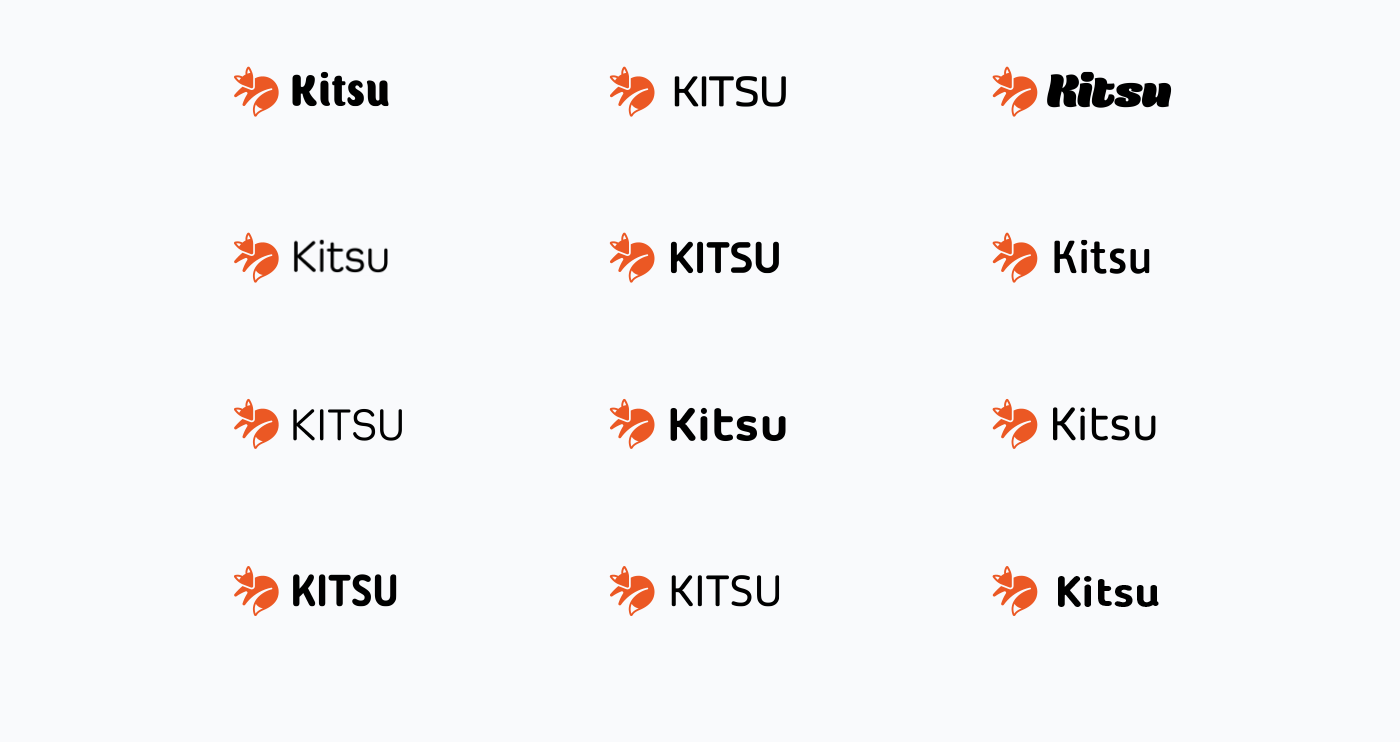
Typeface exploration
The Kitsu logo was created for the web. That means it should look great in the navigation bar of the website and be clearly readable. As such, we focused on Sans Serif font families.


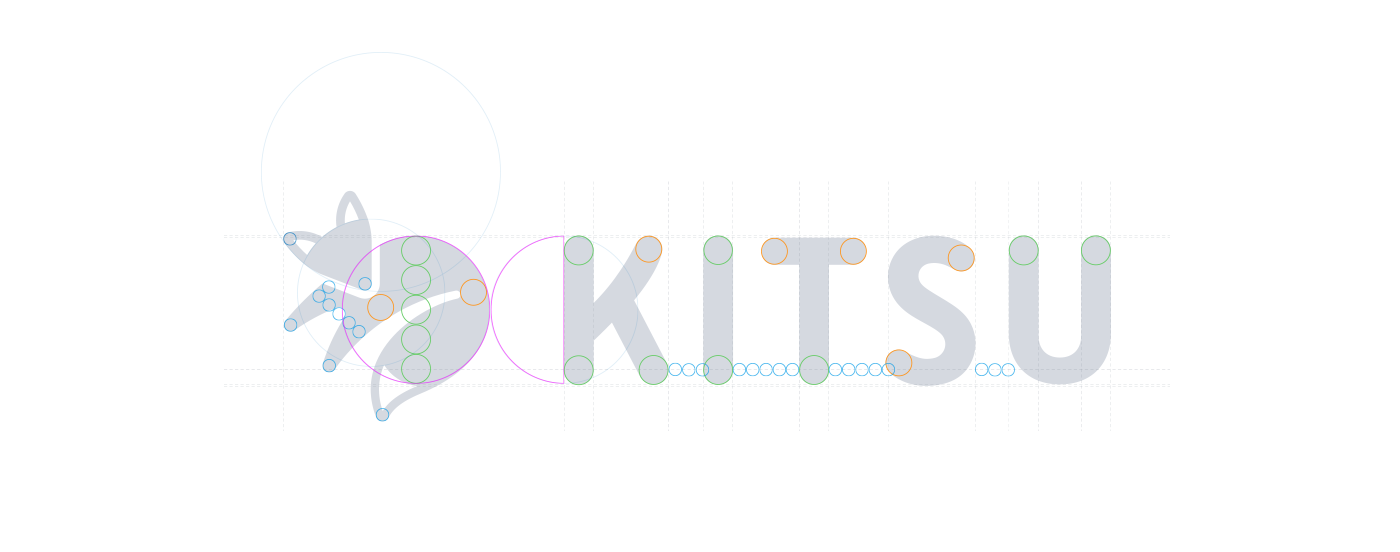
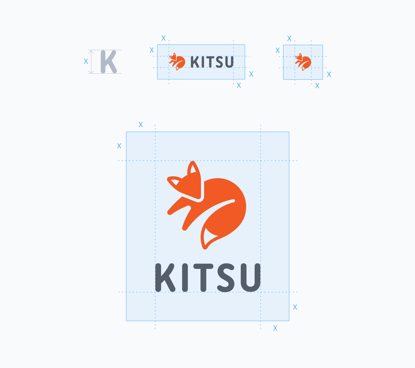
Polishing the logo
This phase is quite important. Even if all these grids and measurements make sense only for designers, this picky approach allows double-checking everything to make sure that the final logo looks balanced. Sometimes, you don't have another chance to fix the spacing or shape because the logo is already printed on thousands of products (not in this exact case, but it's good to remember though) and millions of people have seen it.

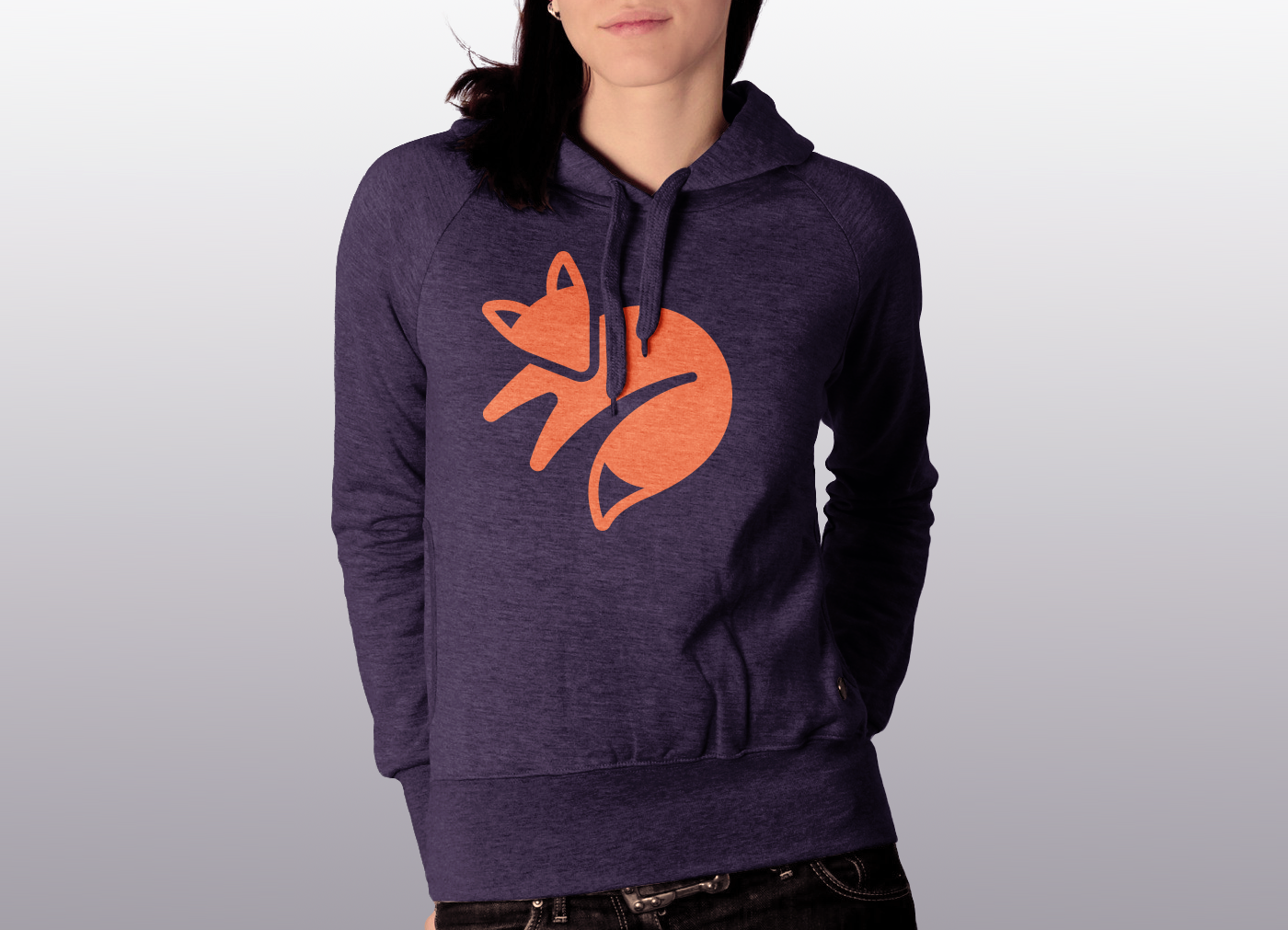
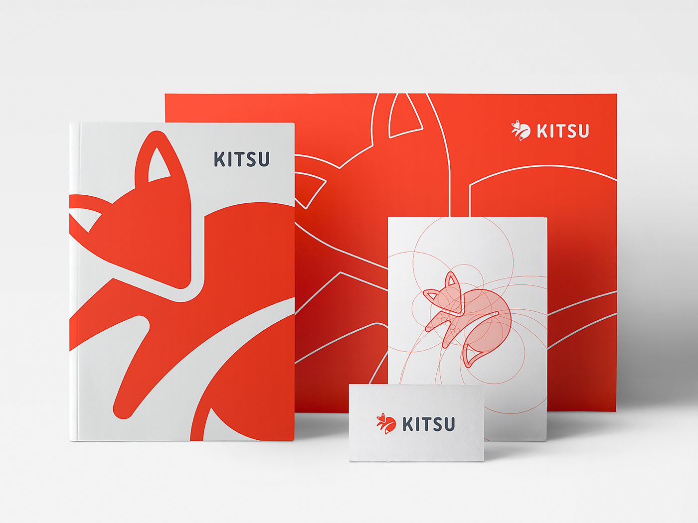
Branding book
As we said earlier in our Wyre project, a branding language is a powerful marketing weapon. However, the stronger the weapon is, the more important it is to follow the rules for using it. So we are perfectionists when it comes to spacings, grids, etc.
Proportion and clear space
Stand alone symbol
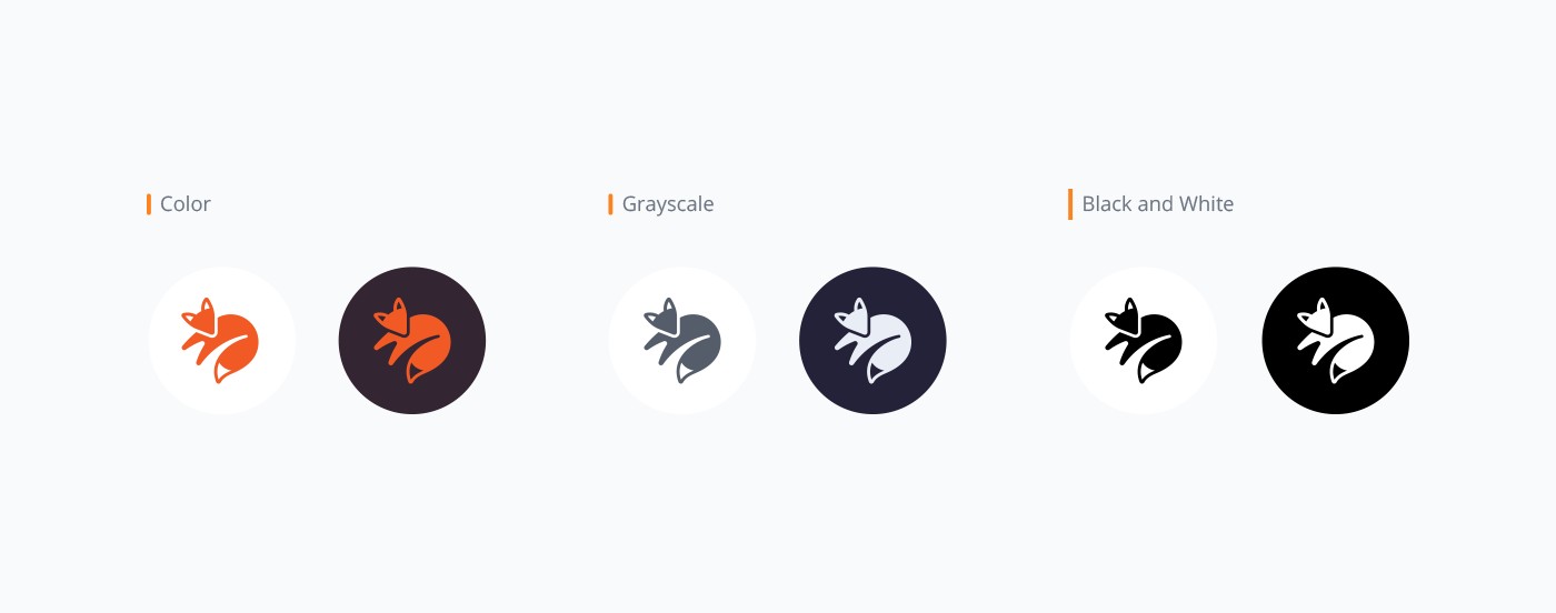
Primary colors

Typography