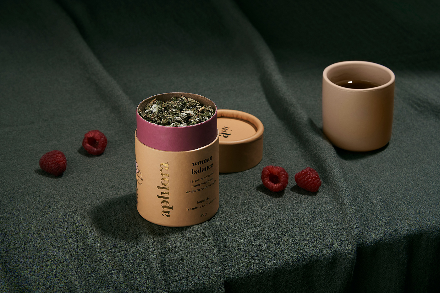
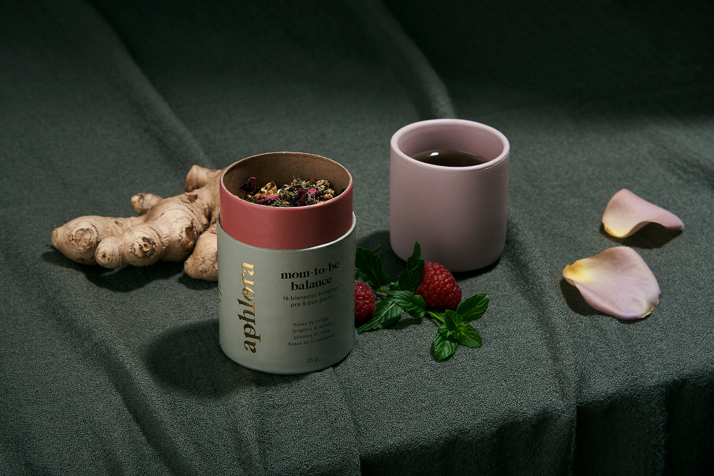
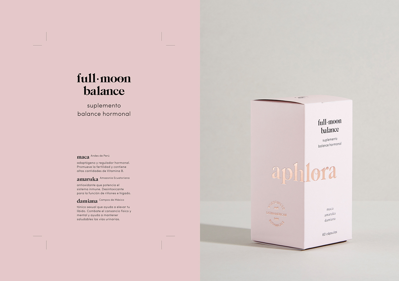
Aphlora is on a mission to create holistic products designed by women for women, in any cycle of their lives. Inspired by ancestral wisdom in Latin American women, and Mother Nature as the great source of connection with ourselves, Aphlora is dedicated to achieving a healthier relationship with our bodies and souls, through natural, Latin American ingredients proven to improve women’s health.
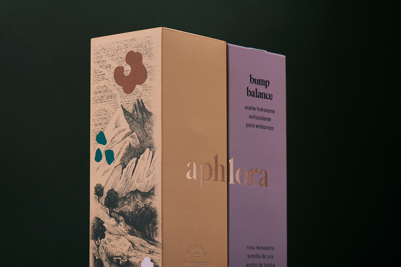
We created a brand name that conveys the message of 3 concepts: pH as aiming for balance, [aflorar] in Spanish, to bloom, to grow or develop fully, and Aphrodite, the ancient greek Goddess. The letterforms in the brand identity depict the beauty of women connections, the diversity of bodies, weights and minds. The monogram is the abbreviation of the full logotype, using letter a pH as an exponential detail, to communicate how these products potentiate a solution in a journey to a better wellbeing.
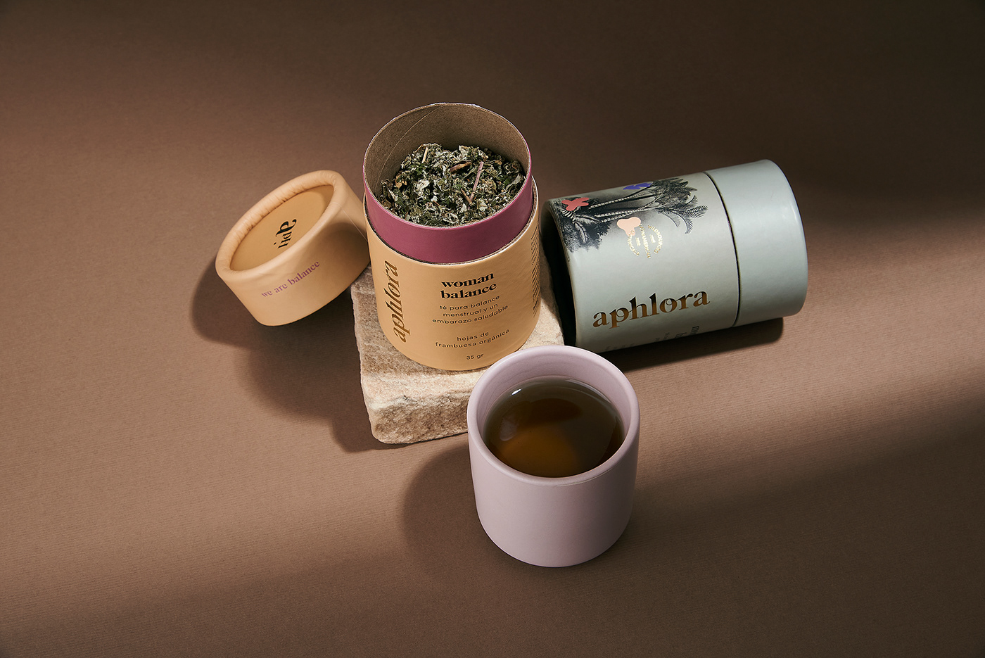
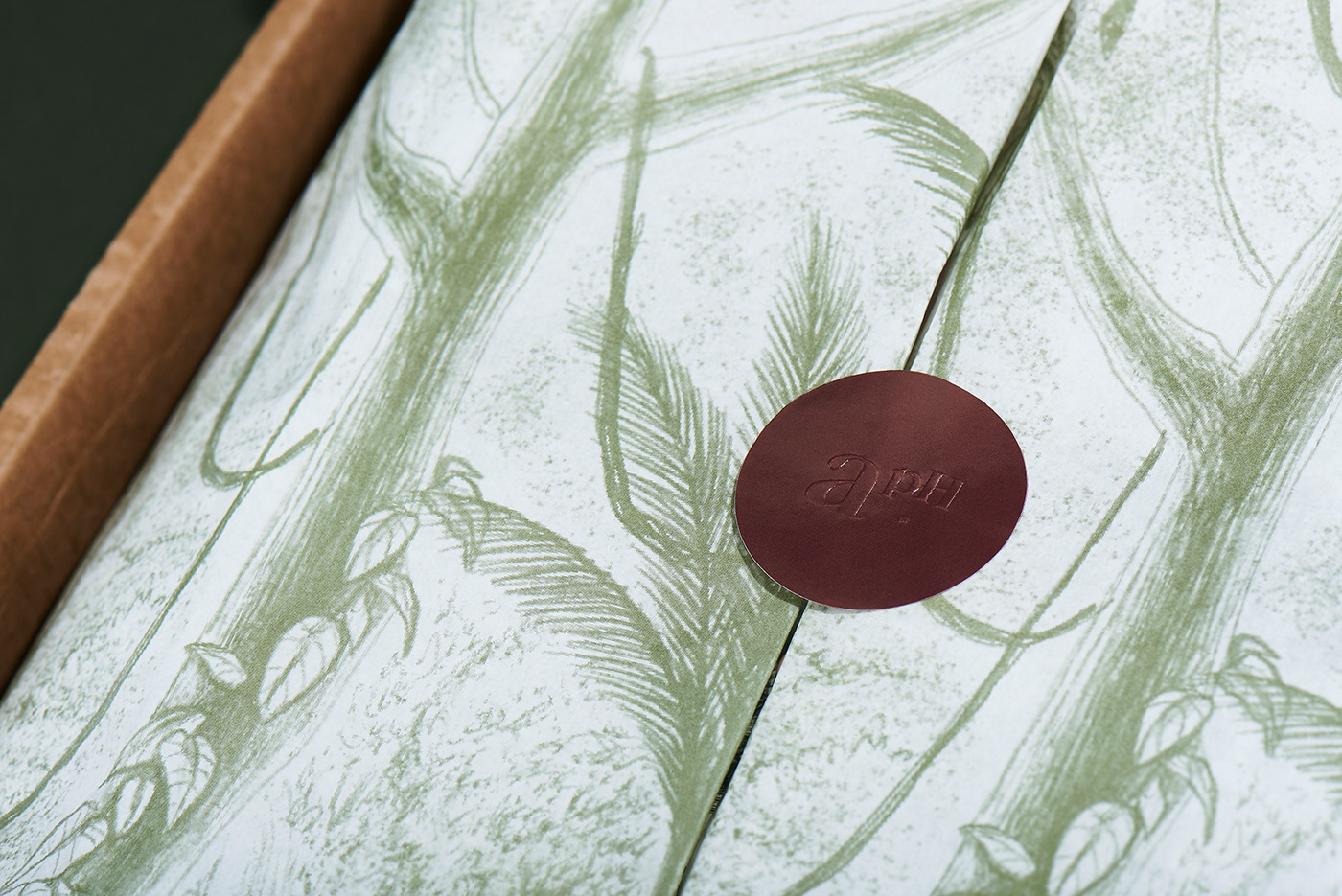
An array of landscape scenes from the remote and even undiscovered Latin America, paired with modern, bold spots of color, that are subtle representations of the key ingredients, are a nod to the lush richness of the region.
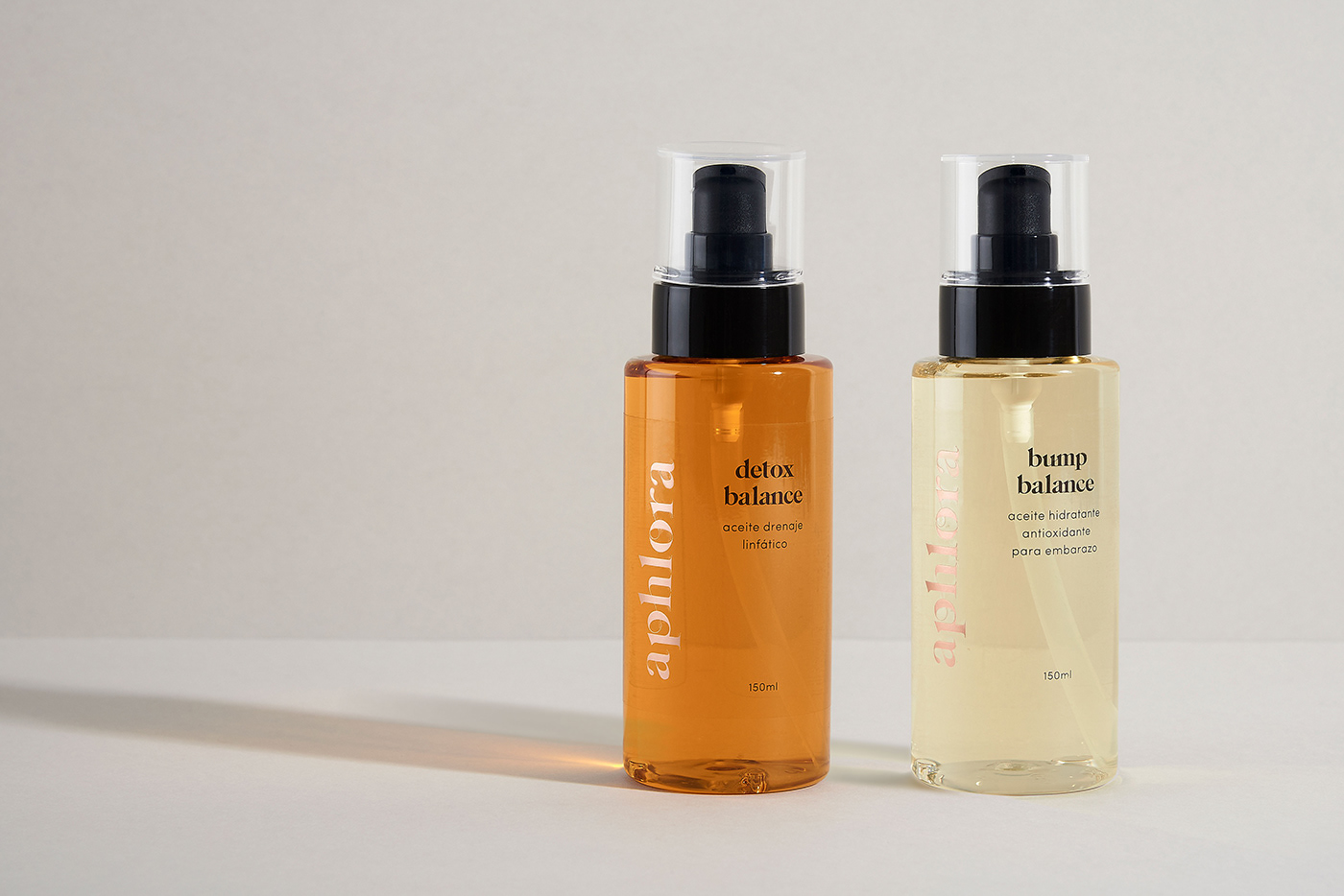
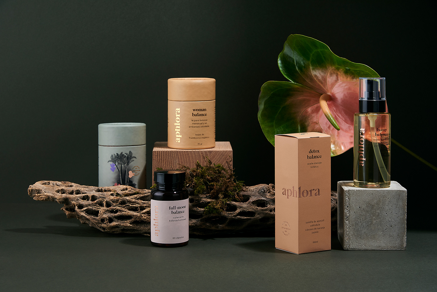
The color palette features natural yet feminine tones that reflect the sense of the brand’s sophisticated spirit.
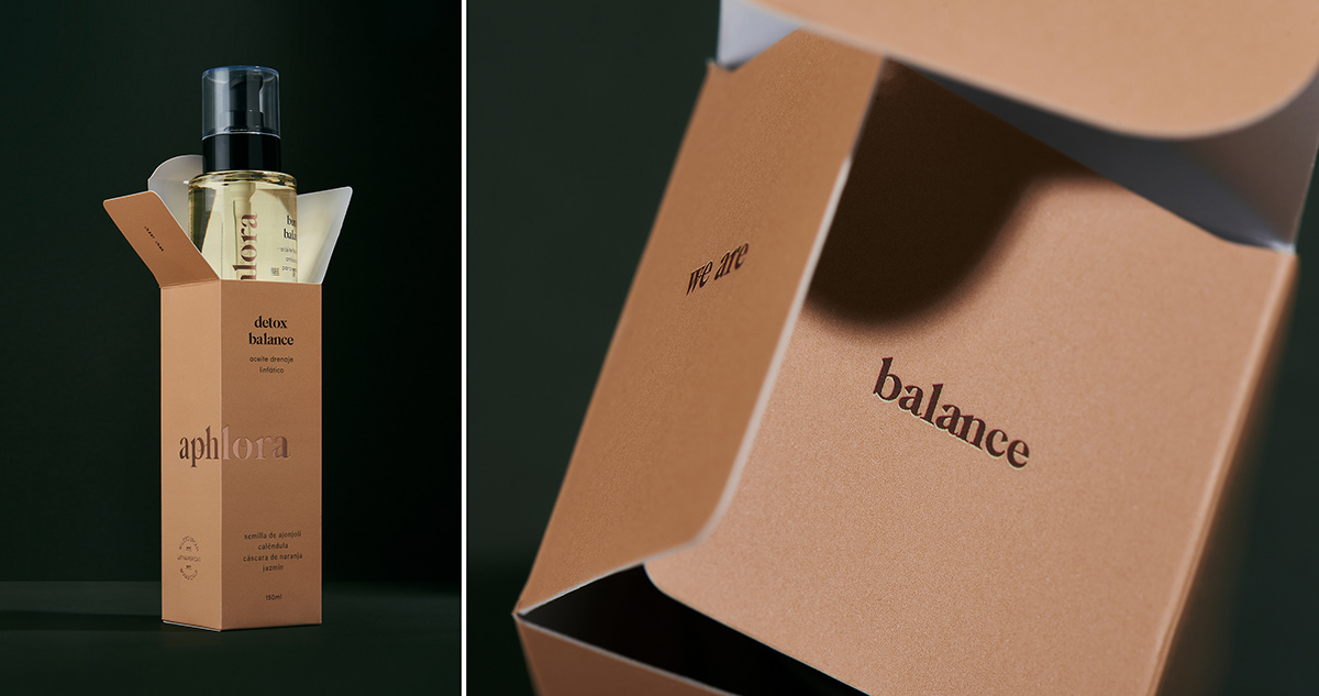
For the packaging system, we played with the idea of placing the logo purposefully, so it’s fully completed when seen from other sides, to instill the concept of all the stages occurring throughout a women's life.
aphlora, we are balance.