"Rationality First, Fun Later" have roughly profiles main ideas of the visual identity design for MAKE SENSE. Due to the fierce competition in the market of men's skin care products, it is absolutely necessary to intensify and supplement the design based on the product features and advantages. The products of MAKE SENSE bring consumers a refreshing, clear and relaxing experience and focus on the quality and logic of the formula. We have made these product features converted into the interest and fun under the simple and clear logic, thereby forming its unique style of MAKE SENSE.
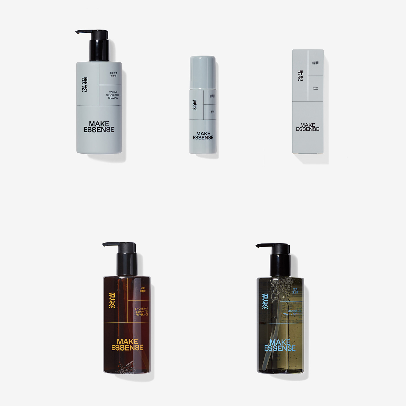
MAKE SENSE is composed of "Chinese characters '理然'+ MAKE SENSE + product name". We have divided the layout into many functional areas by the fine lines, in which respective contents are in an orderly arrangement, and this is our understanding of the refreshing and relaxing experience brought by the men’s skin care products.
MAKE SENSE is composed of "Chinese characters '理然'+ MAKE SENSE + product name". We have divided the layout into many functional areas by the fine lines, in which respective contents are in an orderly arrangement, and this is our understanding of the refreshing and relaxing experience brought by the men’s skin care products.
ART DIRECTOR: Guang Yu / Nod Young
DESIGNER: Liao Liao / Han Lu
YEAR: 2020-2022
CLIENT: MAKE SENSE
DESIGNER: Liao Liao / Han Lu
YEAR: 2020-2022
CLIENT: MAKE SENSE