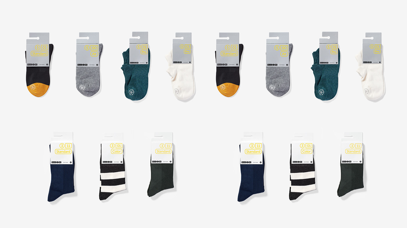
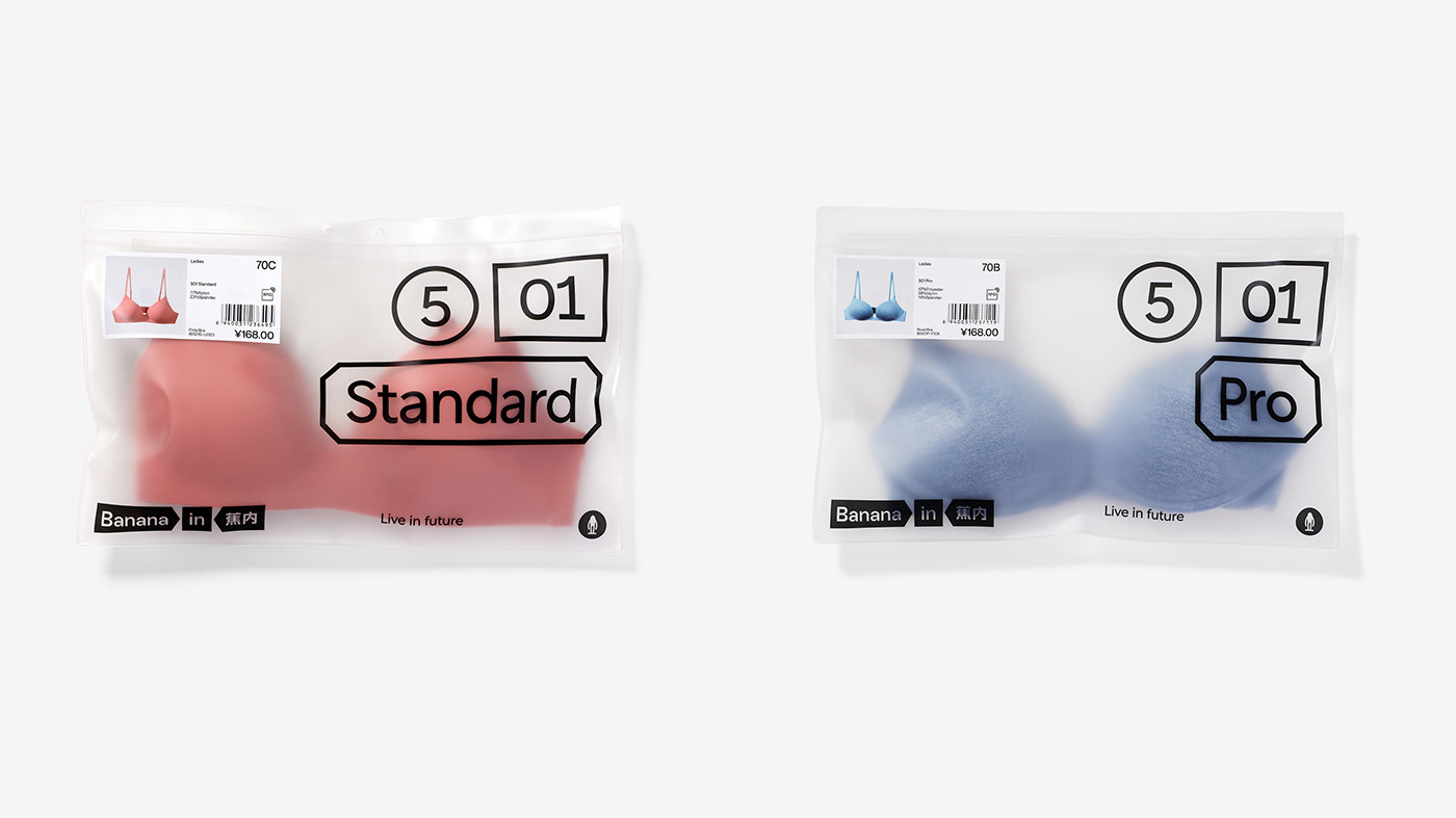
In the cooperation with Bananain, what we discuss most with our client is user experience. Experience or feeling is a very abstract concept. What is the boundary between "feeling something" and "feeling nothing" and how should it be conveyed to users? In the process of sorting out the brand content of Bananain, we found a marker with unique value and extremely high recognition - Tag-less Label. "Tag-less Label" can be used not only as a mark for "feeling nothing", but also as an eye-catching identification for "feeling something". Moreover, this stable, flexible, extremely simple and powerful application mode has well translated the proposition on the brand value of Bananain - Live in Future, namely the comfortable experience in the future.
ART DIRECTOR: Nod Young / Guang Yu
DESIGNER: Liao Liao
YEAR: 2020-2023
CLIENT: Bananain 蕉内
DESIGNER: Liao Liao
YEAR: 2020-2023
CLIENT: Bananain 蕉内


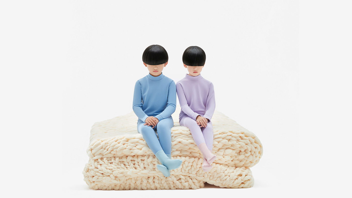
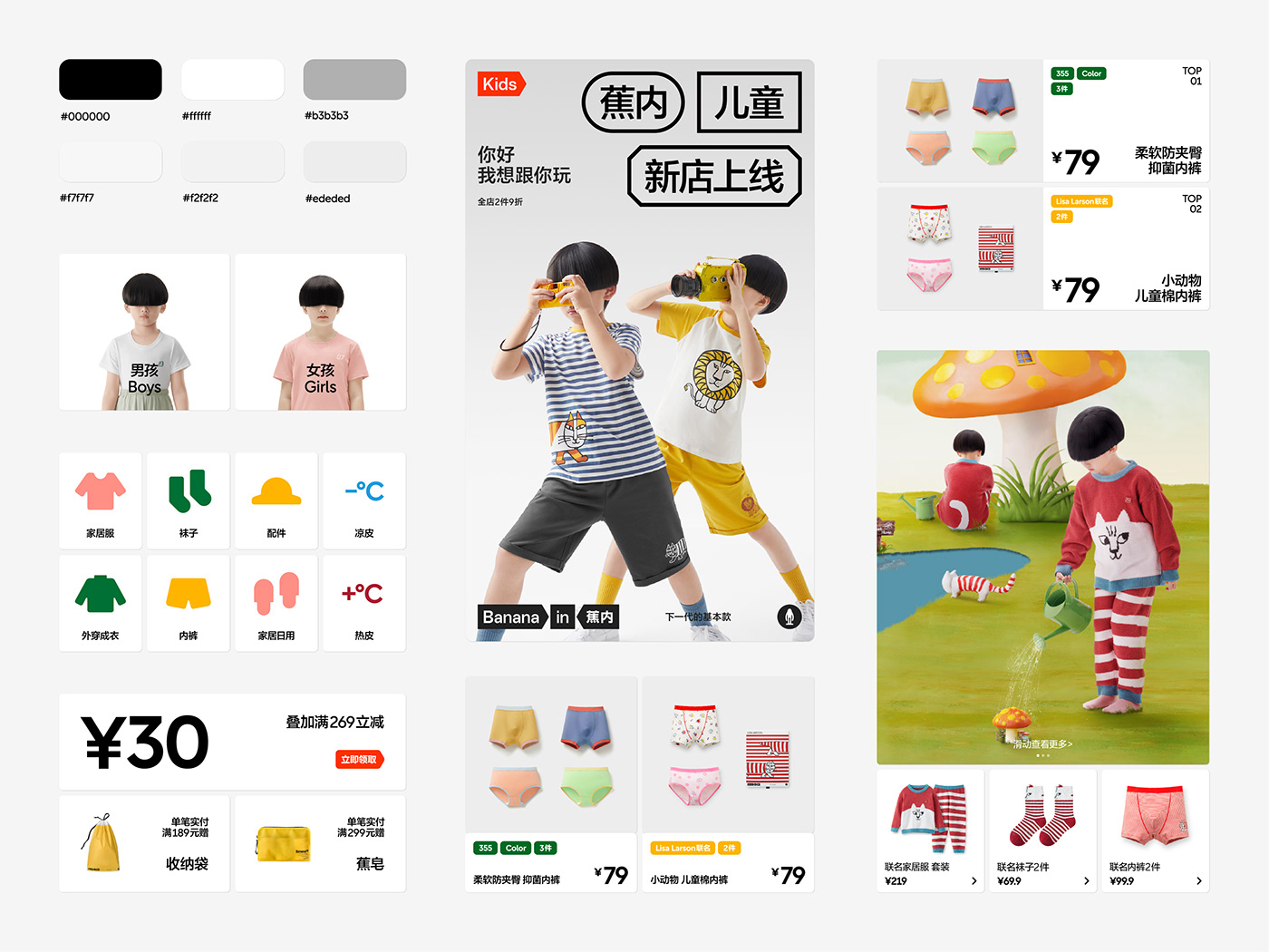
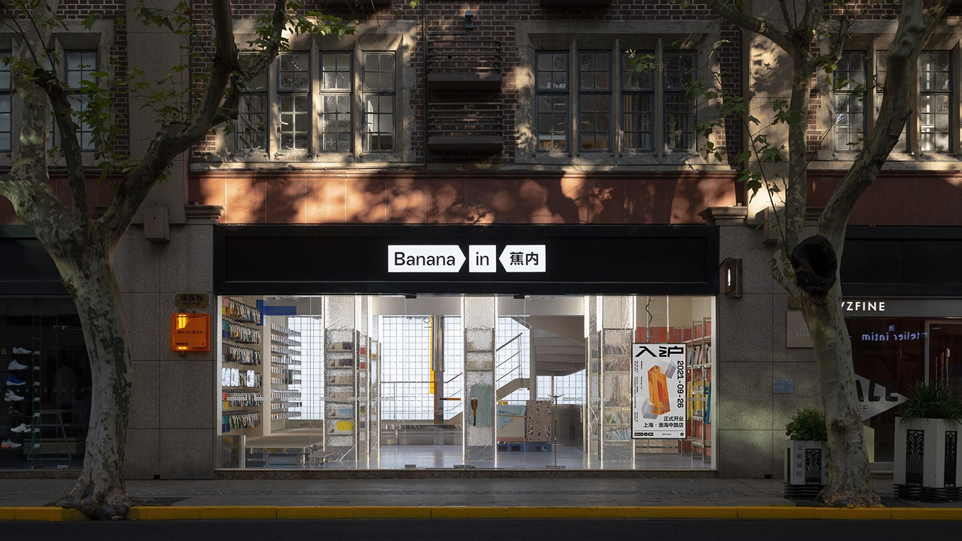
Our cooperation with Bananain can be traced back to 2019 when Bananain’s brand image we designed received very high market evaluation. Bananain has been one of the most influential brands of underwear and leisure wear in China after several years of development. Besides, the “big label” visual system used for Bananain has also become one of the brand images that Chinese consumers are most familiar with and take delight in talking about. This rebranding of Bananain Kids a special version based on the previous design of brand image. It is not only an upgrade of brand image but also a new understanding of Bananain in the perspective of kids. We made three key actions allowing Bananain Kids to show a quite different brand personality without jumping out of the main frame.
Action 1: Enlargement. Everything seems to be bigger in kids’ eyes. For example, an orange we pick up casually may look as big as a basketball to kids. We enlarged the brand information including the logo and big labels as far as possible without exceeding the horizontal width. The enlarged Bananain, compared with the previous one, seems to be more cute and clumsy, bringing more enjoyment to kids.
Action 2: Color. Kids are more sensitive to colors. Bananain Kids is a colorful and gorgeous world for kids where they have an opportunity to see more colors and have more color stimulation. The visual elements including the logo and big labels have been re-colored. All contents are not strictly restricted in colors except for the logo that needs to remain within the fixed scope of colors.
Action 3: Pile up. Among the three actions, the most childlike expression is to pile up. How can we perfectly present children’s characteristics? We achieve this purpose by destroying the original regular structure. The orderly arranged big labels are disorganized like building blocks and piled up together. In our view, it’s more in line with kids’ understanding of the world to pile everything up together in such a casual way. Of course, there is no real randomness from the perspective of brand image and design rules. The effect of random stacking we see is just the outcome of logical and precise design. The intention conveyed is that we hope kids’ innocence will not compromise the quality of brand.