
SAVAL INSURANCE
Logo Design
Logo Design
Logo created for an insurance agent who wanted to get across a familiar homey feeling, that she wants to be part of your family, growing with you, guiding you, and securing your future. She cares about the quality of her business, not how much money she can make. The idea behind the final chosen logo is using the "V" in "Saval" as a vessel for a seedling, a beginning, and growth in the future. The right side overbearing the left side gives the feeling of nurturing and caring for this little seedling. The shape also gives away the idea of having heart and a heartfelt desire to help. The design is very simple and straightforward and easy to recognize of the logomark.


OTHER LOGO VARIATIONS

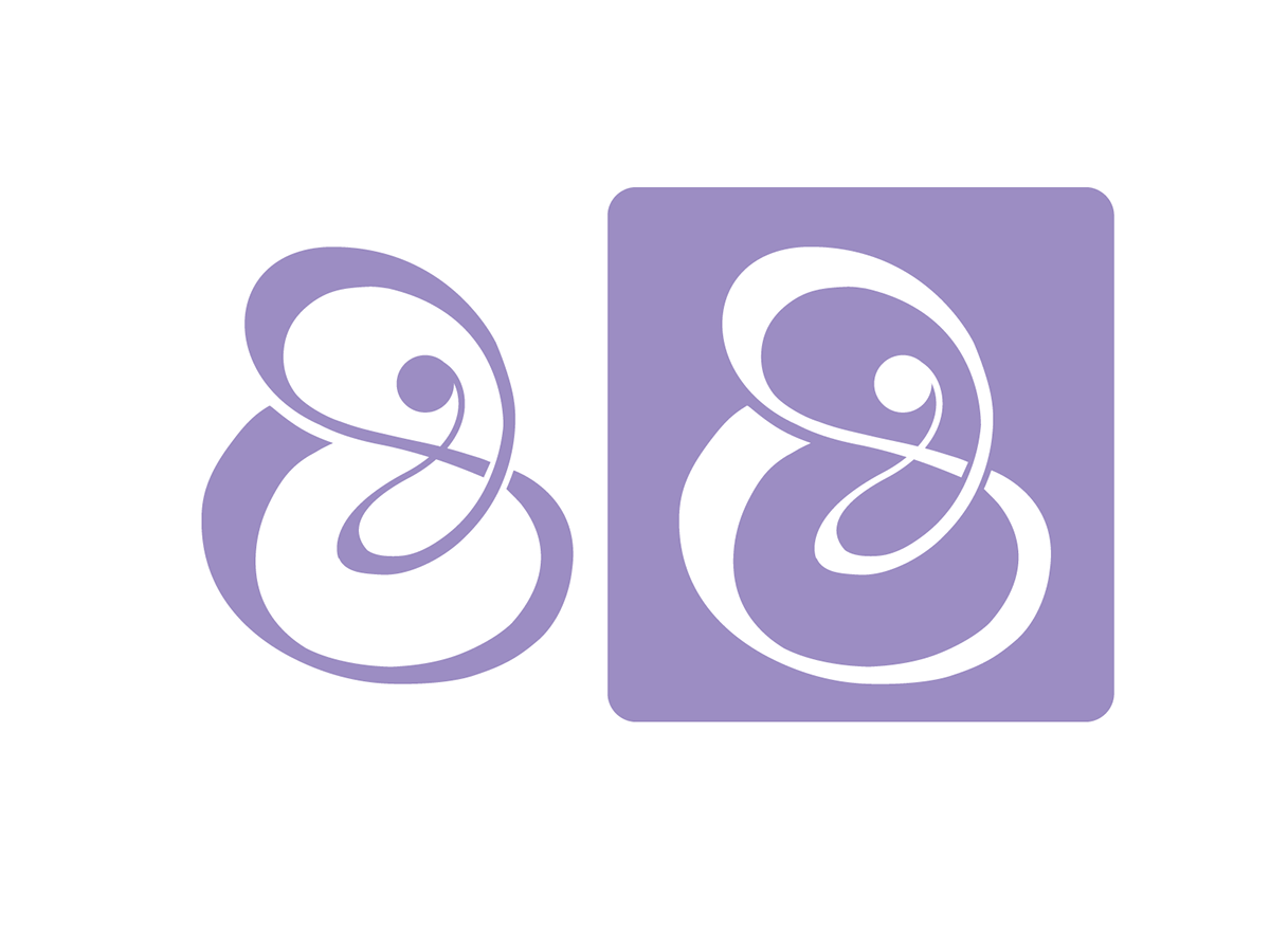
A nurturing touch–that is this logo. It embraces you in its motherly protective arms and is very welcoming and friendly. It just wants to hug you and be part of your family. The soft palette colors are not overbearing and communicate this gentleness about the insurance company which wants to secure you in your life.

This version of the logo is purely typographical, employing various fierce typefaces to come off as youthful and contemporary while remaining professional and edgy with a feminine touch. This logo is not afraid of being different and standing out in the sea of other insurance companies.

Idea behind the logo was that it resembles a mark being stamped onto something. However, it has some soul and some sass about it. It's vivacious and bold, fancy and unafraid.


