Designing a healthy identity
for a retail ice cream brand.
for a retail ice cream brand.
Scope: Brand Identity, UI / UX, Content Strategy, Packaging, Collateral.
Services : Brand Identity
Website Design - UI / UX,
Content Strategy, Tone and Messaging,
Packaging,
Collateral
"I wanted to recreate the joy of ice cream, with none of the guilt. The kind of ice cream, that everyone of all ages could indulge in, without worry" - Said Bharath, the founder of Huga Ice cream.
Bharat had a clear vision, he wanted a brand that excited audiences of all ages to be able to enjoy ice cream without having to think too much.
We had a challenge! To establish a healthy identity for an ice cream brand.
How we approached it?
Our discovery process entailed understanding the target audience alongside how Bharat perceived the brand to be. We had a large set of audience to appeal to, kids, gym enthusiasts, and older audience.
Our first round of research with a sample set of the audience gave us insight on the willingness to try the product, their initial thoughts on the concept, and purchase behavior. Would parents buy ice cream with "whey " in it for their kids if it was safe? Would Fitness enthusiast replace this ice cream tub with their post-workout protein? Would diabetics indulge in it guilt-free if it offered sugar-free options? When do people usually crave ice cream? Willingness to pay for the product?
This discovery process led us to understand Huga's target audience better.
What's in a Name they asked?
It's usually a blessing when clients come to you with clarity on what they want. In this case, Bharat was clear he wanted to name his brand around the feeling of "goodness" "comfort" and "Happy" emotions. Huga, a modification from the danish word for comfort comes from Hygge. The danish designed hygge corners in their homes to make them feel cozy, comfortable and happy. We couldn't see a better fit.
Design and Packaging
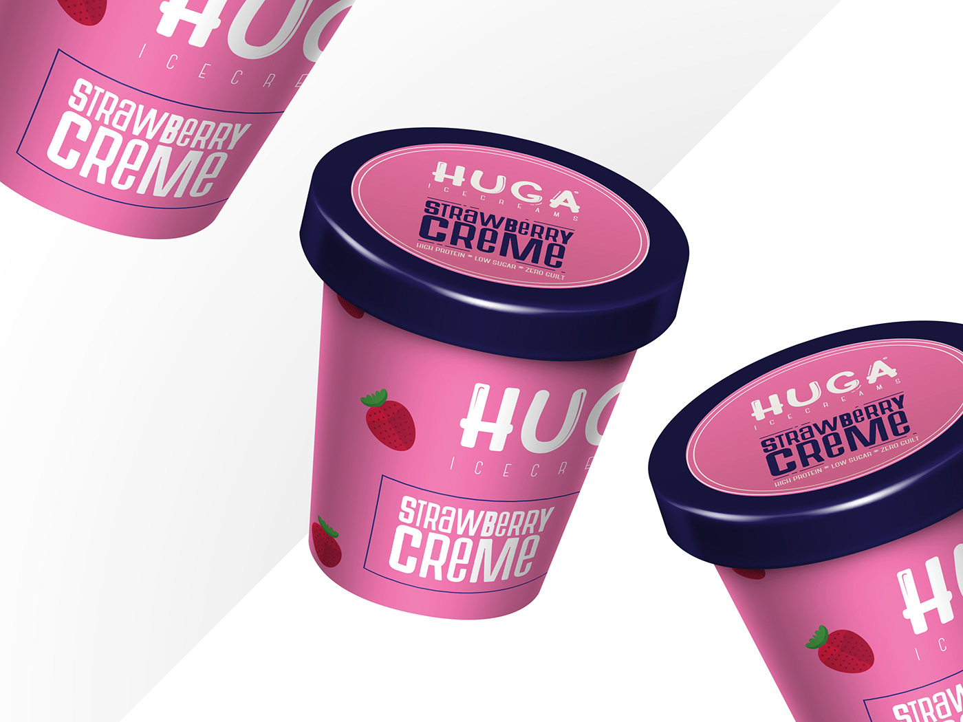
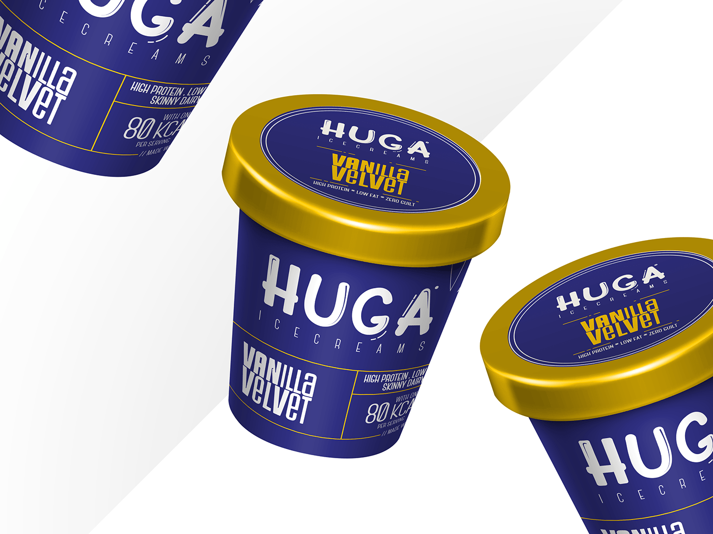
Brand identity and logo - We needed to design an identity for Huga that became synonymous with the word Happy. The audience needed to recognize the brand and get a good feeling when they identified the logo. Moreover, the logo needed to look good on flat surfaces as much as it needed to look good on curved packaging since the tubs were round. We chose a bright and happy color palette, shades of yellow and pink as primary colors.
Packaging
Food packaging is the most crucial component of a consumer brand. The fate of many brands that are at display in supermarkets alongside competitors is tied to how appealing the packaging is. What makes users pick up the product from a shelf full of similar products. What makes them engage with your brand and want to give it a shot? The window of decision making is small and the packaging needs to be a true representation of what the brand wants to convey.
Alongside that, we were also mindful of the constraints that came with manufacturing the packaging tubs. Are we using plastic? Could we use more eco-friendly packaging? How could we label the tubs in a way that doesn't bleed the print color since the product is frozen and cold etc.. Alongside that, we needed to factor the production budget of the brand and ensure our design recommendations match the production price.
Huga had 5 flavors to offer and the USP was that every ingredient was sourced from its place of origin which needed to be highlighted on the packaging. For eg, vanilla was sourced from Madagascar and chocolate from Ghana. Alongside that, the founder wanted to be transparent about the nutritional value of the product and communicating transparency was an important aspect of our packaging exercise.
Every variant was designed in a color synonymous to the flavour of the packaging. Given that HUGA was designed to target the urban audience the feel of the packaging was minimal and modern, yet bright and fun.

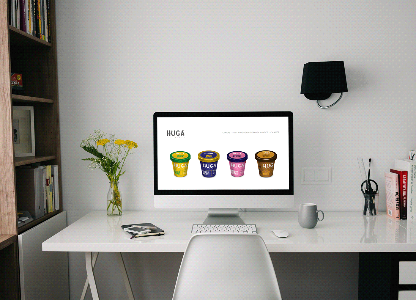
HUGAs website needed to reflect the core feeling of "Joy" that it was trying to offer its customers. Alongside prospective customers, HUGA was looking to attract investors and franchise owners and the website needed to be designed keeping all the audience in mind.
To delight the customers - We decided to keep the design a little fun. We used micro animations to bring the element of Joy to life.
To cater to the Investors and Franchise owners - We focused on highlighting the vision and the story of the brand to build a human connection. Bharat's Vision, Mission, and the story of how and why he started HUGA (Which is very heartwarming btw) needed to move the audience as it moved us.
The website also focused on transparency, the nutritional value of the products, and the USP needed to stand out clearly, we used fun vectors and line drawings to communicate all of these.
Refer to www.hugaicecream.com
Tone and Messaging
HUGA was largely focused on targeting the millennial urban audience in tier 1 and 2 cities. We decided to keep the tone casual and fun to build a stronger association with the audience. For example, we renamed the "USP" page "Why go Gaga over Huga" and the Blog page was renamed as "New Scoop" and contact us was "Feed us back with your best shot" - all synonymous with Ice creams and terms used around it.
Safe to say that Bharat was gaga over our interpretation of HUGA and here's what he has to say about us
"We can not say enough about Pooja and her team. As a startup, we were struggling with how to brand our business. We came across Vamos through a reference and were thrilled to work with them on our project. Vamos provided with guidance absolutely perfect! Vamos has been fantastic to work with and we look forward to working with them in the future!”
Bharat Chandra, Founder Huga Ice cream


