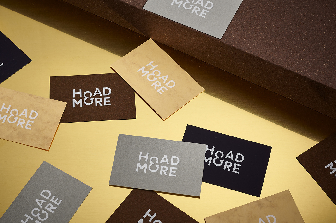
Formerly Jona Hoad Design, Hoad & More create lighting, among other things. They build installations as well as products and are as passionate about thinking and dreaming as they are about making and implementing. As well as renaming them, we also created a new identity and website. The name 'Hoad & More' reflects not only their collaborative way of working but also the varied nature of their projects, from beautiful switches to large scale chandeliers.
Being natural collaborators we created an ampersand at the heart of the logo and used '& More' as a suffix on items such as business cards. The ampersand also gave Hoad & More a distinctive shorthand logo that is used as a makers mark and editorially. A special cut of 'Circular' was created by Lineto which incorporated the ampersand into the font.
As part of the rebrand we also created a new website which shows more of the journey from sketches to the finished pieces. The homepage is deliberately explorative, there is an element of '& more' as you rollover the words, revealing short films and imagery. The series of short films show snippets of the life of the studio, people, workshops, maquettes & more.
Stationery was printed on a deliberately varied selection of stocks, again to represent Hoad & More's explorative use of materials. All elements are foil blocked in a matt white foil.