


Viena UI UX For B2B Contract & Customer Management System
Viena is a dashboard to provide an at-a-glance view of progress reports using key performance indicators relevant to the business. A B2B Contract and Customer Management Software to support contract management, contract lifecycle management, and contractor management on projects. While Contract Management systems can be complex and packed with data, I committed most of the time on UI UX to design a system that can help companies create new contracts and keep track of existing contracts. I was responsible for research, design, testing, and handoff. I focused on delivering a user-friendly app experience.
Client: Viena
Date: 1.13.20
Based In: Toronto, Canda

The Challenge
The ability to manage a business and its aspects are increasingly important for B2B businesses. However, the large portion of CRMs and Contract management systems are sorely lacking in good user experiences. Operations Staff & Managers had to pull key data from different software, manage & consolidate critical information. This led to this opportunity to find a solution using a custom dashboard.

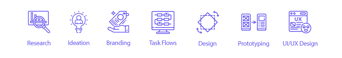
My Role
I completed all activities in the UX project cycle in a solo capacity- from research to design to prototyping. I was in charge of Research, Ideation, User Task Flows, Branding, Design, Prototyping & UI/UX Design. I conducted user research using interviews and surveys in order to address both user behaviour and attitudes.
Tools

Pen, Paper, Whimsical, Miro, Procreate, Microsoft Word, Microsoft Excel, Adobe Illustrator, Adobe Photoshop, Figma, Lookback, Zeplin
Techniques: Surveys, Questionnaires, Interviews, Affinity Diagram, Value vs. Complexity Model, Competitive/Comparative Analysis, Mood boards, User Flow, Paper Prototype, Crazy-8, Wireframes, Mockups, Pattern Library, Key Performance Indicators, Remote Un-moderated Usability Testing, Accessibility Analysis, Prototyping
Duration
2 Weeks
Research & Analysis
I began with a set of interview and survey questions to give me the direction I needed to dig deeper to find the answers I needed to solve the most common problems. I transferred all my notes and responses onto sticky notes on Miro, recognized patterns, rearranged the sticky notes into clusters under different themes, and possible opportunities, detailing particular pain points, and user insights. I also conducted an analysis based on competition, users, and business logic as a way to gain insights into user flow and wire-framing. The most important takeaway from this activity was learning how different softwares organized their selection and the overall layout. I started by defining the minimum requirements or deliverables. I made User Flows to define the navigation and its structure followed by Wireframes and Low-fi mockups.

Low Fidelity Mockup
Using a pen, the crazy-8 method, different layouts, triggers, and responses I started sketching low fidelity wireframes for some screens on paper. After many iterations, the rough version for developing a low fidelity prototype was achieved using Adobe XD, Photoshop, Illustrator & Figma. Before coming up with colors, typography, and images, I wanted to put this layout to test to see how my users would process this information without the distraction of visual design and branding.

Feedback & Iteration
I used Lookback to observe user’s while they interacted with the prototype. Tests revealed that not all business logic was in place and I was able to improve my designs based on my observations and the users’ direct feedback.
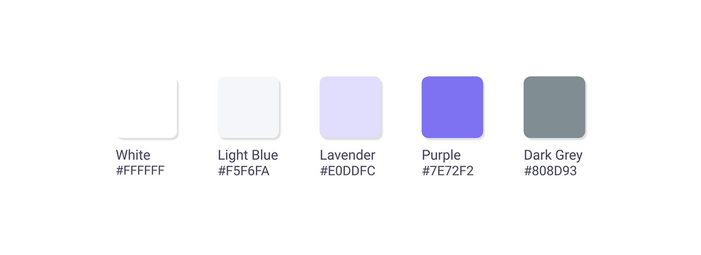
Color Palette
Colors are my big inspiration to see the world. I believe the color theory is science and art.
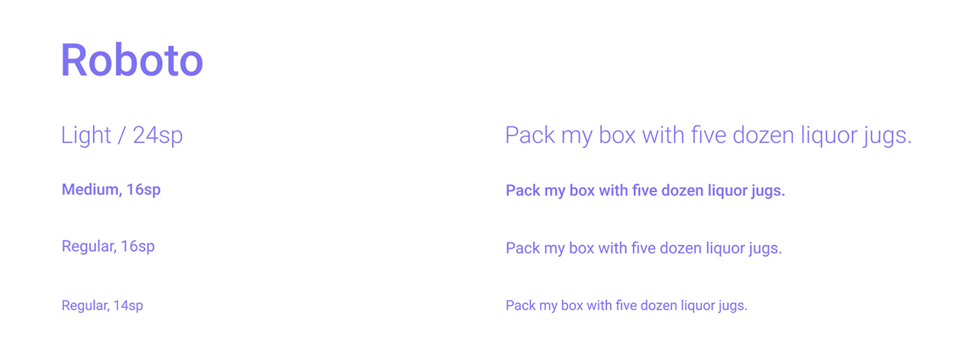
Typography
I used well-known system fonts with different text sizes, alignment, and line & letter spacing to better communicate information.
Iconography
A user’s icon understanding is based on previous experience and universally understood icons are extremely rare. Therefore, I tried to use system icons as much as possible to create a sense of familiarity for the user.

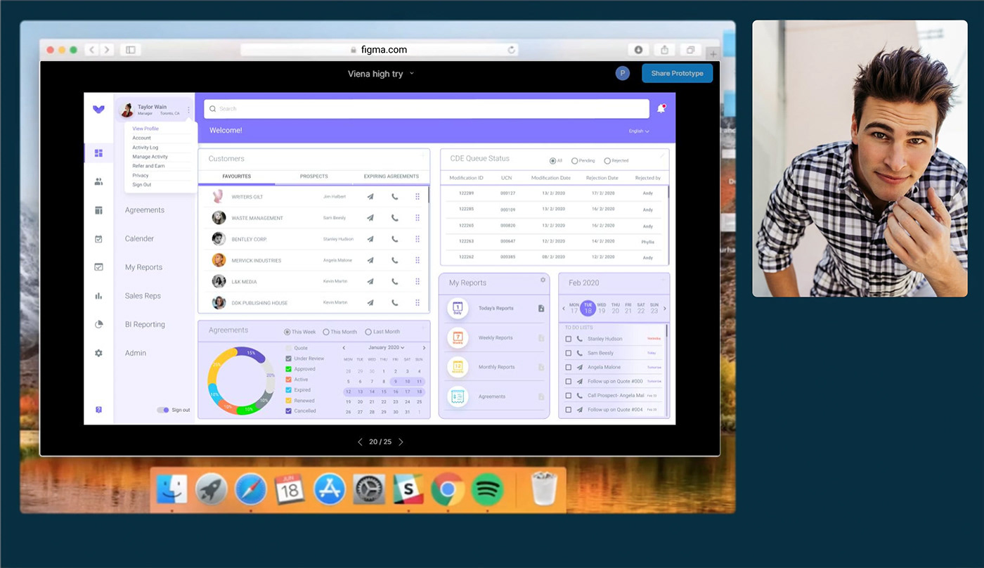
High Fidelity Clickable Prototype
As a result of the testing, my observations, and the users’ feedback, I was able to improve my designs. I also used the framework previously established in the low-fidelity mockups along with the appropriate colors, icons, typefaces & fonts. I made the detailed High-Fidelity clickable prototype using Figma.

Validation, Usability, Feedback & Iteration
Using Lookback for Testing, I was able to gain valuable user feedback, observations, and personal insights. I used my latest UX trends to create a final high fidelity mockup using Adobe XD, Photoshop & Illustrator, and then imported it to Figma to create a shareable, clickable prototype. After I was confident, I improved accessibility, created stylesheets, and Component Sheet in both Figma & Zeplin.
Solution & Insights
Although this overwhelming project was created within one month where all activities in the UX project cycle in a solo capacity by me, this short period of time was an eye-opening experience for me. I learned the importance of having a well-defined and close-ended problem statement. This has also resulted in the accumulation of a large amount of knowledge and many new skills in Adobe XD & Figma. Looking back, I believe my solutions solve the user's problem.
Walk-through Video using Adobe XD
High Fidelity Clickable Prototype using Figma


