


The Body Shop UI UX For Website Homepage
This project is a UI UX redesign for 'The Body Shop' Homepage. A Leaping Bunny approved company that provides cruelty-free beauty products. I was responsible for research, design, testing, and handoff. I focused on delivering a clean user experience for the Body Shop website. Because e-commerce is well-studied in the industry, we were committed the most of the research time for basic and market research as well as developing a sense of professional best practices one can consistently rely on. The site also needed to distinguish Body Shop from other e-commerce retailers & needed to reinforce their core business values: traditional, clean, and responsible.
Client: Body Shop
Date: 9.25.19
Based In: Toronto, Canada
The Challenge
Body Shop wanted a new e-commerce website; they wanted to showcase their products while maintaining their brand image. They want to maintain their values; Great customer service, Focus on high-quality over quantity, Reasonable pricing, Steer customers towards popular products. I believe that a clean and pleasing UX has become mandatory for businesses in today's world.


Overview
Founded in 1976, The Body Shop is a global enterprise with over 2,500 stores in 62 countries. The company sells cosmetics products that are inspired by nature and produced according to strict ethical standards. The product range currently encompasses more than 1,200 products that are also sold on the company’s own website. The product's focus is shampoos, conditioners, bath products, soaps, and skin creams but also includes fragrance, spa products, and beauty-related accessories. Their products are solely based on natural ingredients and manufactured according to an ethical code which is opposed to animal testing.
My Role
I completed all activities in the UX project cycle in a solo capacity- from research to design to prototyping. I was in charge of Research, Ideation, Branding, Design, Prototyping, UI/UX Design & Web Design. I conducted user research using interviews and surveys in order to address both user behaviors and attitudes.

Tools
Pen, Paper, Whimsical, Miro, Procreate, Microsoft Word, Microsoft Excel, Adobe Illustrator, Adobe Photoshop, Figma, Lookback, Zeplin
Techniques: Surveys, Questionnaires, Interviews, Affinity Diagram, Value vs. Complexity Model, Competitive/Comparative Analysis, Mood boards, User Flow, Paper Prototype, Crazy-8, Wireframes, Mockups, Pattern Library, Key Performance Indicators, Remote Un-moderated Usability Testing, Accessibility Analysis, Prototyping

Duration
2 Weeks
Research & Analysis
After looking over the brief, I started research on competitor's websites to see any trends or patterns in their UX. I looked through direct and indirect competitors, interviewed users, and collecting business analysis. I was determined to visit as many other e-commerce websites as I could and interview the users and see what problems they. 31 people answered my survey in a 48-hour window which provided me with a good start. This was helpful information that helped solidify the stage for my second phase of research. The next step in the design process was to organize the research findings and give it structure. After our ideating stage, I created a MoSCoW graph which helped me come down to specific features I must include on the website. The most important takeaway from this activity was learning how different websites organized their selection and the overall layouts they used for those websites. After researching and taking into account the cosmetic industry and its nature, I decided to keep the homepage visually appealing and spaced out. A key strategy was to space out the elements and use a minimalist approach.

Low Fidelity Mockup
Based on what I learned in my research, I started with designing a few low-fidelity wire-frames using the crazy-8 method took using a pen and paper. I then chose the one I gravitated towards and created them on the Figma. After many iterations, the rough version for developing a low-fidelity prototype was achieved using Adobe Photoshop, Illustrator & Figma. Before coming up with colors, typography, and images, I wanted to put this layout to test to see how my users would process this information without the distraction of visual design and branding.

Feedback & Iteration
Overall users were able to easily navigate the web page and locate products and information. However, they did find it a little cluttered. The tests also uncovered that the font size was not consistent and the alignment was a little off. Remote user testing sessions using Lookback was greatly useful as I could observe each user’s behaviors and also listen to users describing their expectations on every interaction. Based on this, I improve my designs.

Color Palette
Effective color matching is a tricky concept to master.

Typography
For the most part, I used text sizes, alignment, and line & letter spacing to better communicate information.

Iconography
I tried to use icons that seem to be from the same product family/suite.

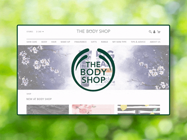
High Fidelity Clickable Prototype
Using the low-fidelity mockups, user feedback, appropriate colors, icons, typefaces, and fonts, I created a high fidelity clickable prototype using Figma. The testing sessions were immensely useful to detect problems and usability issues in my designs.

Validation, Usability, Feedback & Iteration
I used Lookback for Final Testing. Based on the feedback, I increased the font size to 16 pt, placed important links in the footer, prioritized features & created a clean, light, and simple homepage to avoid overwhelming users. Based on the personal insights, observations, and latest UX trends and accessibility standards, I created the final high fidelity prototype using Figma. Once I was confident, style sheets, and Component Sheet in Figma and exported the designs to Zeplin for Engineering Handoff.
Solution & Insights
Although this project was created within two weeks, this short period of time was an eye-opening experience for me. My role in this project is that of the lead and only UX Designer. I feel like I have met the goals and needs of my user. However, I should have listed fewer goals for the MVP of the app. The key trade-offs was that I had fewer users to test with, less time to research and that prototyping was fast. This has resulted in the accumulation of a huge amount of knowledge and many new skills such as Procreate, Whimsical, Miro, Figma, WebAIM, Lookback & Zeplin. By the end of the project, I learned how to conduct user research and come up with insights and findings, turn it into the theme, and building features based on it.

High Fidelity Clickable Prototype


