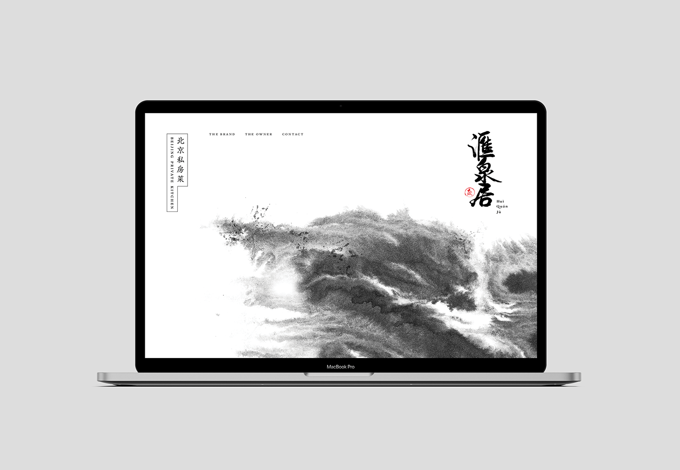
Huì Quán Jù
2019

Where culinary flows rich.
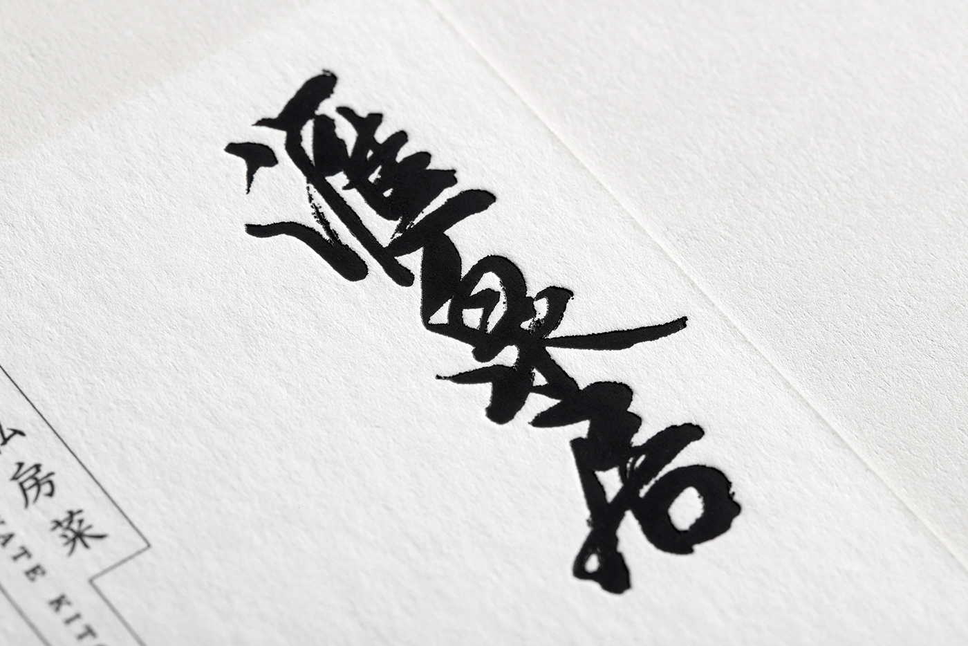
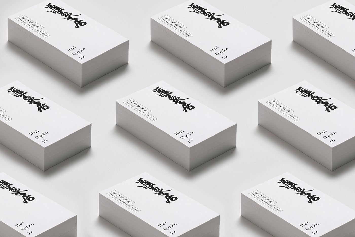
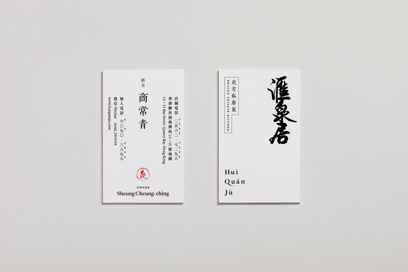
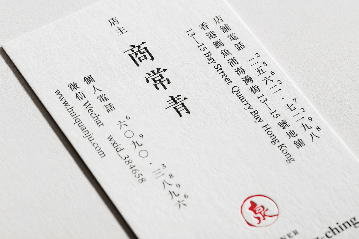
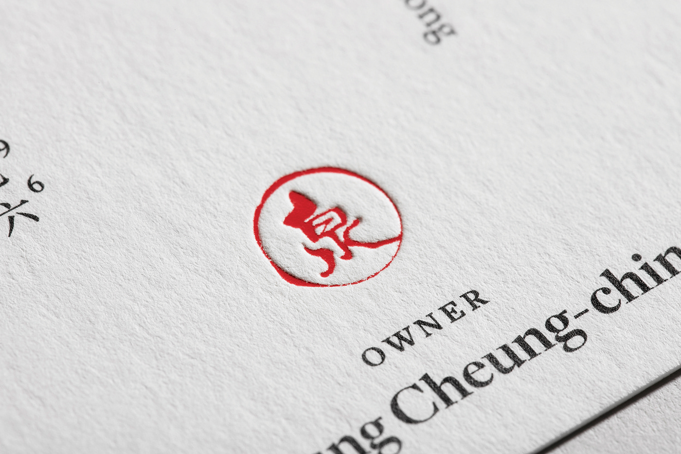
This brand identity project is for Huì Quán Jù, a Private Kitchen specialising in Beijing cuisine. The Chinese name ‘Huì Quán Jù’ (滙泉居) depicts a residence (居) situated where rivers join each other into a more substantial flow (滙泉), as though amassing goodness from all directions. A stark contrast of matte black foil finish that materialises the calligraphic logo of the restaurant against the white paper background reflects the ideal, traditional notion of a masculine man from Northern China, which is incidentally quite reflective of the owner’s own ideals, and to an extent, himself.
Calligraphy accentuates the heritage of traditional Chinese culture in its own unique form, and when done by the very Wah Guo himself, whose strokes graced a plethora of local films, advertisements et cetera, brings out even more rawness that comes out from the bold, semi-cursive script. Words enable a direct expression of sentiment, which is important in conveying the nuanced raggedness of Beijing men. With slight manipulations of type and spacing, coupled with the touch of red from the stamp that is, too, created by Mr. Guo, the theme of a flowing river is sustained.