Projekt publikacji „Art of Liberation. Studium prasoznawcze 1988–2018” tom I
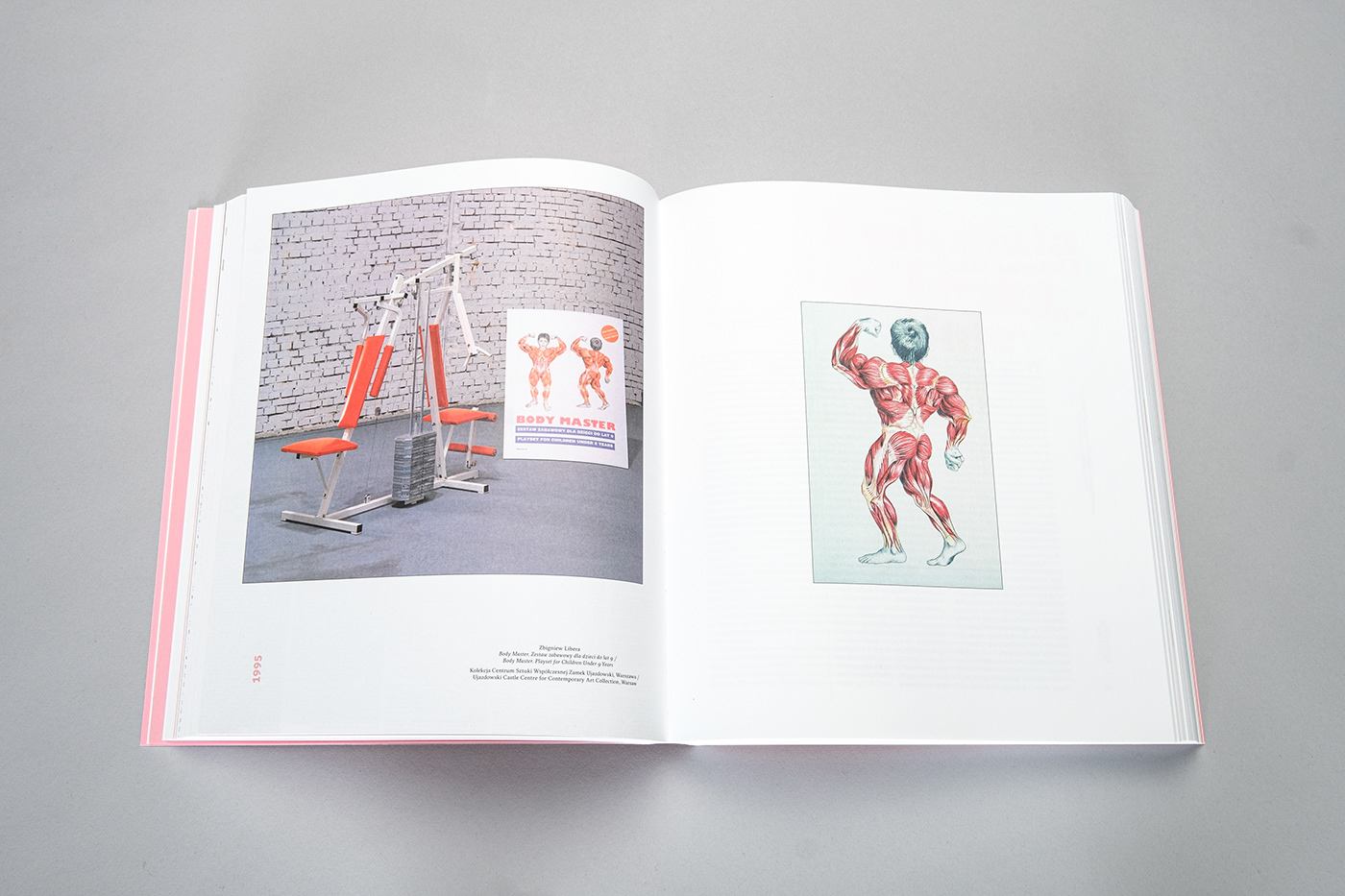
„Art of Liberation” to monumentalny projekt Zbigniewa Libery. Przez 30 lat artysta kolekcjonował polskie i zagraniczne artykuły prasowe dotyczące swojej twórczości, tworząc tym samym archiwum dokumentujące nie tylko ówczesne podejście do polskiej sztuki współczesnej, ale również zmieniający się język krytyki artystycznej.
Docelowo na „Art of Liberation” złożą się trzy tomy, każdy ponad 300-stronicowy.
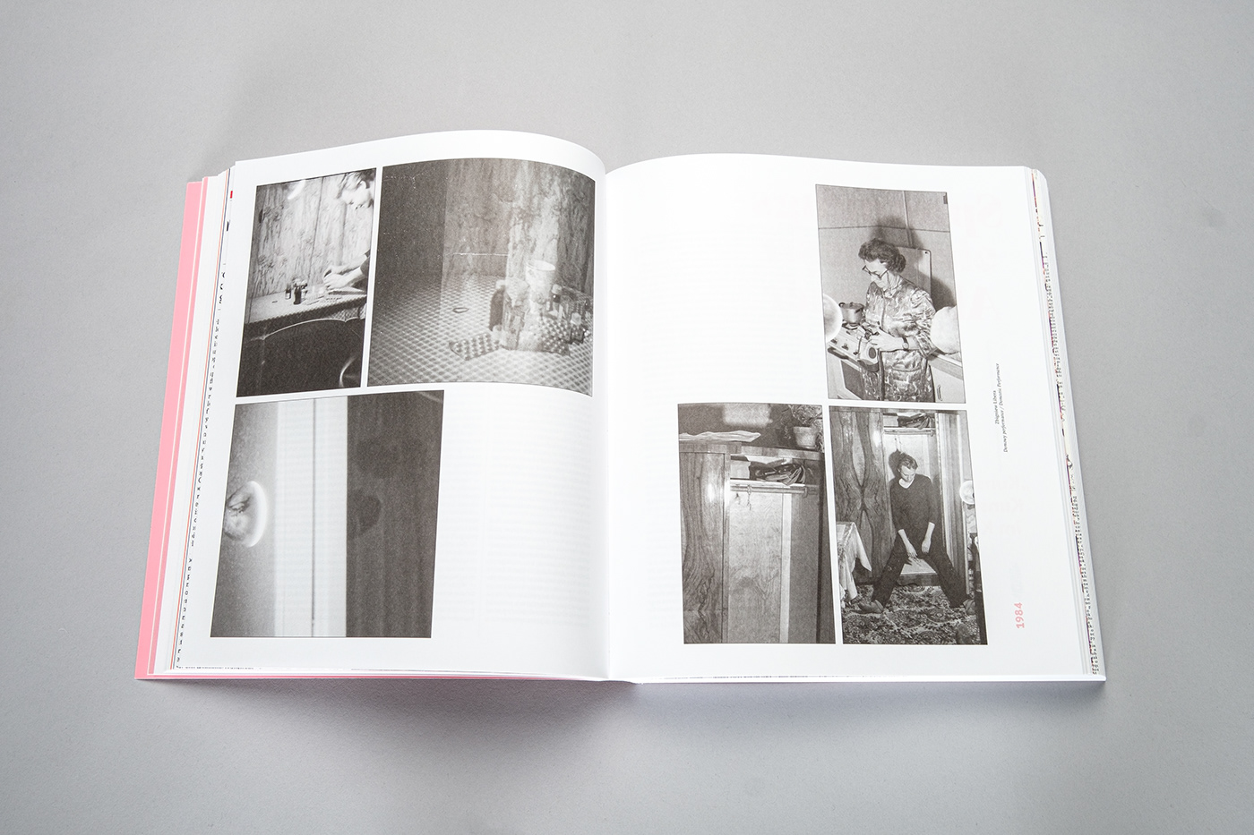
Publikacja zawiera artykuły, liczne reprodukcje materiałów prasowych i prac Libery, a także zdjęcia dokumentujące ówczesne polskie życie artystyczne.
Tom I, obejmujący lata 1988–1997, został wydany w 2019 roku przez CSW Zamek Ujazdowski.
Book design of “Art of Liberation. A Press Study 1988–2018” volume I
“Art of Liberation” is a monumental project by one of the leading Polish contemporary artists, Zbigniew Libera. For 30 years he collected press materials (from Poland and abroad) about his own work. He’s created an archive documenting not only the perception of contemporary Polish art, but also the changing language of Polish art criticism.
“Art of Liberation” is going to be a massive 3-volume publication, each volume of well over 300 pages. It contains articles, reproductions of press materials and Libera’s works, and many photos of art life in Poland.
Volume I, spanning the years 1988–1997, was published in 2019 by the Ujazdowski Castle Centre for Contemporary Art.

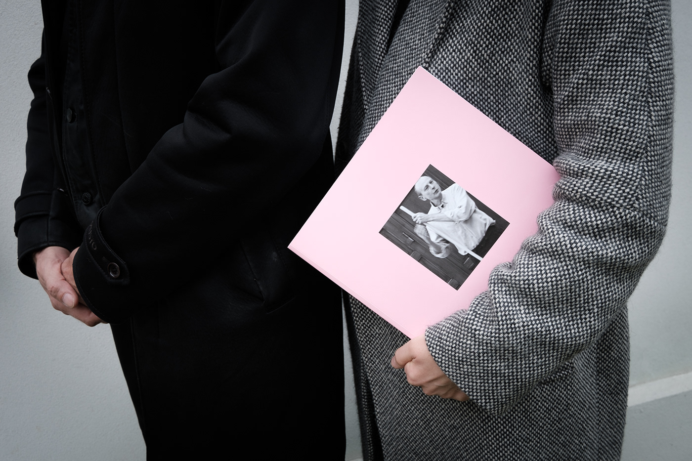
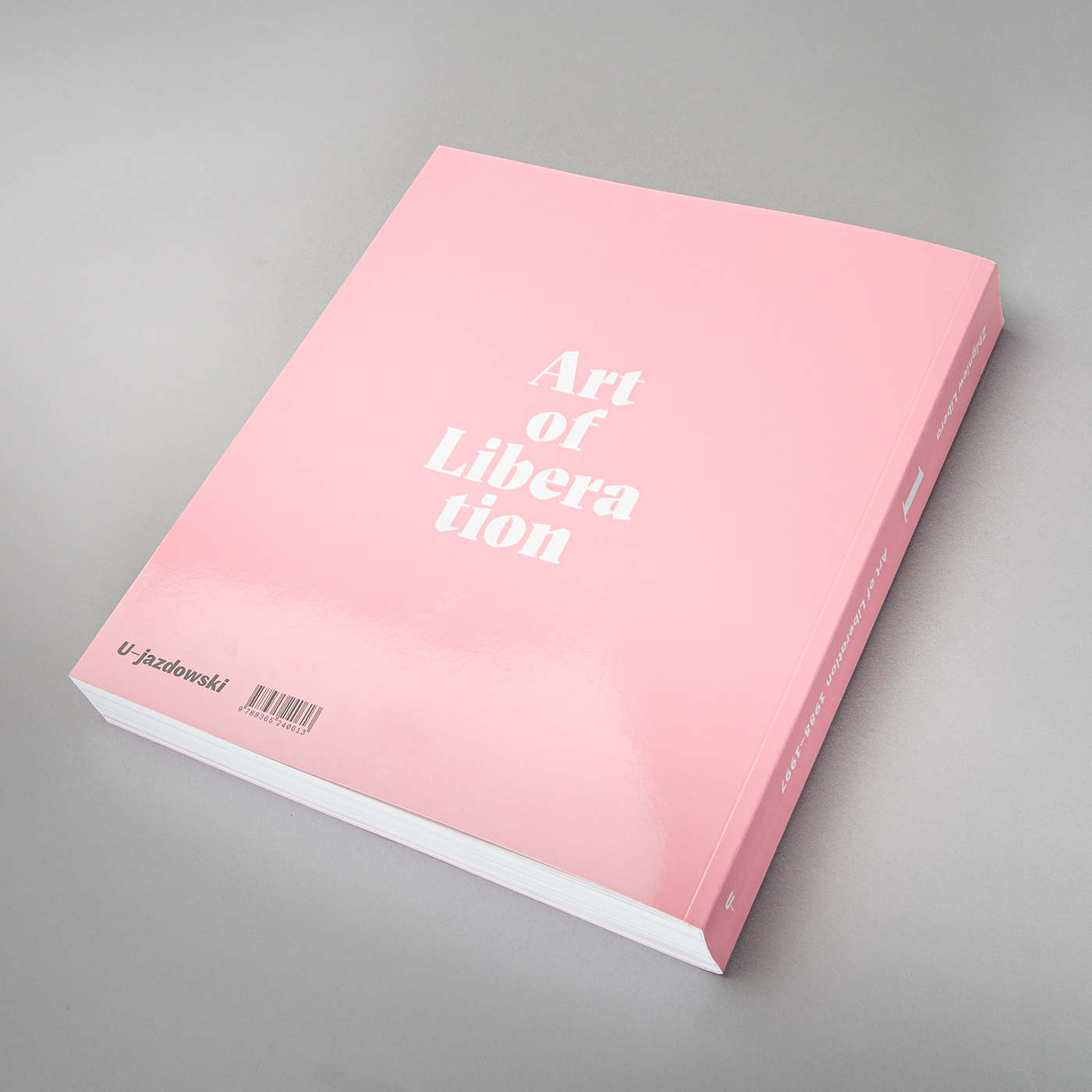
Według słów Zbigniewa Libery w jednym z indiańskich plemion istnieje zwyczaj, że prawo głosu ma osoba, która w danej chwili trzyma laskę. Zdjęcie na okładce przedstawia samego Liberę z laską w dłoni, symbolicznie dając prawo głosu właśnie jemu.
Wiele prac Libery z tego okresu obraca się wokół tematyki gender. Nawiązaniem do tego jest różowa, połyskliwa okładka. Tłoczenie umieszczonego na tylnej okładce tytułu zachęca do dotykania książki.
///
According to Zbigniew Libera there's a tribe with a rule that who holds a stick has a voice. The photo on the cover, depicting Libera himself holding a stick, symbolically makes him a speaker.
Many of his works from this period revolve around the subject of gender. The pink and glossy cover is a reference to that. The title on the back is embossed, inviting you to touch the book.
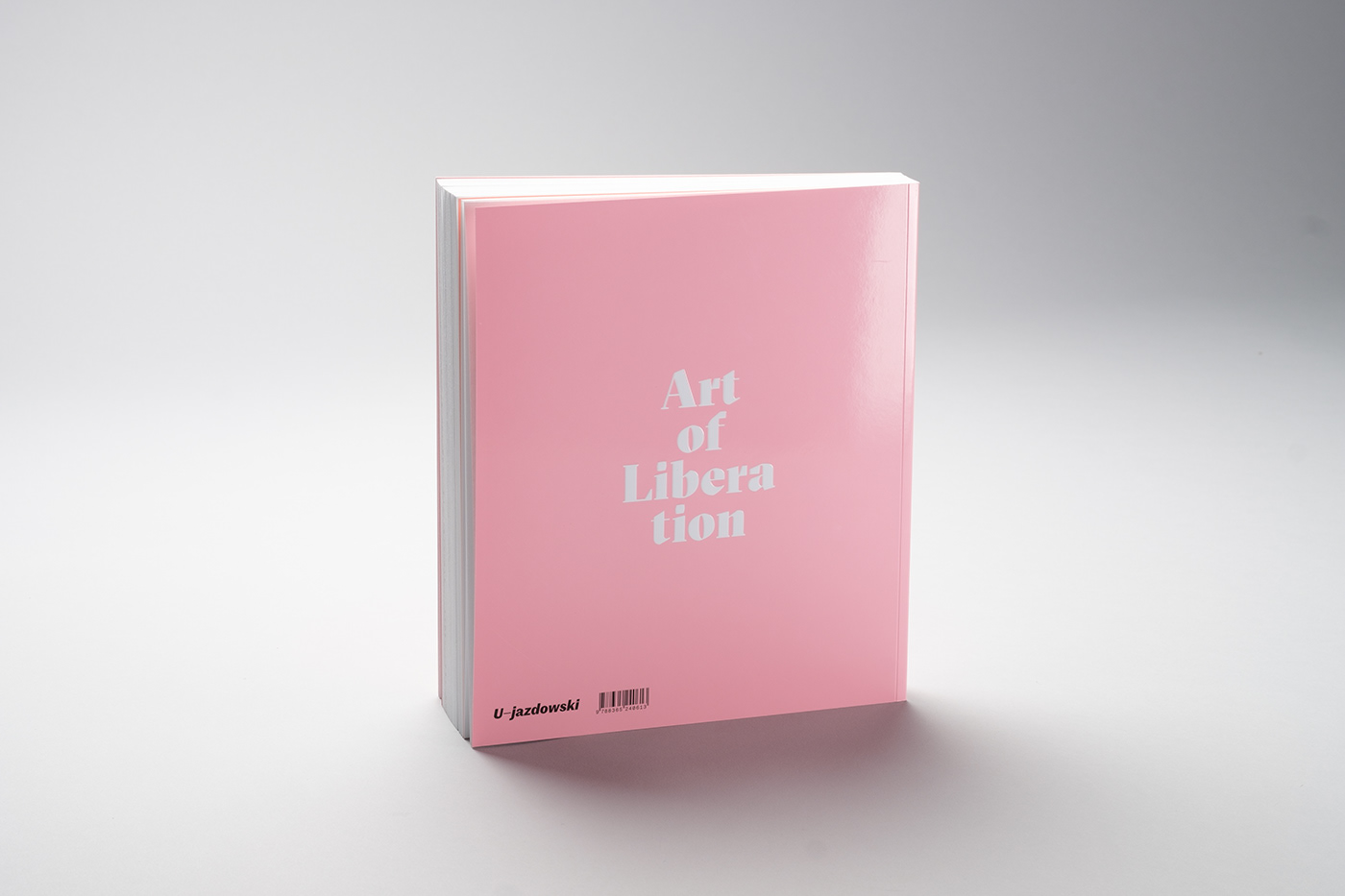
Zestaw kolorów nawiązuje do opisywanego okresu w Polsce – czasu transformacji, pełnego wyzwań, ale też (przede wszystkim) nadziei.
Była to też gra z wizerunkiem samego Libery – długowłosego, zawsze w czerni i z papierosem, trochę niczym gwiazda rocka. Koncepcja okazała się trafiona, Libera skomentował: „Wszystkie publikacje o mnie zawsze są szare lub czarne, takie smętne. Super, że tu jest inaczej”.
///
Through the combination of friendly & energizing colours I also wanted to reflect the atmosphere of this period in Poland – time of changes, with awareness of the challenges ahead, but optimistic in general.
I admit I also wanted to play a bit with the image of Libera himself – always wearing black, always with a cigarette, long hair, with a vibe of an old rock-star. It turned out he liked it. He said: “All the publications about me are either grey or black, so gloomy. It’s great that it’s different.”
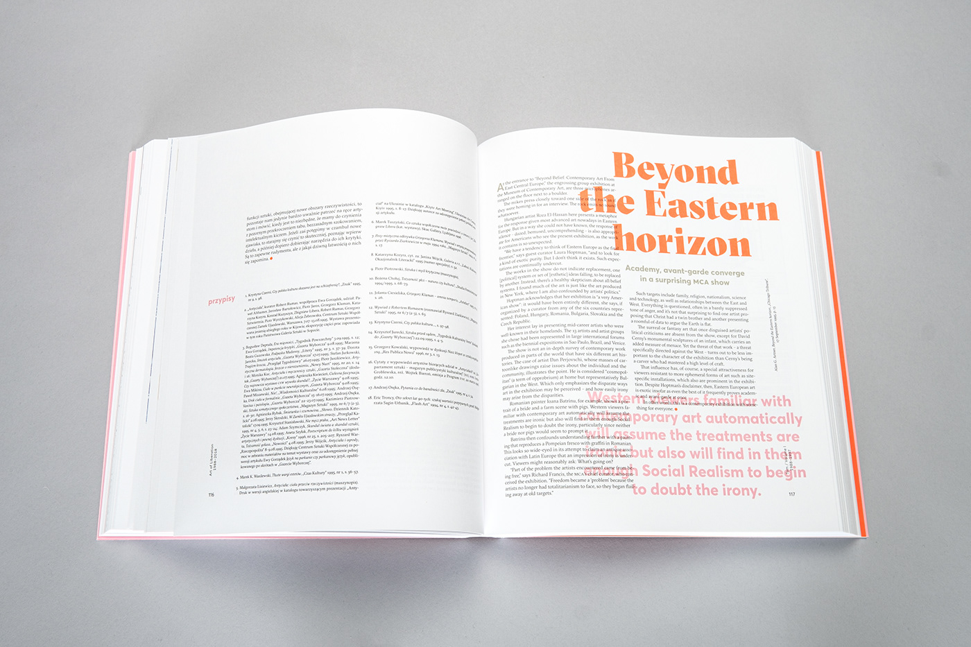
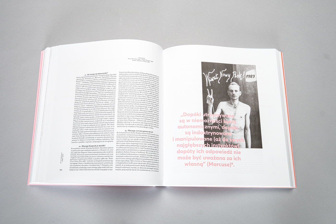
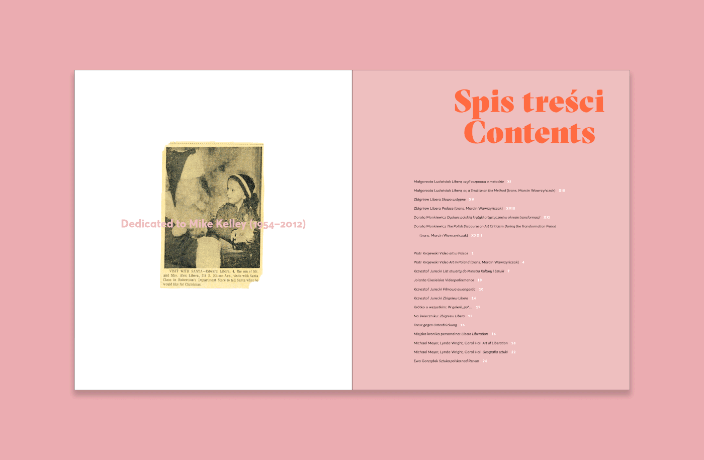
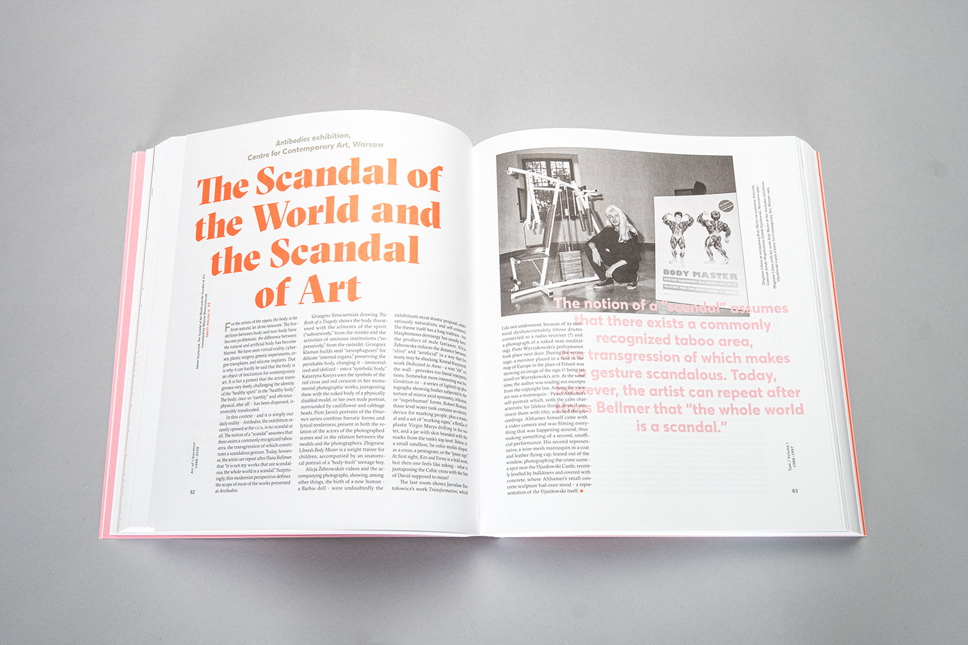
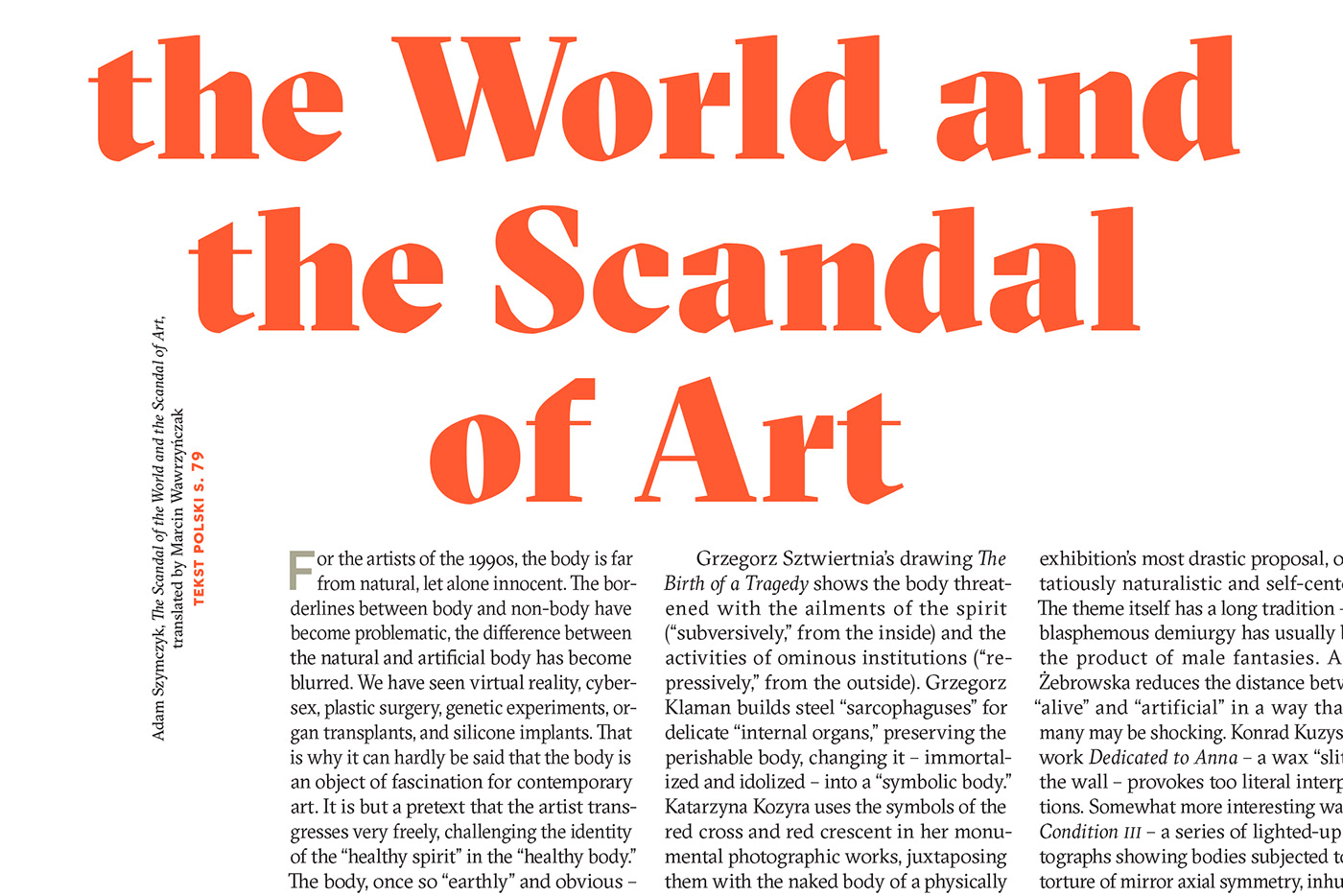
Ponieważ wszystkie teksty były oryginalnie artykułami prasowymi, projekt nawiązuje stylistycznie do gazet: skład jest zwarty, w dwu- lub trzyłamowych kolumnach, każdy artykuł otwiera wpuszczony inicjał, a zamyka duża czerwona kropka.
Publikacja zawiera teksty w kilku językach (m. in. po polsku, angielsku, niemiecku i duńsku) wraz z tłumaczeniami. Wielość znaków diakrytycznych, nawiązania do estetyki prasowej i rozbudowana hierarchia informacji miały wpływ na wybór kroju pisma. GT Sectra ma gazetowy rodowód, rysunek liter pełen charakteru i wszystkie potrzebne diakrytyki.
Krojem towarzyszącym jest Averta.
///
As all the original articles were press materials, the design refers to the newspaper aesthetics: texts are tightly set in either two or three columns, articles start with an initial, a big red dot marks the end of every text.
The publication is multilingual, containing texts in six different languages (plus translations).
The variety of diacritics, press references and an extensive information hierarchy affected the choice of typefaces.
I used GT Sectra, perfect for this project with it’s magazine origin. It’s accompanied by Averta.

Zarówno proporcje strony, jak i layout, zostały wykreślone bazując na geometrii.
///
Both the proportions of the page and the layout are based on geometry.
Gładka, jasna okładka świetnie się sprawdziła jako tło pod autograf Autora.
///
The glossy cover turned out to be a perfect background for the Author’s autograph.


Krótkie video, gdzie Zbigniew Libera przegląda książkę
///
Want to see more pages? Here's a short video of Zbigniew Libera going through the book (in Polish): https://www.youtube.com/watch?v=4rJS-JWJems&feature=youtu.be&fbclid=IwAR3mAskghSjjBxOhl0m_KmoExxgNROluAAHi5qE9Sf8tBtcDIcpr-IT5Ovk
Publikacja została zaprezentowana w roczniku Print Control 8.
///
Featured in Print Control 8 – an annual publication about Polish print design.
Zbigniew Libera
„Art of Liberation. Studium prasoznawcze 1988–2018” tom I / “Art of Liberation. A Press Study 1988–2018” volume I
redakcja / editing: Sylwia Breczko
wydawca / publisher: CSW Zamek Ujazdowski / Ujazdowski Castle Centre for Contemporary Art
zdjęcia książki / photos of the book: Bartosz Górka
format: 240/277 mm
papier / paper: Munken Lynx Rough (środek/inside), Novatech Matt (okładka/cover)
druk / print: offset 5+5
kroje pisma / typefaces: GT Sectra (Marc Kappeler, Dominik Huber, Noël Leu), Averta (Kostas Bartsokas)


