

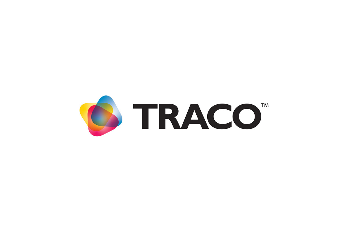
Corporate Logo Versions for Traco Manufacturing, Inc.

Traco Manufacturing, Inc. was started in 1985. They quickly became a leading U.S. manufacturing company and importer of packaging equipment and shrink film products. For the past 35 years they have provided their customers with flexographic and digitally printed shrink sleeve labels and pressure-sensitive labels, packaging equipment and supplies of all varieties. The company operates under a Dba of Traco Packaging for national accounts and Packaging Utah (see Packaging Utah logo) for the State of Utah.
Traco had been using the same logo since nearly their creation, so to say the identity was "stuck in the 80's" was literally true. They felt it was time to bring the company into the 21st century with a new logo and identity that was more congruous with the times, and I was assigned to conceptualize and design the new logo and identity.
The company's owner and CEO, John Palica, was extremely excited to have the new logo done, and since its introduction, sales have steadily increased due to exposure through multiple marketing channels including social media. The company exceeded its goal in revenue for the year with shipping figures reaching well over $26 million.
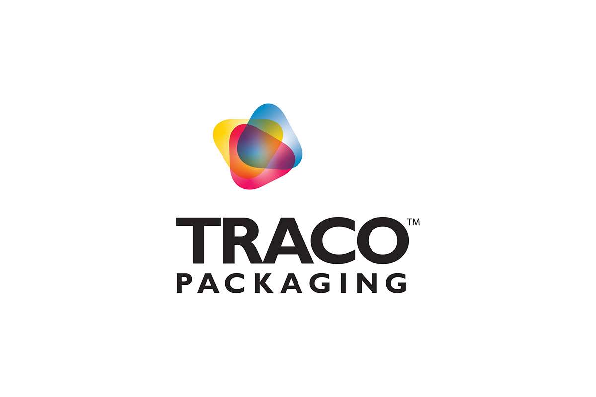
Traco Packaging National Accounts Business Logos

Single color version

Because the main product business has to do with flexible packaging printing, the idea was to reinforce that image. There are many logos that exist that have to do with the printing process, usually in the form or representation of something, sometimes literal, that reminds the viewer of that process. This almost always includes the use of the colors cyan, magenta, yellow, and black, since those are the colors of the ink used on printing presses.
Since many of these printing "symbols" have become overused, I didn't want the logo to be just another iteration of the same. I decided to look at the flexographic printing process itself as the inspiration for the design. Many may not know this, but the process involves printing on clear or opaque plastic film, and the film wraps around rollers in different locations as it is printed, often forming shapes if you were to look at the press from the side. I took a slight variation of CMYK colors and created the shapes that suggest the rollers and flexographic process. To become more than a simple CMYK representation (you get all other colors from these basic colors), I overlapped them to show the complex colors that result from blending CMYK in the printing process. Then I took the newly created symbol and paired it with a modern, clean typeface, Gill Sans, with just the word 'Traco' that represented the corporate manufacturing business. It resulted in a fresh, new look for the company that I later applied to the corporate identity and then the packaging part of the business, Traco Packaging.


