Project: Nobel Hygiene - Dot Period
Date: November 2018
Context:
- Most sanitary pad brands take a subtle approach when it comes to depicting periods in their communication and the tonality with which they talk about menstruation.
Some, like Whisper, even unwittingly enforce the ‘hush-hush’ nature.
- Blue is the popular choice to not only show the period but in the brands’ logo as well.
- All in all, periods are portrayed as undesirable, messy, uncomfortable and as something that holds a woman back.
Objective: To come up with a bold new brand and identity that talks about women's periods, especially those with heavy flow/PCOD.
Approach:
A non-commoditized factory line approach that went the extra mile to be relateable and really talk to women.
A brand that conveys potential, not hindrance.
A brand that is understanding, not withstanding.
A brand that shows promise, not compromise.

The logo and name:
- Unlike the cursive, flowery, calligraphic approach of brands in the sanitary napkin category, we chose a simpler, stronger and a 'to-the-point and let's not mince words' approach.
- The red dot represented the period, that stands out against a monochrome backdrop.
- The name dot period was calling it out, not beating it around the bush.
- Additionally, the dot was placed before the word so as to challenge the 'period coming at the end of a sentence' mindset.
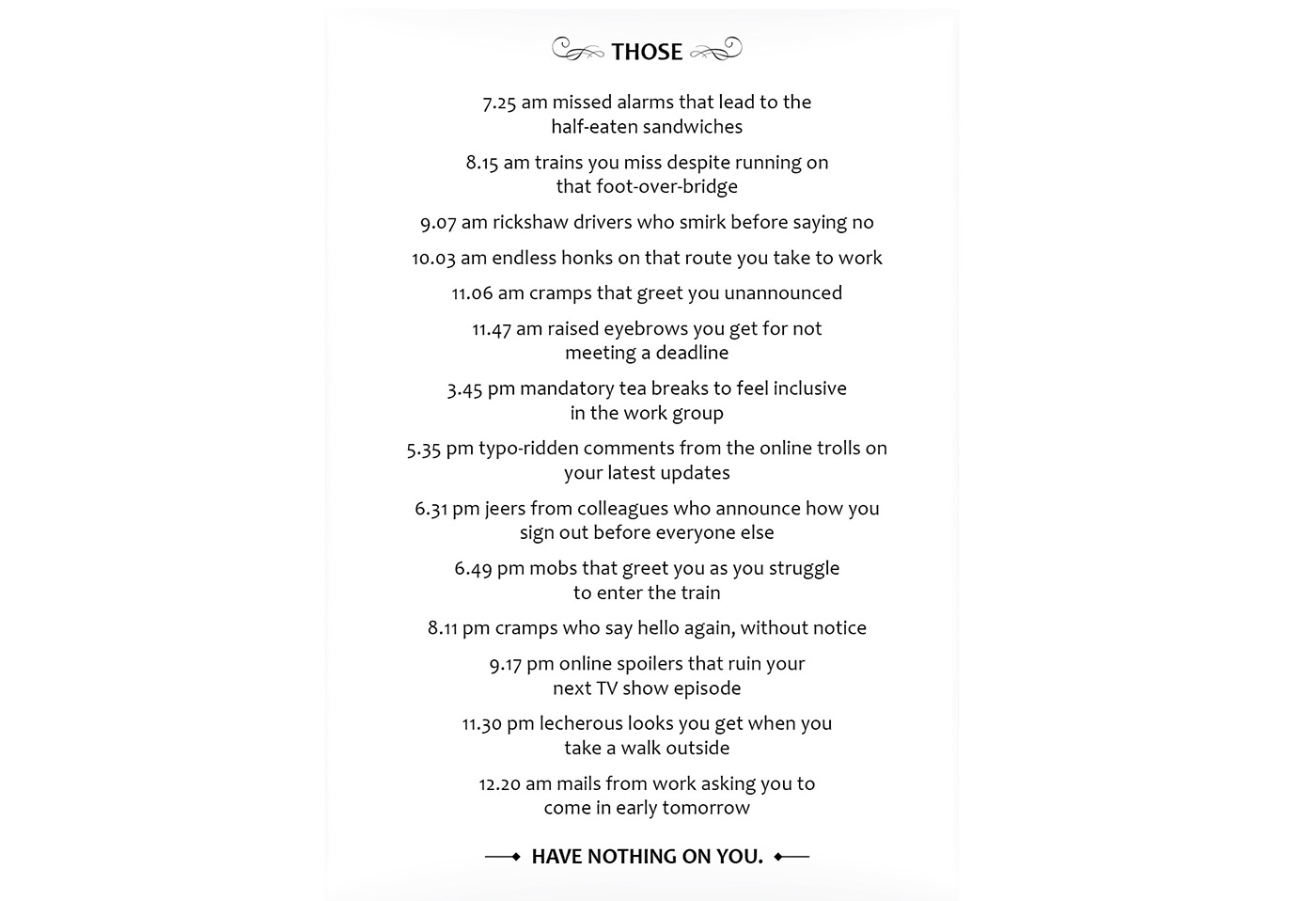
The Dot Period manifesto salutes the everyday woman.

Simple, minimal package design, with the brand's manifesto on the reverse side
and the instructions and product details on the sides.

Statements that grace the product packaging and convey the attitude and mindset reflective of the women the brand talks to and represents.


