


XAMAN
La figura del chamán evoca misticismo. Es leyenda y misterio. Al mismo tiempo, es un ícono inconfundible de nuestro imaginario colectivo. Esta esencia mágica la capturamos en Xaman, una cerveza artesanal mexicana que vive entre la elegancia de su sabor y lo artesanal de su proceso.
Con la mente puesta en una figura chamánica situada en el norte de México, creamos una paleta de colores cálidos que recuerdan el paisaje del desierto. Las texturas y patrones diseñados para la marca conservan rasgos textiles, los cuales funcionan como una abstracción de la indumentaria artesanal de nuestro Xaman. Con esto buscamos reflejar una parte de la identidad mexicana evitando los lugares más comunes.
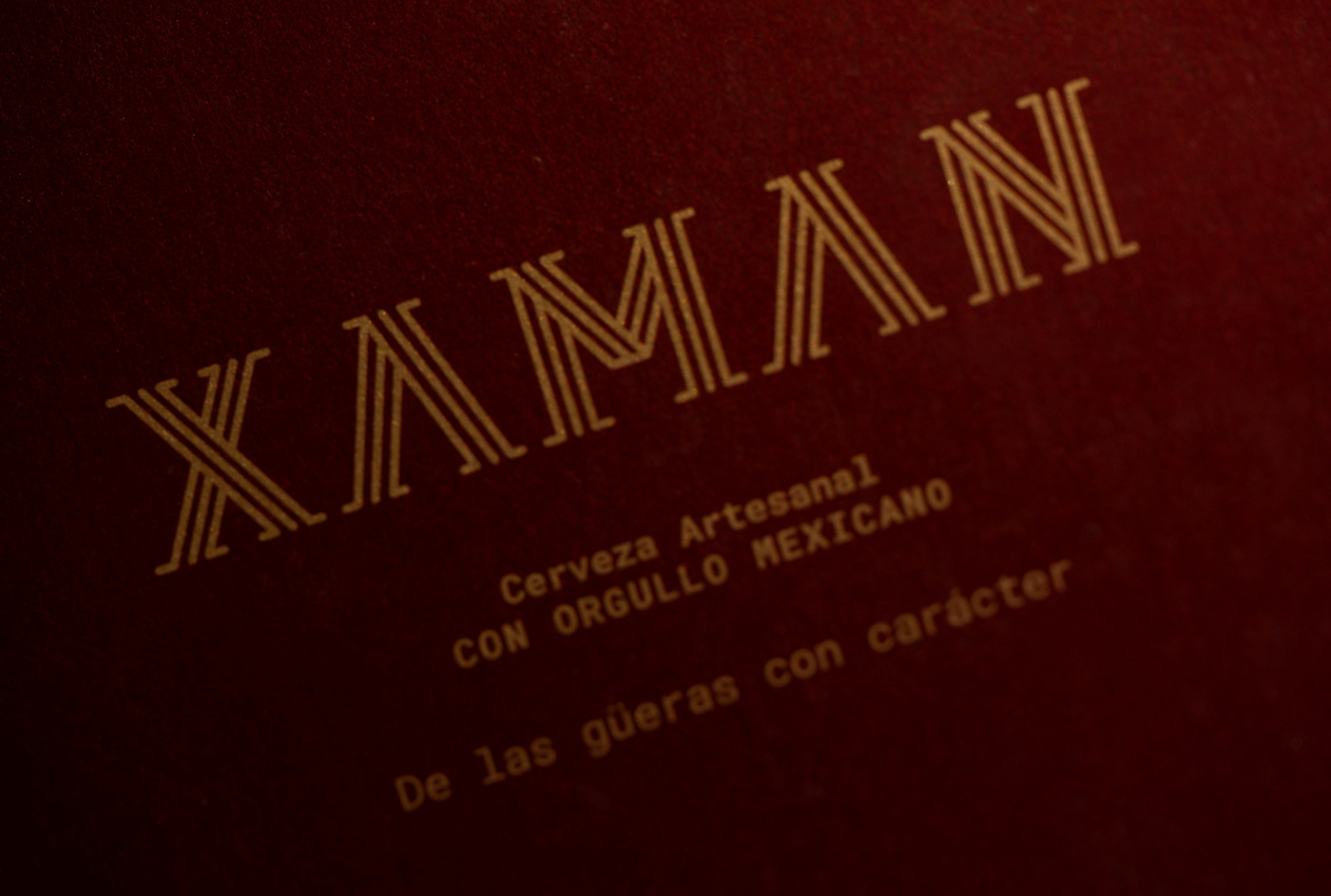
El logotipo tiene cualidades autóctonas. La tipografía, creada también por Estudio Manila, está inspirada en los grabados que decoran las ciudades precolombinas y en una investigación sobre el arte prehispánico. La representación del chamán -ligeramente amorfa, con un rostro de rasgos típicamente mexicanos y un brebaje alzado en sentido de admiración- combina elementos simbólicos y estéticos que reafirman la personalidad de marca al tiempo que balancean la composición.
A esta concepción gráfica se suma una noción moderna de elegancia. Líneas angulares y limpias funcionan como contrapeso a la inspiración artesanal para dar pulcritud y fineza a toda la identidad.
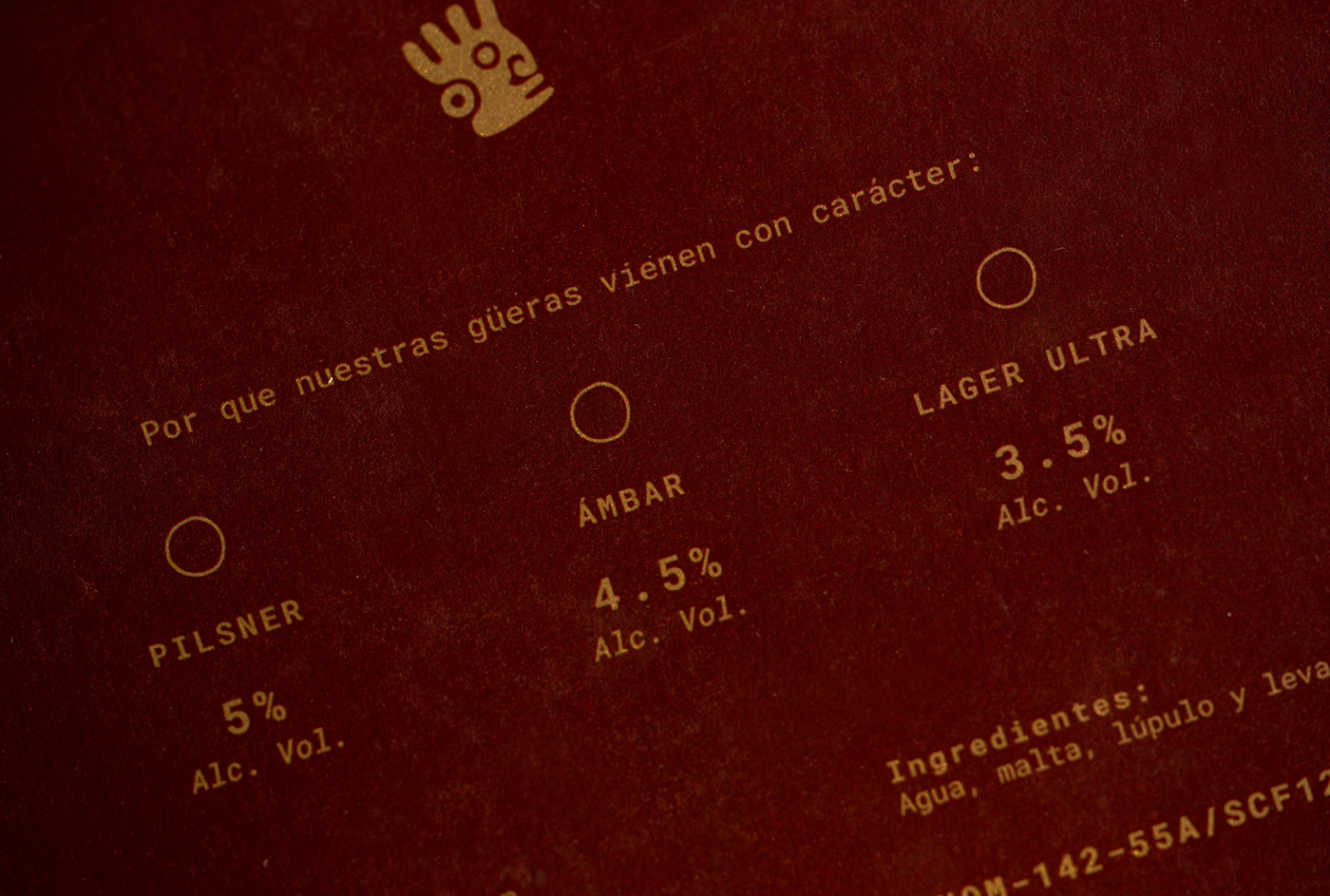
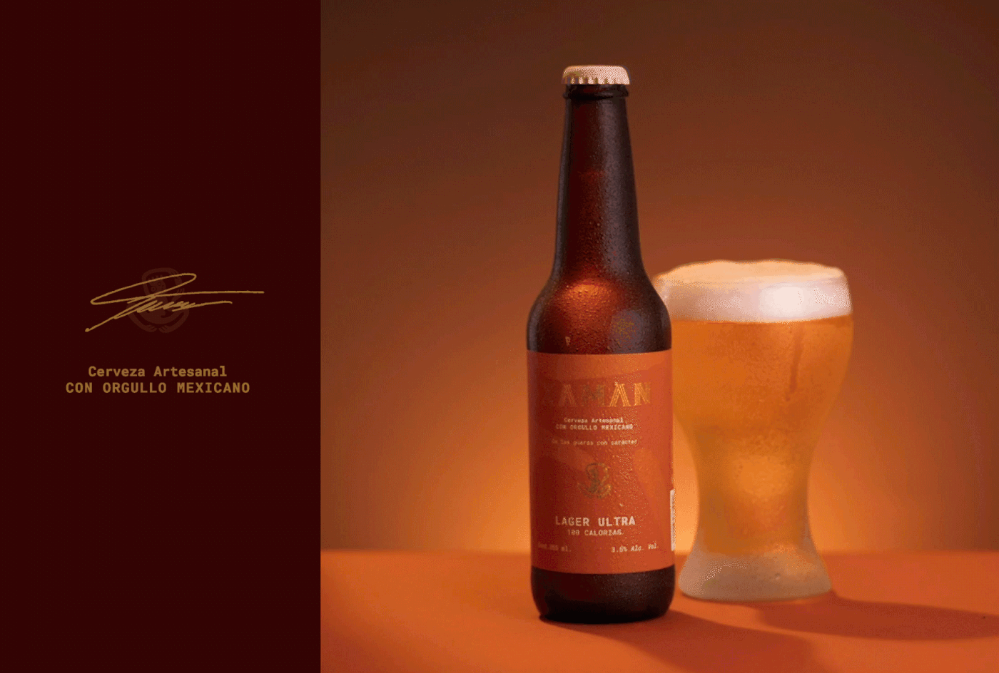
Características similares se aplicaron a las etiquetas, cada una con un color propio para diferenciar entre los tres diferentes tipos de cerveza. Además, se decoraron con abstracciones particulares de la figura del chamán. A su vez, se diseñó un empaque que pudiera utilizarse con cualquiera de las botellas, impreso a una sola tinta, para hacerlo más ecológico.
El chamán también está representado en la papelería corporativa y las corcholatas de cada botella. Con esto, se completa una identidad gráfica consistente en todas sus manifestaciones.
Cerveza Artesanal Mexicana


XAMAN
The figure of a shaman evokes mysticism. It means legend and mystery. At the same time, it is an unmistakable icon of our collective imaginary. We capture this magical essence in Xaman, a mexican craft beer that lives between the elegance of it’s flavour and the handmade qualities of its process.
With our mind set on a shamanic figure located in northern Mexico, we created a palette of warm colors that reminds of the desert landscape. The textures and patterns designed for the brand have textile features, which work as an abstraction of our shaman's handmade clothing. Thus, we seek to reflect a part of Mexican identity avoiding the most common places.
The logo has also native qualities. The typography, created too by Estudio Manila, is inspired by the engravings that decorate pre-Columbian cities and research on pre-Hispanic art. The representation of the shaman -slightly amorphous, with a face of typically Mexican features and a concoction raised in a sign of admiration- combines symbolic and aesthetic elements that reaffirm the brand’s personality while they balance the composition.
To this graphic conception we added a modern notion of elegance. Angular and clean lines work as a counterweight to the artisanal inspiration, providing neatness and finesse to the entire identity.
Similar characteristics were applied to the labels, each with its own color to differentiate between the three different types of beer. In addition, they were decorated with particular abstractions of the shaman’s depiction. In turn, a standard package was designed and printed in a single ink to make it more environmentally friendly.
The shaman is also represented in the corporate stationery and the bottle caps of each bottle. This completes a graphic identity that’s consistent across all its manifestations.
Mexican Craft Beer


