
Kraving Kitchens
Branding & Packaging
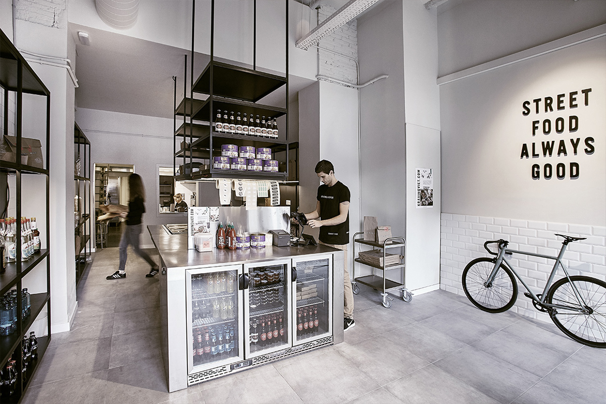
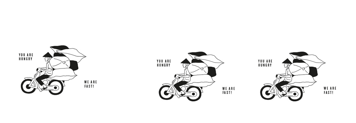
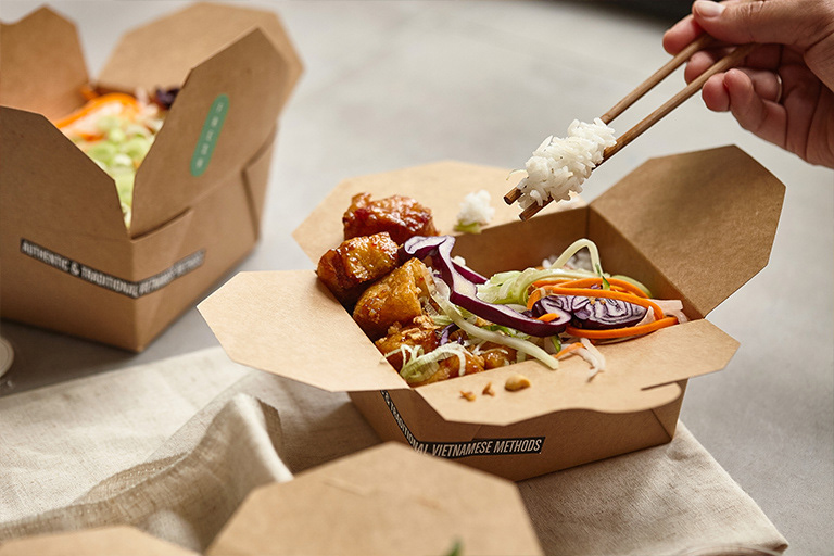
Kraving Kitchens is a food-delivery startup, a "ghost kitchen” specialized in offering fast-casual food on demand from around the world with independent virtual restaurants. All their dishes are being cooked inspired in the traditional methods of each cuisine. As a brand, is very strongly committed to sustainability and ecology. Wherever possible, Kraving Kitchens minimises food waste and residuals by employing slow cooking methods so as to make the most of the ingredients, and by using recycled and biodegradable packaging materials, thereby eliminating plastic. We use green fibre cardboard and PLA bioplastic for all our packaging components.
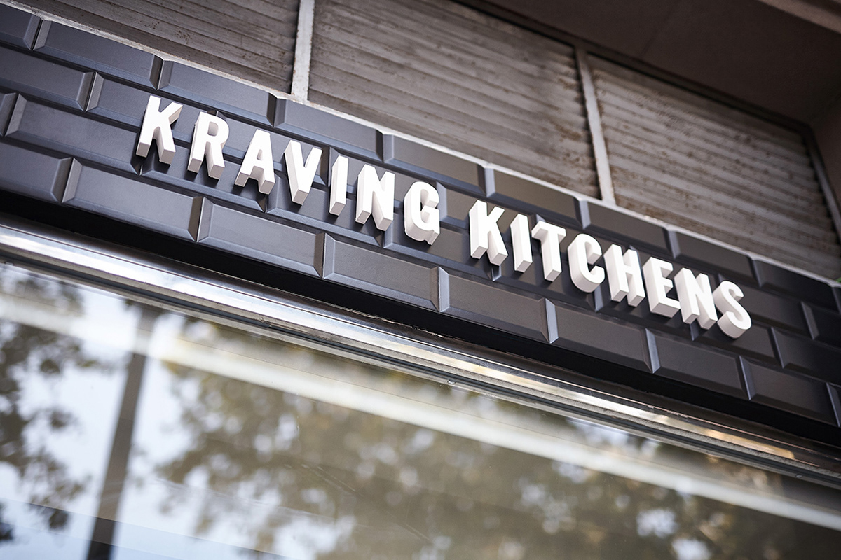
We have designed a neutral brand logotype for the Kraving Kitchens group, unadorned so as to leave space for sub-brands and comfortably coexist with them.


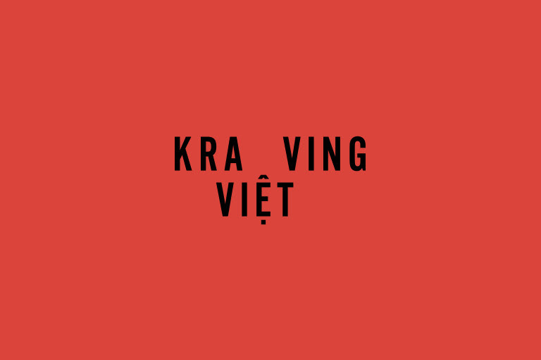
Kraving Viet is the first sub-brand, offering Vietnamese cuisine. The concept and design are inspired by the chaos and disorder of Vietnam’s streets; a jumble of tastes, scents and colours, merged in a vivid scheme of stickers and stamps of varying sizes. The illustrations and messages describe the food, the country and its traditions. Stickers and stamps are applied randomly, so each package is unique.

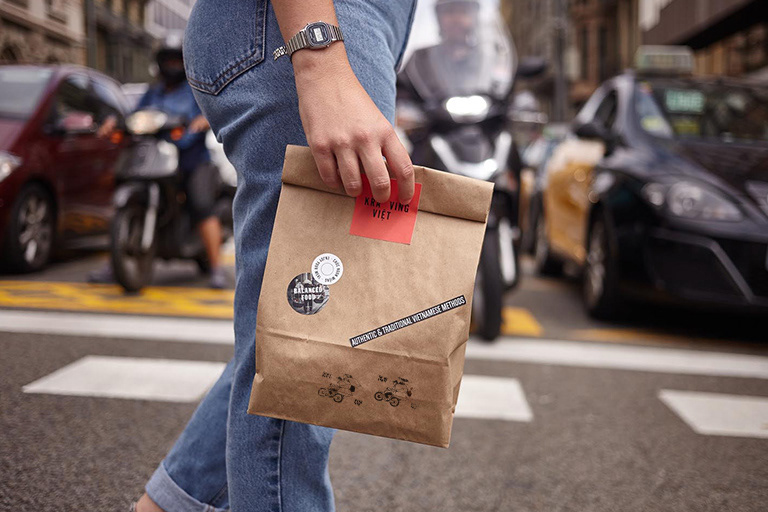
The graphic design is compiled by hand, respecting and emphasising the concept of the brand—it is not intrusive.


Kraving Med takes its name from the Mediterranean, the project’s second sub-brand. The visual concept is based on sensations kindled by the geographical context, poeticizing idyllic times, transporting us towards Mediterranean cuisine.
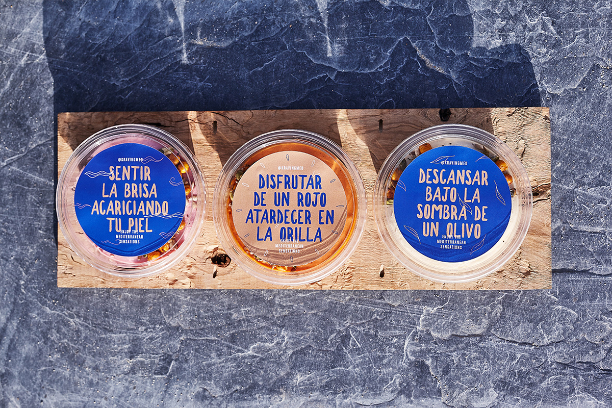


Here, we have an organic logotype; delicate forms highlighting the message and colours of Mediterranean inspiration are combined on the different adhesives applied randomly to the packaging.


