A Coffee Shop is more than just a fancy array of drinks.
You don’t build a hospital for surgery equipment. you don’t build a theatre for film strips, and you don’t build a restaurant for a sandwich.
Now that we’ve established that, Let’s look at the audience.
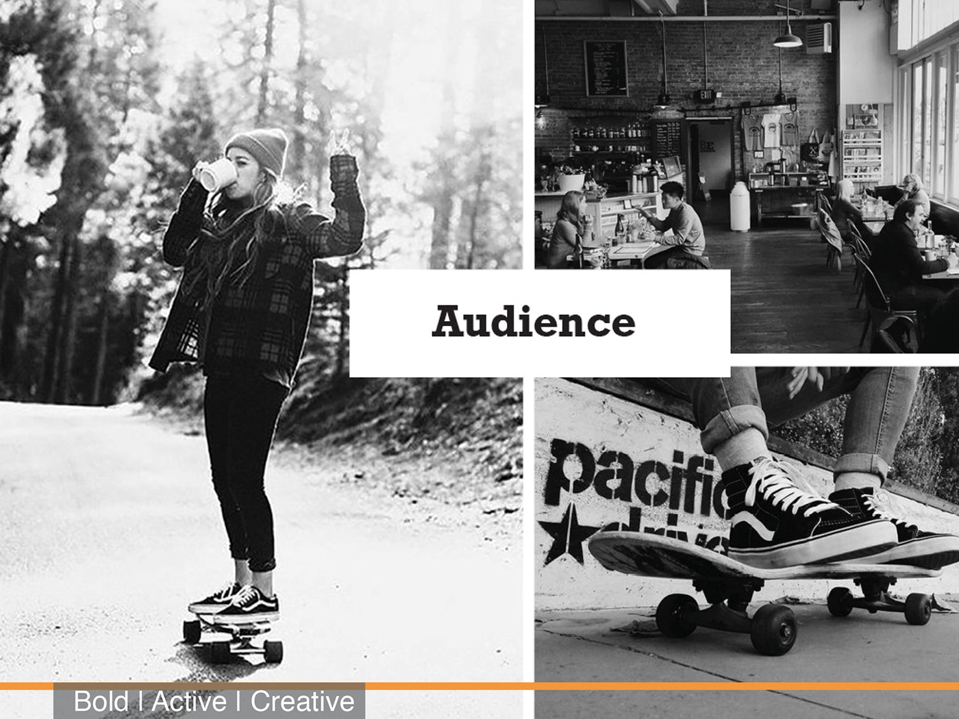
Now, a good coffee shop is a reflection of its community, and Community surrounding our shop is quite diverse. We’re located in the middle of Johnson County’s Suburbs, within driving distance of multiple big-name retailers. walking distance of a private school, a couple temples, and a Swarner Park, home of the Swarner skate park. Our nearest competition, a 8 minute drive away, is a McDonalds. Which is too far to skate.
That being said, we decided to focus in on the skating crowd. Which is perfect because the skate scene is not only the most prominent here, but also because the owner grew up in the bowl, and still mentors the younglings at the park.

To Best understand the Skater community, 3 different brand attributes were chosen. Each had to equally represent both skating and coffee as a whole, and of the 3, one was chosen as the primary. The 3 attributes are Active, Creative, and the primary; Bold.

Contact cards. These will be for the baristas and shop owners to pass out to their customers. These are personal, from the choice of brand color, and personal skate photo on the back, and of course the contact information, they change from barista to barista.
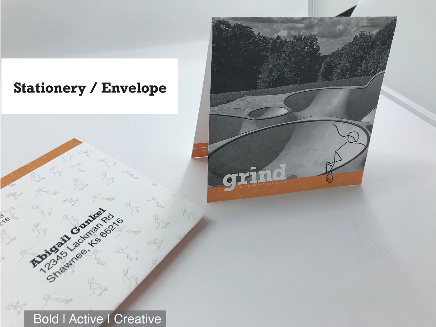
The stationery.
With the same photo treatment and color system as the business cards, it’s fun to look at. It also has a unique shape, folding into a square. This is to creatively and boldly stand out against all the other business mail.

Envelope - To go with the Stationery, is the Envelope. It also has bright colors and bold type and pattern use to stand out against all other business mail. Actively inviting all who receives this letter to be excited about our creative and bold communication system.

Print Advertisement - This magazine add would be placed in local magazines.
Such as Ink-a trendy Kc restaurant magazine, and 435-a local foods and activity magazines. It’s styled to show off both our bold photo styling, and also our creative and active color scheme.

Now our phone app.
The loading screen is as shown. The semi-crescent has the dashes rotating throughout the shape, this is to both emulate a skateboard skating around the bowl, and coffee beans being ground in a coffee grinder. After the app loads we have a menu screen to see our offerings, from there you can order your drink, and for fun; we have a skater showcase blog screen. This is where we can interview some of our regulars from the skate park, to talk about their favorite trick and drink.

This billboard would be placed around the joco area, particularly on i435. Because of the audience, it showcases coffee over skating but with the same photo styling and color scheme. It’s clean and easy to read so people driving can read quickly.

This Pedestrian focused ad is to advertise to the skaters currently at the park. The goal is to raise awareness about the shop across the street, without being too formal -which might deterring the audience.

A coffee shop is much more than just a fancy array of drinks, it’s the community surrounding it, and it’s the people in it.
Always stay as Bold, Active and Creative.


