Cinesa — Cornie's
Established in 1944, with more than 40 movie theaters and 22 million spectators, Cinesa is Spain’s leading company dedicated to cinematographic exhibition. They commissioned us to design the visual identity for Cornie’s, the new brand meant to reposition their popcorn.
For the development of this project, we partnered with the graphic design studio Familia.
Brand Identity
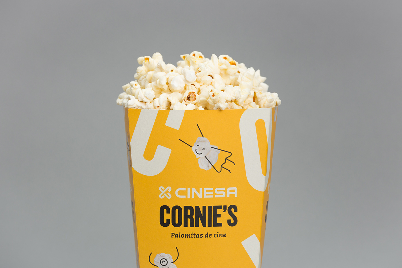
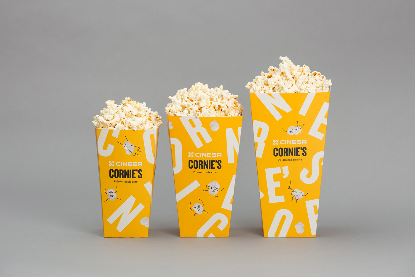
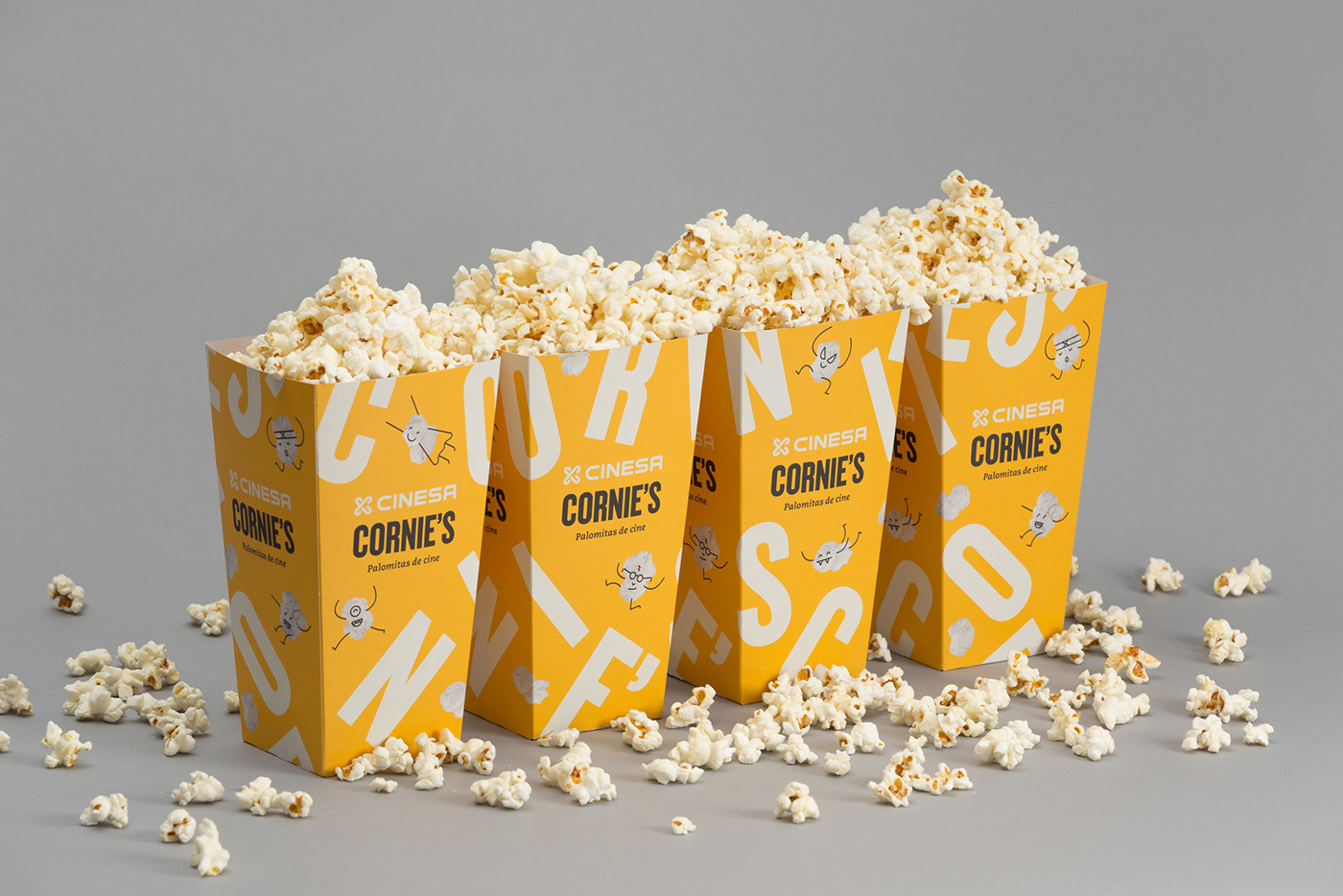
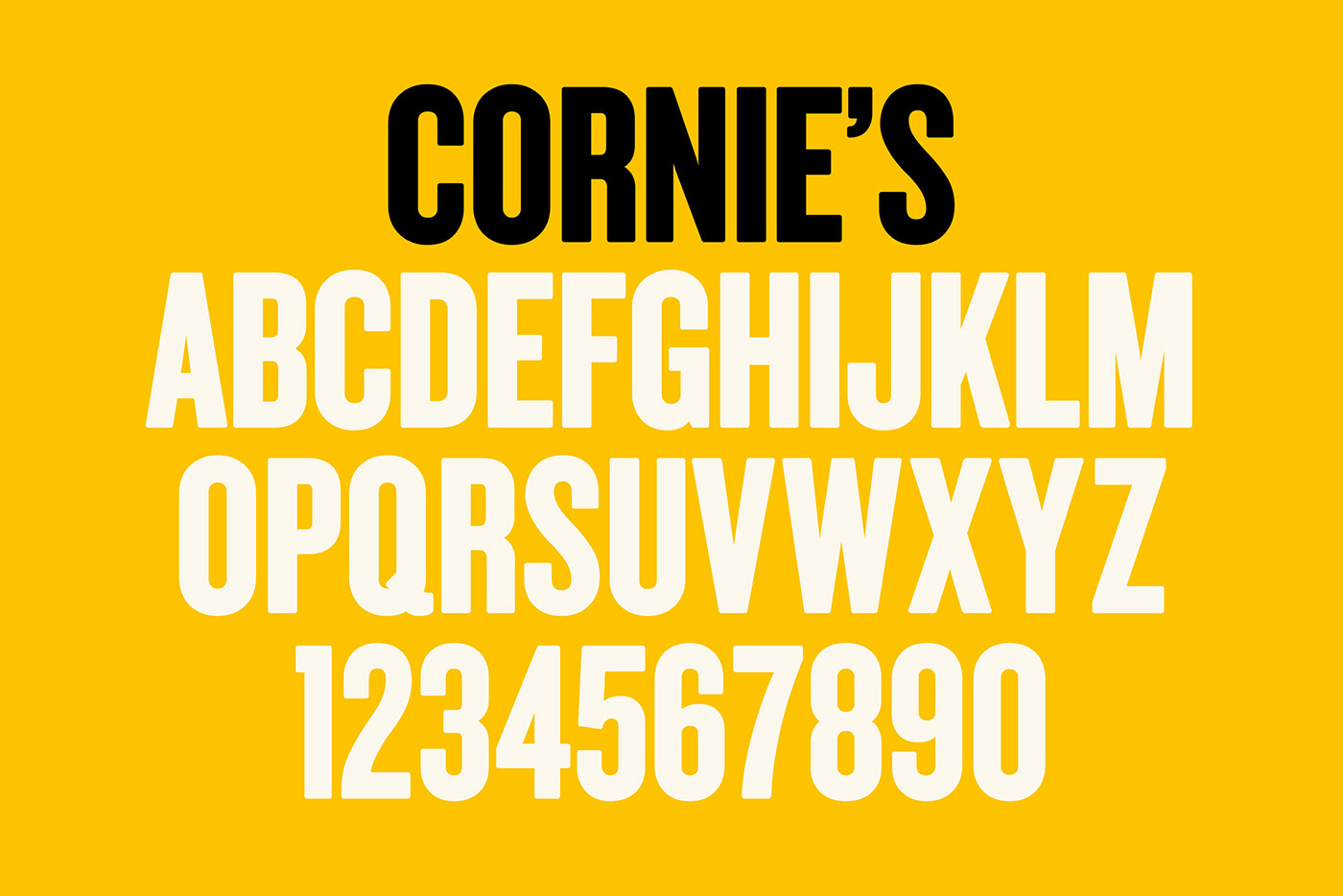
The typographic approach evokes classic movie posters and credits. By giving it a slightly bolder and rounded finish, we also made it more eye-catching and popcorn-like.
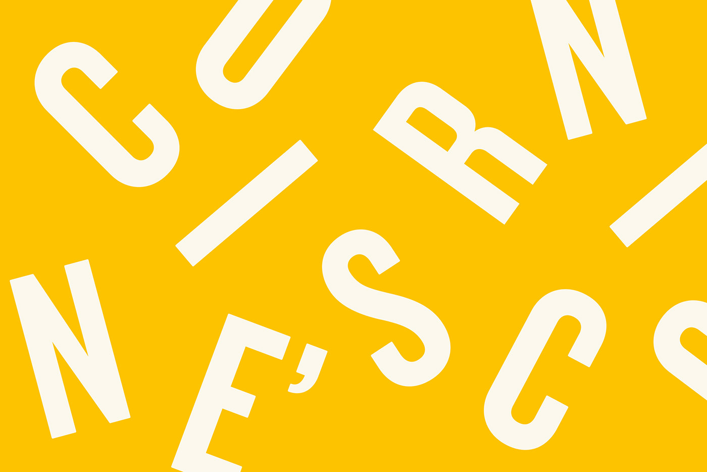
This typography is used both to create the logotypes and a pattern inspired in the ‘pop’ moment, when de kernel become popcorn.


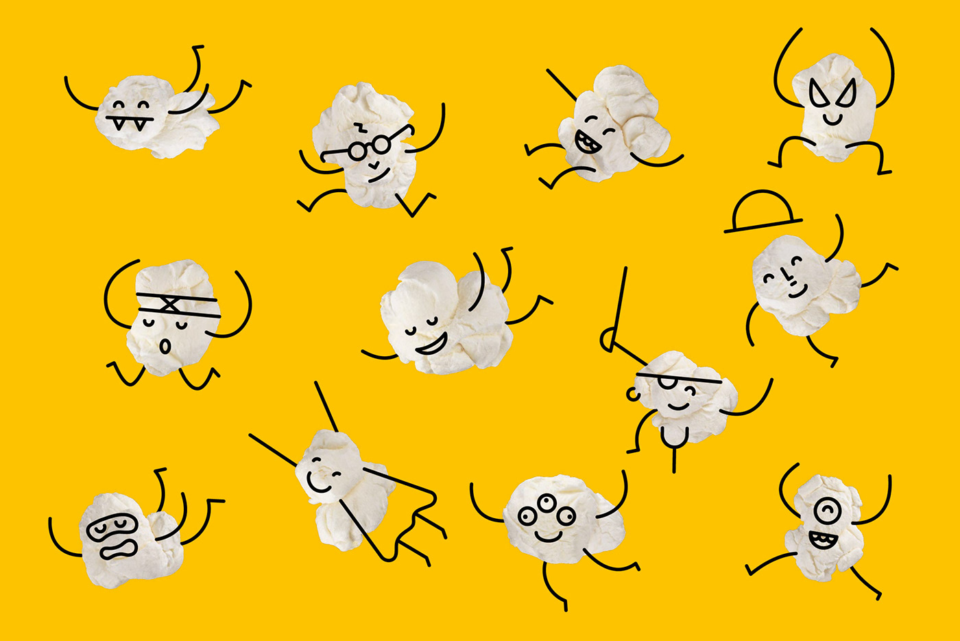
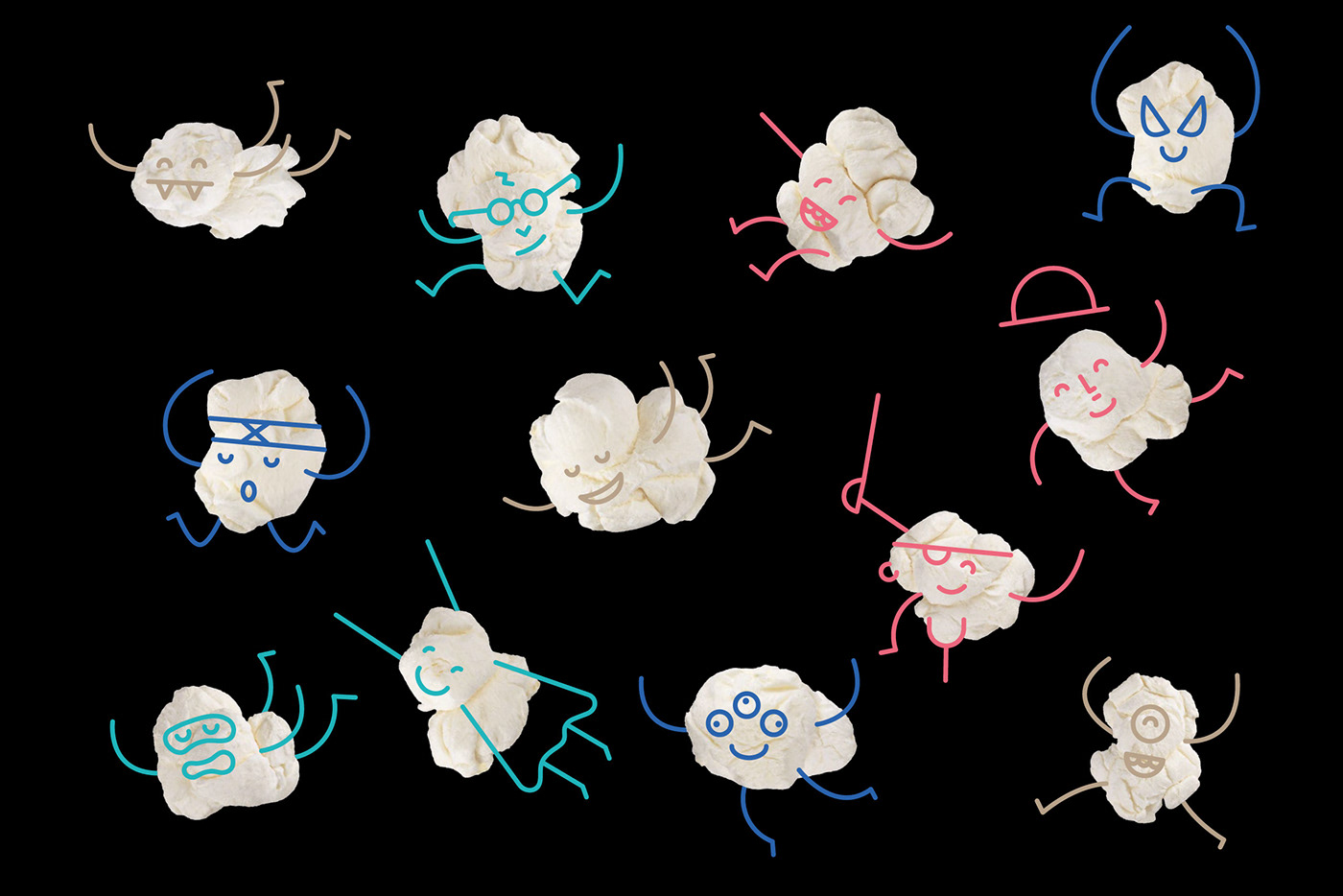
Characters
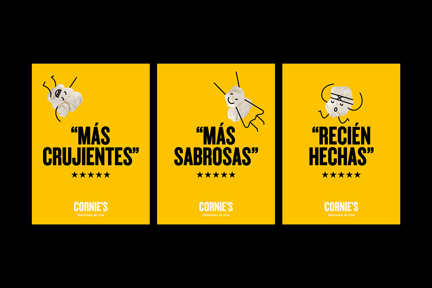
‘Fun’ is an important communication element for Cornie’s. We designed a set of popcorn characters, some of them related to movie icons and stereotypes. These characters, combined with the popping typography, help to set the tone of the brand.

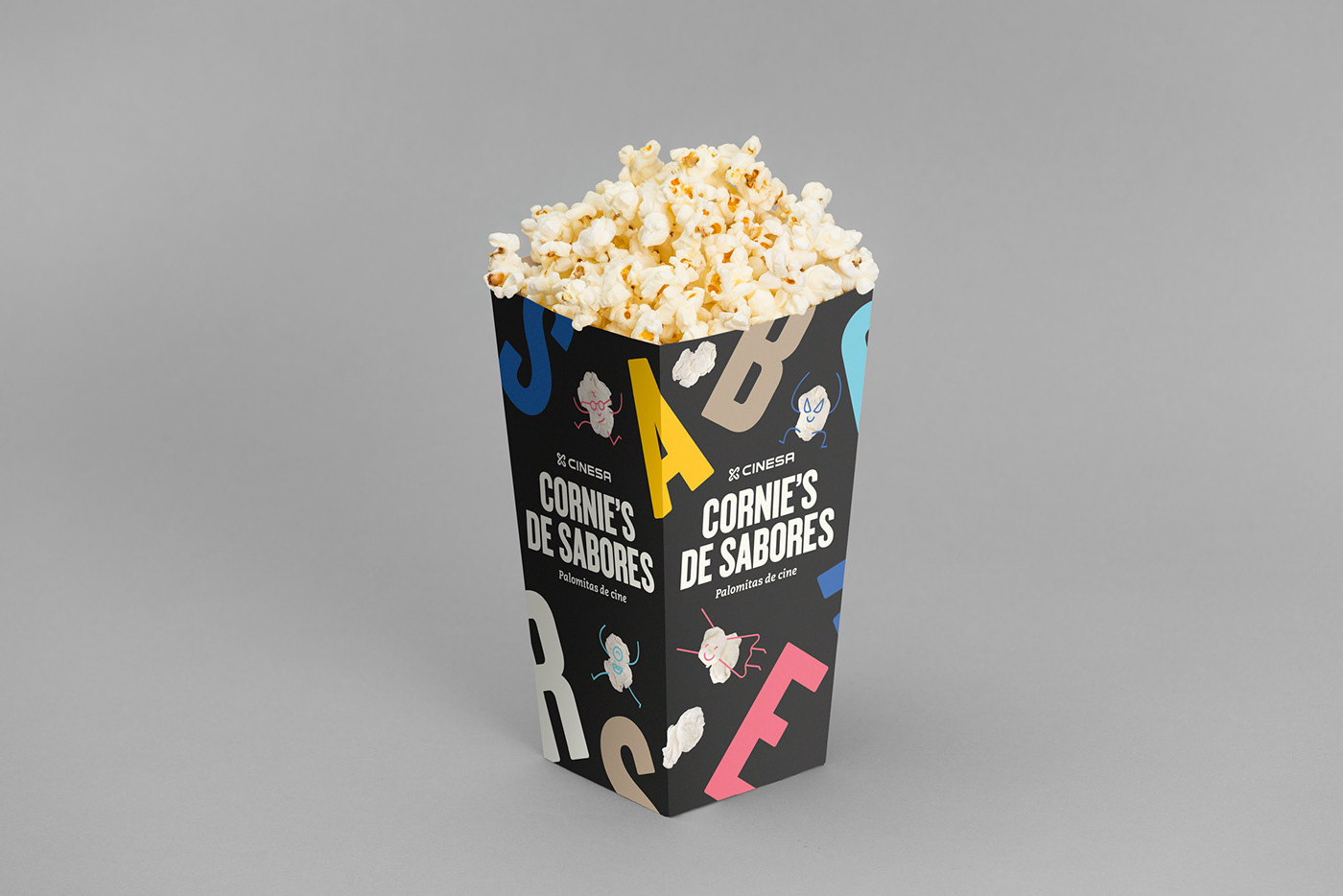
Cornie’s de sabores
We were also commissioned to design the sub-brand Cornie’s de sabores (Flavoured Cornie’s), which had experimental options such as coconut, cinnamon, salted caramel, belgian chocolate or goat cheese.
Cornie’s Launch Campaign
To introduce their new brand, we designed some communication pieces, all of them playing with cinema clichés with a fun approach.