


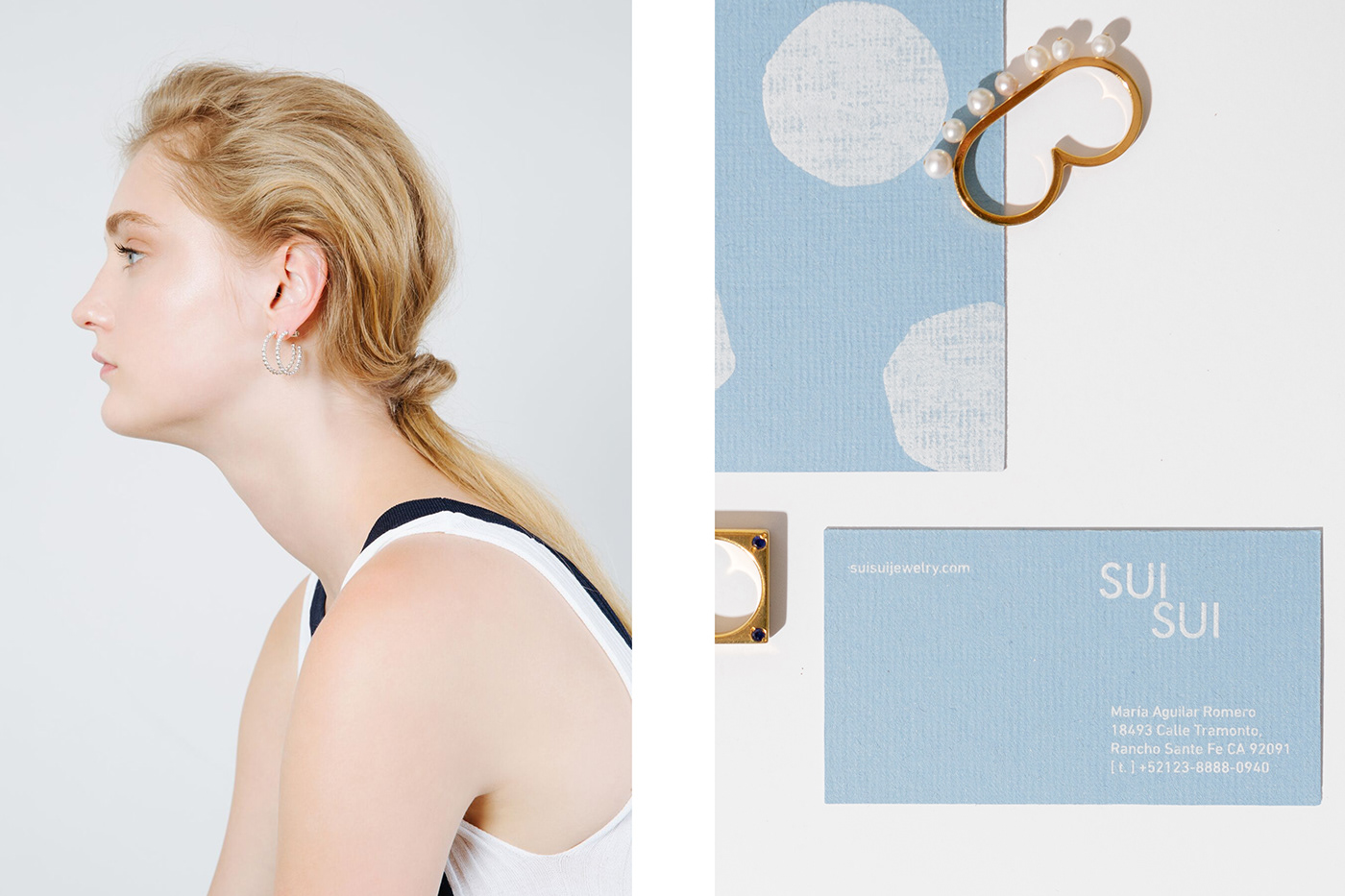


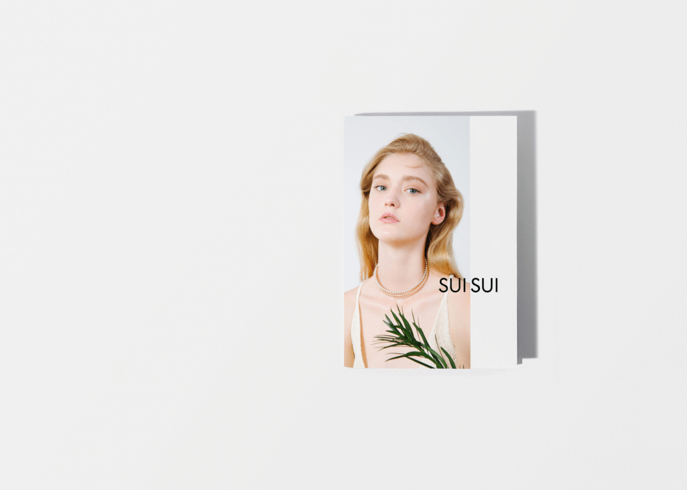


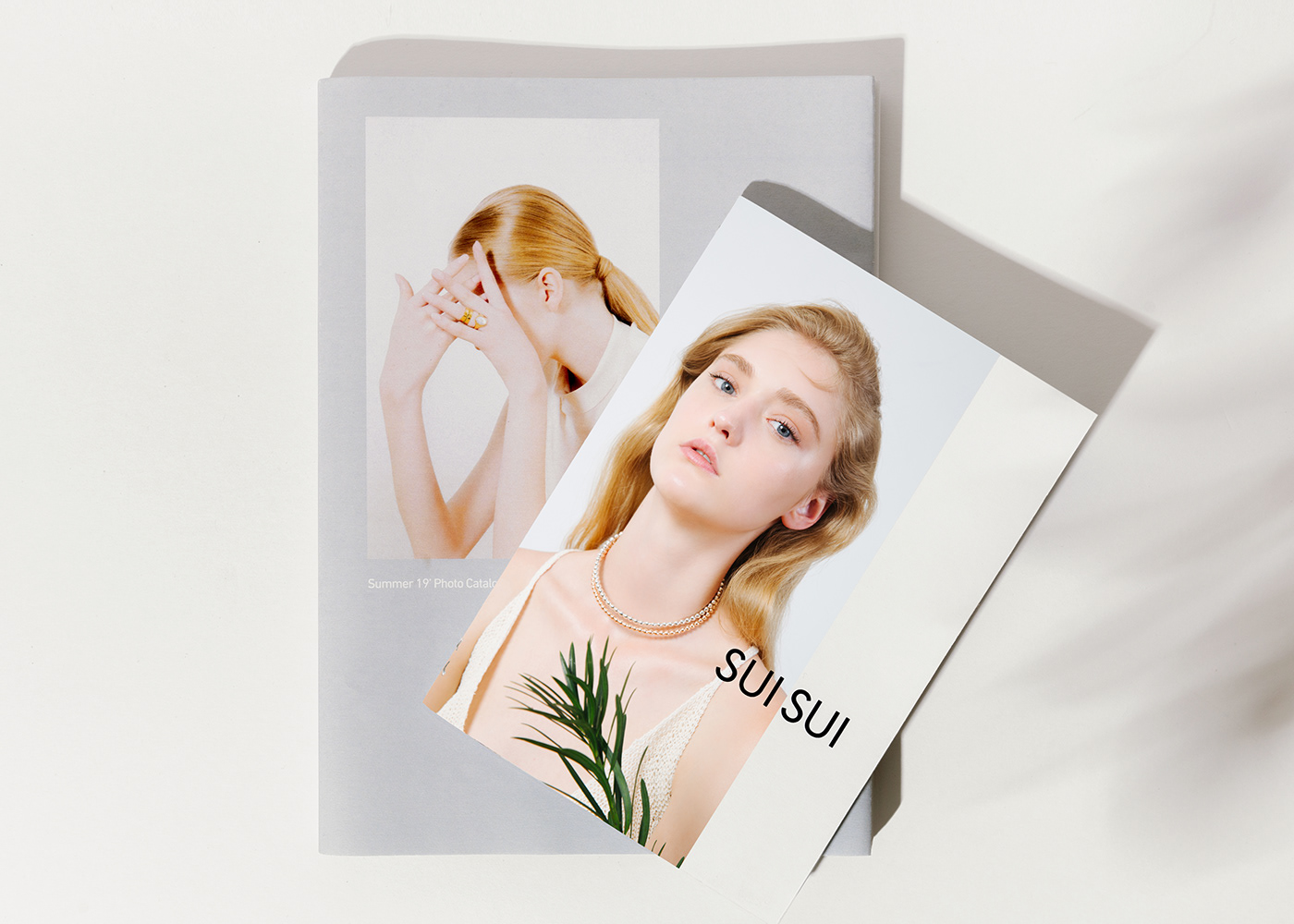


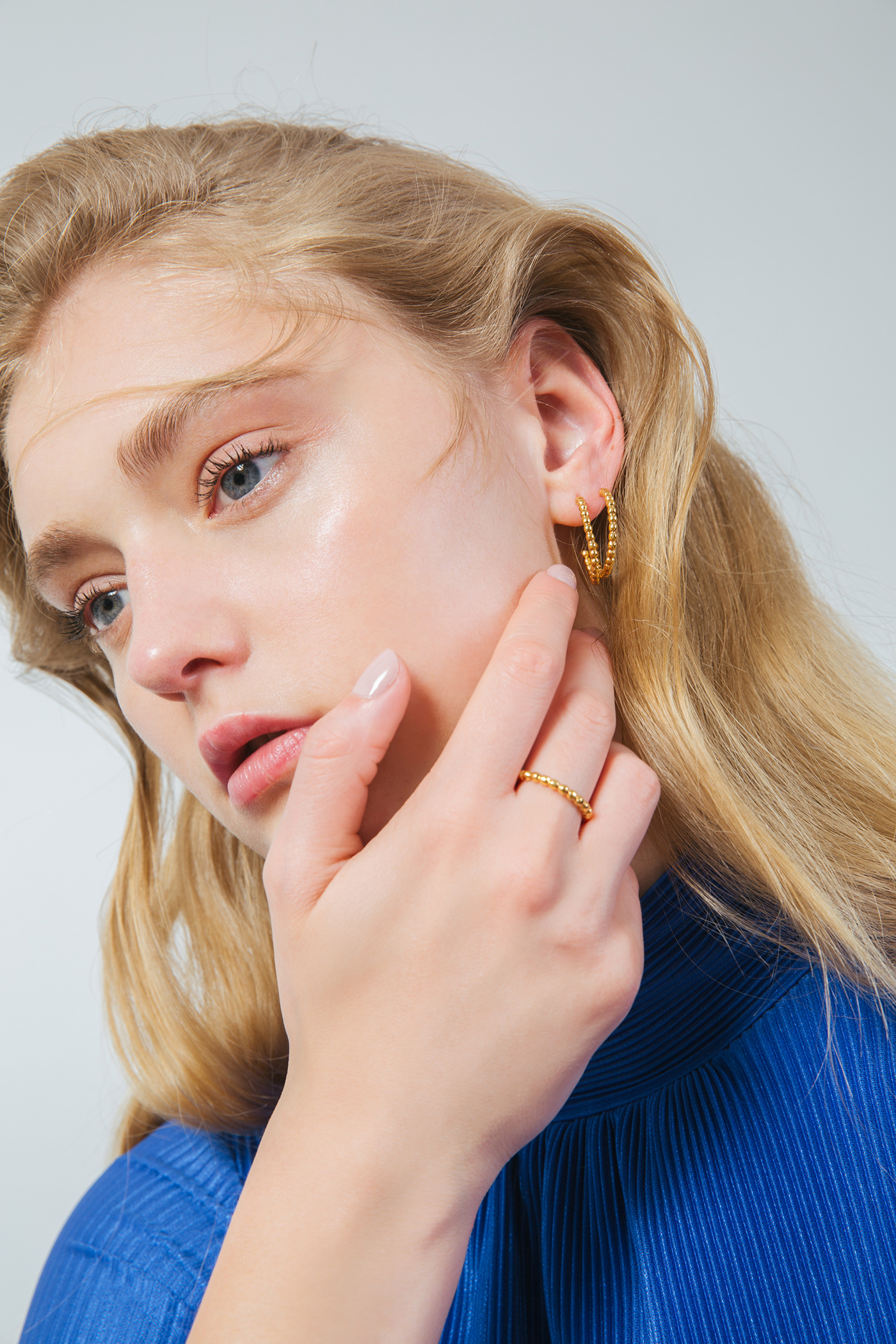
SuiSui as a brand represents the organic nature of nature itself. The client wanted a brand that would represent the jewelry pieces and each one's original design and creation. The logotype is special in the way that it has many different applications that can be used in a dynamic form across the entire brand. For the color palette, we used soft and feminine neutrals that would coexist harmoniously with the metals and materials of each jewelry piece. To round up the brand, we designed an uneven pattern of rough, organic forms inspired in the natural, uncut shape of gemstones.
Pictures- Juan Hdz
parametro.studio


