EVOLUTION OF THE LETTER A
Major Project 2010
Major Project 2010

French Fold Design, Stitch and Perfect Bound
French Fold Design

Semi-transparent paper stock has been used (Vallum)
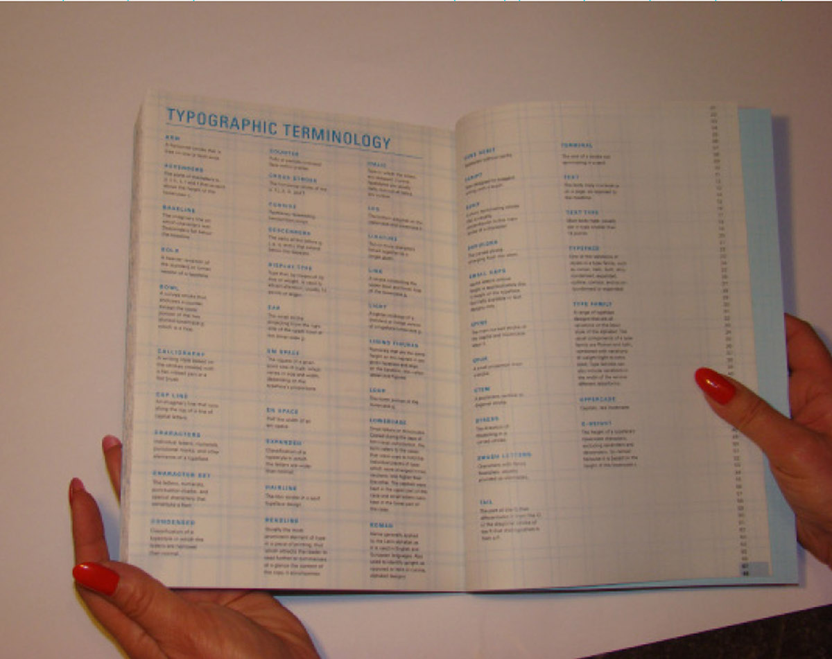
Typographic Terminology Spread
Posters
RATIONALE
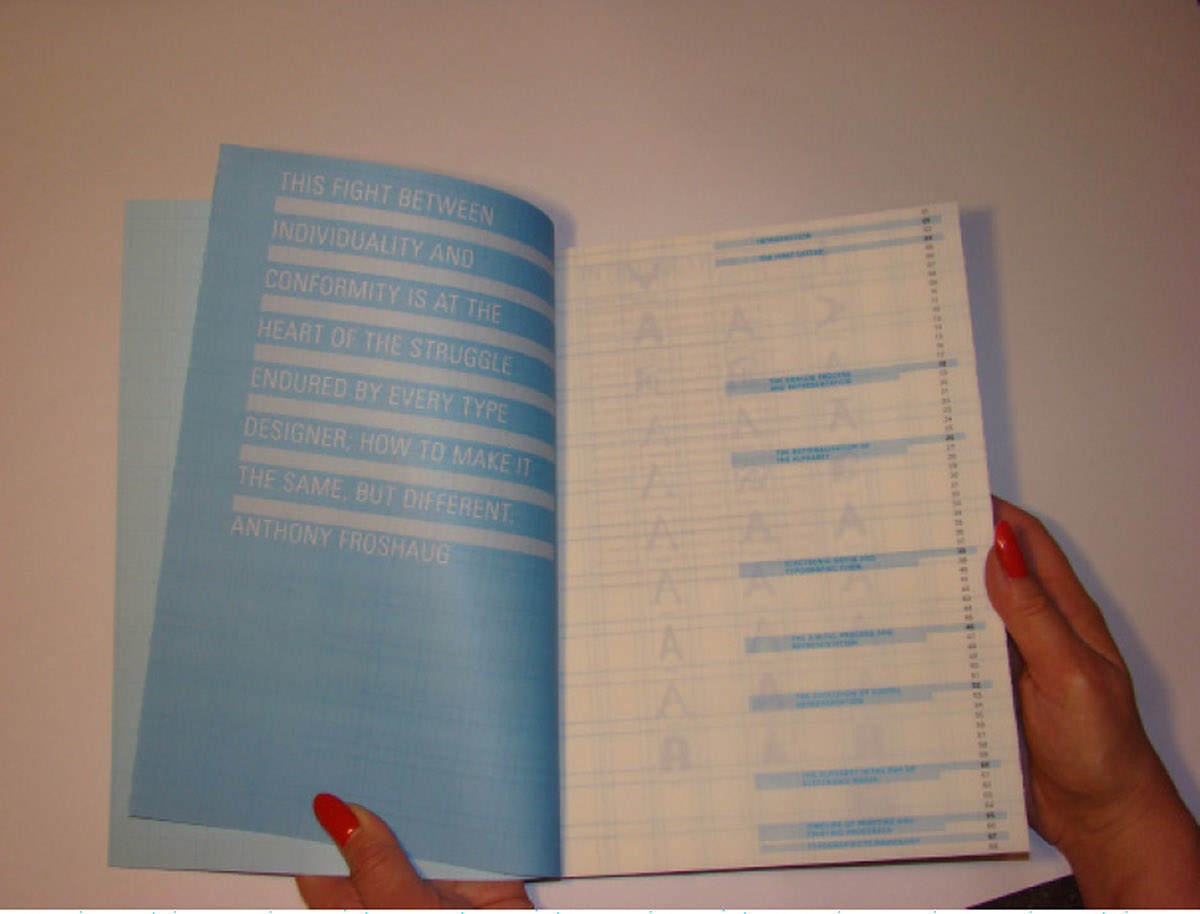
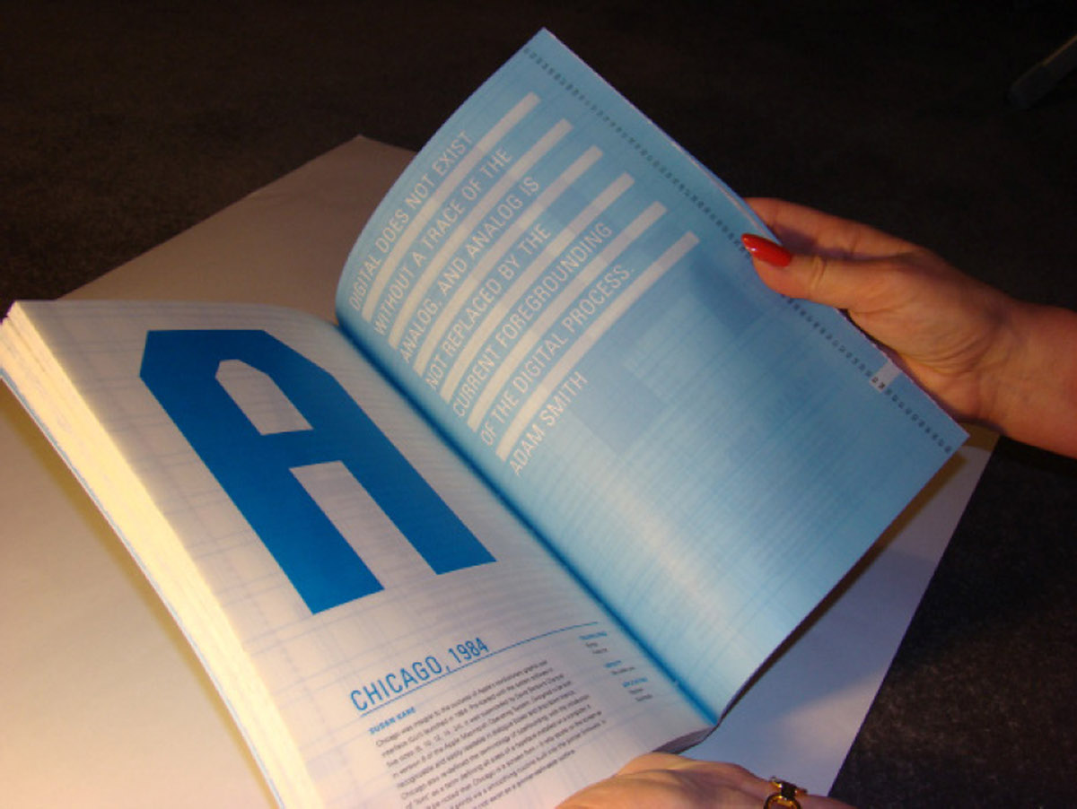
Digital does not exist without a trace of the analog, and analog is notreplaced by the current foregrounding of the digital process. - Adam Smith
For my major project I have explored how technology has changed theshape and form of the letter A over time.
Initially, I started looking at a hypothetical museum space, which wouldbe called Type Factory, I would place my work within the Type Factory as, afactory symbolises the beginning of something; is a place where things arecreated and where processes take place, and a museum as this is a place whereobjects are exhibited
and preserved.
and preserved.
My aim for the Type Factory is to hold an ongoing exhibition, thisexhibition would emphasis typography and
hi-light the changes in its evolution,and how the machine has shaped and changed its form over time.
hi-light the changes in its evolution,and how the machine has shaped and changed its form over time.
Displayed within The Type Factory would be, various tools and machines,which have helped shape and form letterforms as we know them today. There wouldalso be a gallery space, working room where visitors are able to create theirown work using different technologies and a shop for visitors and tourists topurchase materials which would further educate and enhance their knowledge on howtechnology has shaped and changed the form of letterforms.
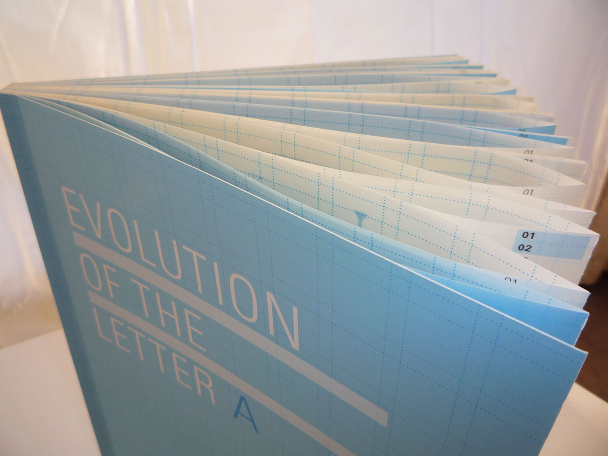
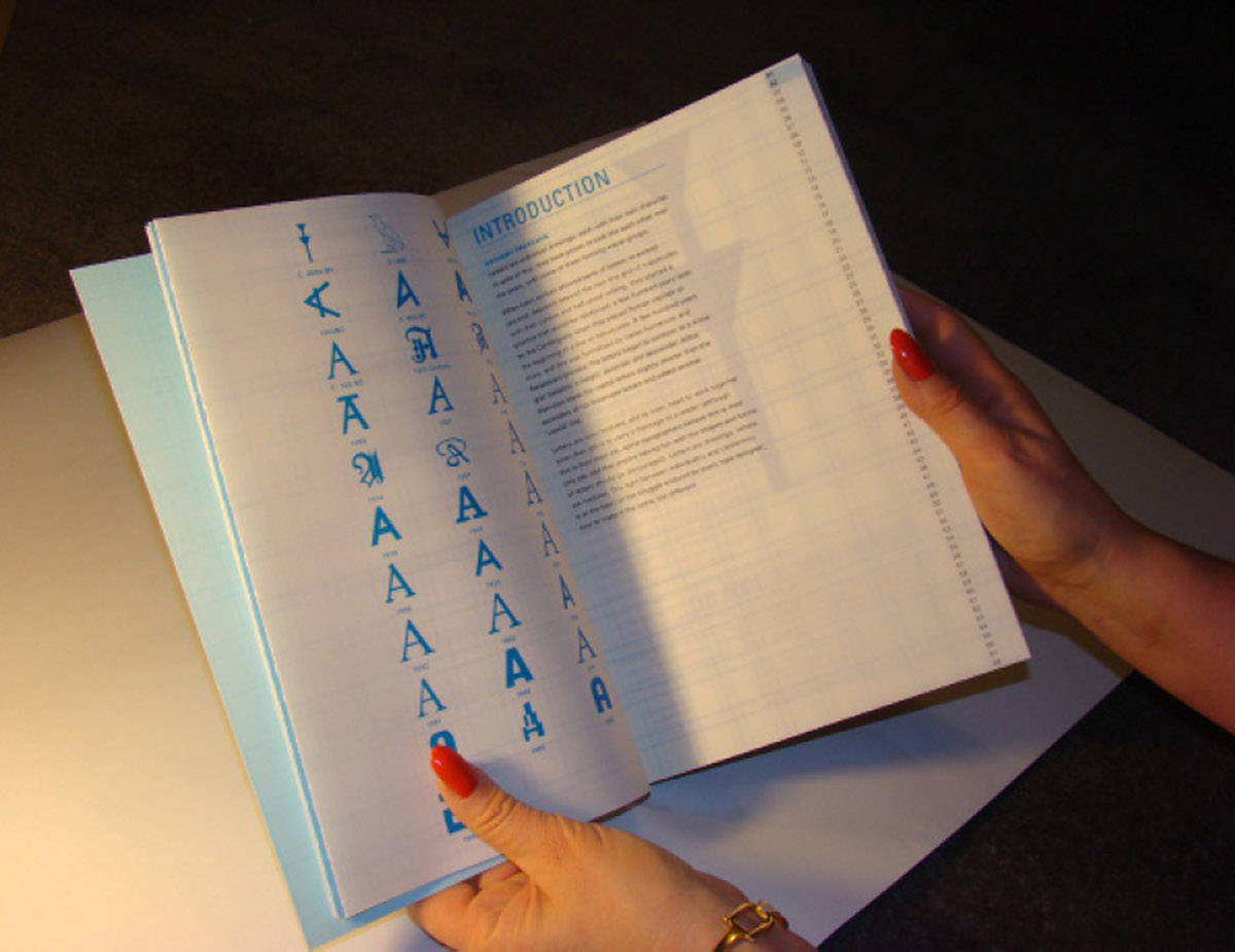
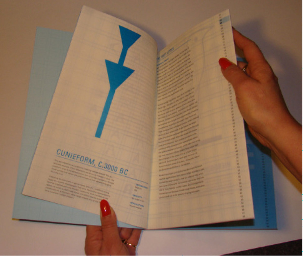
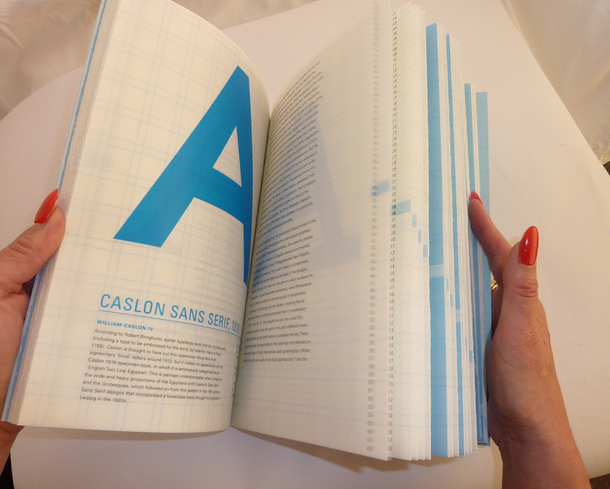
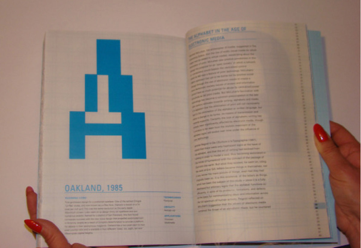
I have therefore designed a book, which could be purchased within theType Factory. The book is titled, Evolution of the letter A, I have named thebook so as the book goes on a journey starting with the first letter A,Cunieform, which was created in C.3000 BC. This is the earliest known form ofwritten expression using a wedge-shaped reed as a stylus on clay. The booktakes the reader on a journey, showing key developmental stages wheretechnology has influenced the shape and form of letters; the reader is thenable to visually see the gradual changes of the letter A, displayed within thebook. Followed by a brief explanation of the form and designer, the date inwhich it was created, technologies used, how often it is used and where it wasor can be applied today.
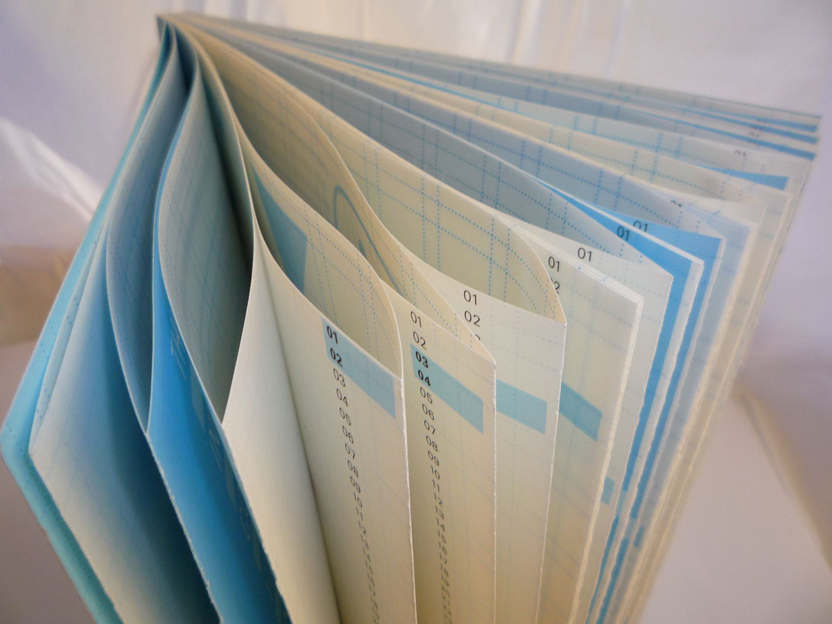
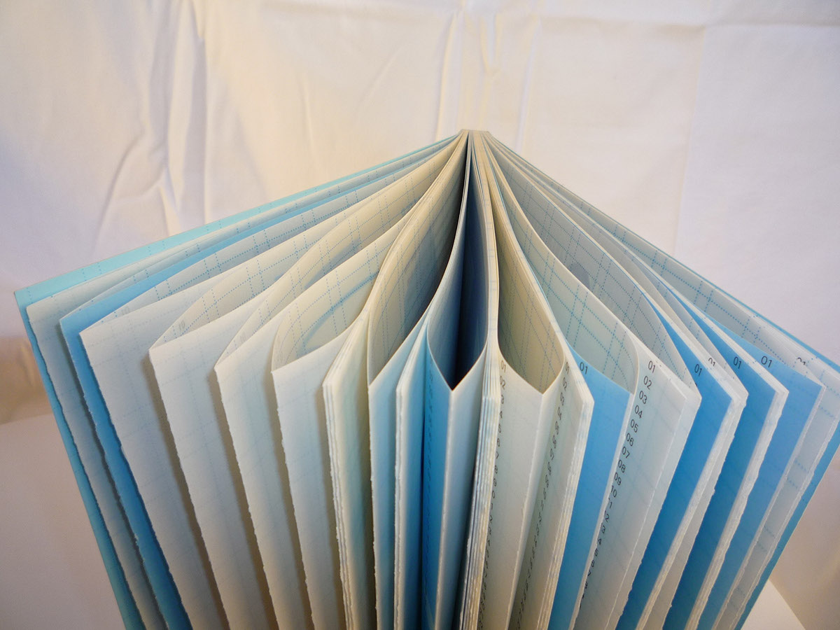
The book is a French fold design, therefore the paper choice plays animportant role. The paper stock in
which the book has been printed on isvellum, which is semi-translucent. This stock has been used as with
the Frenchfold design, a grid system has been printed on the insert of all spreads, andinformative information, which the reader will read on the front of the folds.I have done this as the grid plays a very important role in typographic design,and is the underlying factor in which all typefaces are designed upon. Thevellum paper stock also allows the reader to compare forms as the solidletterform can be seen through the semi-translucent paper stock. The reader is also able to see which form will come next.
The forms are also in keeping with the chosen texts; which have beensourced from various books and are in keeping with the letter A and howtechnology has influenced and changed the forms of letters.
The colour used is blue, and various shades of this have been usedthroughout the book. The colour blue has been used as this symbolises a blueprint, which is something intended as aguide for making something else which, in this case, is the letter A. Thecolour has been used throughout the book as each form is based on the previous.The last A in the book is also blue which indicates that there are yet furtherchanges to come and new technologies which will influence the shape of theletter A.
The typeface Univers hasbeen used throughout. I chose to use this typeface as it is a contemporary sansserif typeface which is clear and easy to read.
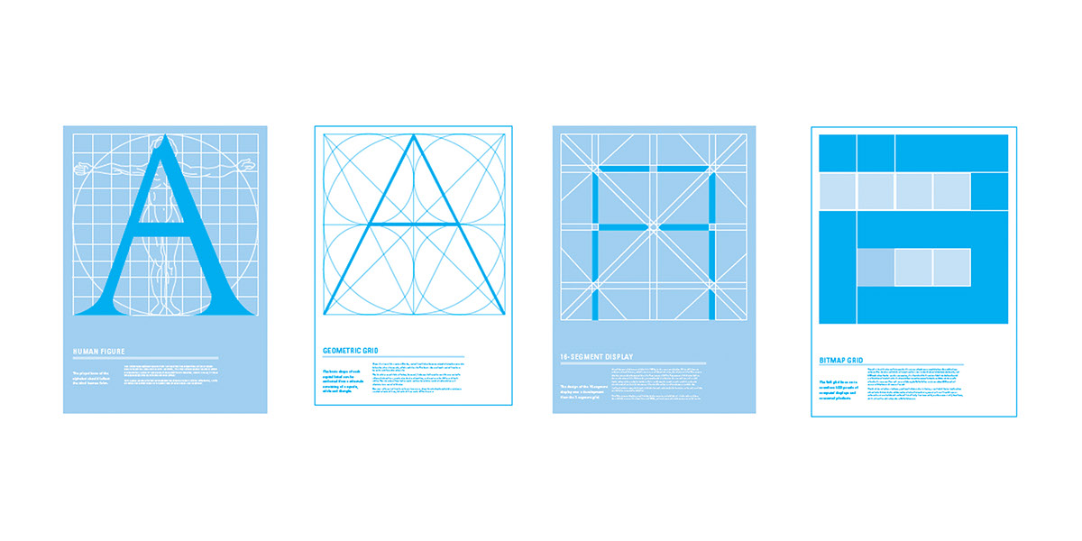
Four posters have also been created, these visually show viewers theconnections between the grid system and letterform, and how the grid systemshapes the letterform. The letter A has been used for each poster, in keepingwith the book, also with using the same letter viewers can visually see howletterforms have evolved over time with new technology.
The secondary text on all four posters is informative about each gridsystem and the technologies, which use the grid system. The typeface Univershas been used as this is in keeping with the book and is a clear and easy toread typeface on all four posters.
The four grid systems in which I have used to show various key stages inthe development of the letter A are, the Geometric Grid System, Human FigureGrid System developed by Geofroy Troy, 16-segment display grid and the 5x5bitmap grid system.
The colour blue has been carried through to the posters as these gridsystems are perceived as blue prints, and are the basis for which theletterform is designed upon. The blue print also allows room for change as thisis bound to happen with the development of new technologies in the not too farfuture.
Typography must embrace the machine age to gain a much more serious grasp of technologyand represent the new visual experiences of the age. Moholy-Nagy
