As we know, a Coffee shop is more than just a drink, it’s the people in it and their lives that interact with the shop. At the Grind Coffee shop, our main objective is to best serve and enlighten the lives of the community that surrounds it, and of course to serve out some good caffeine. While we align ourselves to appeal to the skate park, our Active, Bold, and creative atmosphere is welcoming to all of the Johnson County ‘burbians.

To best serve our community it’s important to analyze our audience. We are located within walking distance of a private school, a large shopping center, and a park with a playground and popular skate park. While we align ourselves to appeal to the skate park, our Active, Bold, and creative atmosphere is welcoming to all of the joco ‘burbians.

Contact Card - First off, let’s look at our contact cards. These will be for the baristas and shop owners to pass out to their customers. These are personal, from the choice of brand color, and personal skate photo on the back, and of course the contact information, they change from barista to barista.

Stationery - With the same photo treatment and color system it’s fun to look at. It also has a unique shape, folding into a square. This is to creatively and boldly stand out against all the other business mail.

Envelope - To go with the Stationery, is the Envelope. It also has bright colors and bold type and pattern use to stand out against all other business mail. Actively inviting all who receives this letter to be excited about our creative and bold communication system.
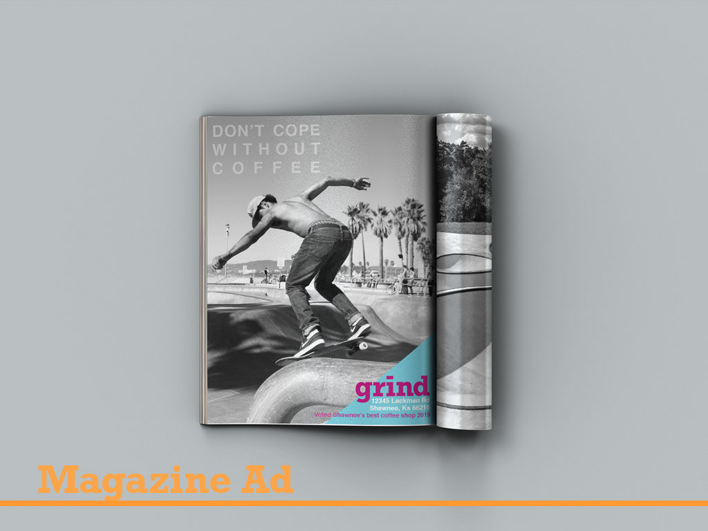
Print Advertisement - This magazine add would be placed in local magazines like Ink-a trendy Kc restaurant magazine, and 435-a local foods and activity magazines. It’s styled to show off both our bold photo styling, and also our creative and active color scheme.

Large Scale print Advertisement - Billboard
This billboard would be placed around the joco area, particularly on i435. Because of the audience, it showcases coffee over skating but with the same photo styling and color scheme. It’s clean and easy to read so people driving can read quickly.

Storefront Identifier - both vehicle and pedestrian-focused
The storefront identifier is a mural on the building. It’s bright and creative to capture the attention of both the suburbans driving by for the shopping centers and schools, and also for the skaters who can see from the skatepark.


Phone Application - Then we have the Iphone App. Our app is an ordering and blog app. We have an App-Icon that focuses on our iconic stick figure. Our loading screen works to emulate the the idea of skateboarders skating around the bowl, and also coffee being Ground. After the app loads we have a menu screen to see our offerings, from there you can order your drink, and for fun; we have a skater showcase blog screen. This is where we can interview some of our regulars from the skate park, to talk about their favorite trick and drink.


