
“When the time comes for a man to look his Maker in the eye, where better could the meeting be held than in the wilderness?"
— Richard Proenneke
The Backstory
I have been blessed with the opportunity to work on so many fun projects over the years with a number of great clients. As I produced work, each piece helped me to grow as an illustrator as I pushed to develop my style, my control of lighting, form, texture, and everything that goes into bringing a piece from out of the ether onto the page.
The challenge of illustrating for so many great clients is it can be very difficult to find time to illustrate anything for myself. With so little time, it also means I’ve been unable to make prints available to those who have been asking. This year, I decided to solve both of those challenges with the introduction of a new piece, exclusively created for the purpose of printing.
This print is special to me because it captures the memories I have of so many summer mornings spent on the shores of various lakes in Colorado with my Dad, my Grandpa, Uncles, Cousins, and friends. These were times of exploration and adventure as the world around me unfolded in dramatic Colorado landscapes - all under the loving care of the men in my family who shaped and guided me as a kid.
This print is a tribute to all father figures and sons - anyone with a heart yearning for adventure in the wild which beckons us to explore…
Process
Creating this piece was no easy task. For years I have worked under the parameters of a creative brief which, no matter how open ended, always gave some sort of direction. I was used to working with art directors and committees, each interjecting feedback at key stages to guide and shape my efforts. It’s also much easier creating pieces for others because I view it as a way of serving them and their needs.
However, when it came time to create a piece apart from all of that, a piece which would encapsulate powerful childhood memories, I was at a loss. It was as if I was learning to create all over again. I floundered during the initial phase, nervous to commit to a single idea, worried I would waste the limited time I had to produce this piece as client projects continued on.
Finally, I forced myself to face my fears of the blank page and I began sketching…

The sketch started off with two figures sitting next to one another on the banks of a mountain lake. For some reason, I drew a breath cloud stemming from each of the figures and in that moment, I knew that the focus of this piece was the shared conversation between a father and son in this epic landscape. I knew that the breath of their conversation would be echoed on the surface of the lake and from that point forward, everything in the landscape functioned as the backdrop for this single moment.
I threw a frame around the sketch just to see where things were landing and this is when I knew the piece would be worth finishing.

Black & White
I wanted to spend as much time in this piece as I could so I opted to work in black and white first before moving to color. I’ve worked directly in color before (like I did in the posters I created for Space Park) but I find an odd satisfaction in working in black and white. It used to be that I worked in black and white as a means of focusing my attention on a limited number of things: shape, texture, lighting. These days, however, I work in black and white simply because I enjoy the aesthetic and I love the transformation which happens when I move to color (more on that later…)

Transitioning To Color
I’m often asked how I transition from black and white to color as I suspect many of us have tried overlays on top of black and white pieces which often yields disappointing results. My method of transitioning is not magical, it’s particular: I replace every single value every layer of every single object you see. If there is a rock that has 3 values (dark, middle value, light), each of those values is on its own layer. I lock the pixels of each of those layers and then replace each value with a color of my choosing.
This may seem like an insane way of working (and it is) but it’s an insanity I’ve grown so accustomed to it’s simply a normal and effective way of working for me. It goes much quicker than you think, but it can still be a grind every now and then which is why I’ll change things up once in a while and work directly in color when I’m feeling the need.
Color
The color of this piece was something I’d determined fairly early on. I wanted to create a color scheme that felt warm, inviting, and nostalgic in the sense that it would capture the sunrise on the surface of the water, the smell of the leather boots my grandpa wore, and the vintage fishing & hunting magazines he used to keep. I knew the colors would be yellow, brown, green, and rich. These colors would allow me opportunities to cast long shadows on the rock forms and in between pockets of land like the cliffs, the rolling hills, etc.
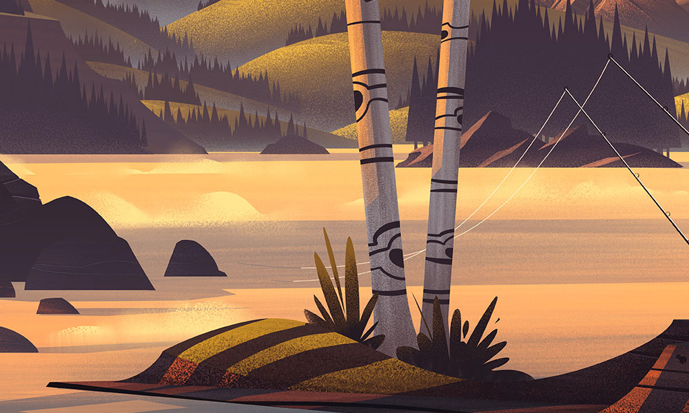
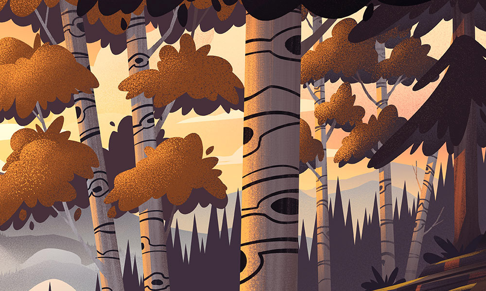
Details
Here are a handful of the details in this piece. As you’ll see, I strive to create small moments and compositions within the larger context of the illustration. As you explore every inch of the piece, you find details that may have eluded a first glance.


The Print
I have been working with the fine folks at Grand Palace to bring this piece to life in the form of a limited edition signature series screen print. Screen printing brings a whole new level to the piece and really pushes craft and vintage aesthetics into a piece you’ll definitely want to grab when it’s available. Be sure to follow along on my social media channels if you’re interested in picking this one up - should be soon!


