


Experimental Typography 'Aquaphobia'
In this project I tested how experimental I could be with typography and its construction.
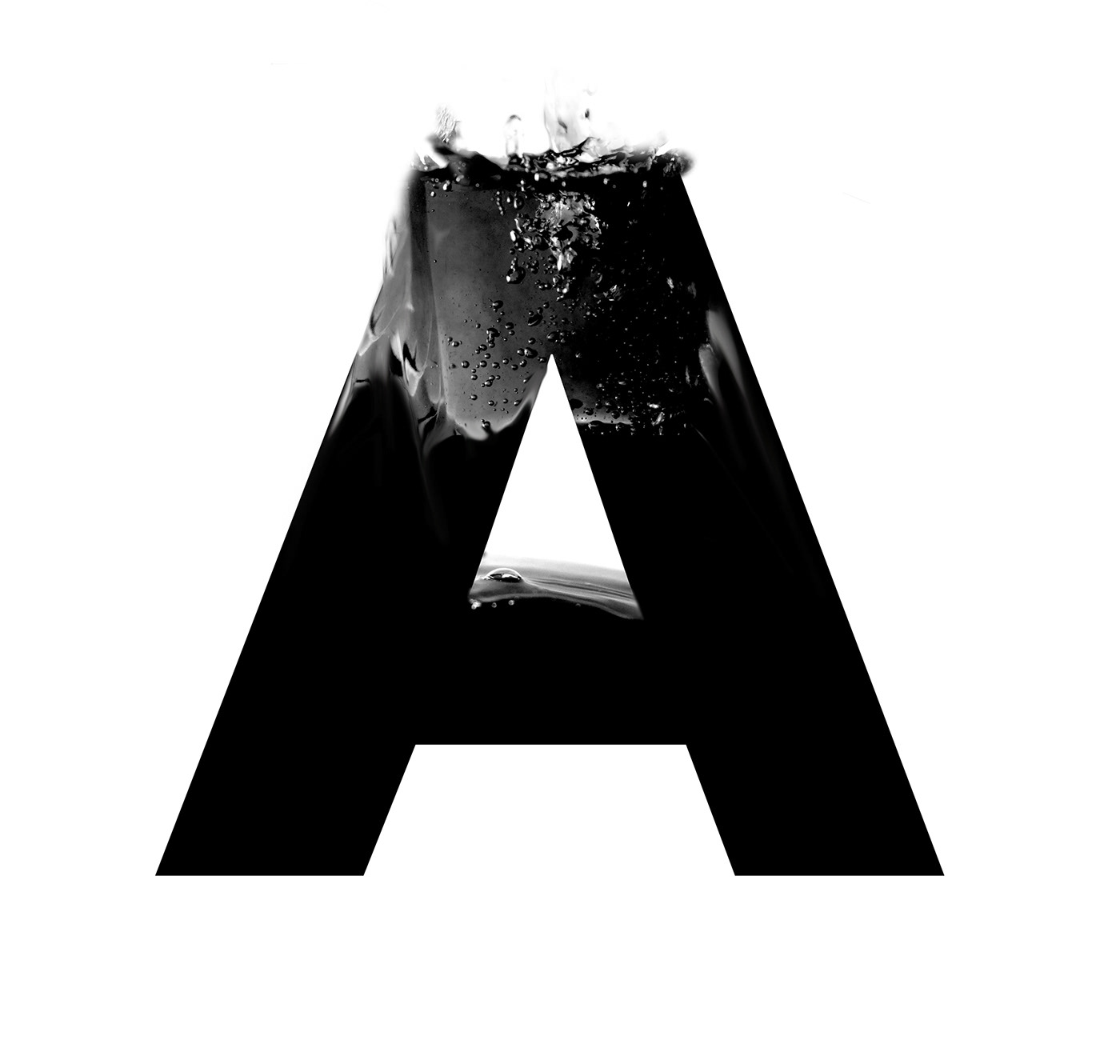
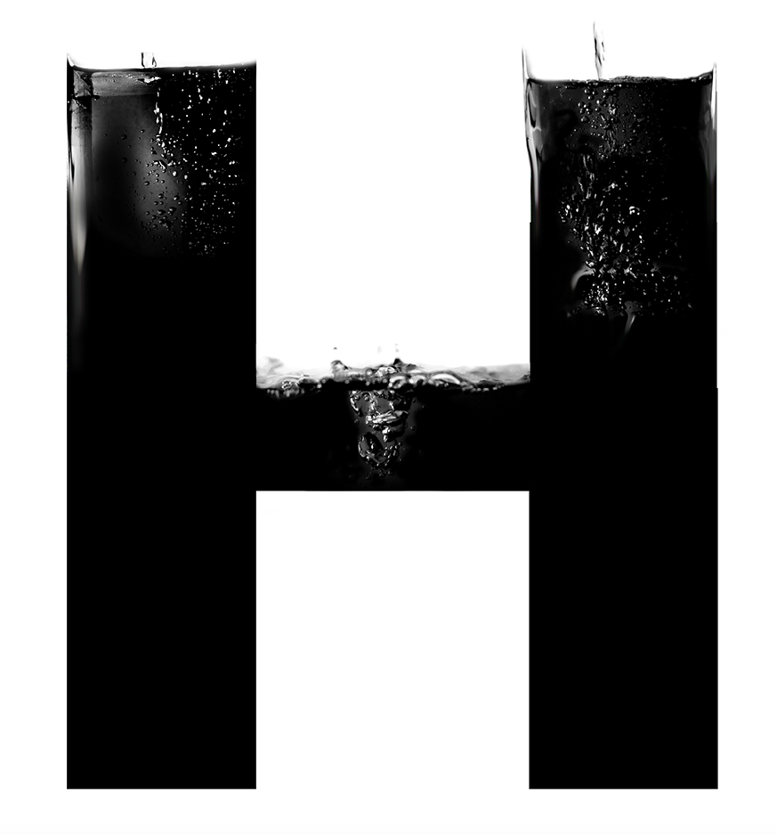
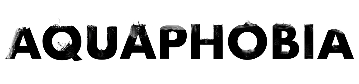
I first chose a phobia and wanted to convey its meaning through visually explaining the word through its letters.

I developed my skills within Adobe illustrator whilst trying to decide which visual solution would work best.
I then experimented with photography and editing photos of inked water into letters.
The photographical experimentation led me to the idea of fusing letters with splashes of water. I photographed many splashes of water with blue coloured dye in a vase with a Canon 600D.


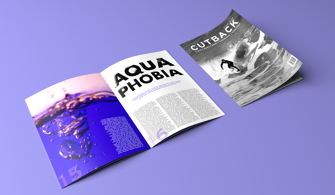
The final typographical solution mocked up in a surfing magazine to show how it would fit into the real world. All images are my own.


