


Anytime anywhere
Break-Fast chain of coffee shops uses best practices of the best Moscow restaurants in this segment to offer a high-quality alternative to expensive cafes — a stylish cosy place which offers delicious coffee, good service, and reasonable prices.
To stand out and be recognizable in the congested coffee shop market, a new brand should grab their customers — engage them into communication, hold their attention with the contents and then high quality products. However, before highlighting the key points of the brand strategy, it’s important to find and understand the target audience.
Break-Fast focuses on the youth. The positioning of this chain reflects habits of modern young people and helps the brand be closer to its target audience by blending in.
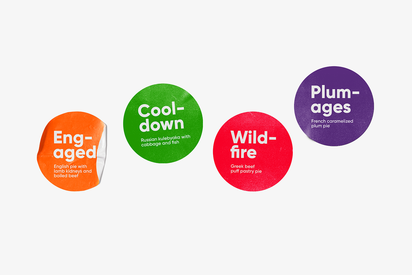
The core of the target audience is young adults of 20 to 30 years old who often use English words in their everyday speech — “update”, “weekend”, “handmade”, “superman”. The list is endless, and some of the words are so common of informal speech that it’s impossible to imagine modern communication without them.
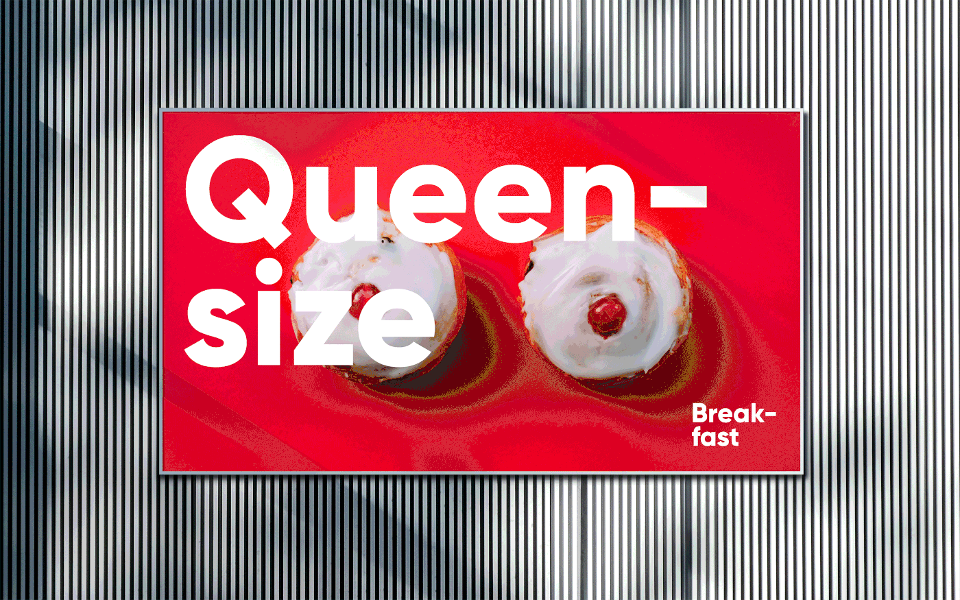
The brand identity reflects the main idea of the communication strategy — speaking the same language as the audience about things that concern them. Familiar English words and simple phrases communicate the benefits and offers of the coffee shop chain. High quality coffee, fast service, professional approach.

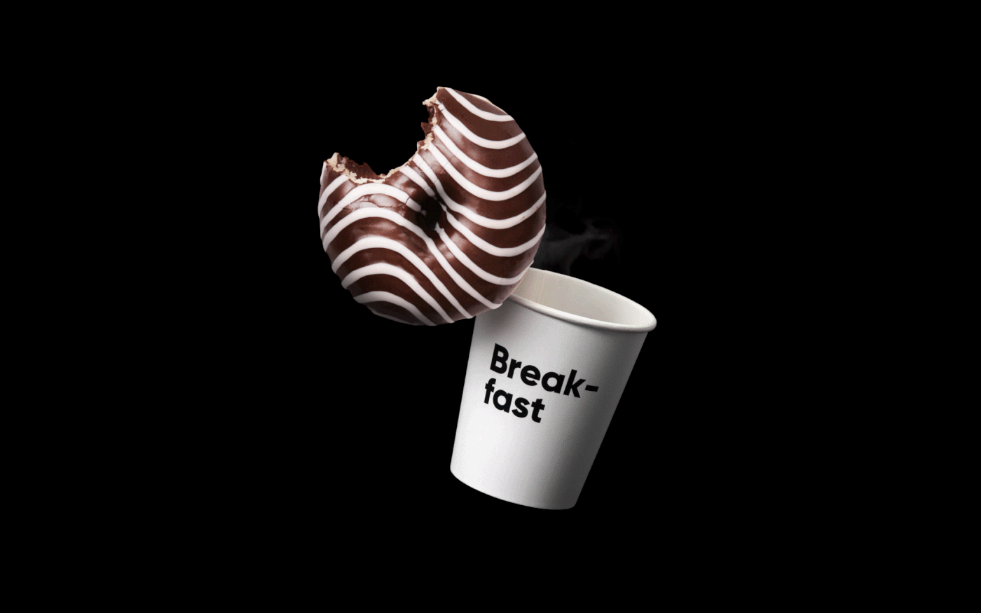
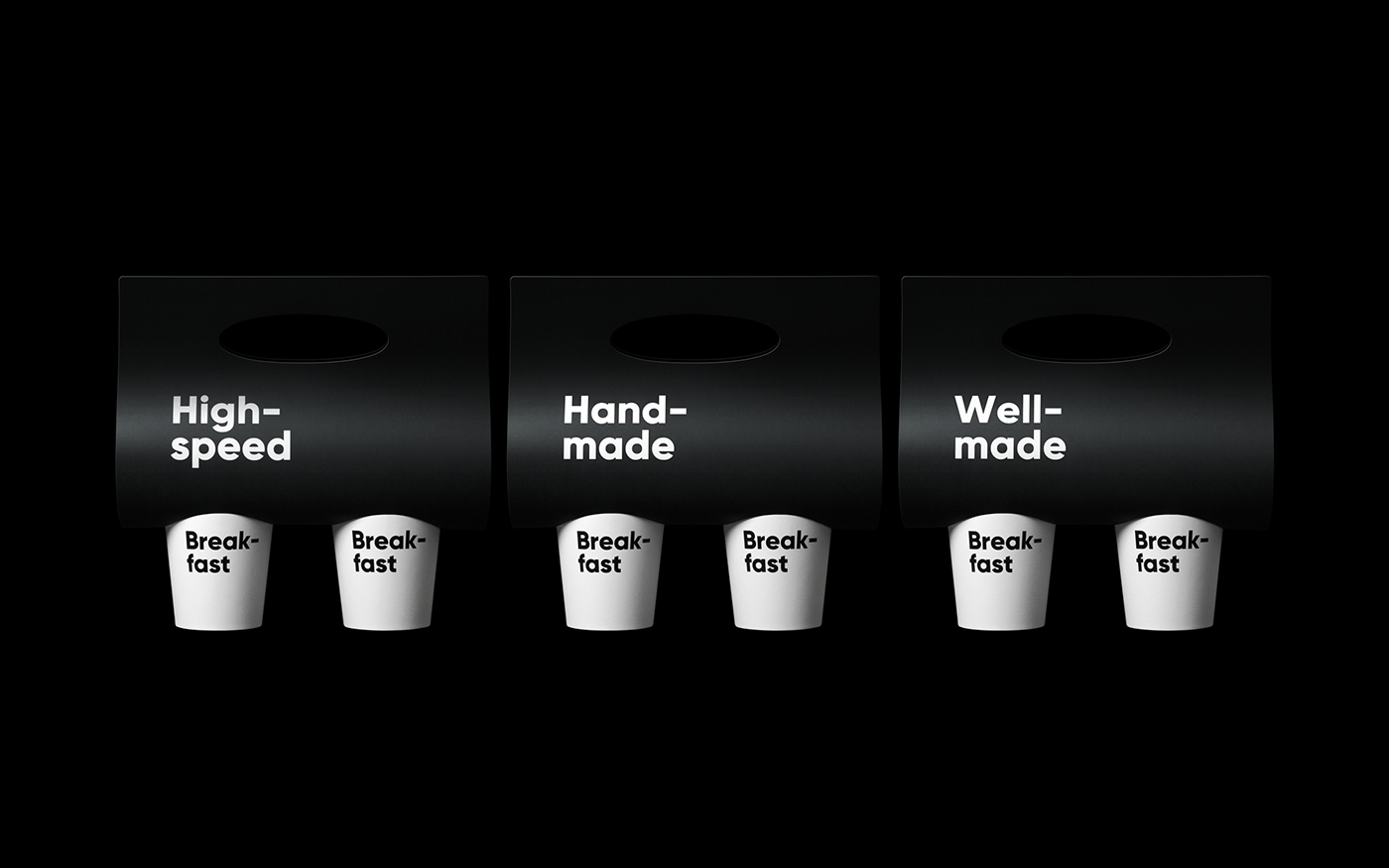
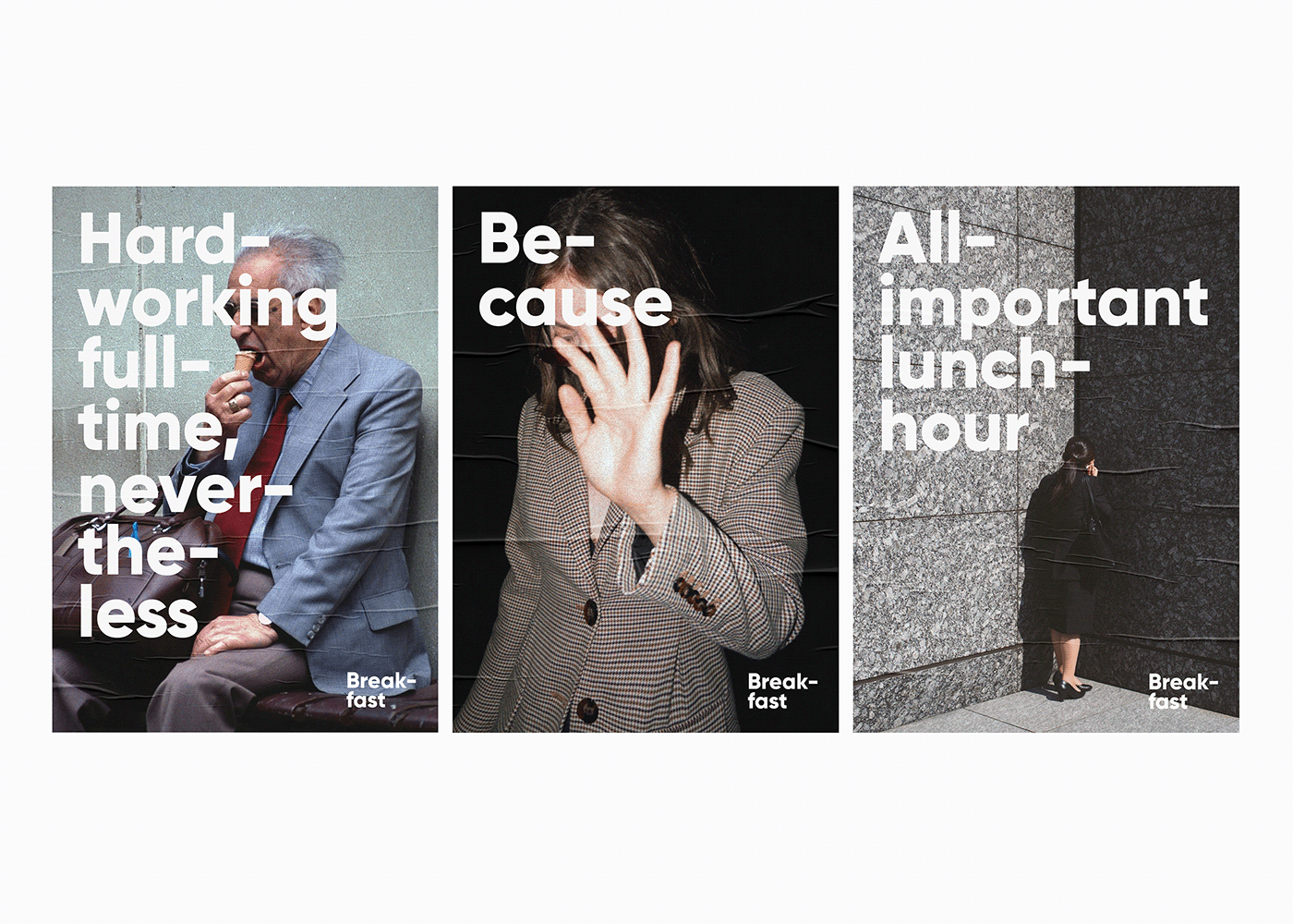
The key message of the visual and verbal identity is the idea which was first reflected in the logo. The word breakfast is divided into two parts — break (meaning “pause”) and fast (meaning “quick”).


Thus, in addition to its usual meaning, the name acquires additional connotations: pause, break, food-to-go — the very thing people living in big bustling cities need.


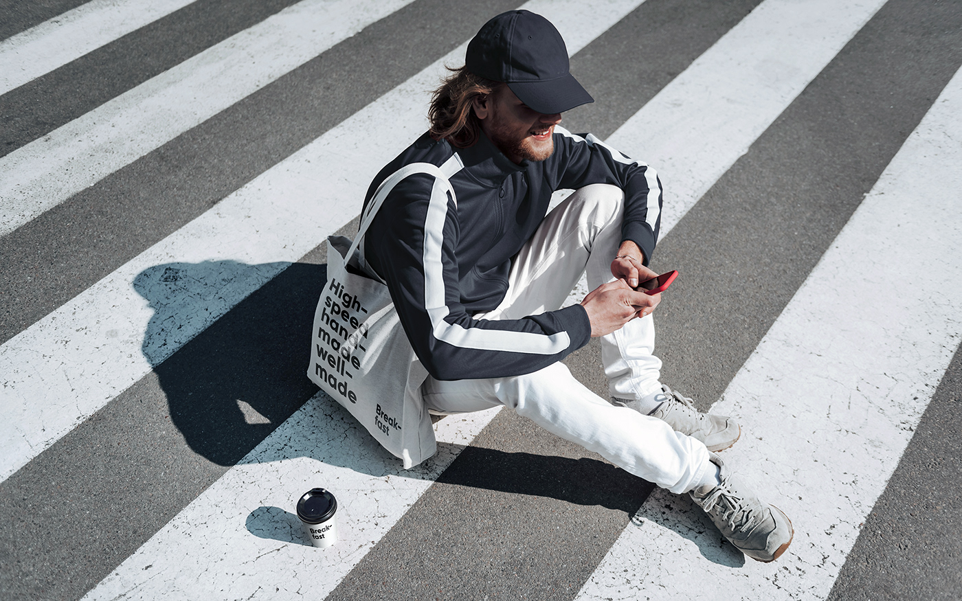
Such division of the word is the key feature of the brand identity. Customers can read the word as a whole, every line separately, or make a sentence of a few words — “Anytime anywhere because high-speed handmade well-made.”


Creative Director: Andrey Tarakanov
Designers: Dasha Ufaeva, Nikita Davydov
Copywriter: Galina Evdokimova
Project Manager: Egor Novozhen
More info: www.tomatdesign.com
Follow us on Instagram


