

Champaign is served. Cheers!
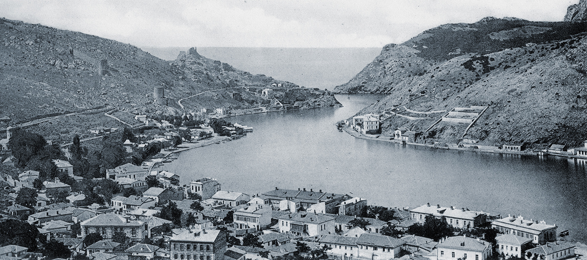
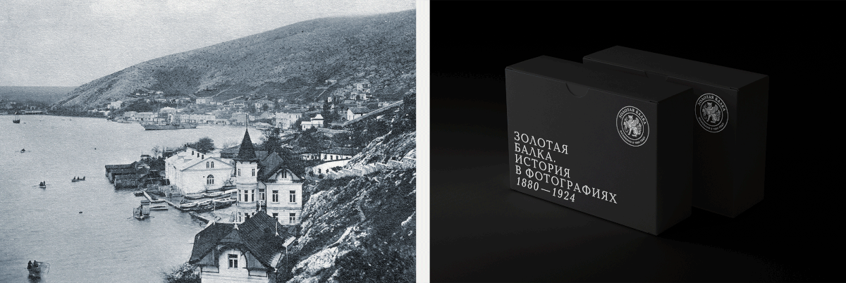
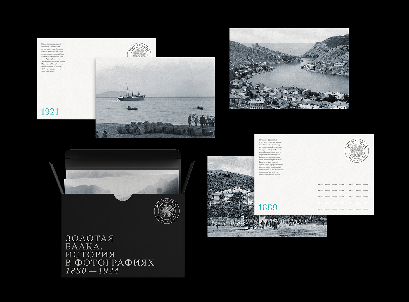
Zolotaya Balka is one of the oldest Russian wine producers. In 1889, Major-General Alexander Witmer established the first wine cellar in Balaklava, and winemaking became a standalone industry. Later on, this place became home to several wineries whose unique experience was used in the production of many Crimean varieties of sparkling wines.
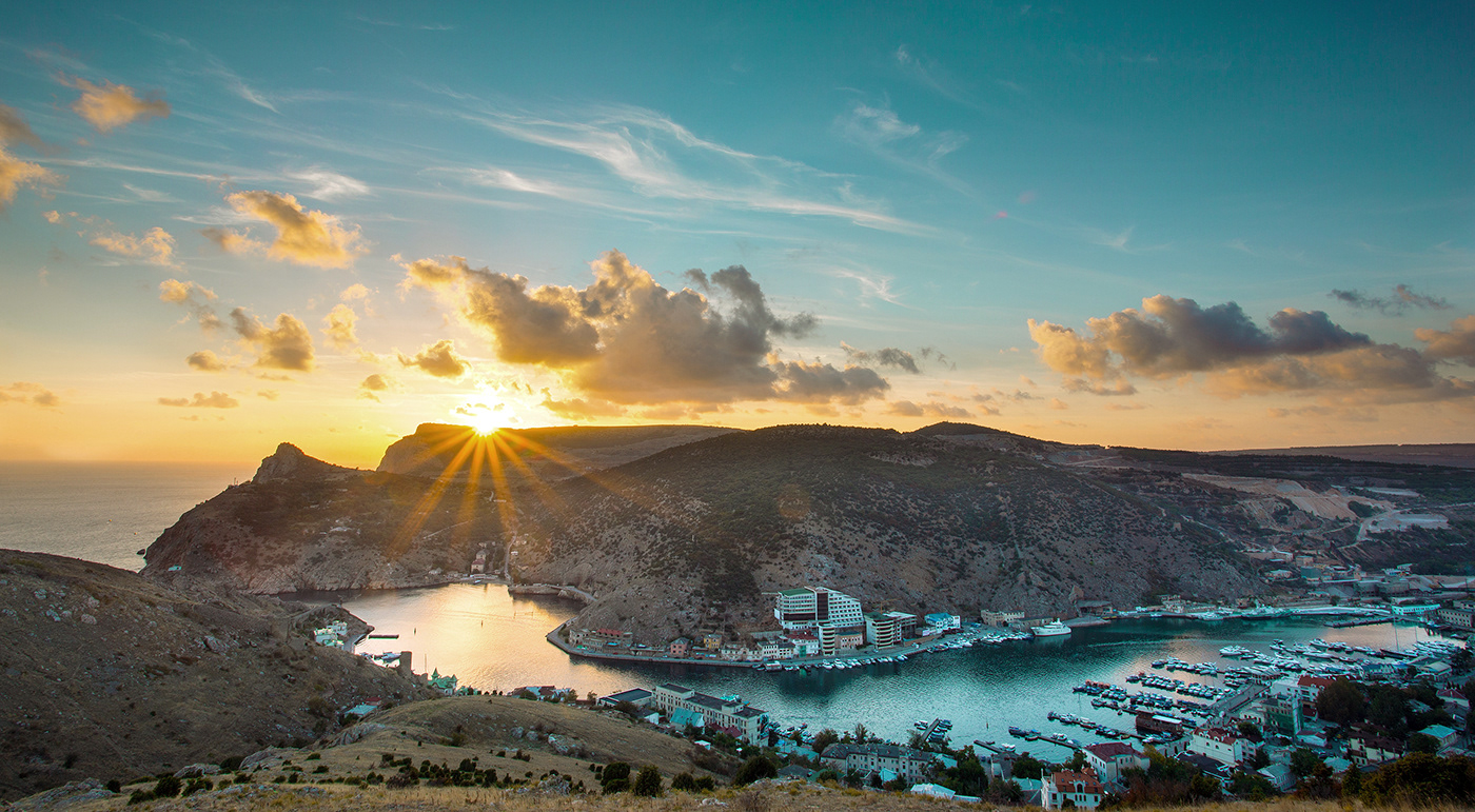
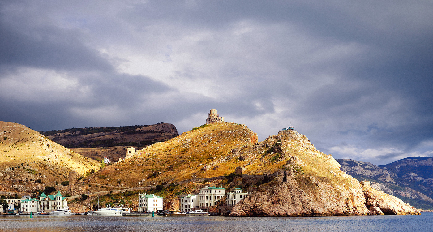
Tauri, the first people to inhabit the Crimean Peninsula, started growing grapes in Balaklava. The first mentions of this place go back to the 8th century BC. For instance, Homer in his famous epic poem Odyssey tells the story of Odysseus’ encounter with the Laestrygonians, the man-eating giants, and mentions the «glorious harbor», or the Balaklava Bay.
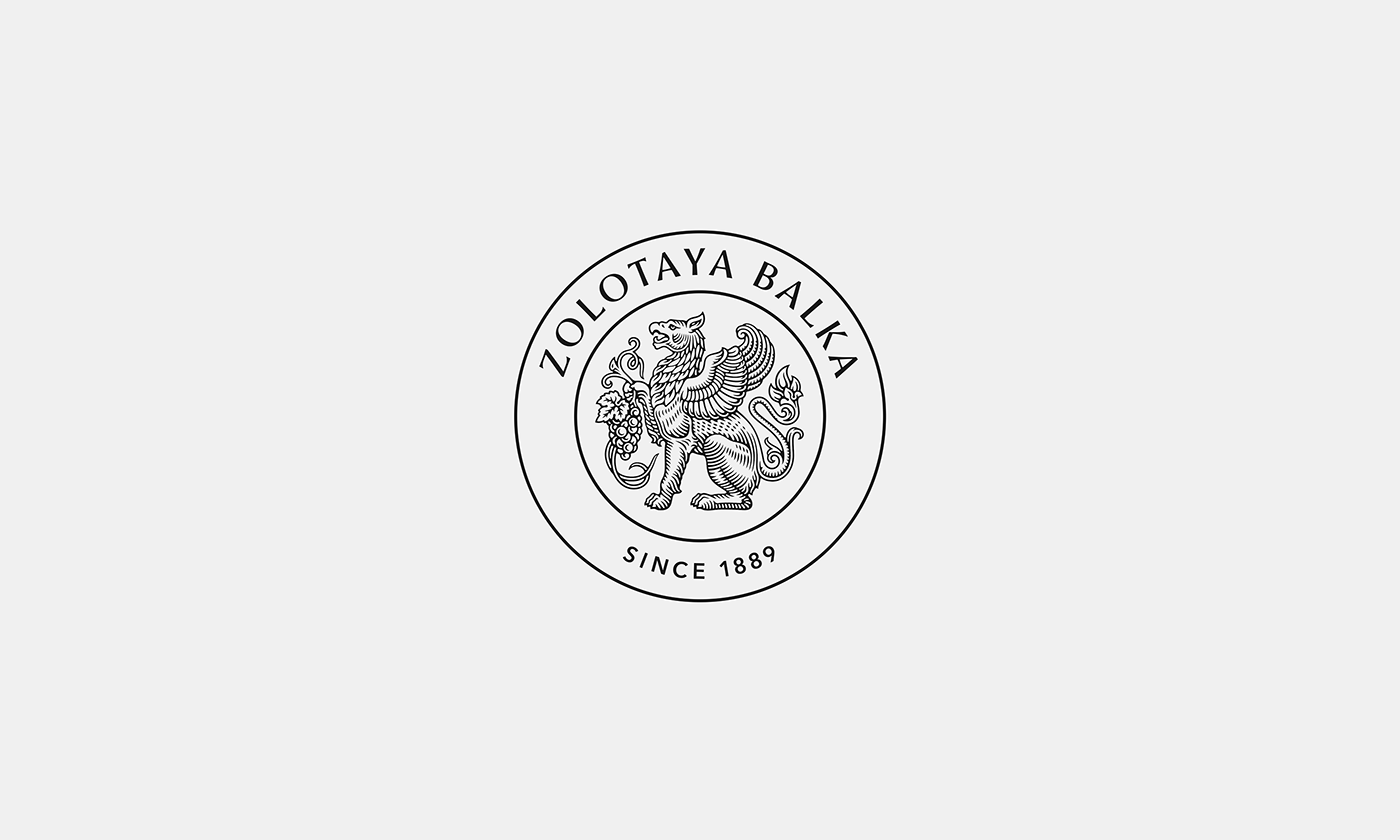
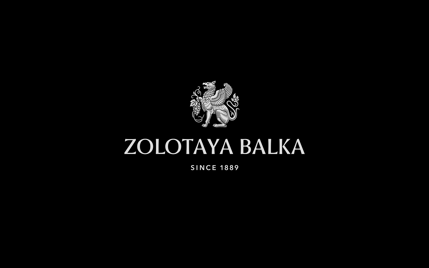
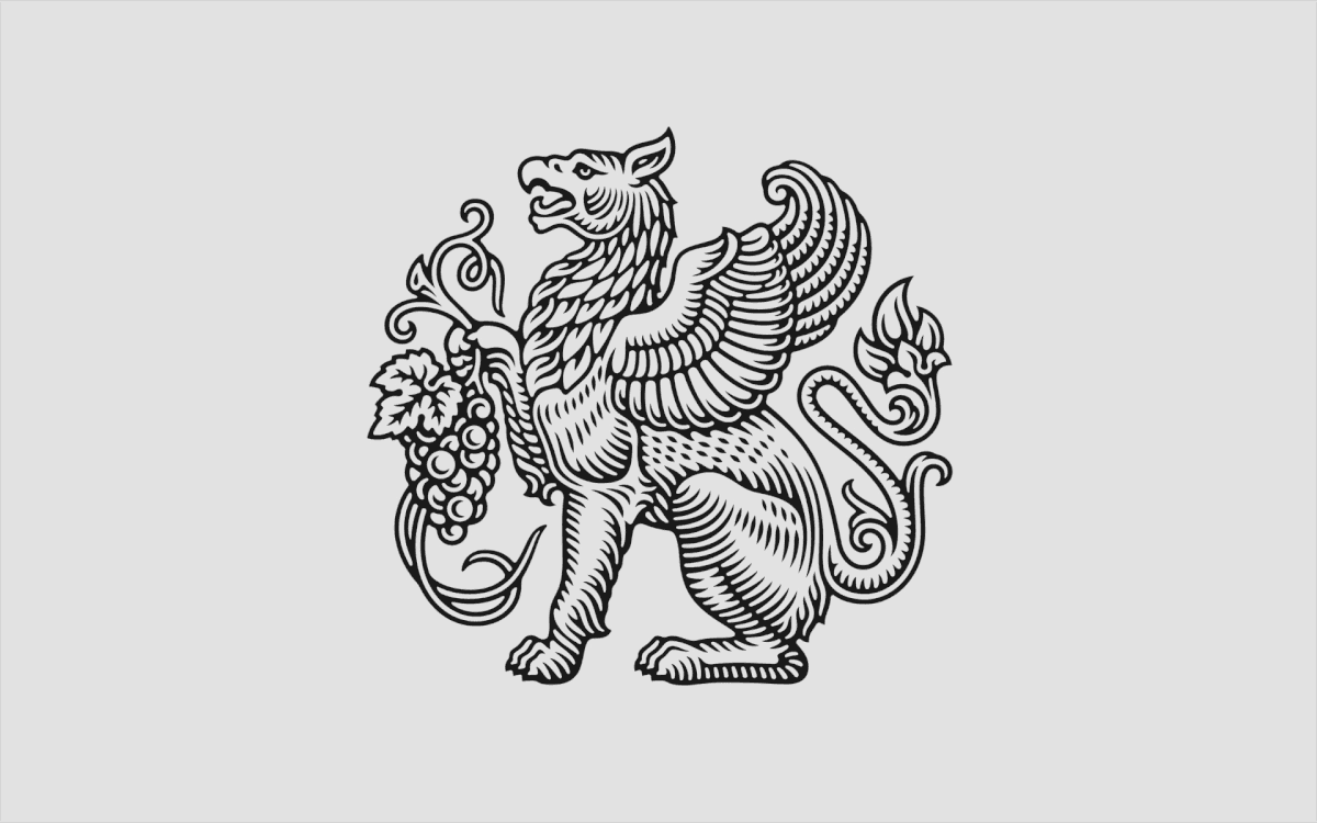
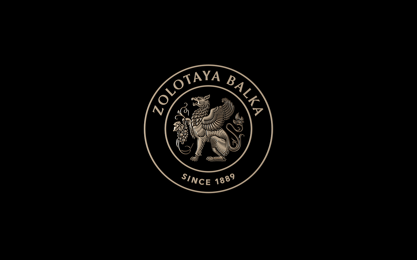
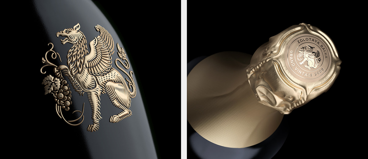
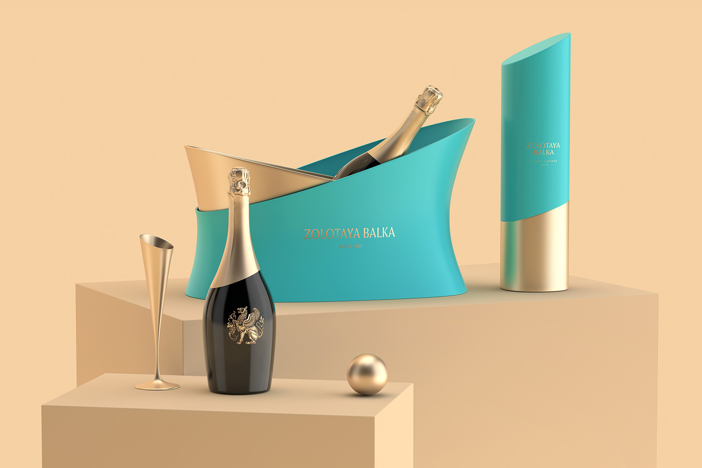
The symbol of Zolotaya Balka is a gryphon holding a grapevine in its paw. According to one legend, the gryphons saved sparkling wine from flood. «Giant gryphons, lords of earth and air, spreading large wings, in their lion’s paws preserved the vine for the future world».
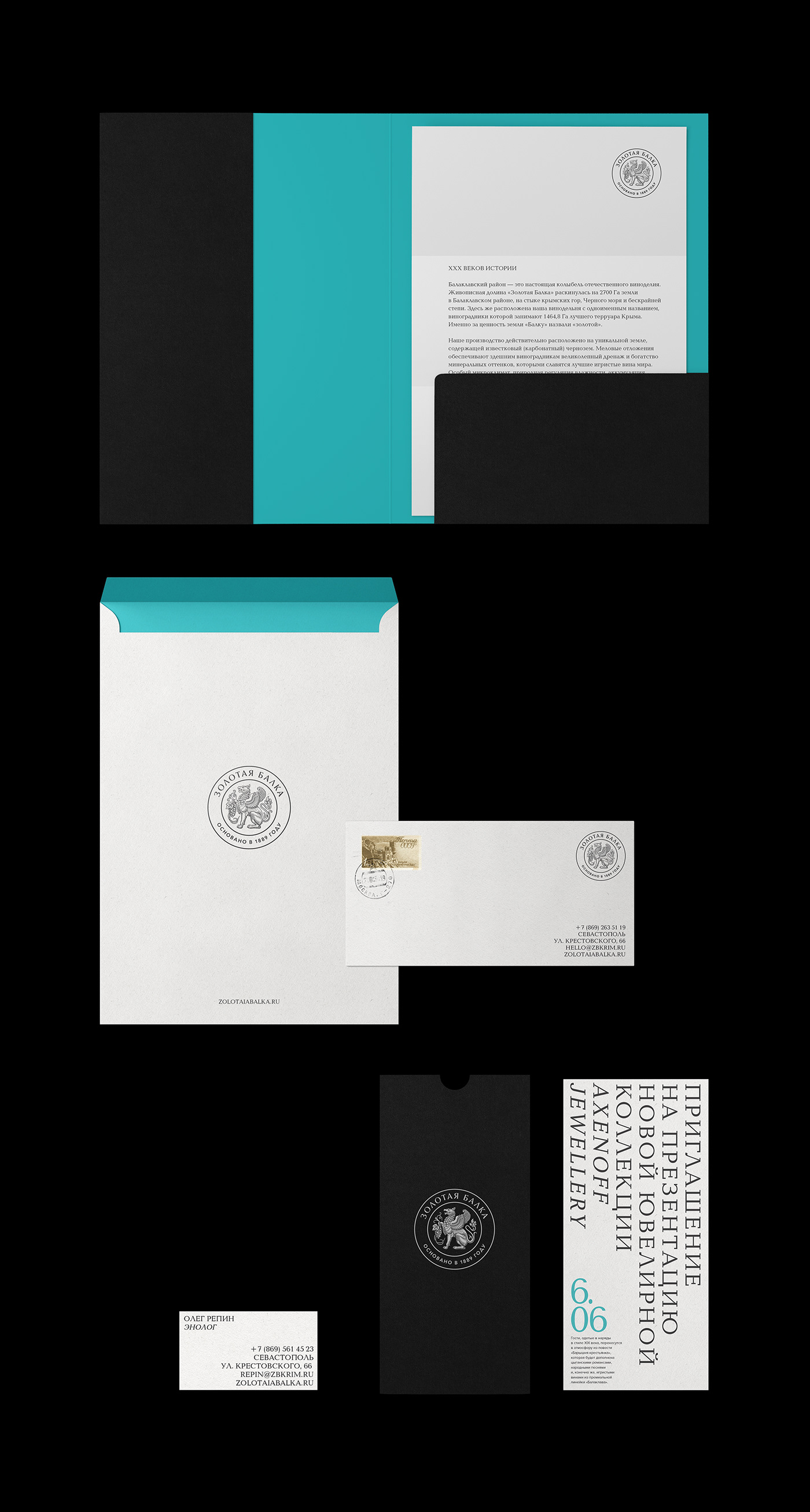
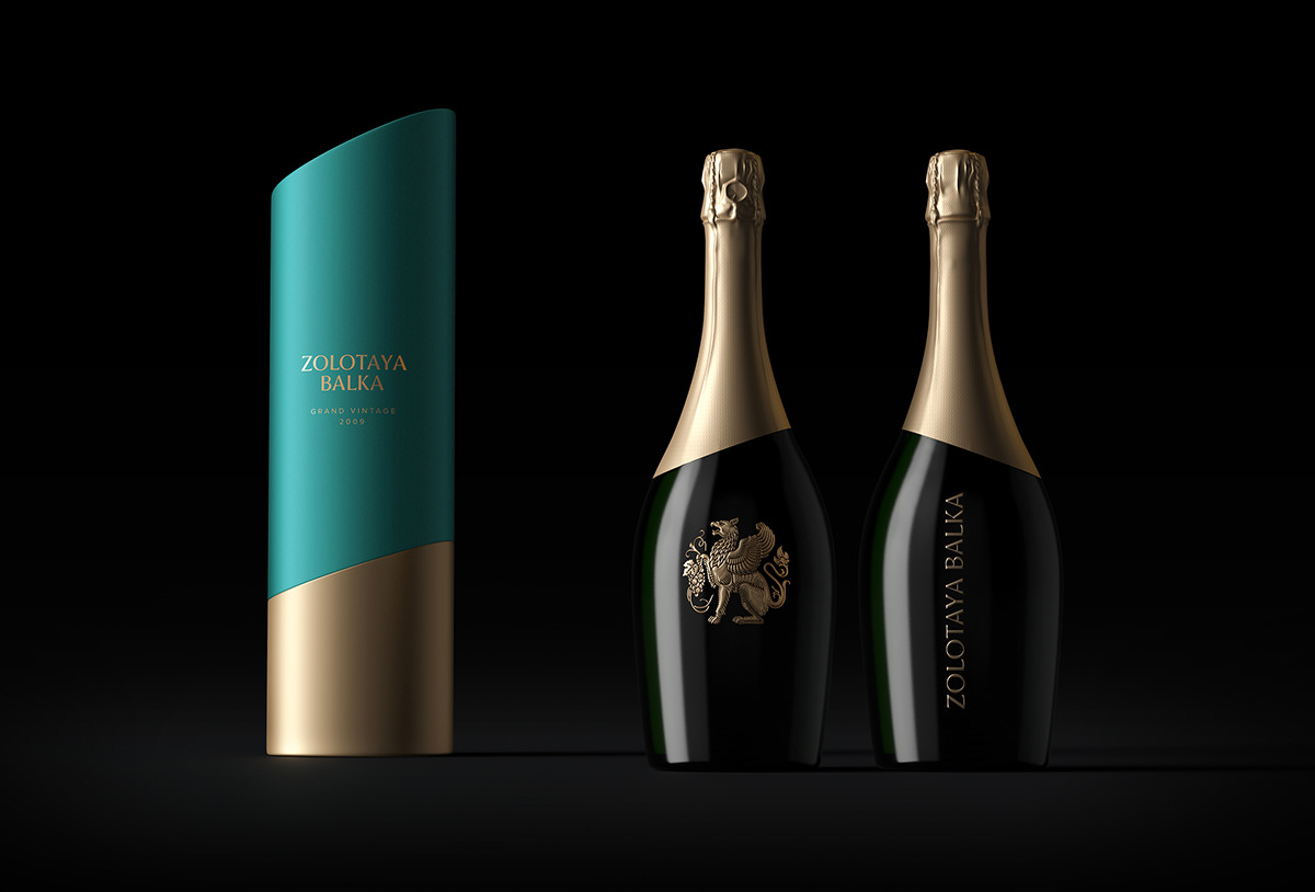
Main corporate colours of Zolotaya Balka form the solemn combination of black and gold, the traditional choice of colours for champagne and sparkling wines category. The addition of azure «Balaklava» colour is used to male an emotional emphasis to enhance the visual identity of the brand, as well as to refer to the Balaklava Bay with its sea, yachts and the blue summer sky.

We have designed several options of logo’s combinations, including a horizontal block and a round print. This approach helped us avoid excessive uniformity and increased the design’s flexibility that is required to adjust the logo for various functions and formats. For instance, a horizontal logo is perfect for store facades, while the round version fits well in the package design.
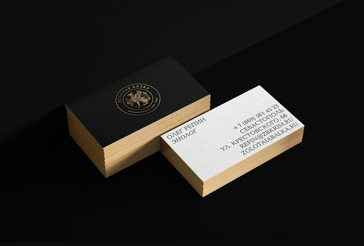

While developing brand identity for Zolotaya Balka, we decided to focus less on current trends and rather reflect on the deep historical roots of the brand and its long-term development strategy instead. This resulted in very conservative design solutions that are based on the traditions established in this given category.
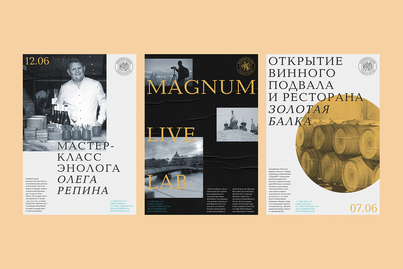
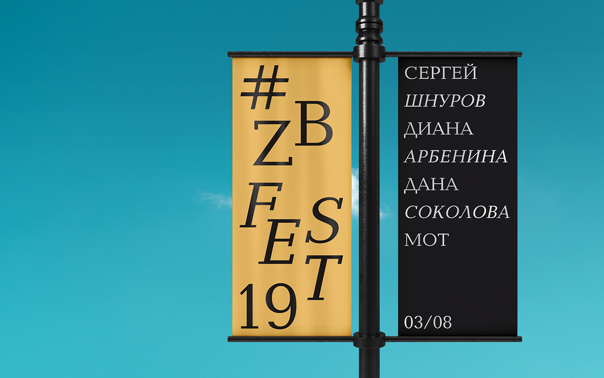
Zolotaya Balka is known for its social and cultural involvement as well as its high-quality products. The company is organizer and participant of a great number of different events including festivals, workshops, opening ceremonies, social gatherings and fashion shows. Creating the design for «#zbfest» music festival that was held right at Zolotaya Balka vineyards became «a project within a project» for us.

Creative Director: Andrey Tarakanov
Designers: Kirill Ermoshin, Roman Gruzdkov, Alexander Shevchuk
Illustrator: Marina Novikova
Project Manager: Dmitry Mayer
More info: www.tomatdesign.com


