


Short story
Few years ago, completely ordinary teacher of english language Mary Yanchak burning desire to carry so important language to masses, doing it creatively and understandable way for all people.

Mary Yanchak
The first step to implement this dream, is creating club Salt (Speak, act, live and think right), where anyone could come and conduct a lesson. With growing popularity of club, lessons began conduct volunteers from the US, Britain, Canada, Australia and other countries.


After a while, club had outgrow from small idea to big education community with its school and interest clubs, where anybody who wants can absolutely for free find new meetings, improve self language or simple relax.


Soon became clear, that Salt need in fresh brand, which will reflect essence of club.
The concept
So, main logo consist of three parts:
1. Big shape, which colored in one of the five firm colors and symbolize continent.
2. Small shape, which is manner english language.
3. Stroke, that connect shapes together and symbolizing free access to other people and countries, thanks to knowledge english.
1. Big shape, which colored in one of the five firm colors and symbolize continent.
2. Small shape, which is manner english language.
3. Stroke, that connect shapes together and symbolizing free access to other people and countries, thanks to knowledge english.
Salt opens up taste features of food, and english — features of the world.

In special version of logotype using at once three color shapes — and so it becomes more vivid, which mean bright and substandard language learning.

The identity
Spots in logotype impart its uniqueness. Shapes are combined and creating recognizable style of business, pens, notepads, posters and everything.
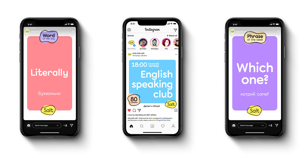
Stores tightly entered our daily lives. At any free moment, we open Instagram and watch endless stories of friends. Obviously, this is a waste of time and in order for people to spend this time with benefit, we decided to partially transfer the study of English to Instagram Stores.
The advertising poster is made in the maximum simple and understandable form and does not contain unnecessary distracting objects.
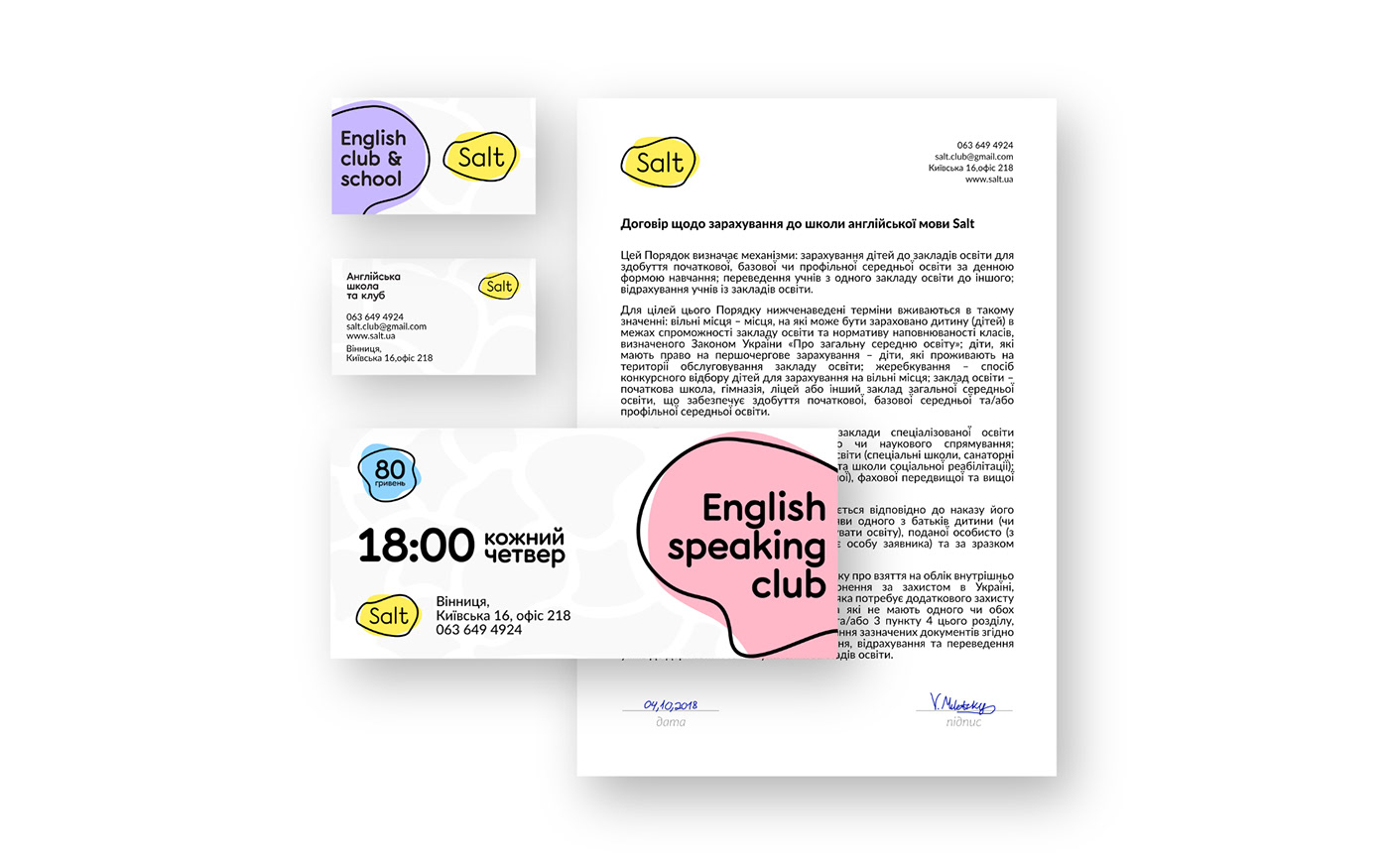
Registration of business cards, advertising flyers and documents.

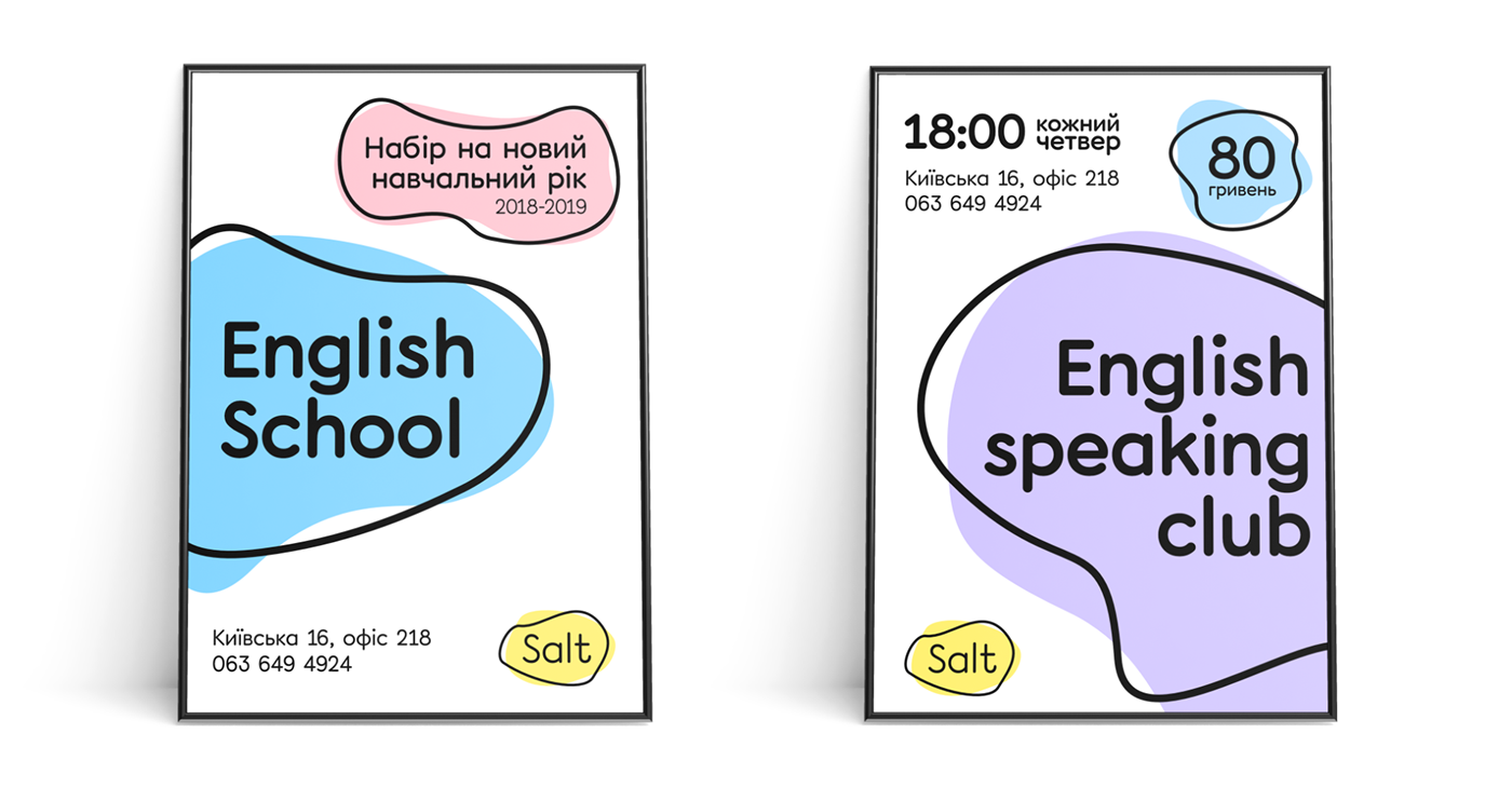
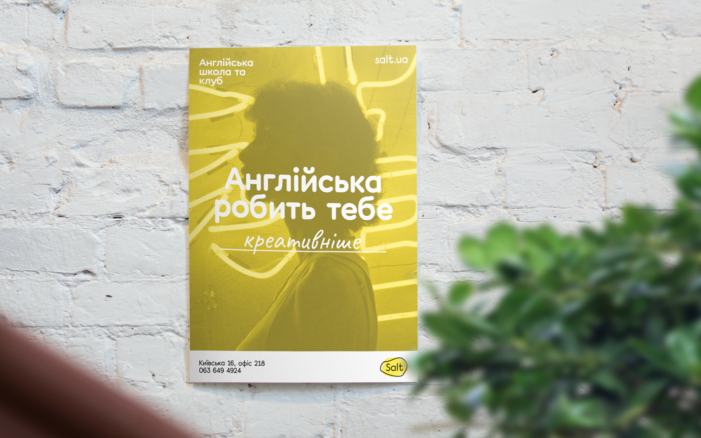
For Salt, posters were also developed that motivate to learn English. They talk about the benefits of English, for example: freedom, opportunity, diversity, and so on.
Backstage
For me it was more than simply another project, it was success story about how small idea can affect on lives of many people.
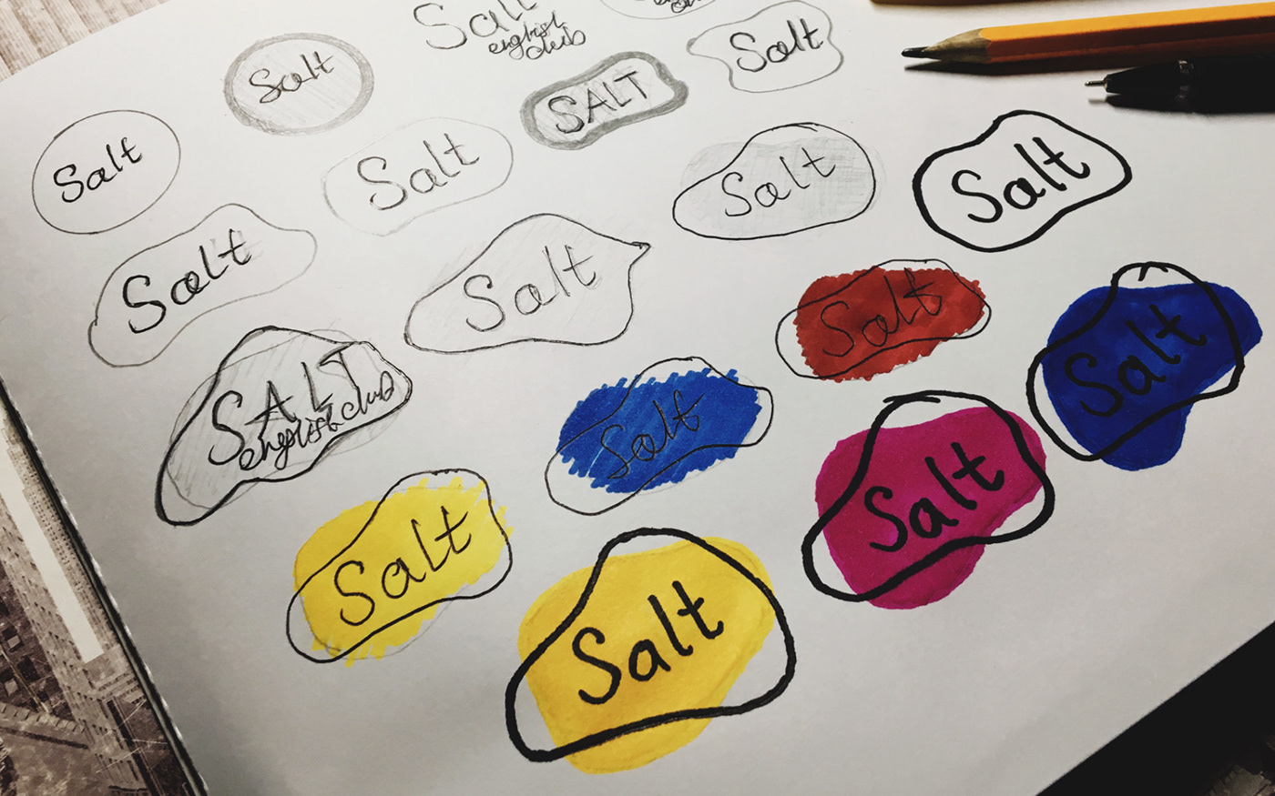
For the most curious, i will attach my sketches and intermediate ideas in work process.


Thanks for watching!


