
What is the mobile Internet?
Today, you can use examples, and hold up a device and show it off.
But it wasn't so easy question to answer in 2001, when the exemplars are inconveniently in places like Japan. And they meet different cultural needs, and use very different technology.
This is the question I – and a lot of others – answered when designing the services for the first mobile Web in North America. There were no pattern libraries, and the technology service providers we had to use barely understood what the point was, so we were begging at the back door, or very much on our own to create many solutions.

The first Wireless Web was mostly text, and had to work on the monochrome phones that dominated the market. The Sanyo flip-phone on the left was the first color screen we'd seen, as before this there wasn't any point really.
There was no device detection, so we had to make it all work equally well on color and monochrome, various screen sizes and various browsers. That was hard enough that complaints of fragmentation today seem trivial. And just to make our job harder, there was a new crop of PDA Phones—really the first smartphones, though you'd probably laugh at them today—like this Kyocera on the right. They needed a fairly different interface again.

I think we were aware of formal research such as Jakob Neilsen's (damning) 2000 study of the UK Mobile Web, but there was nothing new or unpredictable there. The space for information was limited, the browsers had memory constraints (and if you exceed them, sometimes the whole phone crashes), latency is high, and speeds are low. Getting to information fast is important. Not all that different from today.
Naturally, we had pressures from marketing and other business organizations to promote their agenda, but when designing interactions like shown above, I did try to address these with easy-to-follow labels, and really useful progressive disclosure; note the weather for example, with the basic conditions on the landing page.
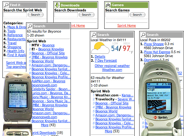
One of the first, most interesting, and most regularly-revised features was mobile search. This was first provided by Google (lower left photo), but Google was apparently uninterested in mobile so I did all the design, at the last minute, in about 4 days. (2001)
Later, there were revisions to this, and a change of provider to some no-name who disappeared in the interval anway. I applied what we'd learned from people using the first version, as well as adding in lots more capabilities. Aside from dropping the walled garden, the success had led to additional partnerships and by then we had added the music and app stores (discussed below) so linked across to them. (2002)
To the right is work continued from the redesign, applied in part when Google came back on board after less than a year. The wireframes are all about parametric search, revealing more information pre-emptively, and more useful results information (such as distance for geographic results, several years before online maps were mainstream). (Late 2002) The photo to the right is the more graphically-intensive Google results including images and so on, just after this design.
This is some of the first multi-platform design or products I am aware of.
It is certainly among the first times I had really worked on multiple platforms at once, and it seems that it's some of the first thinking anyone did like this.
Even if something else preceded it, it did so without our awareness. I had to dream up ways to think about architecture, design, development, content, and even just drawing styles from scratch. The designs for the desktop and mobile web management products were designed side by side, sometimes on the same piece of paper.
Whether it was billing information, or actual functions to manage the Web experience on the handset, it was obvious on the surface of it that the data and functionality had to be as similar as possible.

A key piece to add to the desktop Web self care functions was a way for users to control what was on the "home deck" of their Wireless Web experience. The first launch was a walled garden, and there was a persistent belief that an AOL-like portal was the best experience, so curated links ruled the day.
I (and most of the UX team) let this happen so we could put something prominent on the highly-visited landing page that looked like a mobile handset screen, to expose customers to the possibility of the experience on the handset for a change. (2001)
Later (inset) the screen organizer became an actual emulator to entice users to see what they can do on the handset (and fight the nearly-catastrophic over-promise of the first TV commercials) as well as to organize their settings. (2002)
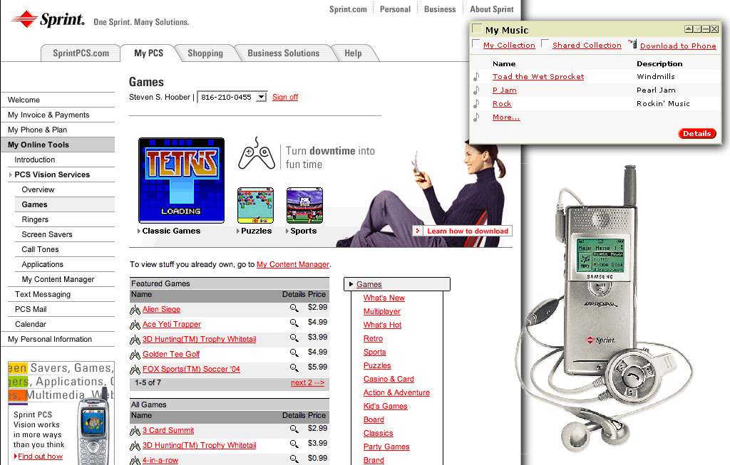
One of the major things users wanted to do was download content, and expand the functionality of their devices. So I helped design one of the first app stores anywhere, maybe the first mobile centric app store, and certainly the first functional one in the U.S. It started selling ringtones, then moved into applications (for featurephones), subscription services, and other products. Of course we designed it to handle all this from the start, so expansion was easy when the content arrived.
The popup above, and the entire page below, focus on music. Another key function (launched first as an independent product due to partnerships with a vendor) was to sell and manage complete MP3 tracks, which went on the Samsung Uproar M-100, the first MP3 phone anywhere (yes, even Japan).
It was... not a success. And the vendor solution was clunky, but we did it and whether the designs I used were emulated or we all simply came up with the right answer independently, all the music, ringtone and app stores today look an awful lot like this still in many ways.


