
Rock On
This project was to create a "gig" poster for a band, with specifications given to incorporate the typography as part of the illustration. The project underwent various phases, including sketches, digital sketches, and peer-reviews, prior to completion of the final composition.
Sketches
Once the project was presented, sketching began. The initial phases of sketches, didn't really have a concrete genre of music that they would follow, so Rock, Big Band/Swing, and Jazz were primarily explored. These sketches were focused more upon the illustration's composition and values than with the typography.

Initial Sketch phase. Peers reviewed these sketches and responded more to 3, 4, 7, 12, and 25.
Digital Sketches
Once the hand-drawn sketches were completed, what I felt were the top three designs were then brought into Adobe Illustrator and were given an initial rendering. Music genre still wasn't totally decided upon yet by this time, so the top three consisted of one representative for each of the previously listed genres.
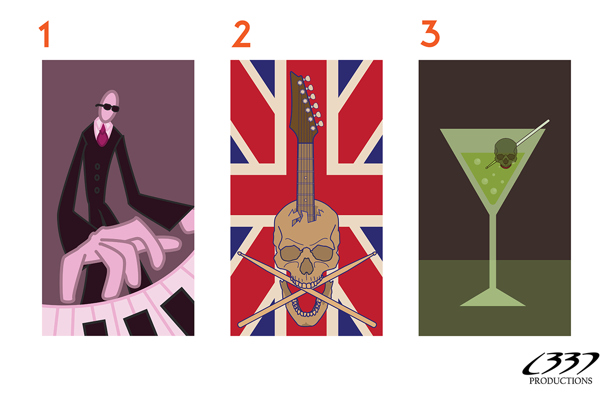
Digital Sketches. Color themes were also explored at this stage. There was an even 33% split in peer responses about which direction to go, and provided feedback as to how to improve each one further.
Further Sketching
Once the digital sketches were presented before peers and the feedback had been recorded, and a direction was chosen, further sketches were made that explored typography, and how to incorporate them into the illustration.

Additional Sketches. As can be seen, typography was explored here, as well as a thought to combine two of the digital sketches into one.
One Last Digital Sketch
The additional sketches were translated into the digital work space and fine details were applied to the illustration.

Last digital sketch. The name of the band was placed going across the page. It was decided that it obscured the guitar too much, and didn't feel right. Peers responded positively to the halftones being implemented as a defining texture in the design.
The Final Gig Poster "Rock On"
Work began again once the final peer review came back in. The typography was well received, but changed in where it would be implemented on the final product. I revisited what other ideas I had had in the additional sketch phase, and like the idea of the name of the band on the top of the guitar, like it was a brand name. Since the name of the band was there, I figured that the time, date, and location should do the same on the drumsticks.

The Final. Additional fine details were added or revisited in order to help make the image as cohesive as possible.


