


Copia is a social digital reading platform, originally designed to be centered around ePaper/eInk hardware, but also available in other channels.
My team was engaged to provide UX/IA/IxD direction for the digital agency contracted to develop the platform. I led the creation of design principles and the development of an IA for the whole platform, as part of a multi-disciplinary team at the agency.
In collaboration with creative and development teams, I then led my team in the design of a complete set of interaction designs for an eReader (never launched), desktop web, desktop application, and mobile products.
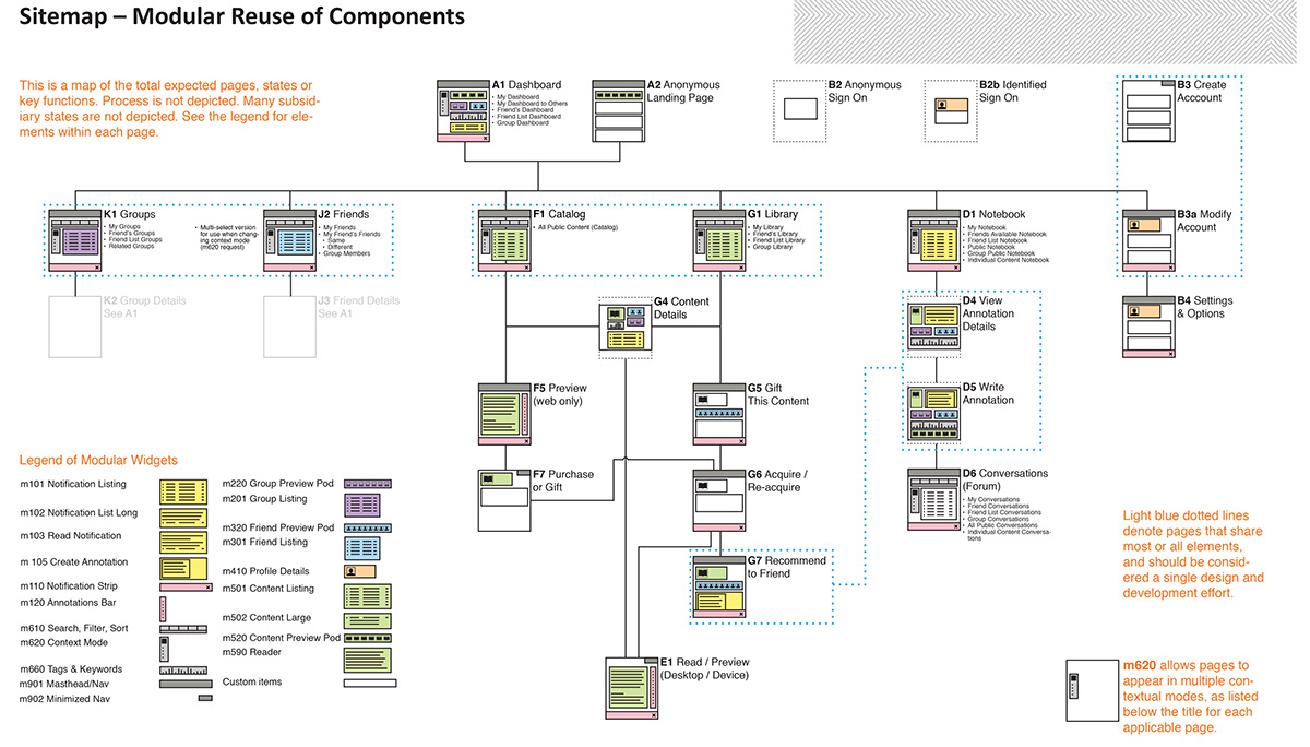
This is the first fully-formed use of what I later called a blueprint; the design here is a sitemap for the service. The desktop web uses a limited set of this, the eReader used most of it, but not everything, etc. Each interface has a customized subset, but uses this model to assure consistency.
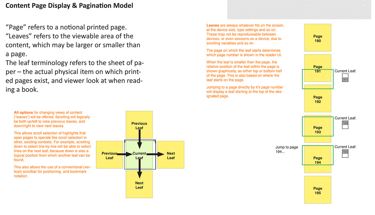
Even the simplest stuff was complex. What is a "page" in a digital book? Current eBooks used complex, technical references which had no real world analogue. This describes a model for page display, and page interaction.

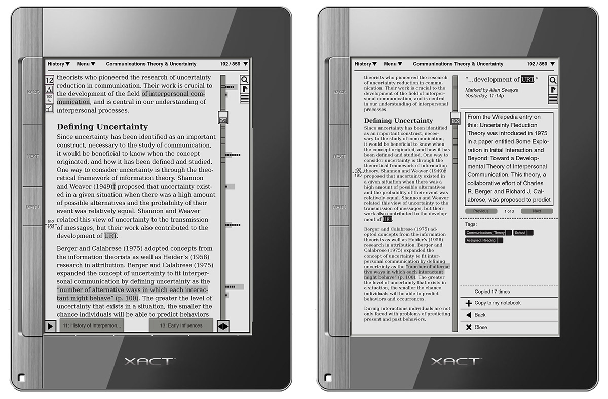
The key feature of this product was adding robust note-taking, tagging and creating social reading by sharing notes. Above is a part of the design document I created to specify this behavior and interaction.
Below is the final design of how this looked on the eReader hardware. See subsequent designs on tablets and handsets for how it evolved further.
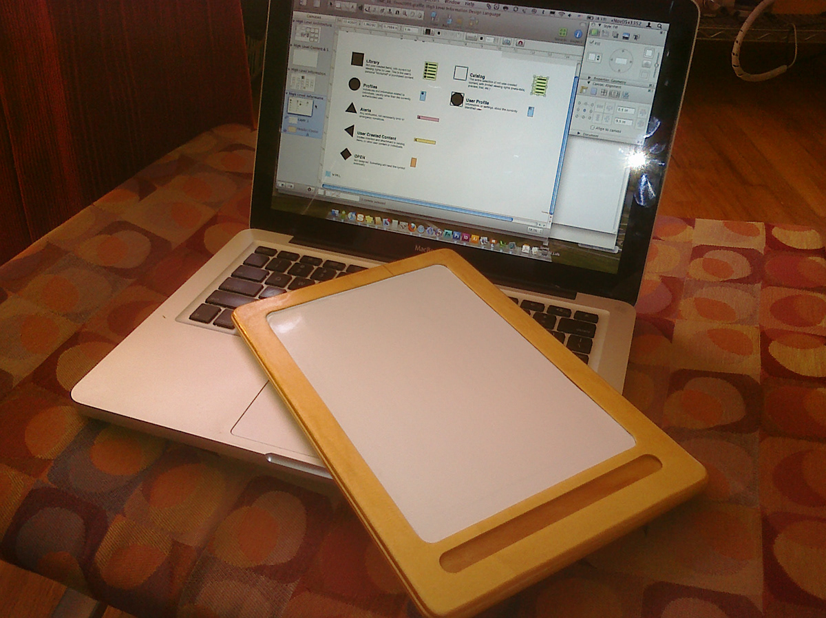
We did this before there were iPads and other easily-modifiable tablets, so to mock up designs I made a plywood tablet, which we could sketch on (the white part is whiteboard paint), or put half sheets of paper in to check out printed designs on a piece of hardware, of sorts. (On the Macbook is the legend for an encoding system used in developing the information architecture).
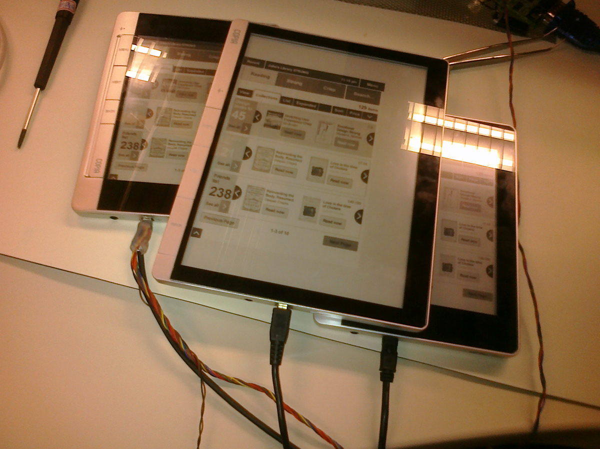
Development hardware. I had loaded imagery onto the devices to check mostly the color density. Significant work was also done to develop the right size and typeface for the text in the reader interface to assure it was readable.
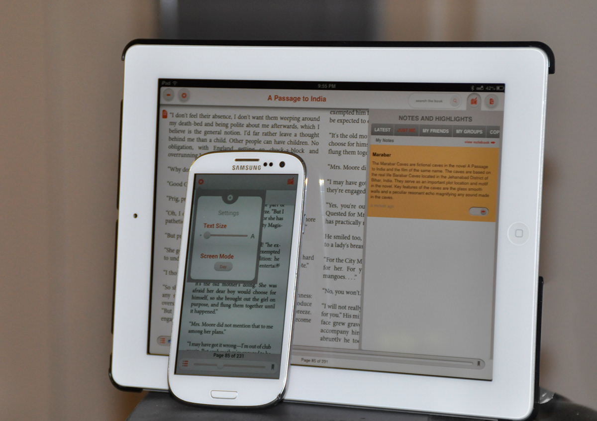
The reader inteface as it has evolved to fit the iPad and Android (Galaxy S3) as of early 2013.
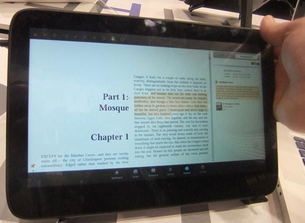
The reader interface as originally demonstrated after moving from ePaper to full color tablets, as presented at CES.
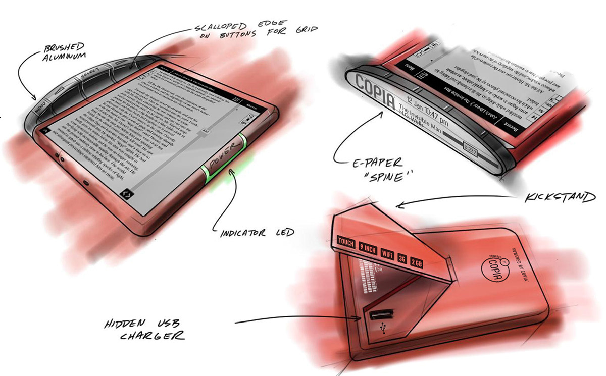
I also led a team in developing concepts for innovative eReader hardware (not implemented) to take advantage of the digital platform most effectively. This is just one of the ideas proposed. I did not draw the basic sketch, but aside from giving lots of direction did draw the interface elements, added in most of the external branding and labels, and otherwise tweaked the drawings before presenting to the client.


