Helsinki is the Capital of Finland and the centre of the Helsinki Region, a functional urban region of about 1.4 million inhabitants and 751,000 jobs.
In August 2017 we were chosen to lead the design process of the new brand identity for the City of Helsinki.


The City of Helsinki had no uniform brand identity and city departments and projects have had their own varying identities and logos. The only consistent identity element was the Helsinki coat of arms but it had its own restrictions and challenges in terms of usability.
The reform of the City organization offered an opportunity to unify the City’s brand into one cohesive visual identity.


The rebranding of Helsinki sought a fresh new brand identity that respects the past and is both modern and timeless. The identity needed to be adaptive, responsive and versatile.
The target audience was basically “everyone”, starting from 40,000 City employees to Helsinki residents, other Finns, foreigners, tourists, immigrants and special groups. This amplified the need for a flexible and memorable identity that is also easy to use.
The scale of the project was massive —the City of Helsinki brand renewal has been the biggest such project ever done in Finland.

The spearhead of the identity–Helsinki logo–was designed based on the most recognisable Helsinki symbol, the traditional Helsinki crest. The new logo was designed to be adaptive and responsive to any content, for example, different language versions of the logo.
The graphic wave motif (and its variations) used as a graphic element was also derived from the coat of arms.


The entire new identity was built on emotional, tangible cornerstones that most users and target audiences could get a grasp on. This helped in introducing the identity to target audiences.
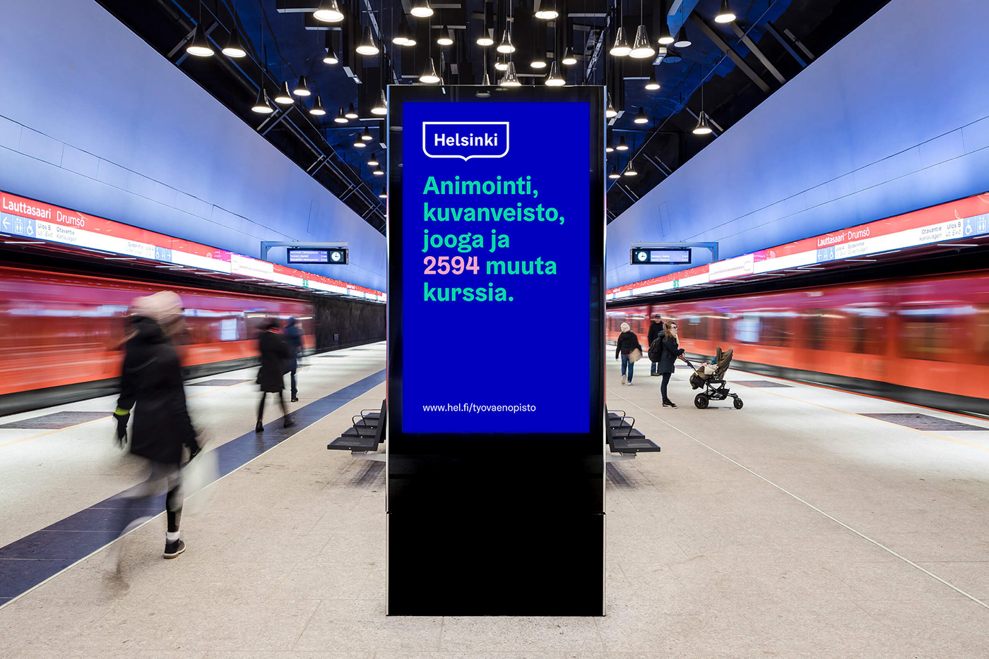


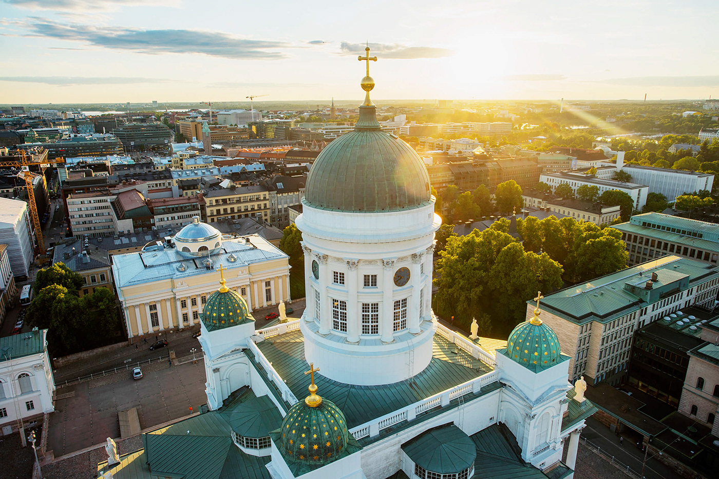
The brand colours are subconsciously familiar to citizens—they are the colours used in the Helsinki crest, the cupola of Helsinki Cathedral and colours of the tram and metro, etc.
A custom typeface with typographic “wavy” details, Helsinki Grotesk by Camelot, was customized to be used consistently in all Helsinki City communication.


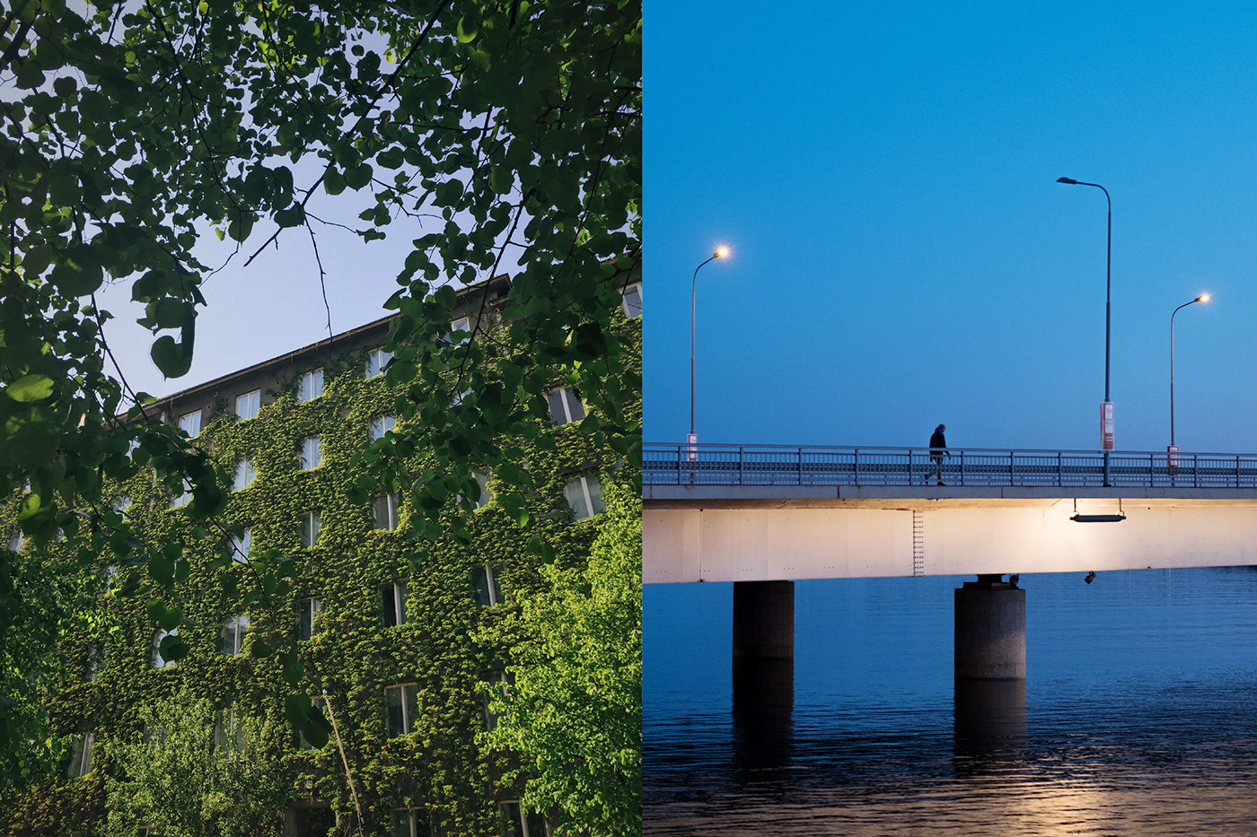
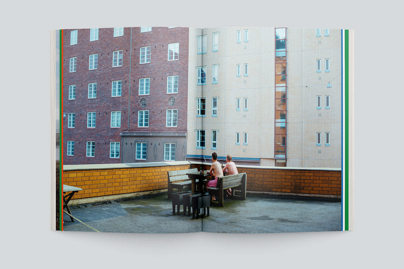
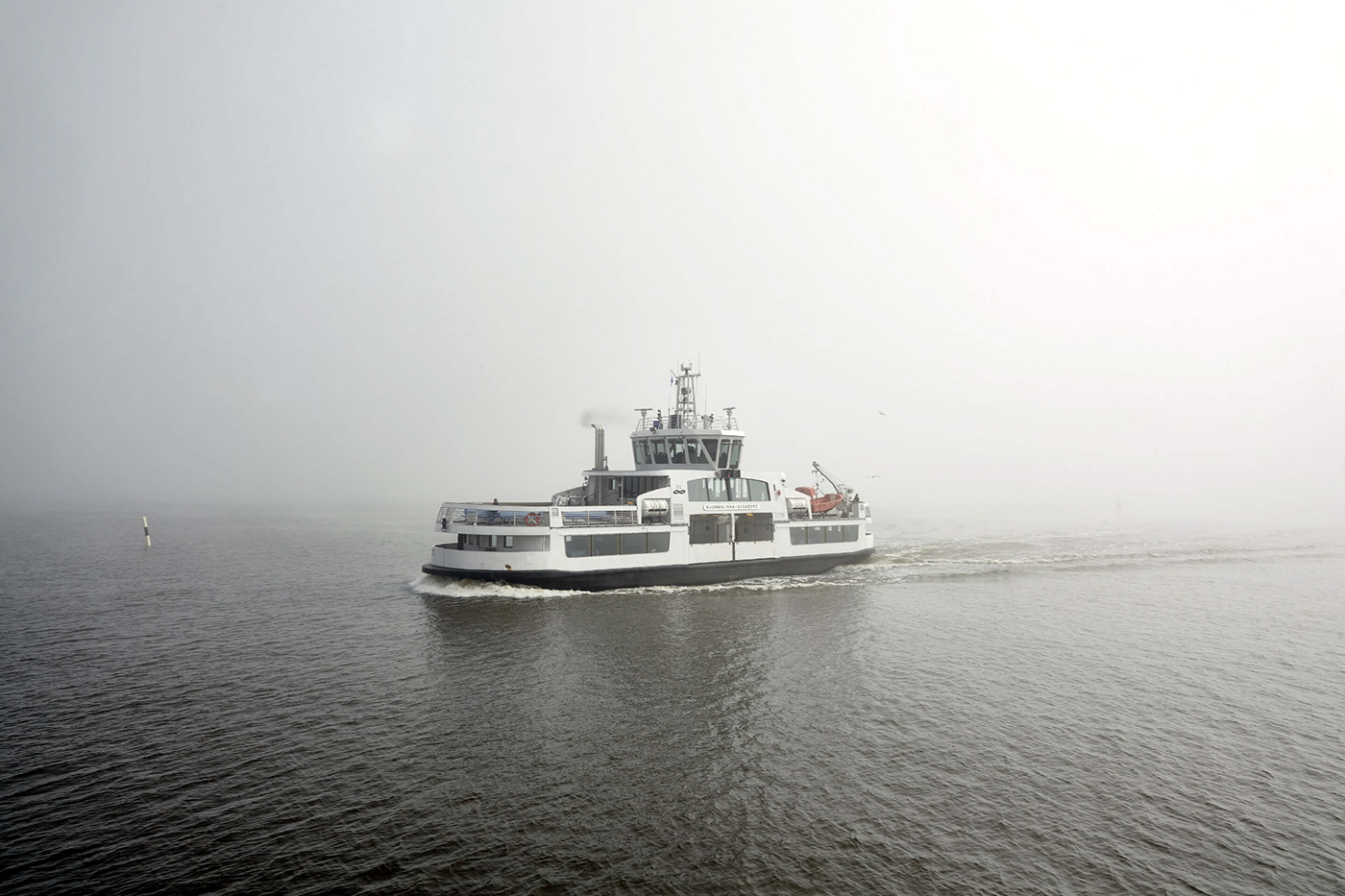
A fully new image narrative was designed (both for moving and still image) for the City with the help of curated photographers. The overall theme for the images and executions was “no filter”, portraying Helsinki as it is.


Now that the entire organization produces and uses materials based on a uniform identity, the City’s actions can draw more attention and be more efficient, as well as save money.
For citizens the reform means increasingly clear, easily understood and more resident-oriented marketing and communication about the City and its services.
People working in Helsinki or visiting the city will perceive Helsinki more easily than before as a straightforward, appealing, modern, functional and enjoyable place. The uniform identity also helps Helsinki to differentiate itself from other cities and regions.

The introduction of the new brand identity throughout the City organization will take time. It is likely that many years will pass before the identity is fully established. We will update the case study as the identity evolves.
Design & Branding Agency: Werklig
Type Design: Wolfgang Schwärzler, Camelot Typefaces
Digital Agency: Idean
Film material by: Sherpa
Type Design: Wolfgang Schwärzler, Camelot Typefaces
Digital Agency: Idean
Film material by: Sherpa
Photographers: Eetu Ahanen, Carl Bergman, Jussi Hellsten, Juhana Hurtig, Kuvio, Julius Konttinen, Risto Musta, Robert Lindström, Aleksi Poutanen, Riku Pihlanto et. al.
See also: My Helsinki website


