


The CAMPUS (Science Park), Brno derived its name from its vicinity to Masaryk University and also because we wanted to create a business park brand portfolio building on the success of The PARK project and branding. The design and floor plates of the building were similar to the PARK, with the difference mainly in the focus on types of tenant and usage. In Brno the site was adjacent also to the Brno teaching hospital and the aim was create flexible space for normal office floor plans but also for R&D/Biotech companies who might be able to benefit from the nearby student population. The Science Park was also next door to the Campus Square Retail Town Center shopping mall.
Therefore we chose to adapt The PARK identity for The CAMPUS and later The OFFICES in Plzen.
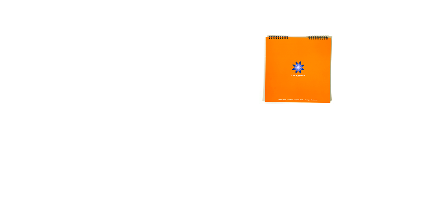
The CAMPUS ID was in orange with a overlaying flowery icon in blue. We also used transparent paper but with a different colour palette and message. The project was not as big but successful and had now allowed the creation of The PARKS portfoio brand.
Elements:
Name: The CAMPUS - Logo and CID with manual - Slogans: Living Works, Vibrant Campus Life - Taglines - Copywriting - Brochures: Promo square brochure - Photoshoots: Architecture and areal - web (for Campus Square only) - Signage: exterior building monoliths and internal room signs - Maps and parking signage - Branding for on-site cafes and restaurants - Window foil graphics for offices and on-site shops and food outlets - online presentations.
Team
Client: AIG/Lincoln - Design: Simon Gray - Photos: Filip Slapal - Areal Photos: Roman Simon - Writer: Jeffrey Young - Production: doD and Holub (foils and signage)


