


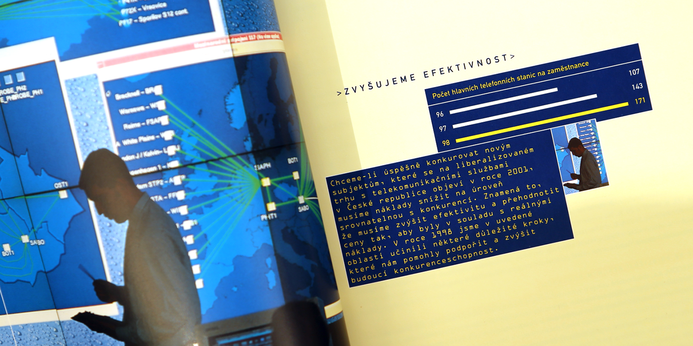
We were lucky in our second year of cooperation to get away from the corporate fonts in the design, allowing a more web 1.0 feel with the use of monospace typefaces, the tinted yellow to make cream backgrounds and menu boxes. It made the design less corporate and got away from what was essentially a very hard and rigid CID in terms of colour and fonts. The design was focused a lot on the high-security state-of-art control centre in Olsanska, which was also used for the board portraits.
Elements:
Name: SPT Telecom Annual and Half-year Report - A4 CM(Y)K: We had a good trick where we replaced CM(Y)K yellow with the branded Yellow pantone. The only difference was about 5% more magenta than typical CMYK yellow - Half year: A5
Team:
Client: SPT Telecom (now Cesky) - Design & photo direction: Simon Gray - Photos: Jan Jindra - Production: doD - Language: CZ & ENG


The 1999 report was more people and lifestyle oriented with large dividing spreads using Vaclav Jirasek's pictures along side stock imagery mainly as backgrounds for key words about Telecom's focus and aims. It was also the first year of the name change to Cesky Telecom and resulting rebranding.
Elements:
Name: Cesky Telecom (previously SPT) Annual and Half-year Report - A4 CM(Y)K: We used the same trick with the yellow pantone - Half year: A5
Team:
Client: Cesky Telecom (formerly SPT) - Design & photo direction: Simon Gray - Photos: Vaclav Jirasek plus stock art - Production: doD - Language: CZ & ENG


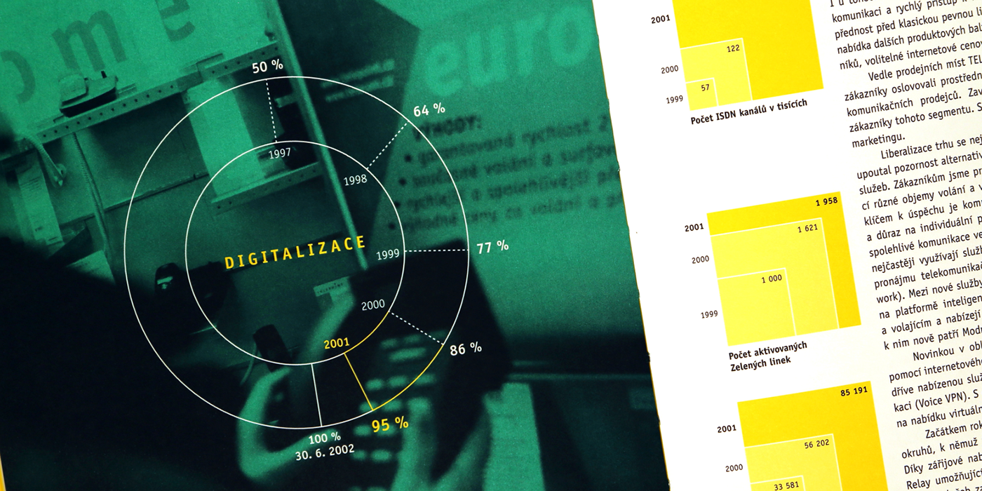
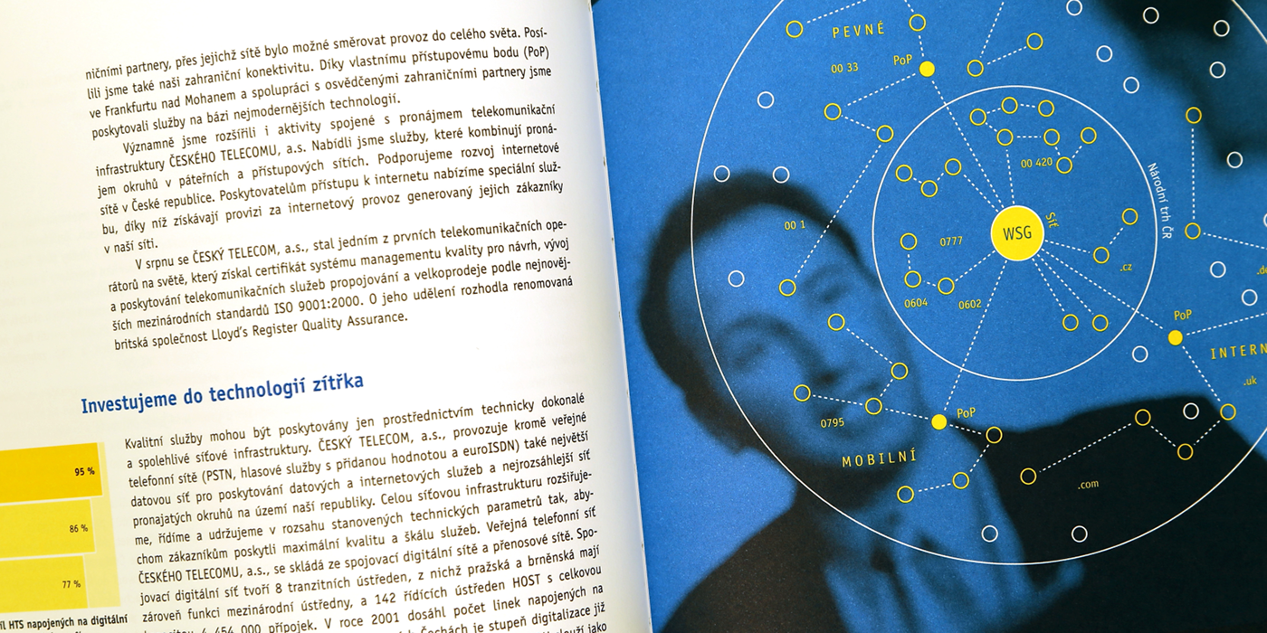

After a year off we returned with this award winning 2001 annual report focused on the technological and infrastructure advances of Cesky Telecom in the previous year and showed that they were on track to reach their stated goals. We had an excellent relationship with the CEO who was very keen on the infographic approach. I was also happy with the two spots we used for the different accounting systems in the financials. They were based on the blue and green from the brand colour specs but lighter. The whole report was printed with four spot colours in the main section and two x two spot colours in the financials. This was also the only year that we had complete control of the project as we also generated all the content in English and Czech.
Elements:
Name: Cesky Telecom Annual and Half-year Report - 200x240mm, 4/4 spot in main section and 2/2 in the financials - copywriting in English and translation
Team:
Client: Cesky Telecom (previously SPT) - Design & photo direction: Simon Gray - Photos: Various - Copywriting - Jeffrey Young - Production: doD - Language: CZ & ENG
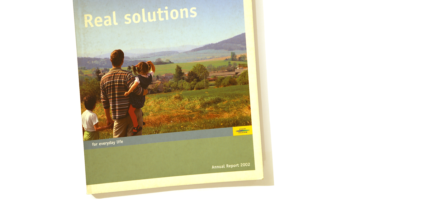


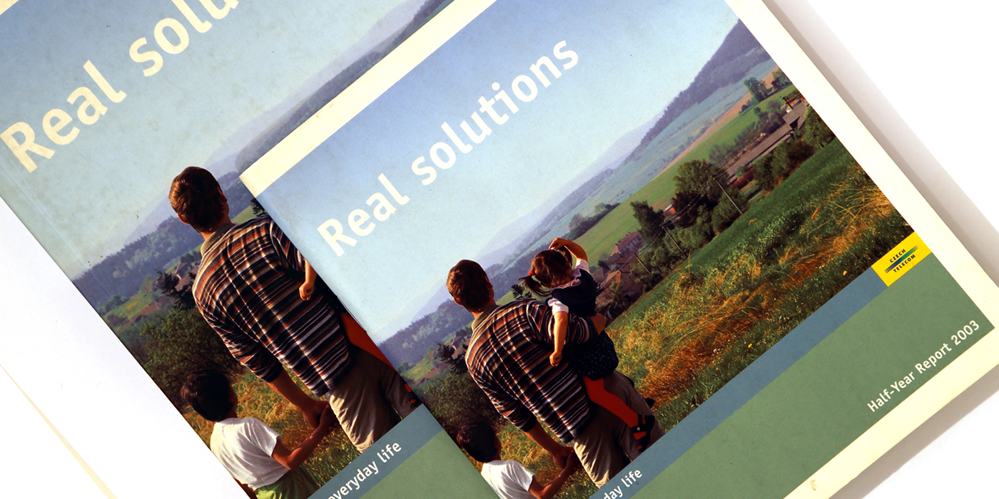
The 2002 annual report used the same smaller format of 2001 and returned to focusing on the technological and infrastructure advances of Cesky Telecom in the previous year. It used key data to show their advances and we supported this with abstract everyday life pictures taken by Filip Slapal. The new brand colour palette allowed more freedom and colour coding, and to got us away from the over emphasis on yellow. The innovative informal board of directors meeting portraits did not go down so well with the board members themselves but we were happy to have slipped it past them!
Elements:
Name: Cesky Telecom Annual and Half-year Report - 200x240mm CMYK thrpughout. The only difference was about 5% more magenta than typical CMYK yellow - Half year: half-size
Team:
Client: Cesky Telecom - Design, photo direction & infographics: Simon Gray - Photos: Filip Slapal - Production: doD - Language: CZ & ENG


