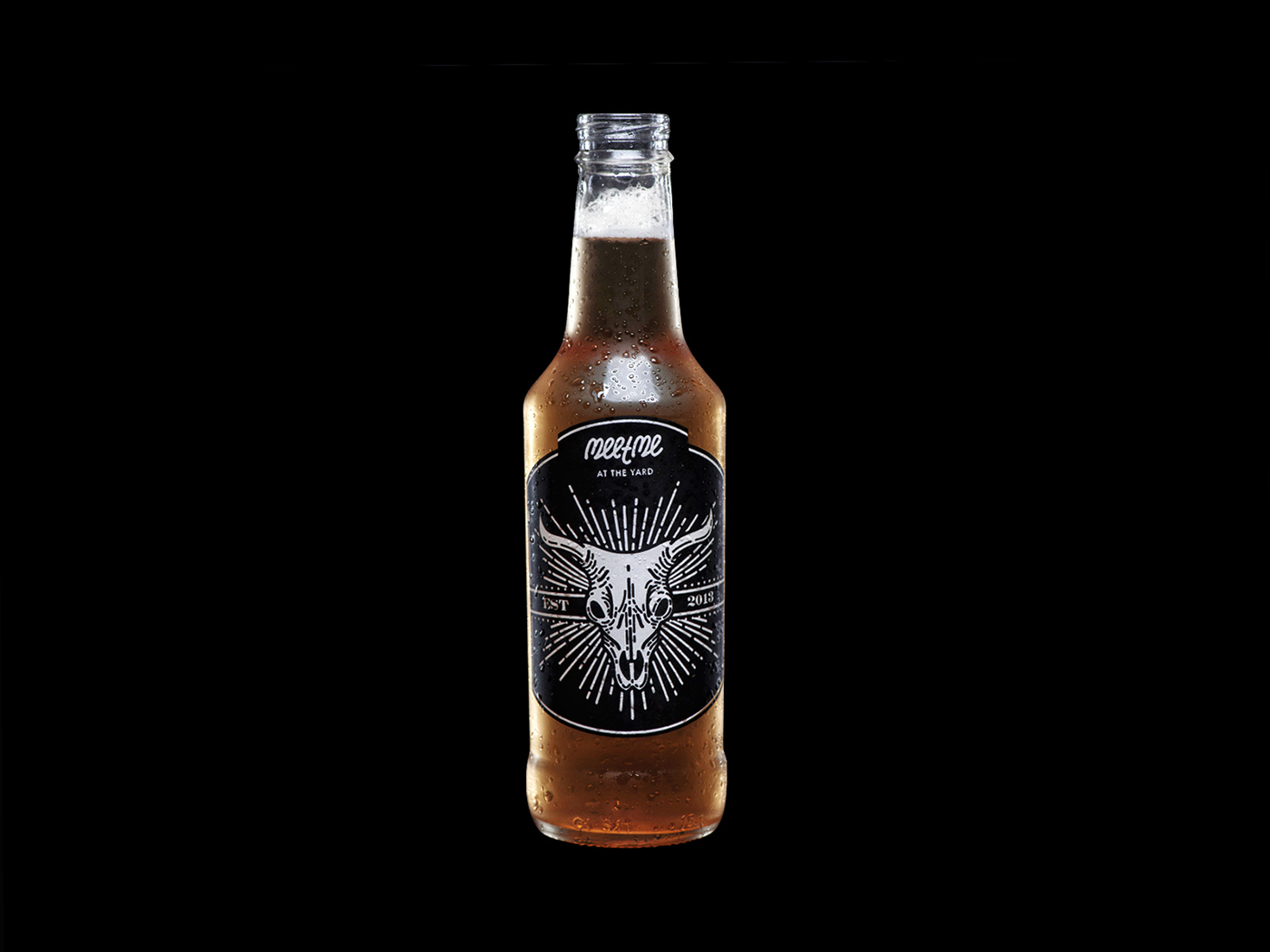
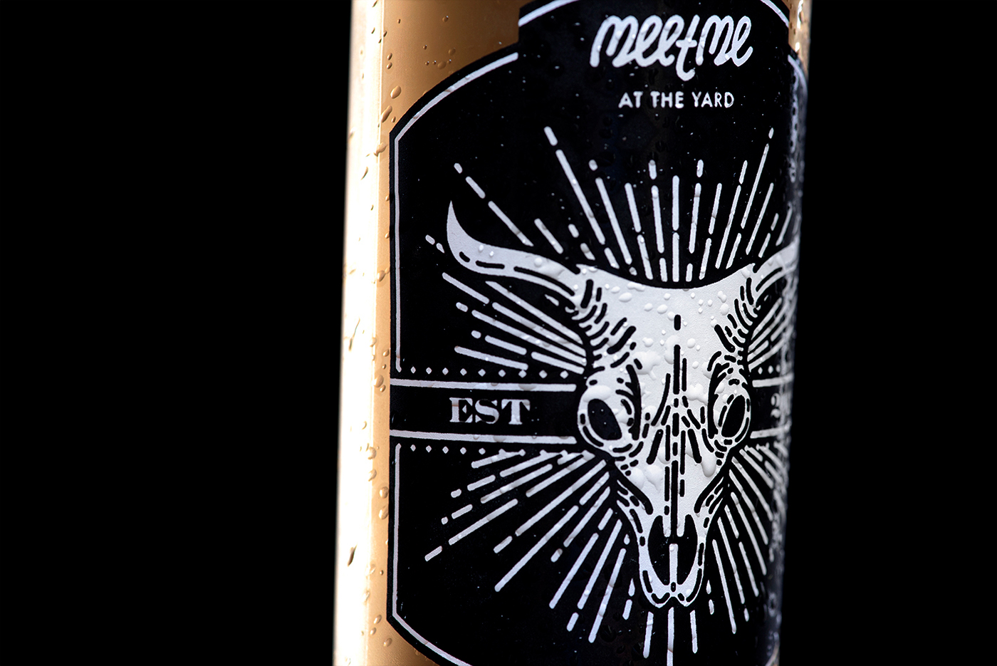
After its first year in business, MeetMe did a full restructuring of its operations, and needed a complete rebrand, altering everything but its logo (designed by Francis Dias). The concept behind the project was of the 'New American Cuisine': food based on american traditions, but 'remixed' with influences from all around the world, using the 'Melting Pot Metaphor' as the root for all the strategy.

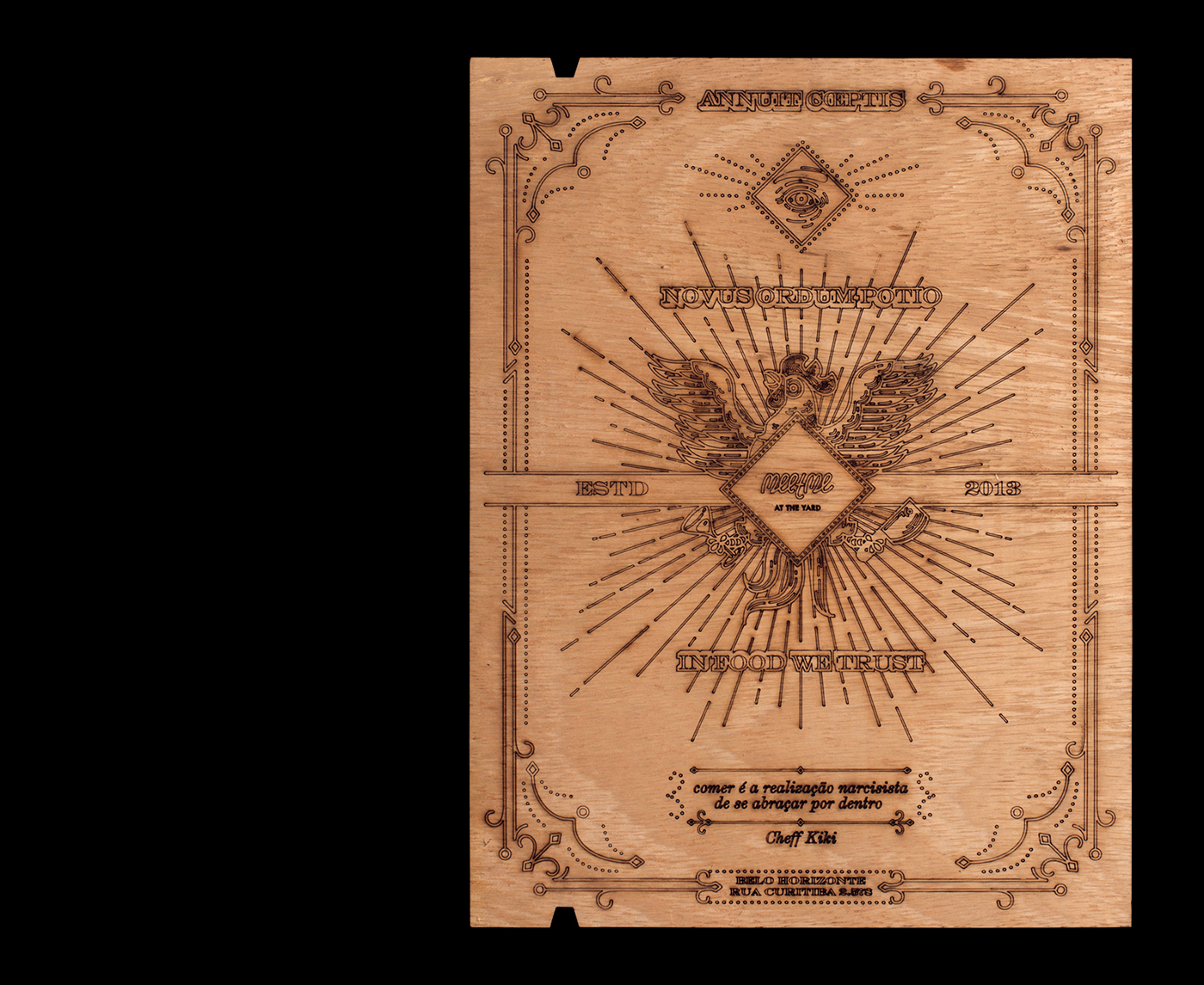
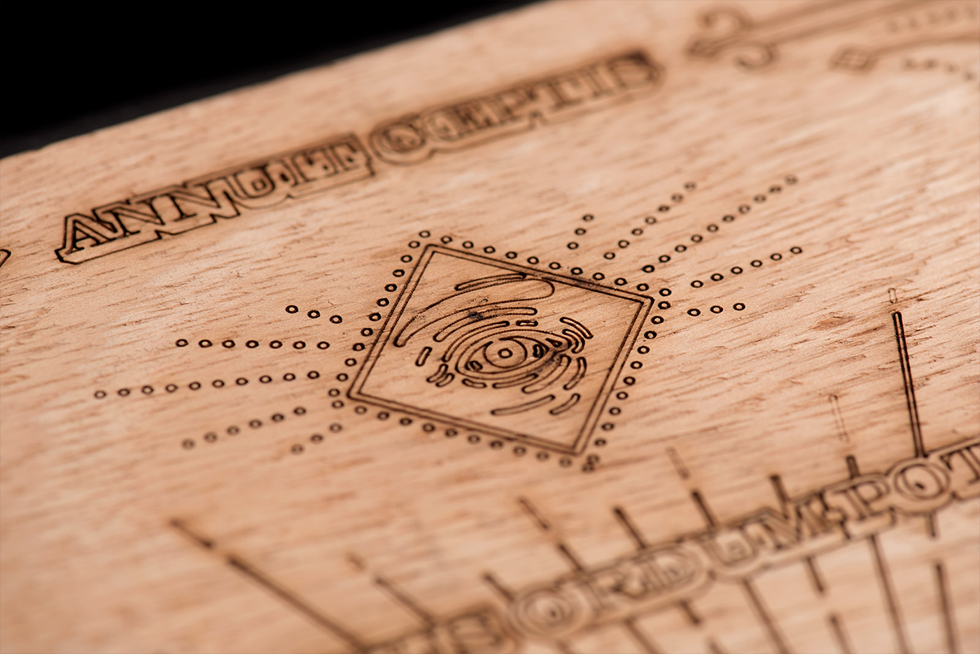
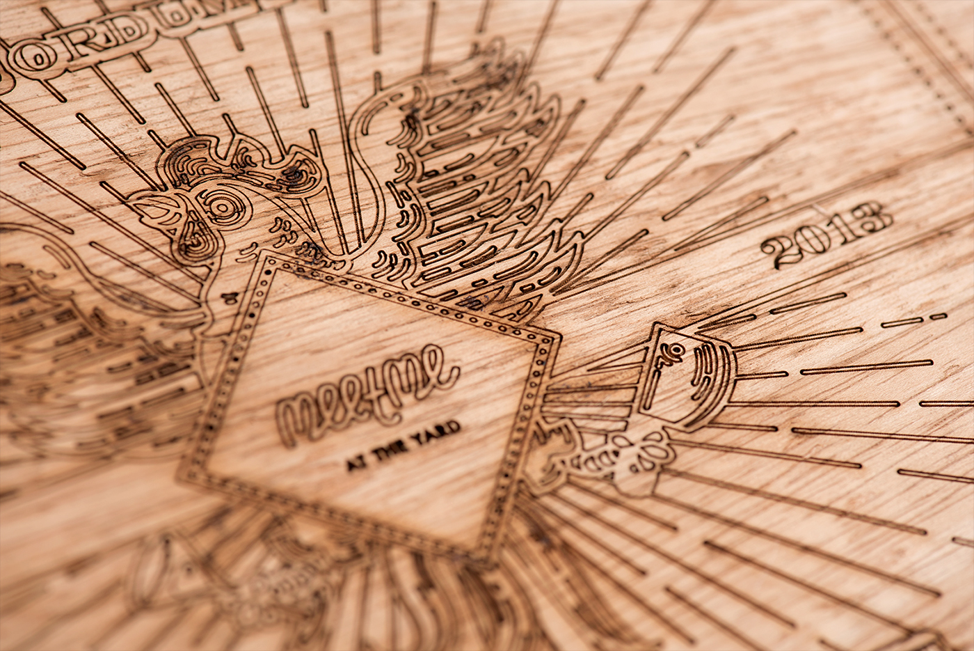
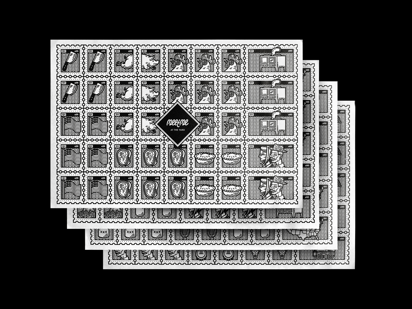
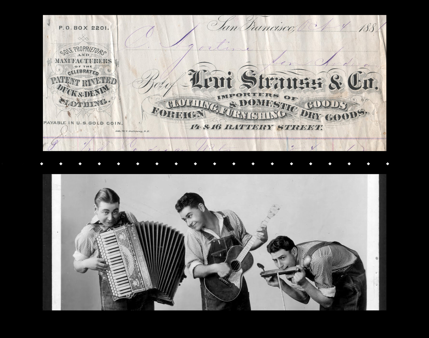
Looking for ways to implement their concept in the graphic design realm, we went all the way back to the post civil war late 1800s (way away from the 1950s, traditionally used by every american related food joint in Brazil). The idea was to depict 'typical southern traditions' using an updated take on the 'northern industrial design' look.

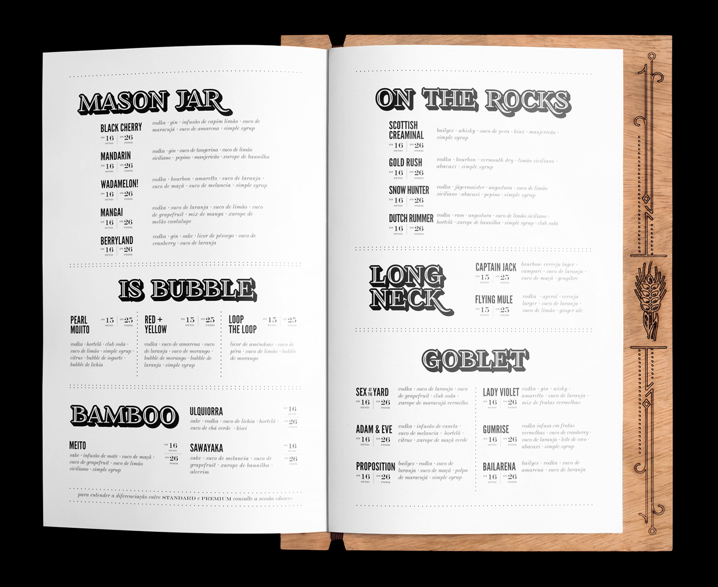
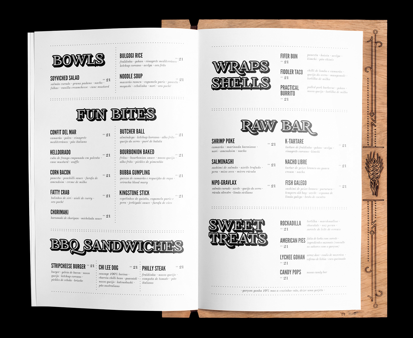
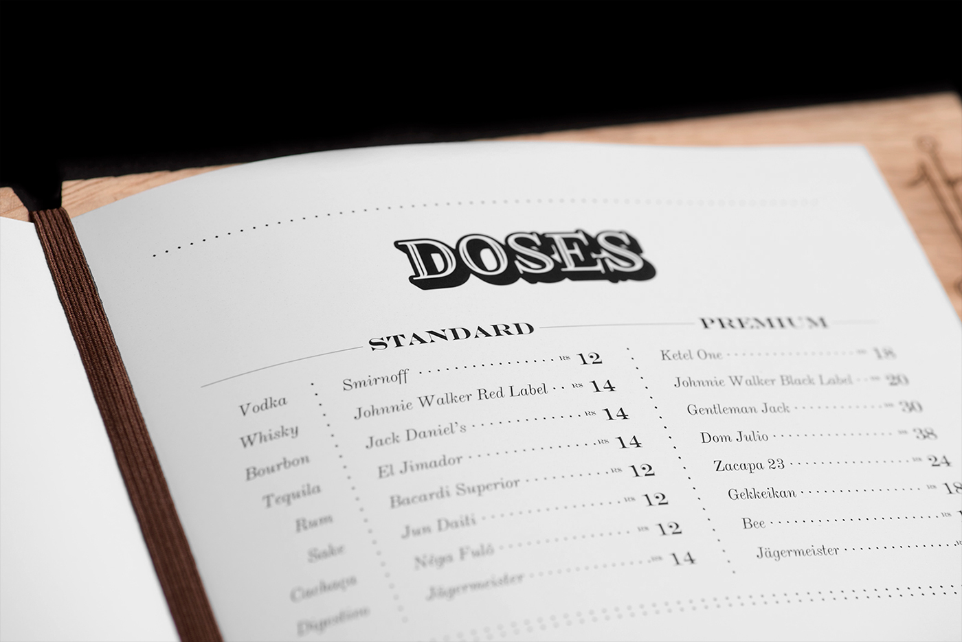
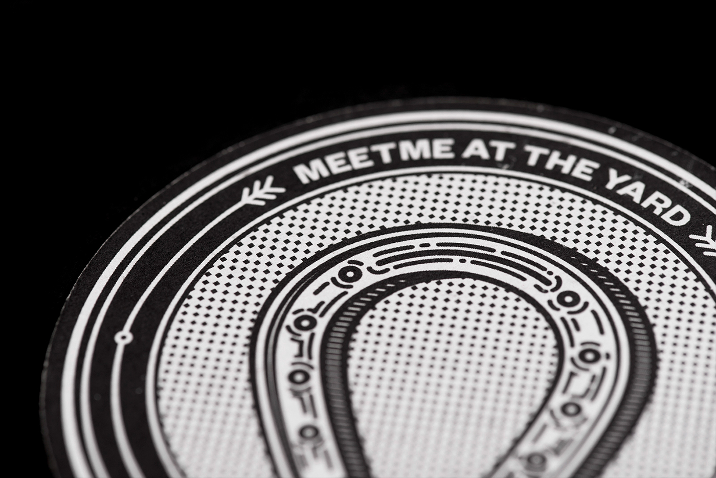
With the idea to evoke late 1800s print material and minimize costs, the color palette was kept to the most basic: black and white only, with no grayscale in between. A set of different textures were developed in order to create different 'halftones', mimicking stone, wood and metal engravings from the period.


The typography was carefully chosen with fonts that were somehow similar to those found in documents from that era, some of the 'base' fonts even received an additional decorative treatment. As a result, a diverse type palette was created, allowing the composition of beautiful and complex text hierarchies.


The illustrations developed the color palette's idea to mimic old engravings and took it further, helping the overall brand look to feel more casual and contemporary. The size of the strokes was kept constant through most of the illustrations, with changes only in the amount of detail in each illustration according to its size.