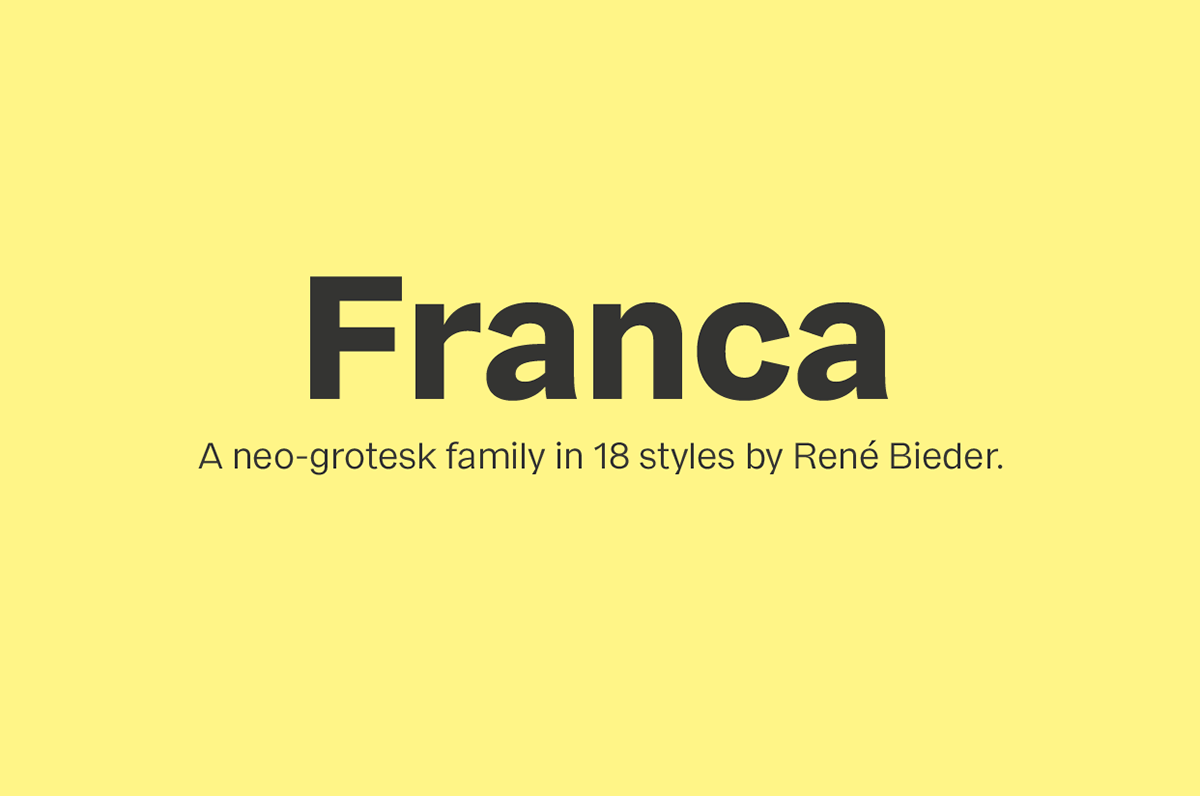
Franca.
A neo-grotesk family in 18 styles.
Franca is a neo-grotesk family in nine weights plus matching italics. The inspiration for the design came trough the constant interest in new interpretations of the classic grotesk model and a study of „neutral“ typefaces like Helvetica, Univers or Normal Grotesk. During the studies, additional attention was given to the American representatives of the genre, resulting in the initial impetus for a reinterpretation, combining both paths into one contemporary design. This is reflected in the name, blending together the names of the most popular typefaces of each genres, (Fran)klin and Helveti(ca).

Characteristics
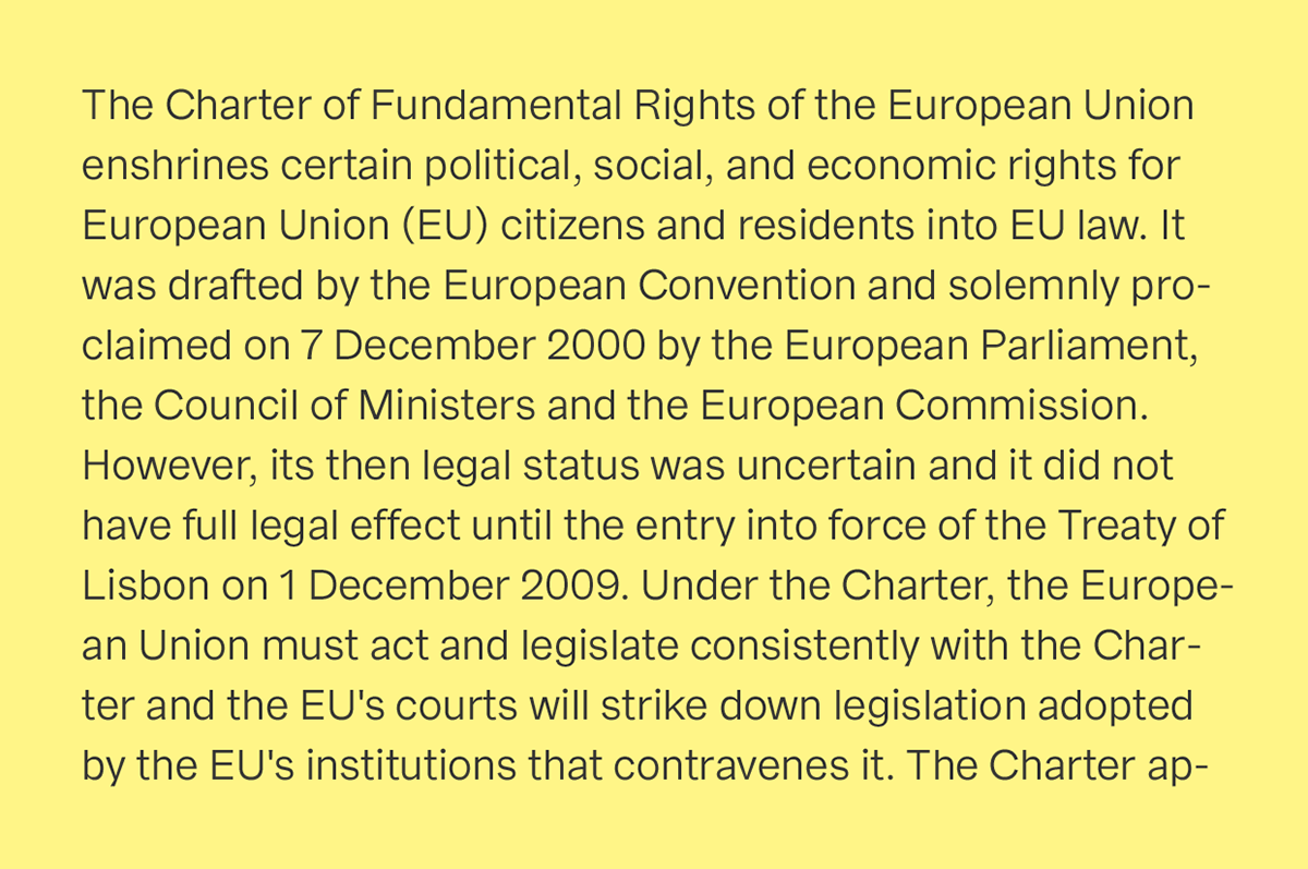
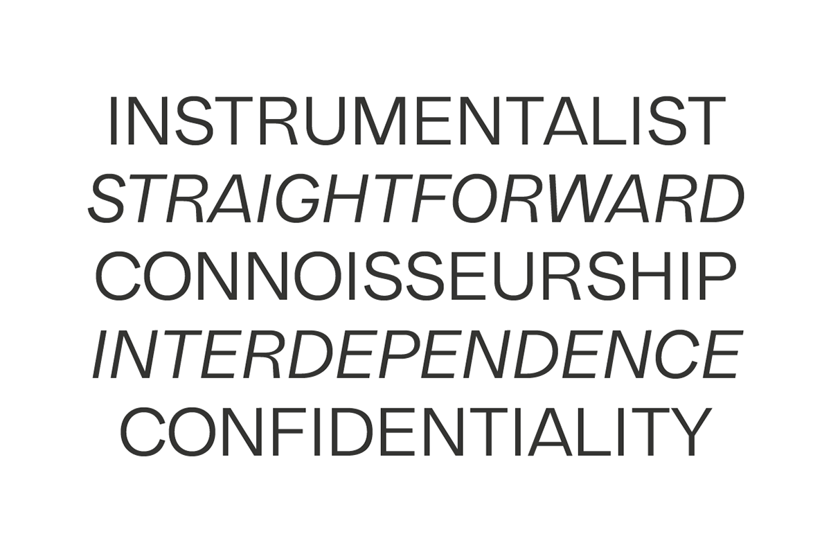
Due to its large x-height and plain design, the family is perfectly suited for all kinds of text. The calm and harmonic texture is combined with a compact look, which is the result of a short descender/ascender and closed apertures.

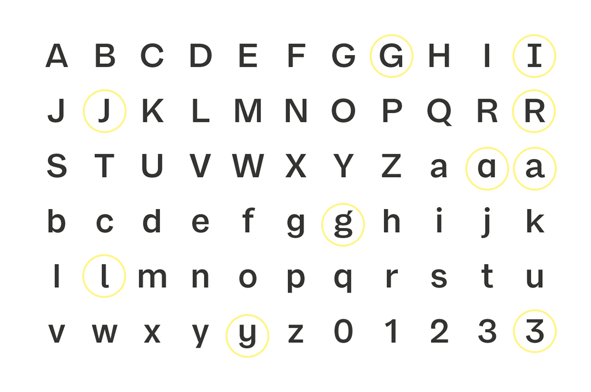
Basic Glyphs
The design of the uppercase characters follow a modern approach, characterized by optically similar glyph widths. This is carried on in the lowercase characters. In addition to the standard glyphs, the family is equipped with eleven sets of alternative glyph shapes, enabling quick and easy customizations.

Opentype Features
A wide range of opentype features like stylistic sets, ligatures, old style figures, fractions, case sensitive shapes and many more, is available for professional typesetting.


Language Support
The family supports up to 92 languages and comes with 500+ glyphs per font. All alternative characters come with their diacritic counterparts.


Weights
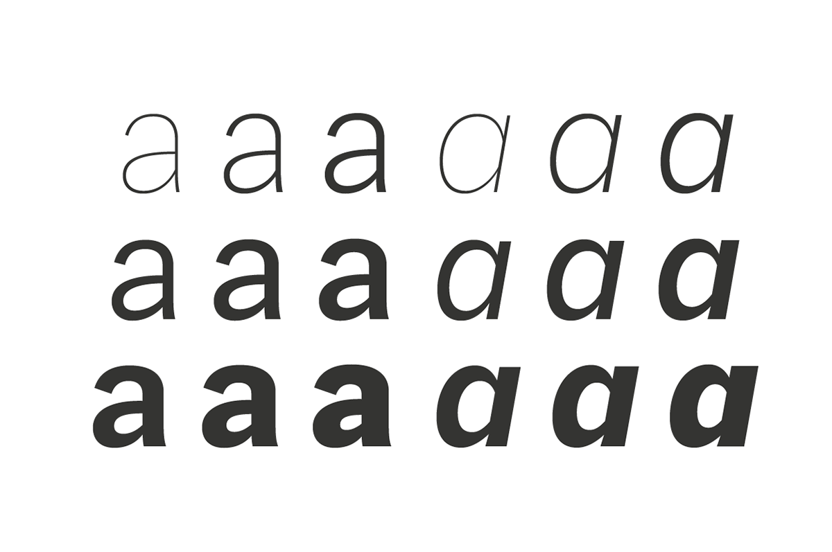
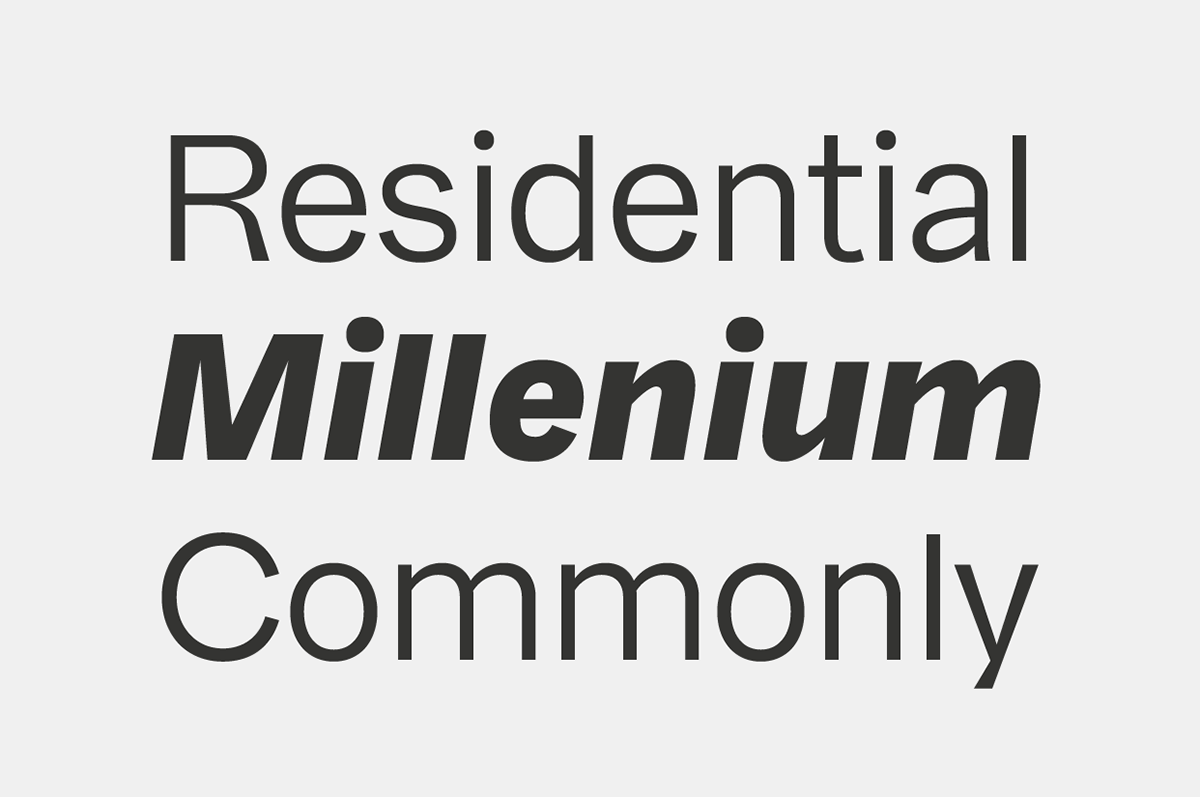
Franca comes in nine weights plus matching italics. Its mid-weights are optimized for usage in long paragraphs, while the bolder weights, due to a short descender and ascender, create a compact and confident look in headlines or short copy. In order to create strong and dynamic italics, the oblique glyph shapes come with a faint calligraphic hint, defined by a higher stroke contrast and a steeper connection between stems and arcs in, for example, h n m and u. This is followed by different standard shapes for a and y, supporting the dynamic movement of the lowercase.