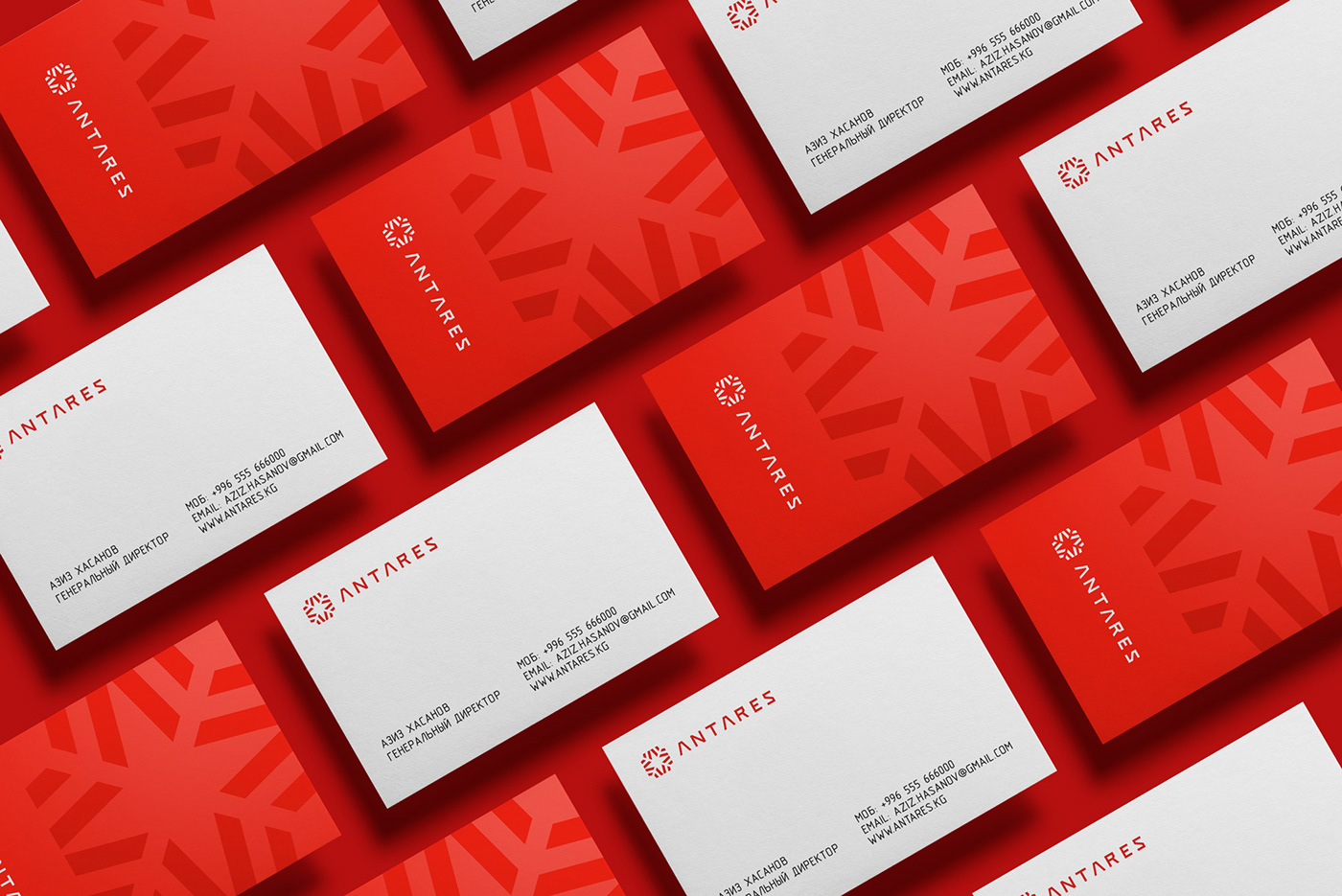
Background: Antares Creative Group is one of the best production studios in Kyrgyzstan. This year they've settled to update their external visual appearance.
Task: To design a new identity for the Antares Creative Group.
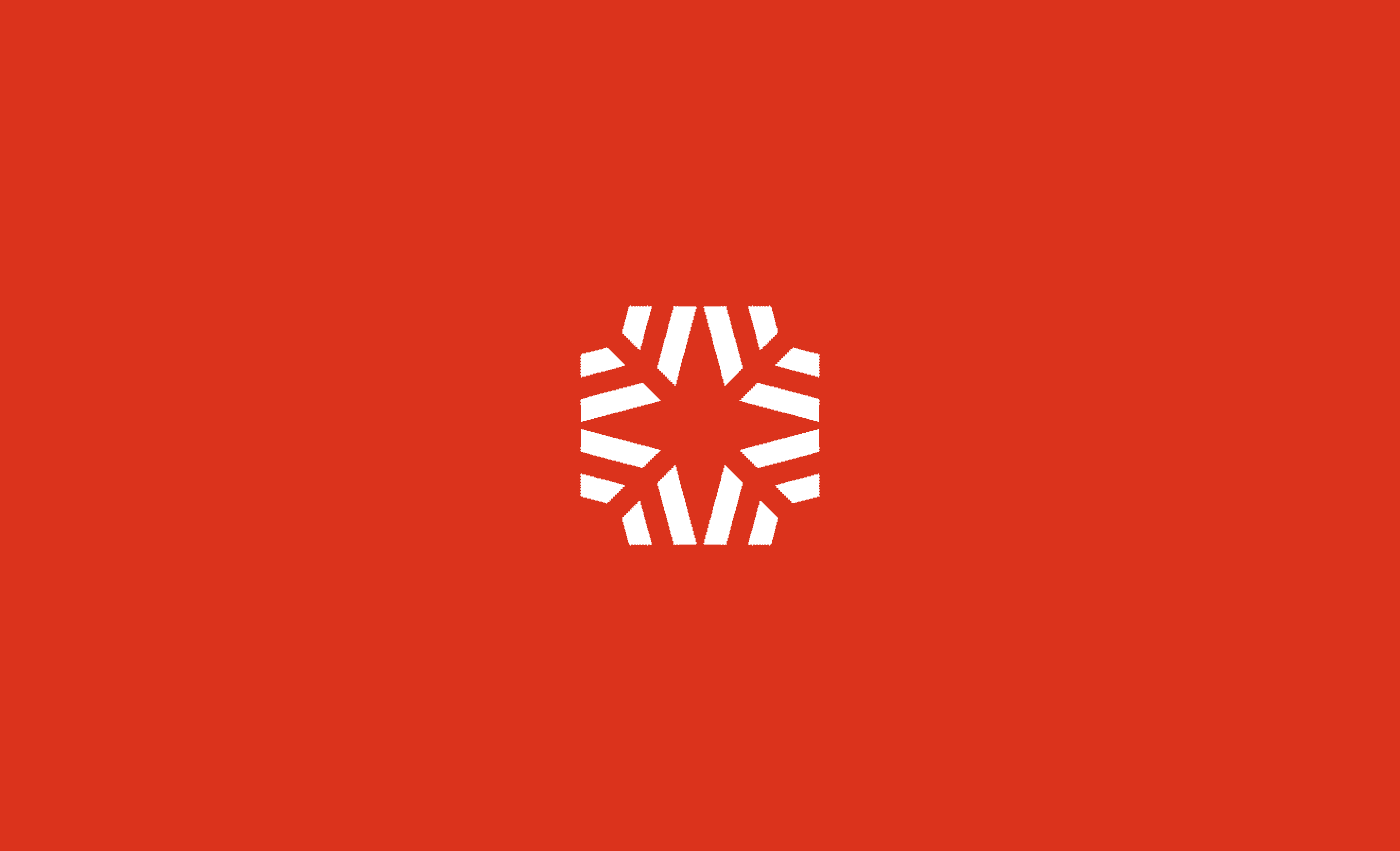
Idea & solution: '"Antares" is the brightest star in the constellation Scorpius and represents the Scorpion’s Heart. So, we decided to reflect this insight into the logo. The logo represents the Antares star, consisting of A-letters, which are also similar to the arrows and makes the brandmark dynamic. We took red as the primary corporate color as the longest color wave in the spectrum and therefore one of the brightest one. Also, handwritten typography lets use it solely.