


Sputnik – Quarter for life
«Sputnik» apartment complex is favorably distinguished by a combination of urban comfort and a natural environment, typical for a country lifestyle. The original landscape design and the surrounding ponds, park, embankment and beach will provide an opportunity to relax from noise and fuss of the big city.
The attitude of Russian consumers towards apartments is ambiguous. In «Sputnik» quarter from «Samolet Development» exactly this format of housing is proposed. The audience of the complex – pragmatists, who are well aware of the market, are familiar with other proposals and often treat them skeptically. Therefore, it was decided to talk with them in a simple and understandable language, with a share of self-irony.
In front of us was the task to draw attention to a specific product and to interest consumers. It required something unusual, different from the typical developers’ message. We offered a dynamic identity with advertising potential, vibrant and flexible.
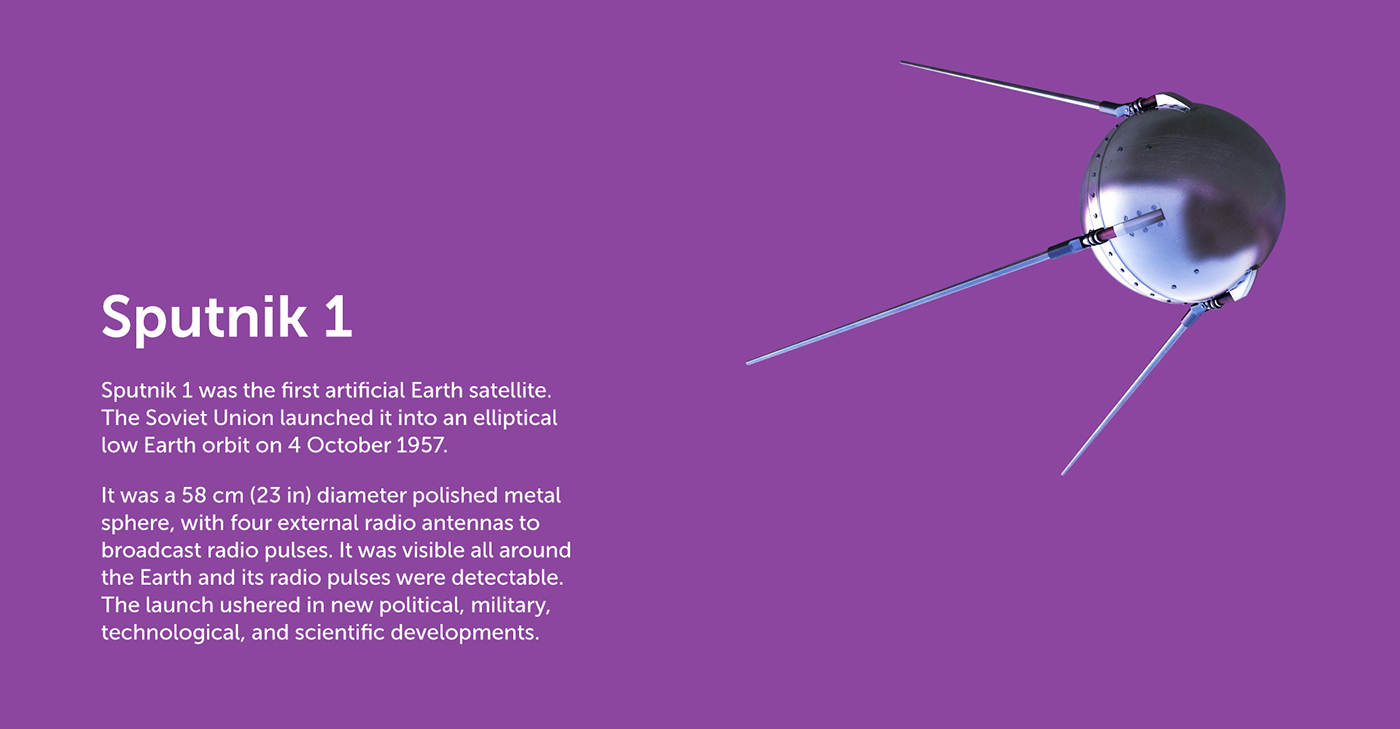
In our interpretation, the image of a satellite has undergone a transformation: from a soulless (albeit innovative) object it has become an emotional, vivid and ironic symbol of the living space. In the developed logo-container endless stories connected to product offers and consumer way of life are placed.
Primary logo >


Typography >

Color system >

Stationery and souvenirs >


Product brochures >


Pattern >

Advertising >


