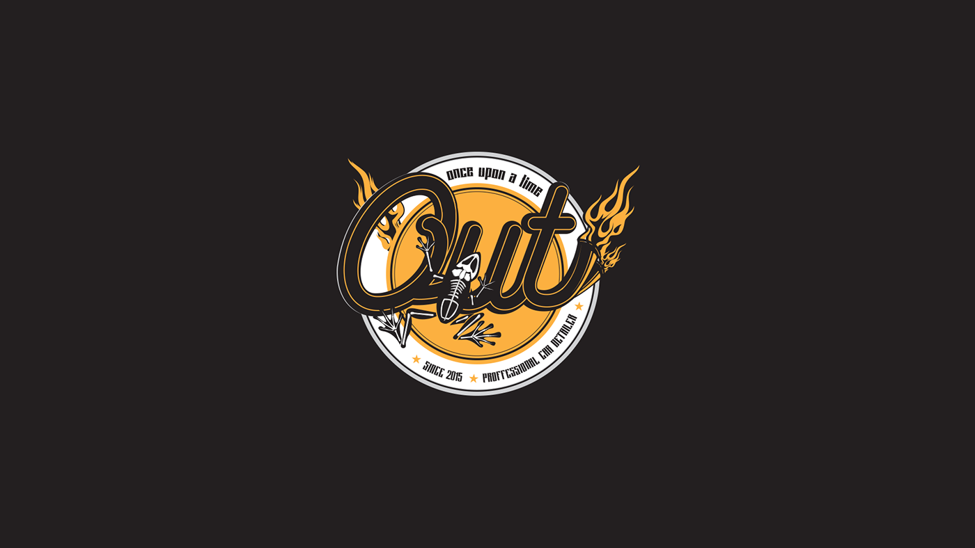
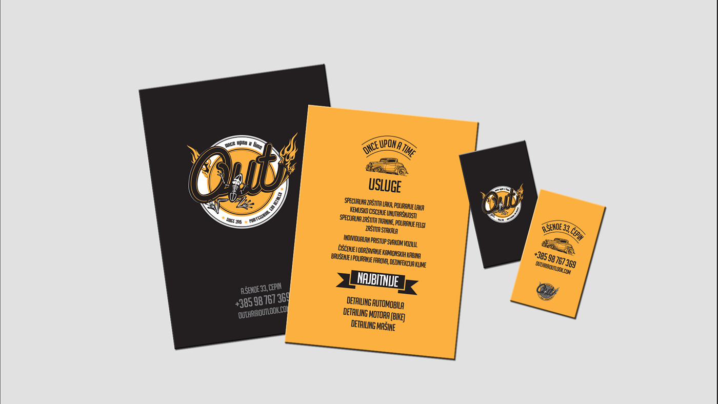
Naming and Visual Identity we did for car&bike wash and detailing shop. Client started small and his signature was frog. So we came up with the idea to connect it with a story of frog turning into a prince. We saw connection with a process of car or motorcycle entering the shop "ugly" and exiting "pretty". So we came up with the name OUT (Once Upon a Time), like in the start of every fairy tale. We upgraded on that and took notes from client about his target group visual style and came up with logo that fits.
• • •
• • •
Vizualni identitet i naziv za studio koji se bavi čišćenjem i uređenjem automobila i motocikala. Klijent je započeo praksu sa svojim potpisom, žigom, koji je bila žaba. Ta činjenica i sam proces uređenja automobila kako postaje od "ružnog" nešto "lijepo" nas je asociralo na priču o žabi koja se pretvara u princa. Iz tog razloga smo predložili ime "Bilo jednom davno" (Once upon a time) ili skraćeno OUT. Gradili smo na tome i prema ciljnoj skupini kreirali logotip koji će pogoditi njihov sentiment i sentiment klijenta i njegovih usluga.