

MY PROCESS
(research-analysis-design)
This is a project where am designing a user experience rather than just a cool website. The following is my journey while learning & understanding this discipline under the mentorship of UX designer Tim Noetzel.
PURPOSE OF RE-DESIGN
To present a aesthetic, modern, minimalist, trustworthy outlook of the railway website that caters to approximately 1 million visitors/day from the existing barebones, basic, information overloaded design.
GOAL OF PROJECT
The goal is to redesign user experience so it is engaging, smooth & effortless right from the beginning.
The 4 important user design issues I chose to address are:
1. Users cannot search for tickets without logging in.
- enable users to search for availability of tickets without logging in.
2. Can book tickets only as a registered user.
- provide option to book tickets as a guest in addition to registered users.
3. System status not visible.
- establish minimum number of steps to book ticket enabling user to recognize every step he/she is at any given time and also to navigate back and forth easily between every system state.
4. No attractive placement of railway tour packages/discounts images to increase booking.
- encourage people to book more tickets through high definition, modern, sleek images.

1. RESEARCH TO UNDERSTAND; LISTEN TO LEARN
When I arrived at the problem I planned to address, I proceeded to learn on how exactly users interacted with IRCTC. I gained a lot of insight into the challenges people faced from various online discussion forums.
I also performed site audits of similar websites. It helped me to develop an overall need assessment for the site I was planning to design.
I worked on questionnaires and conducted structured interview to elicit storytelling. Along the way I documented users thoughts, feelings, actions by learning what motivates users to book tickets, how & when do they search for tickets; whom do they travel often with and how frequently do they travel to meet friends, family or go on vacations etc.
> Content audit
> Competitive analysis (heuristic analysis)
> Questionnaires
> User interviews
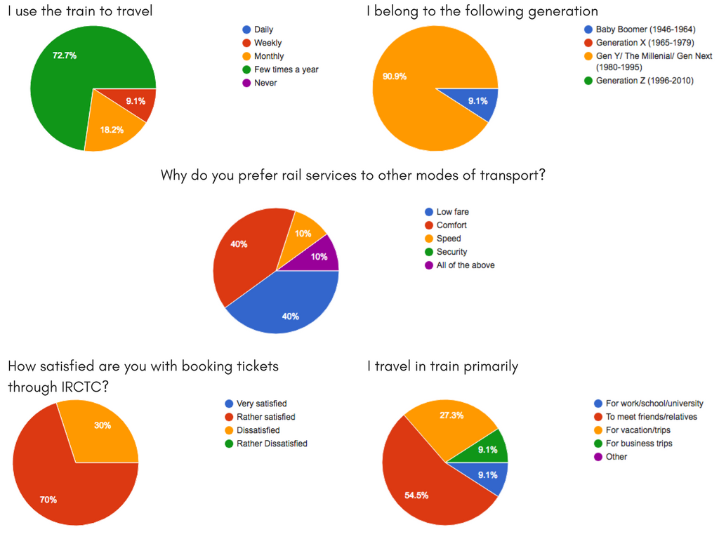
Survey results

Comparative analysis of Deutsche Bahn, Virgin Trains & IRCTC railway websites


"How might I develop a more enticing online presence which better facilitates interaction between IRCTC website & its million visitors/day?"

2. SYNTHESIZE TO DEFINE CONCEPTS
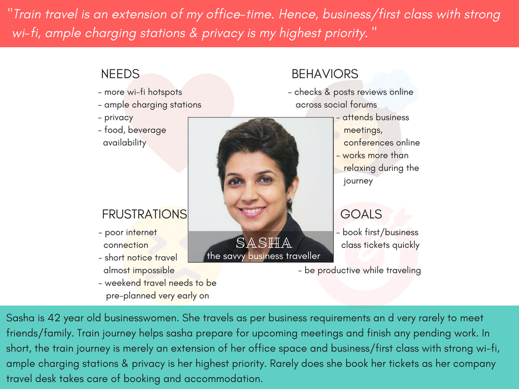
Analyzing from what I learned during the user interviews, I modeled their experiences, tasks and mindsets to articulate the users goals & presented them as empathy maps and personas for quick, easy reference & guidance throughout the design process.
> Personas
> Empathy maps
> Sketching
> Storyboards


3. VISUALIZE THE INTERACTION; COMMUNICATE THE IDEA
Visualizing and diagramming the user interactions mostly went along with prototype development, as it comes from user feedback during user testing & serves to guide later iterations.
Sketches and wireframes formed the basis for low, high fidelity prototypes at multiple stages to get perspective & test with users.
> Card sorting
> Sitemap
> User flow diagrams
> Wireframes
> Paper prototypes
> Visual mockups


4. TEST THE PROTOTYPE; REFINE & REPEAT
Getting timely and useful feedback on prototyped ideas in a structured/informal setting is crucial to the iterative process.
The feedback from the testing is what drives the iterative process, giving me essential insight into refining the prototype, rethinking the interaction & even generating more concepts.
For example, I wanted to design a different way to list the trains available to book. But, important details such as departure time, arrival time, train number were not very prominent in this design.
I also noticed while wireframing that in Deutsche bahn & Virgin trains websites ticket prices are displayed but not the number of seats available.
And, in IRCTC website since ticket prices remain the same with very little fluctuations the deciding factor is the number of seats available which is understandable due to the sheer number of online visitors trying to book tickets.
(Half a million train tickets are booked online every day...thats excluding tickets booked via ticket counters & agent bookings)

Initial design of the 'Choose trains' page while wireframing
During design discussions, my mentor suggested that coming up with a different design is all right as long as the purpose of design is not lost. And, sometimes that just means sticking to the standard display of data that is easy on the eyes. Hence, I decided that a standard row and column presentation is the best way to go to display the trains available to book.
> Usability testing
> A/B testing
> Guerilla testing

Modified design of the 'Choose trains' page while wireframing


WIREFRAMING - Login page, user homepage, choose train & passenger details page


PROTOTYPING

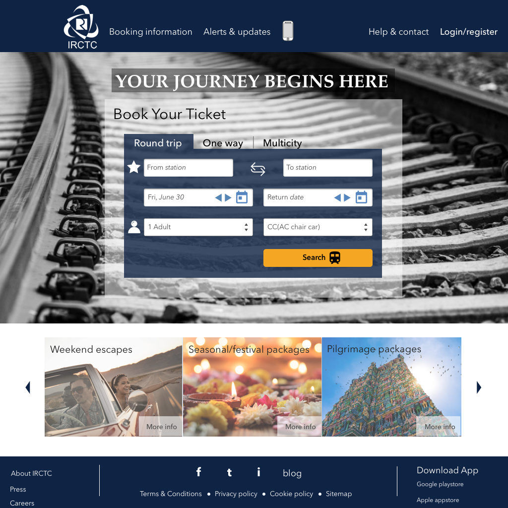
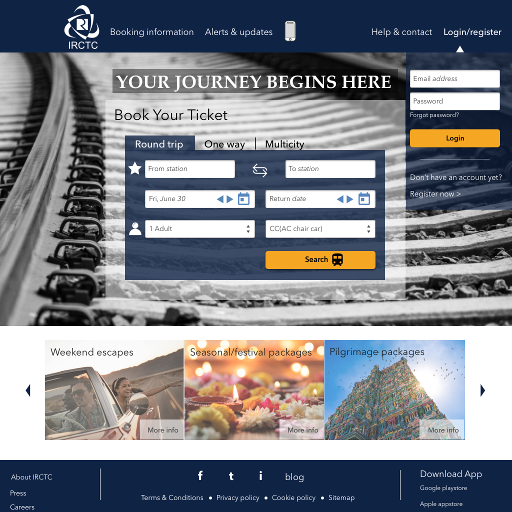
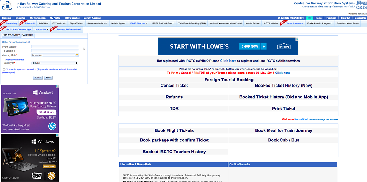
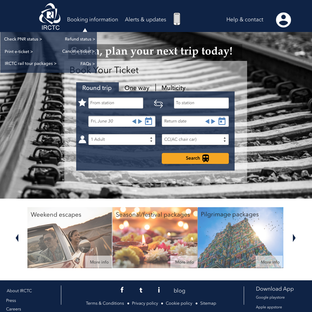
BEFORE & AFTER (homepage/login page)

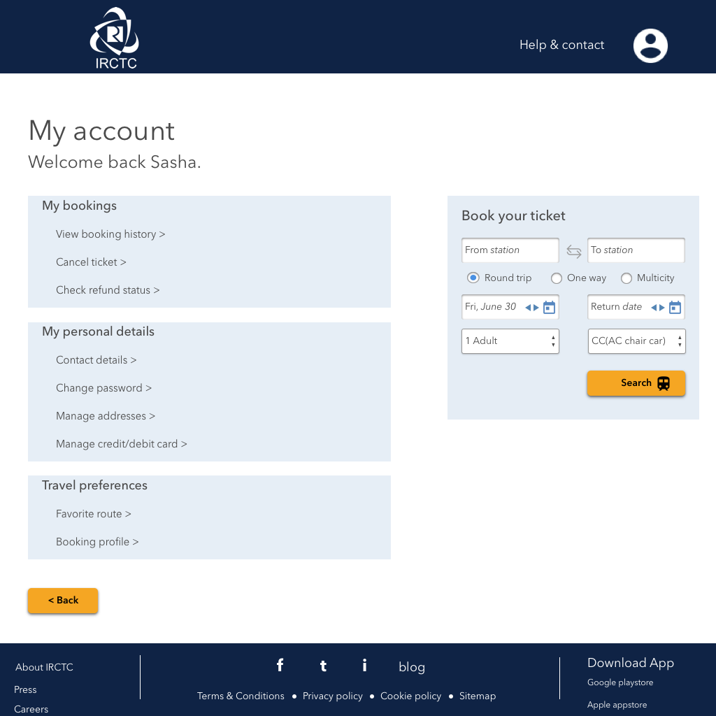
BEFORE & AFTER (user homepage)


BEFORE & AFTER (new user registration page)


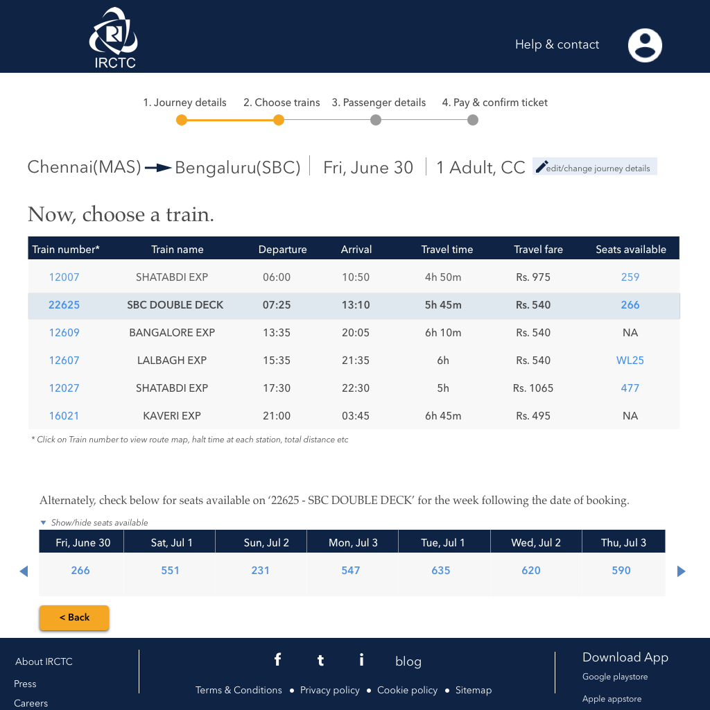
BEFORE & AFTER (choose train page)


BEFORE & AFTER (passenger details page)


BEFORE & AFTER (payment page)


ROOM FOR IMPROVEMENT
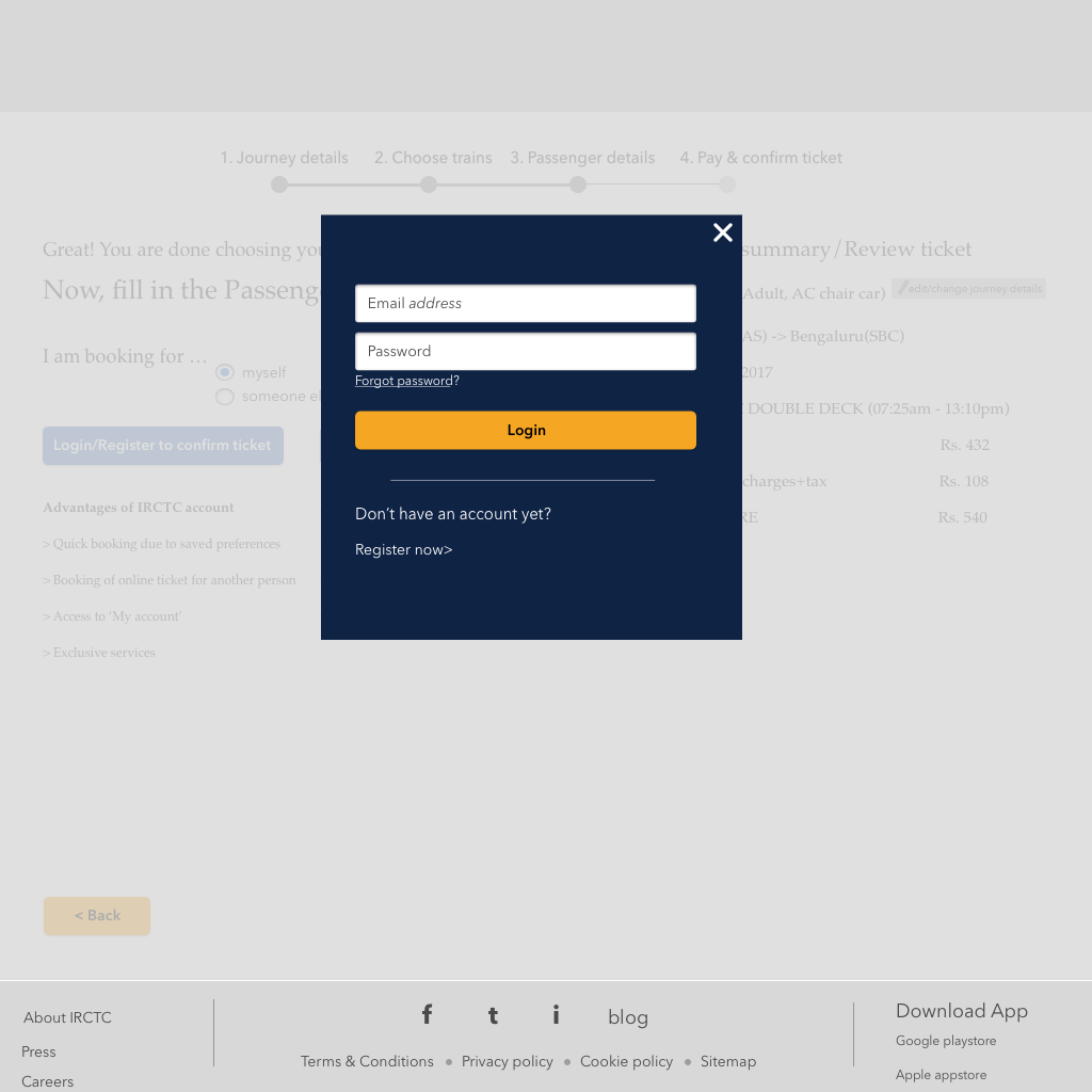
There was quite a bit of confusion in the 'choose trains' booking stage wherein user wasn't sure whether the train number link or the seats available link will navigate to the next step of booking.
Many users suggested a CTA button such as 'BOOK NOW' button/link next to seats available column to explicitly inform user to click to go to next page.

