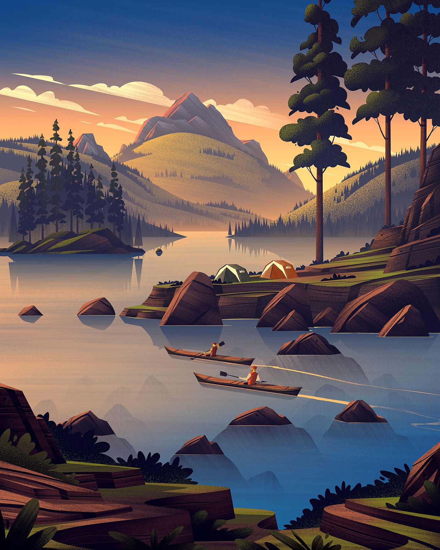
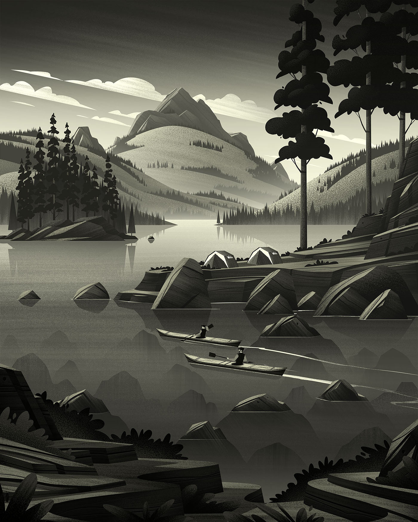
Next up in the OCS's series for REI is the 4th of July Clearance Sale illustration. This piece was a favorite to work on because I couldn't help imagining what it would be like to paddle a kayak on those serene sunset waters...
These kinds of pieces are always a treat to work on and afford me the opportunity to detail out each and every element of the illustration. Lately I've been focusing on lots of my design decisions for each part of the illustration: from the land mass in the foreground to the positioning of the tents and trees and especially the atmosphere between the rolling hills in the background. If you're interested, feel free to read about the creation process below.
Sketches
When I'm tackling sketches, I try to keep my process as clean and simple as I'm able so I can focus purely on the idea. I find if I try to use too many tools or programs or mediums, I loose sight of the piece and my focus becomes on the tools themselves. To keep things simple, I use an iPad Pro + Apple Pencil and one of my all time favorite apps, Procreate.
Procreate's brush engine is very satisfying to work in (this coming from a guy who buys boxes and boxes of col-erase pencils should tell you something...). I stick to one pencil tool and work out the entirety of my composition. Once everything is sketched out, I'll grab a single water color brush and add a few tones just to help set the mood and separate the forms. I don't always have time for this step but when I do, I think it adds a lot.
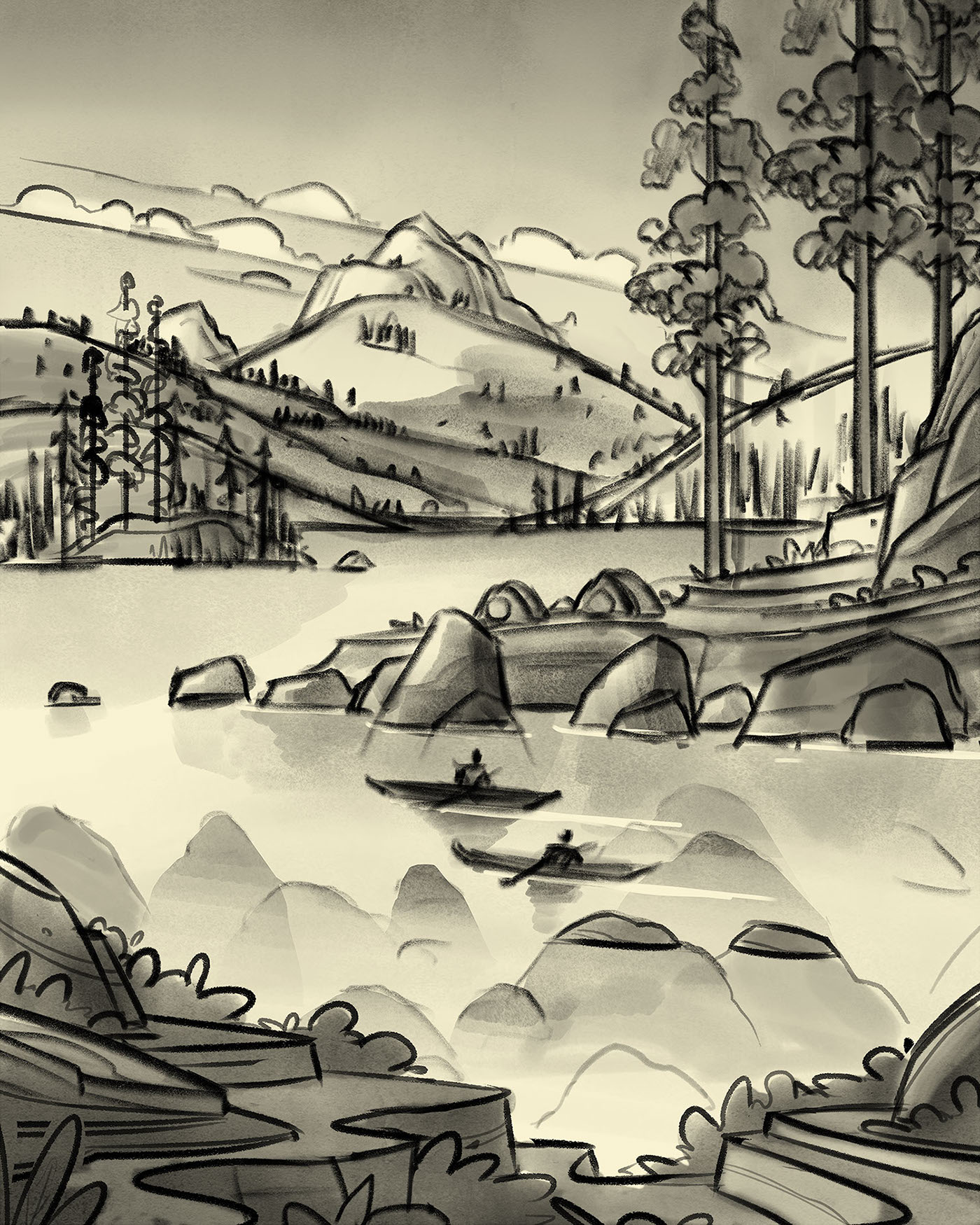
Values
Once the sketch has been approved, we get to one of my favorite parts: building shapes, values, and textures. For this part of my process, I switch to Adobe Photoshop and work at the full required resolution (in this case, 16" x 20" at 300dpi). Here my focus is on building pleasing shapes for my forms, layering in details where I want areas of interest, and lighting and texturing. This is usually where the difficult decisions made during sketching pay off (assuming I made the right decisions...).
Color
Once the values have been locked down, its time for color. I don't often have to make many changes to the piece itself once I get to the color phase, but every once in a while I will depending on what I'm seeing. In this case, the rocks under the surface of the water weren't reading so well so we opted to reduce the number. I learned a long time ago that if a piece is giving you fits, one of the best things you can do is pull elements out of the piece, reducing the complexity, and allowing you to grapple with less to find the right answer.
Once the color version was approved, I packaged it up and sent it out into the world.
As always, I want to thank REI and the fine folks who gave me the opportunity to create. These kinds of pieces are so special to me and I am honored to work with them.
And thank YOU for reading and following along!